
How to Create a Website Menu and Footer and Add a Favicon in Droopler

On our blog, you can find many posts introducing you to the world of Droopler, which show how to build a showcase website in a simple and transparent way. In this article, however, we'll deal with one of the most important things on this type of webpage: menu, footer, and favicon. They are like the three musketeers and neither of them should ever be taken lightly. Why?
Importance of a website menu, footer and favicon
From the point of view of our system, these elements in an abstract sense have a completely different meaning and we handle each of them differently.
Menu
If we need to change the direction of travel on a highway, we have to use a crossing in the form of an overpass. It's no different on the web. When we want to edit a post or go back to the home page, we click the appropriate link. Our menu is the main element that creates traffic.
Footer and favicon
This element is often overlooked by web developers, but it shouldn't be. An intuitive footer can make the user stay on your website. Why? Anyone who isn't particularly interested in the content on your page will scroll down until they hit the footer. This is the moment when the user can either change the tab in the browser or stay on your page by clicking the appropriate link in the menu. A footer may also contain other interesting elements, such as a map, contact details or a form to enter your message.
If you see a small grey globe on the tab next to the page name, it means that the favicon is missing. It's a small image that identifies a given page and tells the user what's in a given tab.
Adding new website elements in Droopler
Drupal is a good CMS offering a really great foundation for setting a page up. However, if we want more than just static content, we need to install additional modules. Considering that each module deals with a single issue, it's easy to get lost. Droopler is a preconfigured Drupal distribution which will allow us to concentrate on adding the content only, as it already contains all the necessary extensions. Thanks to this, a beginner without much technical knowledge can build a simple and functional website.
We can set almost anything on the user interface side. Due to the fact that everyone has their own requirements, e.g. regarding the footer's look, it often depends on the JS and CSS code added separately by the module or theme. Thanks to using Droopler, we don't have to worry about additional configuration, and the process of adding our own styles is easy.
However, to enrich the footer with our own content, we need to obtain some theoretical knowledge. How is the content displayed? There are several ways (a block, a paragraph, a content page) and each of them has its own unique purpose. A block will be the most important one for us.
Block
When we want to add an element with a specific purpose to a website (e.g. a Google map), we are dealing with a block.
How to add a block type?
A block type can be added in two ways – via a custom module or the user interface. We'll focus on the latter, easier method.
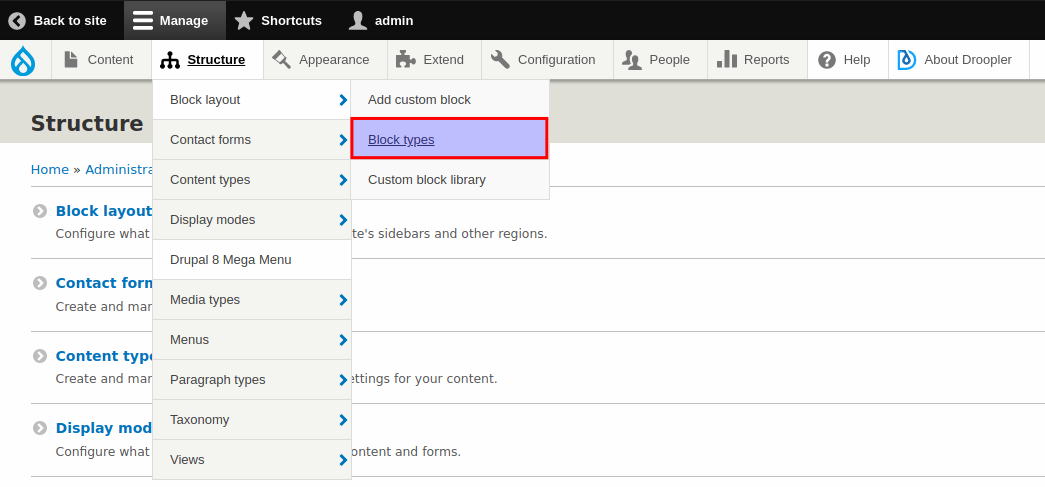
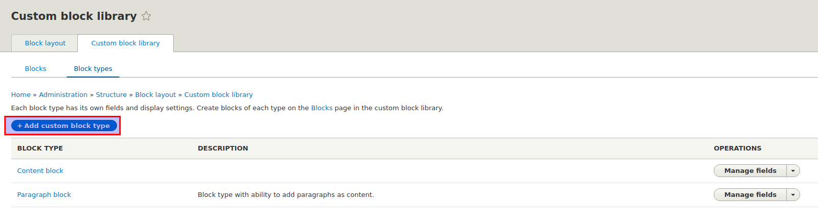
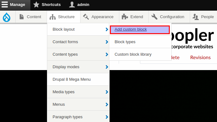
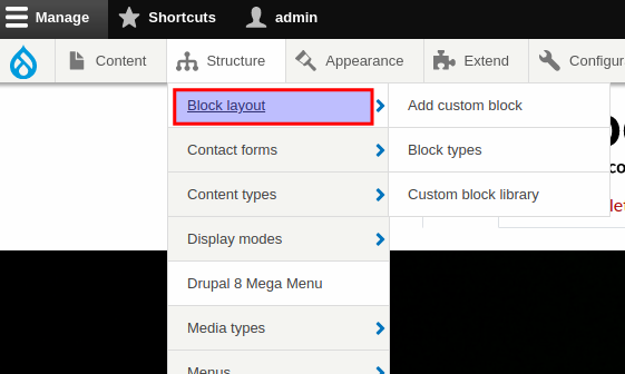
1. In the admin bar, we select the Structure -> Block layout -> Block types option, then in the /admin/structure/block/block-content/types tab we click the + Add custom block type button.
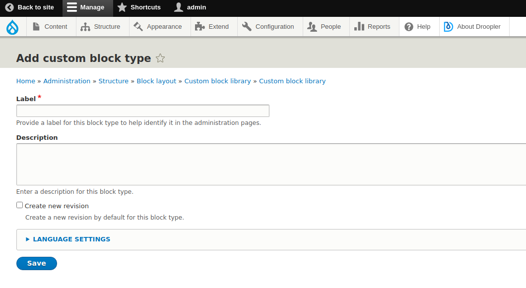
2. At this stage, we set a label for a given type of block, thanks to which we'll find it on the list, and a description that explains what this block is for. The revision option allows us to see a preview of the block type edit history.
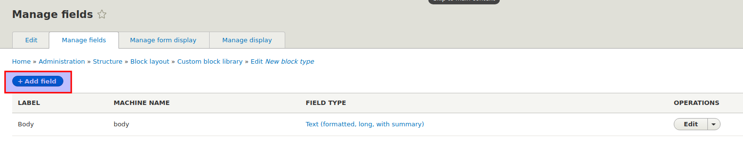
3. We may proceed to add the preferred fields for our block type. We'll make a template which will contain a text field of the text plain type.
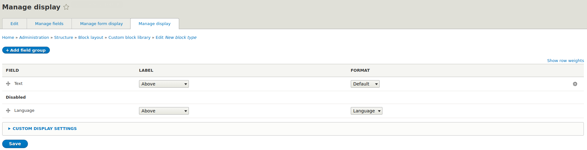
4. In the Manage form display tab, it's possible to set the basic parameters of the form fields, as well as the way they are displayed.
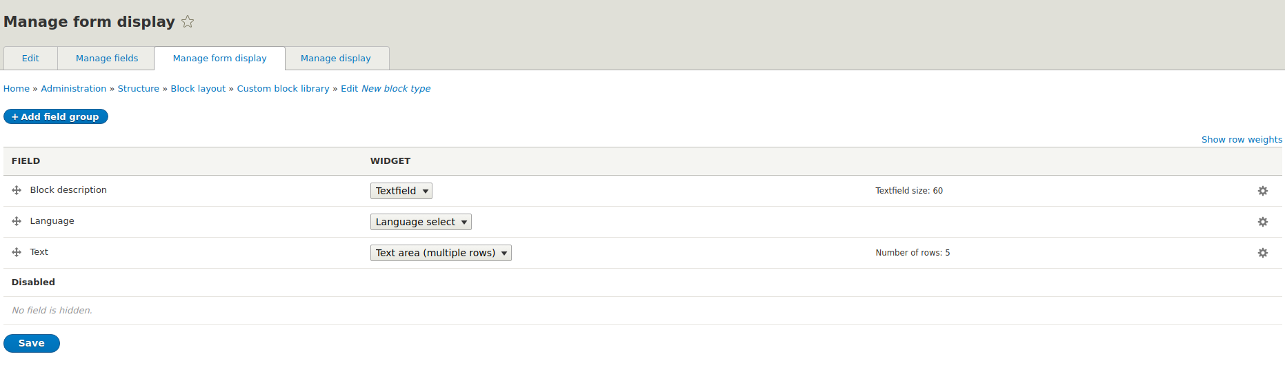
Manage display is used to set the default order of the content contained in the fields, to set the display of the field title or the way of rendering the content.
After it's saved correctly, we'll be redirected to the page with the block types.
How to create a block?
When we have a block type ready, we can create a block from it.
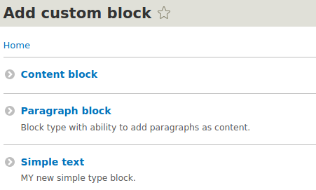
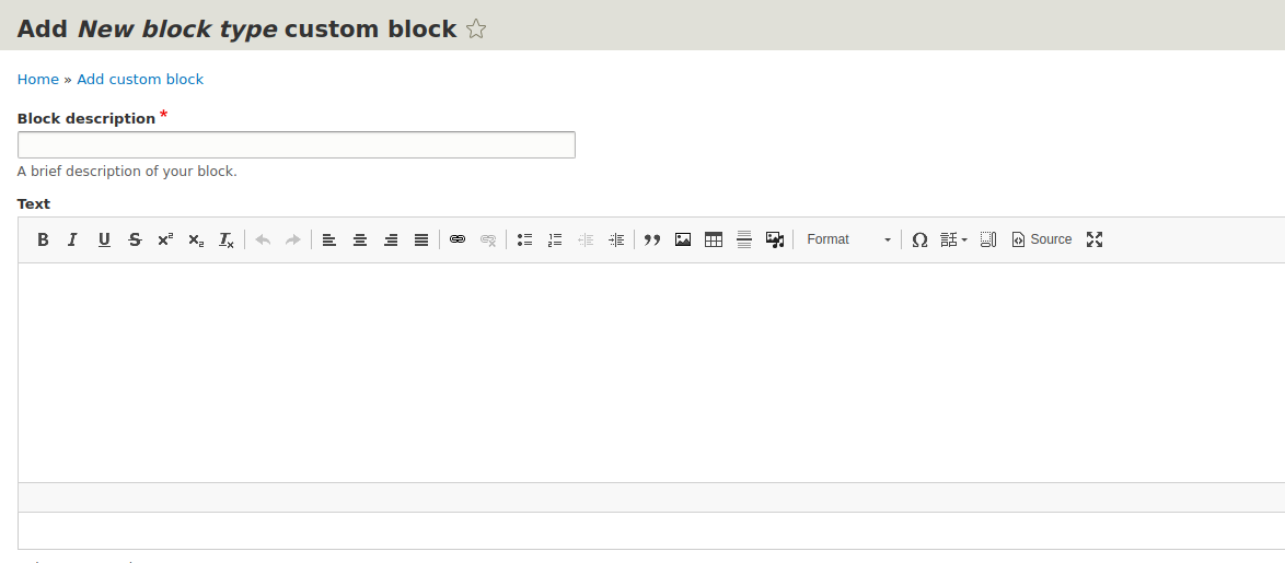
1. In the admin bar, we go to Structure -> Block layout -> Add custom block
2. Then we select our block type from the list:
3. After selecting the block type, we complete its fields, defined earlier in the block type in the Fields tab.
4. As we can see, our block was created in the next subsection. When filling out the form, we'll add it to the region:
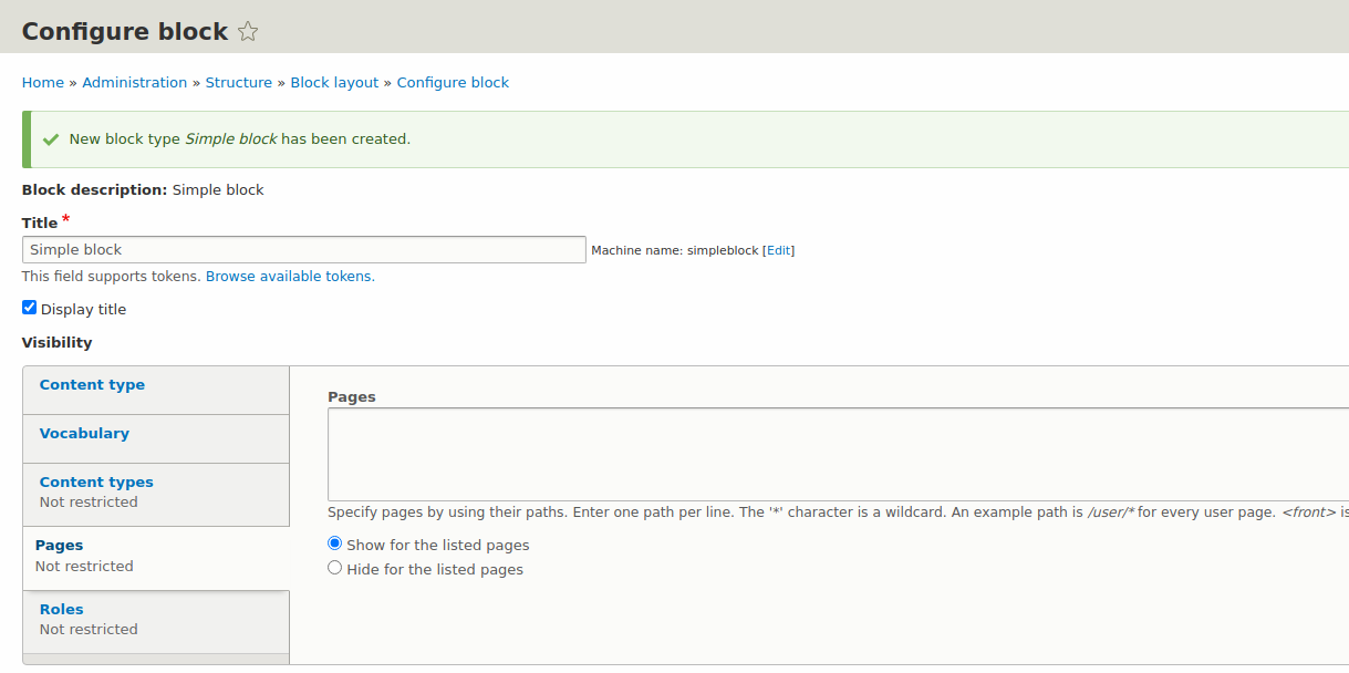
- Display title – determines whether the title of the block is to be displayed.
- Content type tab – determines in which types of content this block is to be shown.
- Pages tab – allows defining the block presence on specific subpages. In the case of using this tab, one of the options should be selected – show on specific subpages/hide on specific subpages. From the description, we can see that it's possible to add not only the paths of specific directories, but also the aliases of the of subpages of the

type or using the * notation which stands for every string of characters. Roles tab – allows determining for which user roles a given block is visible. Region – select the region in which the block should appear. The region for which we wanted to add a block at the beginning is selected.
5. Once successfully added, Drupal will send us to the region list.
We have the block type and the block itself ready. We've already added the block to the region, but we don't know what it is yet.
Region
The block needs to know where we want to use it. In Drupal, this is determined by the regions – the places that we could define as containers. Thanks to them, our project obtains an orderly pattern.
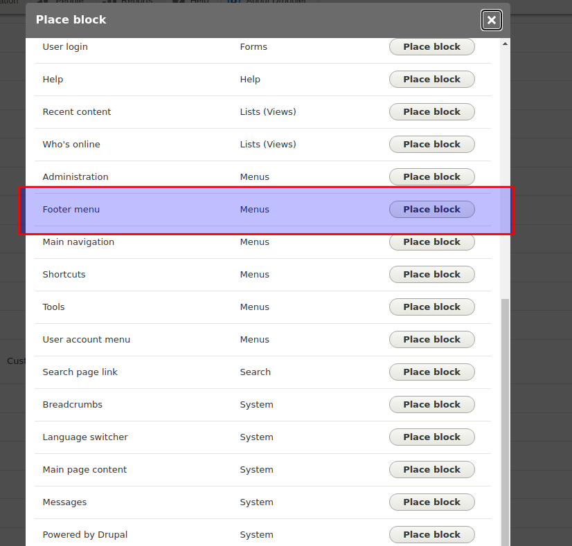
1. To add a preconfigured block to our region we need to go to the Structure -> Block layout tab first.
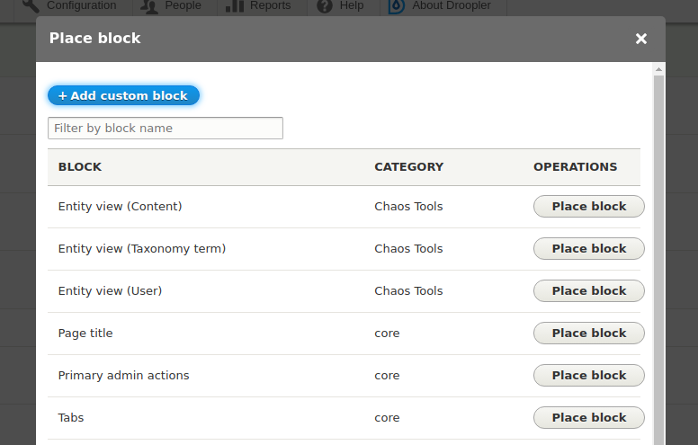
2. We should see a list similar to this one:
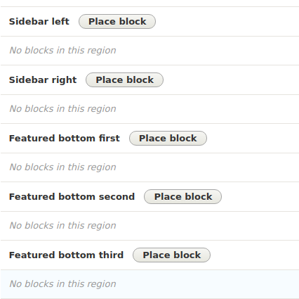
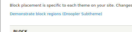
Now we need to find the appropriate region for us. If we want to see the current regions and their layout, the link in the screenshot below may be helpful.
3. Once we know which region we want to add our block to, we click the Place block button next to its title. A list of ready blocks will appear. However, if we want to create another block, we can add it to the system by clicking Structure -> Block layout -> Add custom block in the admin bar (the same way as we did above) or by clicking Add custom block. In the case of selecting an existing block, we'll get a form for adding the block to the region (the last screen of the block adding process).
After adding the block to the region, we'll be redirected to the region list.

4. Everything is ready! We can check on the page if the given block is in the correct region.
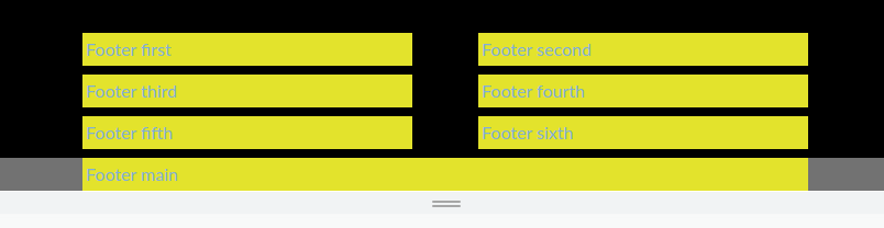
Adding a footer
The footer on our website will be a collection of as many as 7 regions – six on the grid and the main one. If one of them won't be used, it won't be rendered on the page, so we don't have to worry that the other ones will be disturbed. Thanks to this approach, we have various possibilities of nesting the blocks and as we know, with a little effort a block can present content in many different ways.
Adding a menu
A menu is a special block. Its main configuration is based on the links that can be nested. Then we add it to the region just like any other block. Thanks to this, we can create thematic menus that'll organize our navigation in a way that is understandable for the user.
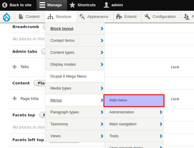
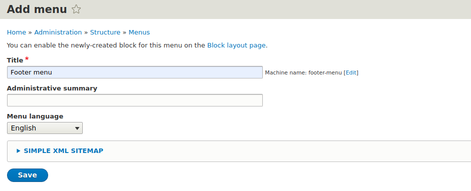
1. We start by entering the appropriate form via the admin bar – Structure -> Menus -> Add menu.
2. The title field is required, so we determine a name that'll help us figure out what's in this menu.
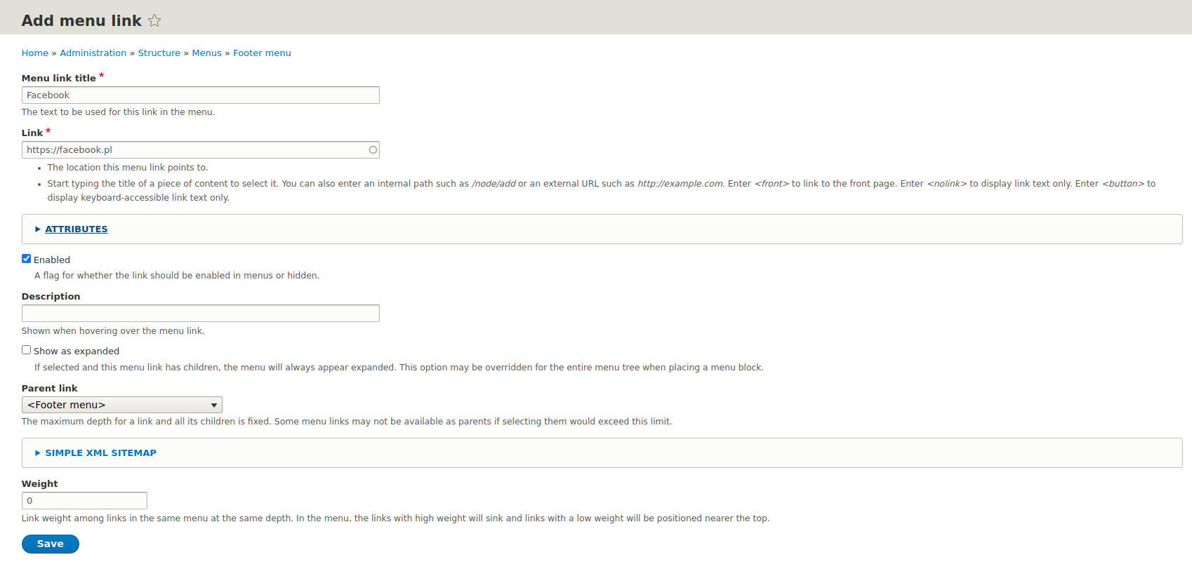
3. We can add our links by clicking the “+ Add link” button.
4. The link form allows us to set and save the most important information such as:
- link title,
- link address,
- link weight corresponding to its place on the list,
- description,
- visibility,
- in which menu the link should be placed.
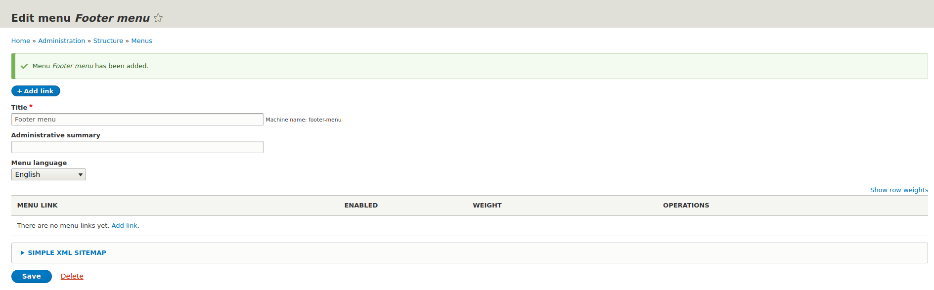
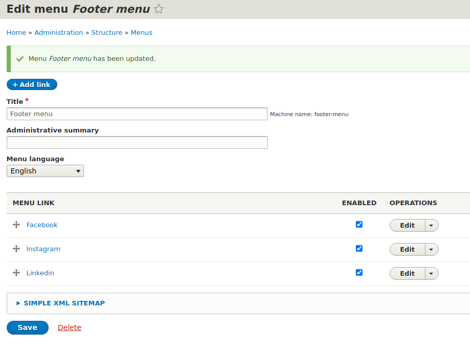
5. After adding the link, we're sent back to the menu.
6. Since the menu is such a special block, and we add the block to the region, then... let's add the menu to the selected region! We can choose different locations, but in our case it'll be the footer.
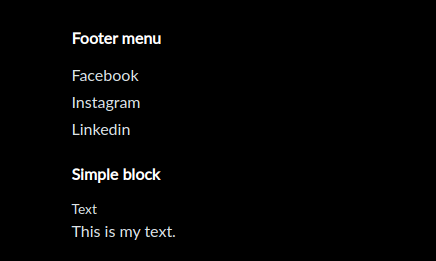
7. The effect should be visible at the bottom of the website:
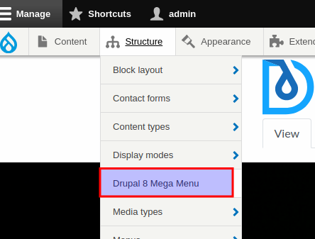
In order to quickly configure the menu on a website, Droopler comes with the Drupal Mega Menu module, which we can use to fully customize our menu.
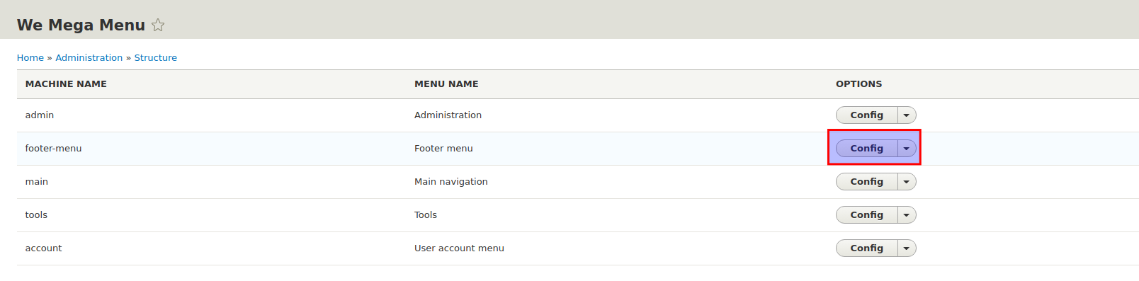
1. We go to Structure -> Drupal 8 Mega Menu.
2. We choose the already composed menu from the list.
3. In the panel, we can add the things necessary for us. Do we want an icon next to a link? Not a problem! Or maybe we want to add a CSS class? Simply enter it in the appropriate field for a given link. We'll also find a checkbox that'll allow us to define where a given link should be opened.
Adding a favicon
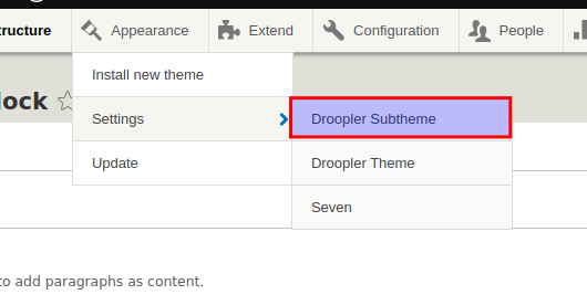
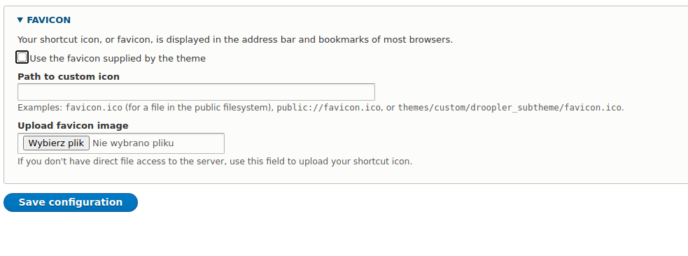
We can find the option of adding a favicon in Droopler in the Droopler Subtheme theme settings.
We simply have to specify the path to our favicon file in the Favicon area or – if we don't have access to the server – upload the file via the interface.
Adding a website menu, footer and favicon – summary
This guide aims to show you the abilities of Drupal using Droopler. It's worth keeping in mind that the list of options is very long. However, you can learn about them gradually after installing Droopler.
I recommend that you familiarize yourself with the Paragraphs module, also available in this Drupal distribution. Thanks to it, our website, in addition to having a favicon and appropriate navigation, will be rich in attractively presented content.