

The world of fashion is strongly represented in the e-commerce industry through a huge number of online stores. Brands compete to provide websites that can provide an experience similar to visiting a real store. An online clothes store must adequately present the clothes on offer; therefore, the page showing a product is of key importance to it. In the post below, I present product websites that stand out in terms of design and interesting visual solutions.
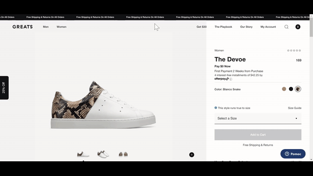
1. www.greats.com
If you're looking for stylish footwear, check out www.greats.com. The product page has a classic layout here. On the left, there is a photo of the product along with a gallery, on the right – an information section and the provided ability to purchase it. An unusual solution here is informing about the availability of specific sizes. When choosing a size, each option has an appropriate icon indicating its availability in stock. It is also interesting to place a slider with related products under the purchase button. Such links are usually used in the lower sections of these types of subpages. Here it is made more accessible because they were put quite high up. The subpage also has a place for additional descriptions and photos under the top part of the page. Website administrators can fill in the fields with content and photos of the product (most often with models). One may also like the use of neutral colours and the space between the elements on the subpage. The page is neat and comfortable to use.
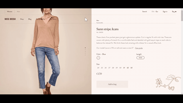
2. mosmosh.com
On the mosmosh.com website, you can see an interesting way of presenting photos combined with screen scrolling. The product photos change as you go down to the lower parts of the description. This solution works very well and allows the customer to comprehensively read the description, as well as look at the photos, eye-catching colour scheme combined with minimalistic descriptions create a pleasant effect.
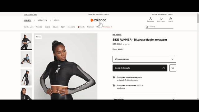
3. zalando.com
This brand does not need an introduction. Zalando, as an ecommerce giant, offers a huge product range that they present in an original way. On the product subpage, you can find an easy-to-view photo gallery and an extensive description hidden under folded tabs. At Zalando, the photos are supposed to do most of the job, so the emphasis here is being put on the presentation of the photos. On the product page, you will also find an extensive presentation (in the form of a gallery) of other similar products. If you are not convinced to the currently viewed product, maybe you will be interested in something that Zalando will suggest you?
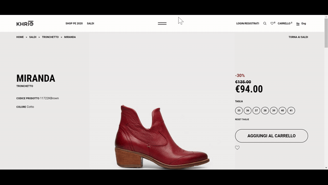
4. khrio.com
At khrio.com, you will find a broad selection of footwear. The minimalistic product subpage presents footwear in highly detailed photos. In addition to the displayed images, the emphasis is put on the price, the product name, and the size selection. The page encourages you to add shoes to your cart by using the available size bar stuck to the bottom part of the screen.
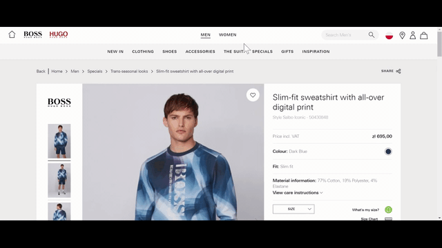
5. hugoboss.com
The Hugo Boss brand website presents proven solutions for the layout of elements on a product subpage. An interesting option is to buy not only the selected item of clothing but also to assemble the entire set presented by the model in a photo. If you check out a sweatshirt, you can immediately buy the matching pants and shoes.
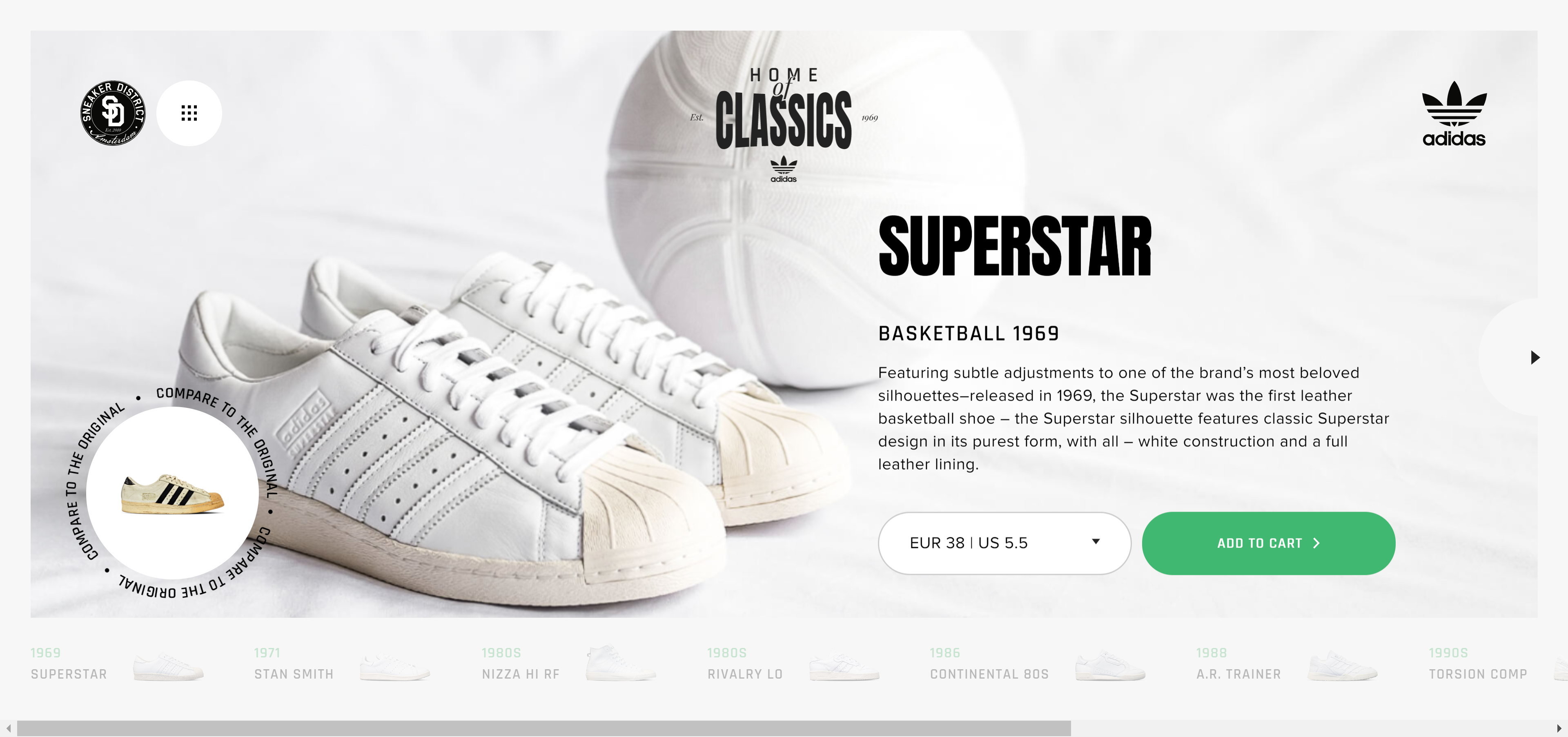
6. homeofclassics.sneakerdistrict.com
Not all products require an extensive presentation and extensive galleries, especially those products that are well-known by everyone, such as the iconic models of Adidas shoes. On the website homeofclassics.sneakerdistrict.com, you will find a minimalistic presentation of the products known to all aficionados of classic footwear. The consistency and matching colours make the visitor eager to check out the next models.
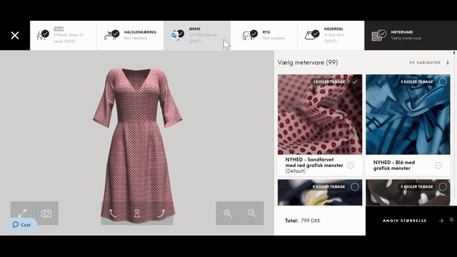
7. nextlevelunique.com
Any woman who has a problem with finding the right dress for herself at other stores, can design her own outfit based on the available models of cuts. This product page is an extensive configurator with a large number of options and a convenient 3D preview of the model. Many a woman will spend a lot of time here, choosing fabrics and styles tailored to her own preferences and tastes.
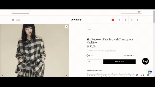
8. akris.com
At akris.com, a product page consists of minimum content and maximum photos. The photos presented on this website are very large. Thanks to this, you can take a closer look at the details of the products being offered, without the need to enlarge the photo.
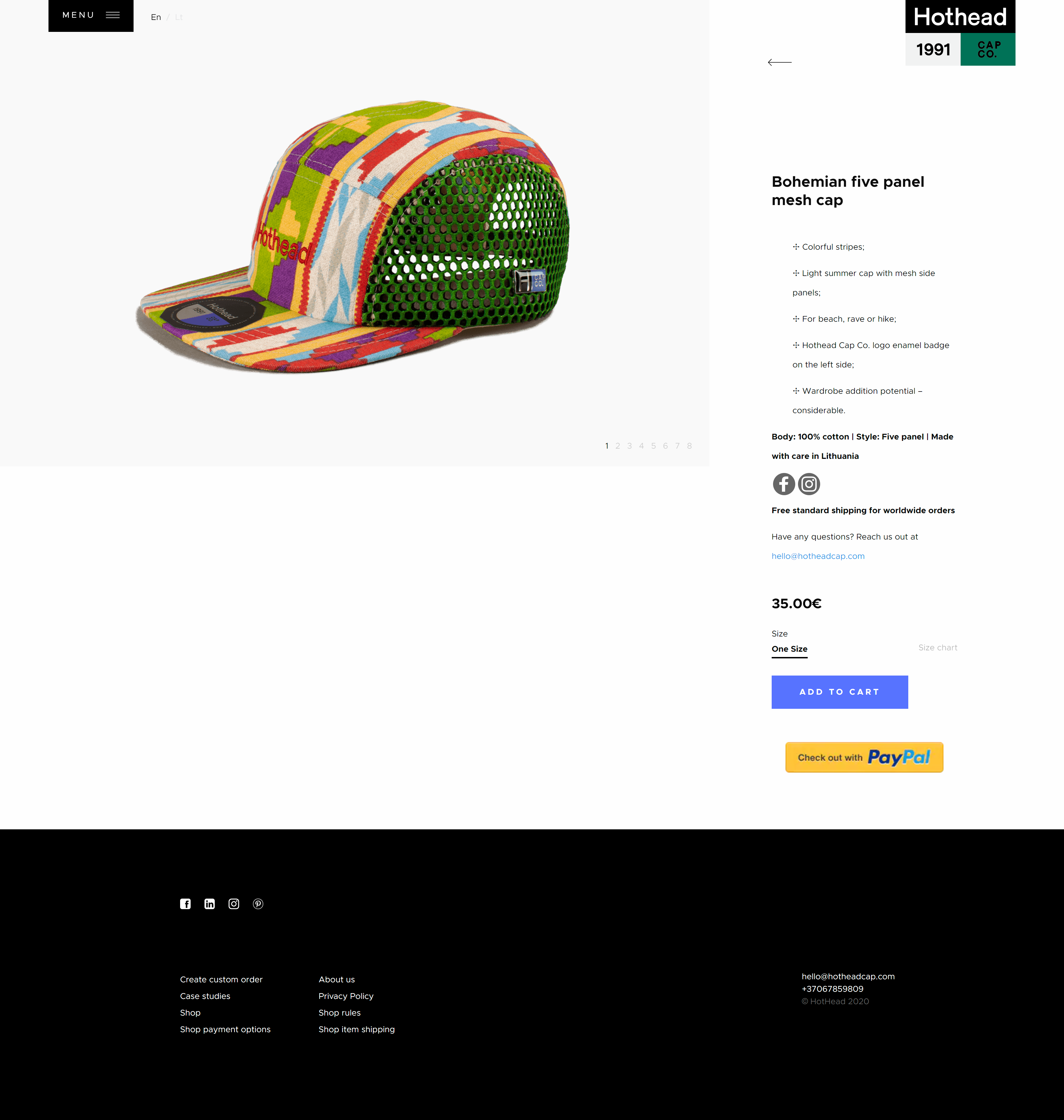
9. hotheadcap.com
If you are looking for headwear, check out hotheadcap.com. In this store, you will find a range of streetwear caps. The product page basically consists of two parts. A slider with photos, and a column with a description and a button for purchases. It is enough to present a product in a comprehensive way. The design of the product subpage is a continuation of the look of the home page, which by the way also deserves attention.
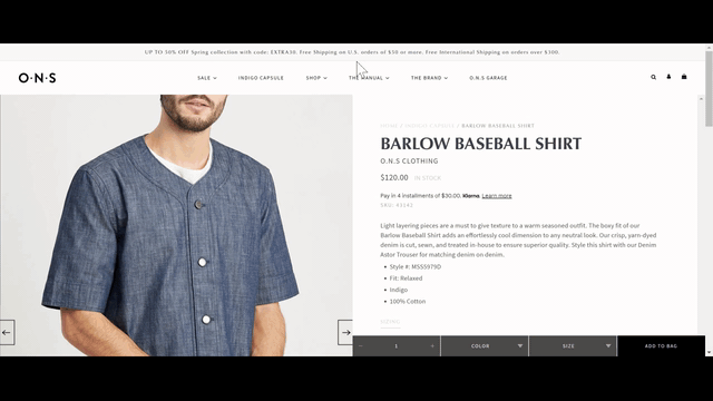
10. onsclothing.com
At the onsclothing.com men's clothing store, the product pages have a classic layout. On this website, it is the details that are impressive. The slider with a gallery, which enlarges the picture when hovering the cursor over it, works very well when viewing the products. The bar allowing the choice of the size, colour as well as adding the product to the cart sticks to the bottom of the screen in an unobtrusive way. This solution does not allow you to forget that you are on the store's website and that you can quickly add every product to the basket.
What a good product page with clothing, should look like?
A good product page with clothing allows the user to "feel" the product. Pictures showing the details are essential. Almost like in an actual brick and mortar store, contact with the product is important. Obviously, a monitor will not replace a fitting room, and this barrier cannot be overcome, but if you can ensure the product to be well-presented, it will not turn out to be a disappointment upon a delivery.
Bearing in mind the limitations, developers of our Drupal agency can make other aspects to be executed even better than in a traditional store. Showing the availability of goods, sizes, showing the related products, showing the clothes together with other pieces of clothing, or offering ready-made stylisations will have an encouraging effect.
Focusing on the product makes the product pages mostly minimalist and without flashy colours. White colour as a background works very well because it strongly emphasises photos.
I hope that the presented examples of product pages will be an inspiration when creating and expanding your e-shop. Therefore, if you want to implement your vision, I invite you to use our services Drupal commerce.