Technology Website Design. 10 Examples That Will Give You Useful Insights

Do you already have a unique product or service and are now wondering how to present your offer to the audience? First impressions are significant when it comes to business websites. But don't forget that it's easy to cross the fine line between great design and a web page overloaded with unnecessary elements. See the technology website design examples that can inspire you.
Why is thoughtful technology website design so important?
An innovative technical website referring to the latest trends testifies to the capabilities of a technology company. After all, it would be hard to believe the brand creates good products if its web page doesn’t look its best.
Using modern functionality and high-quality graphics in technology company website design is advisable. By doing so, it shows that the organization understands the needs of its users and easily operates creative solutions to meet them.
Good corporate website design makes it easier to achieve business goals. With the right elements and actions, an organization can highlight important content and engage visitors more. Internet users are more likely to interact with aesthetically pleasing and intriguing websites with a flawless customer path. In addition, these features of the best technology website design make it faster for users to get to where they’ll accomplish their goals. Here are ten examples of web pages to be inspired by.
1. Bang & Olufsen
Company Bang & Olufsen offers a wide range of electrical devices for sound (speakers, headphones) and video (televisions). This technical website also has a Smart home category, which includes products that facilitate intelligent control of audio devices.
Like many tech websites, this one focuses heavily on the brand's products. The homepage, in this case, serves to showcase them – using aesthetically pleasing and mesmerizing photos and videos. As a nod to the Bang & Olufsen website user, there is an option to stop video playback. A person who finds the constant traffic too distracting can use the button.
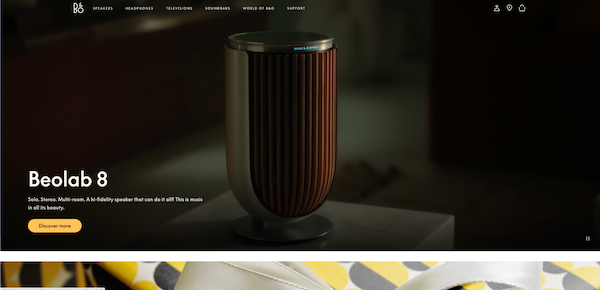
Source: Bang-olufsen.com
Despite the wide range of offered products, the web page is elegant and organized. Subpages for specific products can be easily accessed by clicking on the category tiles in one of the sections. It’s also easy to get to the section related to customer support and contact. Just select the Support tab in the main menu.
Also visually attractive is The World of B&O's story blog. In addition to high-quality images showcasing the company's products, the irregular layout of entries at the top of the web page draws attention. This intriguing action distinguishes the technology website design and encourages content exploration. These, in turn, are engaging and use the call-to-action appropriately. Straight from artists' stories or product development descriptions (spiced up with video), buttons redirect Internet users to subpages where they can purchase.
2. CollaborateMD
CollaborateMD is a company that offers medical clinic management software. Right from the start, there are elements to showcase the available functionalities and make potential customers curious. A dynamic presentation of screenshots from the system shows its specific views and tools.
The following key elements of the website (sections with text and graphics) appear on the screen as you scroll. The movement intrigues and encourages further exploration of the web page. A thoughtful part of the medical technology website design is also the statistics presented in a dynamic form. The numbers begin to accrue only when you scroll down to them on the home page and the "About Us" page. This traffic attracts the eye of the Internet user.
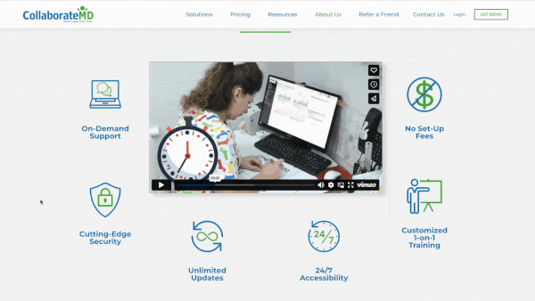
Source: CollaborateMD.com
The business page "About Us" is essential for tech websites. Companies can better explain their motivation and values there. Large buttons are used on the right side of the web page to browse the offerings further. Below is a video that briefly explains the advantages of the company's products. When you hover over a graphic depicting a particular benefit, it turns into a box with a more detailed explanation of that advantage. This procedure not only sparks the interest of Internet users but also saves space on the page.
3. Sony
Sony offers services and products for various business fields. It produces electronic devices, games, music, and movies and even provides financial services. The tech websites of such companies tend to have a complicated structure due to the numerous types of business activities, but not in this case. Sony's website relies on straightforward navigation and presents all products and services well, thanks to an extensive menu.
Most tech designs on this website are distinguished by top-notch graphic development. The web page is filled with high-quality videos and graphics that promote the company's business. Brief descriptions of each content encourage browsing through these materials.
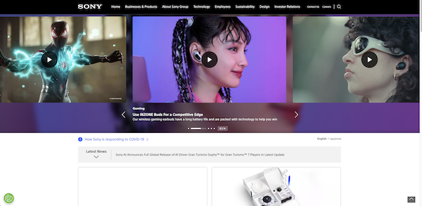
Source: Sony.com
The entire website consists of sizable, interactive tiles. When you click on them, you can watch a video dedicated to a particular topic. At various points on this technology web page, the user usually chooses between written and video content.
4. SONA
SONA is a company that uses technology to make homes more comfortable. They design solutions, provide appliances, and install them to create luxurious leisure environments. They use smart lighting and modern audio and video products, for example, to do this.
This technology website design is mainly distinguished by its minimalism. The most vital point of it is the carefully prepared visuals. Videos and images presenting the solutions offered by the company are mesmerizing. Text has been kept to a minimum in favor of videos and photos. Slightly more written content you can find in the portfolio and categories where the company describes its solutions.
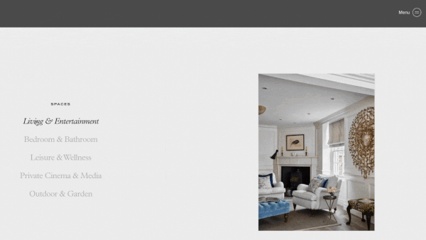
Source: Sona.technology
At the bottom of the home page is a list of categories dedicated to room types. Just hover over one of the names to see a photo of an example implementation. With this subtle trick, you can save space on the web page and, at the same time, attract the user's attention.
5. Mythical Games
Mythical Games is a provider of software for game developers and publishers. It’s used to build and integrate a "play to earn" economy based on blockchain technology into its games.
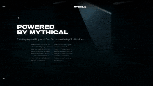
Source: MythicalGames.com
This technology website design is modern and engaging. The three-dimensional graphics in the hero section make it feel like the user is sinking deeper and deeper into the web page when scrolling. Instead of going down, the movement of the mouse causes more elements to appear. They emerge from different locations, drawing Internet users and making them unable to stop exploring the website.
The use of dark colors and expressive graphics enhances the atmosphere of modernity on the web page. A thoughtful play of light and shadows adds to the mysteriousness.
6. Keelvar
Keelvar is a company that develops software to better manage expenses. Many tech websites use contrasts to make them more attractive and bring the most relevant content to the forefront. This web page uses the juxtaposition of white and dark colors – purple, green, and shades of gray – to do so.
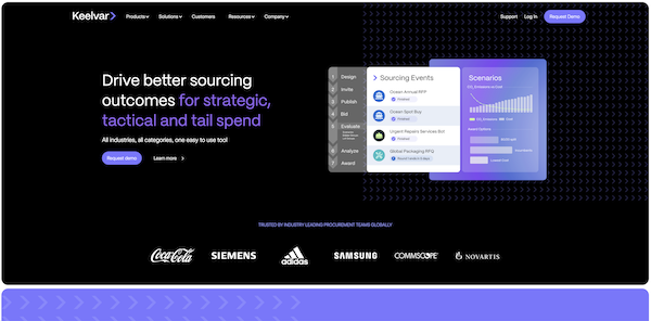
Source: Keelvar.com
Some elements of the technology website design help build trust in the brand from the start, which is very important for the B2B sector. Keelvar's web page already features logos of well-known companies that have used the tool in the hero section. It is also crucial to highlight essential elements, such as statistics or the advantages of using the software, by placing them in prominent boxes.
The dynamic appearance of elements on the web page as visitors scroll gives the impression of movement, naturally increasing visitor engagement. A promotional video that explains the company's mission and how it operates works similarly.
7. Tesla
Tesla is a well-known manufacturer of modern cars, among other things. The tech giant's website is intuitive and engaging from the first seconds. Users are greeted by an exciting video. The website's design and expressive photographs evoke simplicity but also the luxury and strong emotions associated with driving a Tesla.
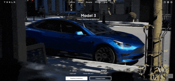
Source: Tesla.com
Product pages are minimalistic. They contain high-quality photos, concise descriptions, and videos illustrating the process of creating solutions.
The brand pushes the viewer towards its products with great determination and, as a result – to purchase. The CTA to schedule a test drive is still in the hero section. The design of this technology website is dominated by aesthetically pleasing high-quality graphics showcasing the solutions and products offered by the brand.
8. PandaPay
PandaPay is a provider of payment terminals for businesses. From the first seconds spent on this technical website, it’s clear that it was designed with care and concern for uniqueness. The original graphics and animations indicate this.
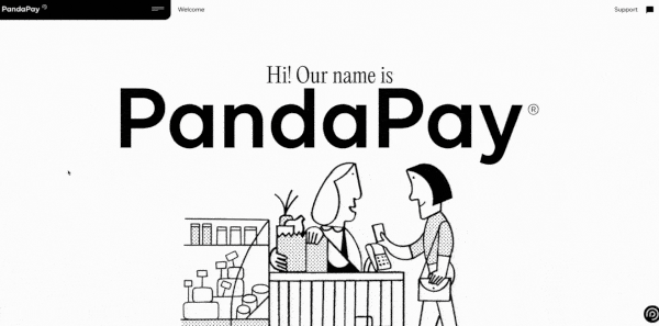
Source: PandaPay.ca
The unique graphics look good as part of the minimalist design of the technology website based on contrasts (black and white). Large fonts guarantee the readability of the content, and the eye is attracted to their style, imitating handwritten notes. The underlining of individual words looks similar. This action can be a way to reduce the distance between the company and the potential recipient.
The technology website design is memorable despite its simplicity and the limitation of the color scheme to two colors. On this web page, it’s the small details that build the mood of the whole.
9. Highline
Highline offers entrepreneurs access to a payment automation platform. Its tech website uses mostly light shades of gray as the background of its various sections, with dark blue elements standing out well.
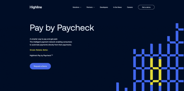
Source: Highline.co
Highline aims to quickly connect with potential customers. This is indicated by the CTA expressly appearing in the hero section, which stands out in a lighter blue color. The message encourages people to get in touch with company representatives. The simple graphic in this section is animated by changing its color.
Elements explaining how the software works appear below the hero section. The flow diagram of funds is presented in the form of an uncomplicated animated graphic. It shows that thanks to automation, finances in the organization will be organized, and their movement will be smooth. Keeping the content to a minimum allows Internet users to focus on the most essential elements of the web page.
10. Avast
Avast creates and sells software to secure devices from potential cyberattacks. The design of this technology website is characterized by bright colors and clarity. The web page is directed at presenting the advantages of the solutions offered.
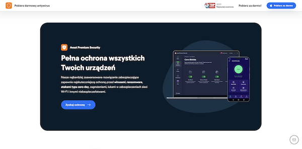
Source: Avast.com
Many companies make the mistake of designing uninteresting CTA buttons. They don't use distinctive colors or interesting shapes. The creators of Avast’s tech website know how important the right slogan is to encourage people to take action. The first CTA already appears above the bend line and is quite compelling ("Download for free"). Below is a section with four reasons to take advantage of the offer. Buttons with specific slogans (e.g., "Get protection," "Discover VPN") encourage users to interact more than the boring "Learn more."
Aesthetically pleasing icons and graphics complement the rather minimalist technology company website design. With their help, the merits of the software are highlighted by testimonials from various customers, consisting of a commentary and a rating.
Technology website design examples – summary
Technology companies increasingly opt for bold and distinctive designs to emphasize their innovation. They’re using animation, creating dynamic websites to symbolize their connection to the world of technology. When designing such a web page, however, it’s worth keeping in mind its clarity and simple navigation. You need to be careful that fancy animations and artistic fonts don't disturb the web page’s readability and make it difficult to understand the offerings. We can advise you on the most exciting technological trends or design a unique website for you.