

E-commerce stores with gadgets and consumer electronics often stand out with their interesting design and UX solutions. In this article, I am going to present five examples of attractive product pages that effectively encourage users to purchase a new electronic device.
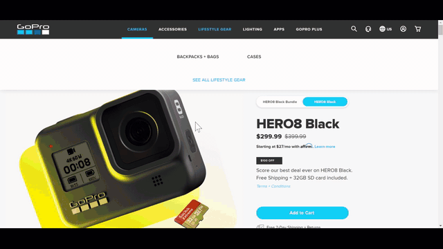
goPro.com
unique animations
GoPro is a household name among geeks of the world. This manufacturer of action cameras has been settings standards for active users for many years now, but the multitude of features that each of their products has makes selling them a challenge. How to showcase the vast variety of functionalities in a comprehensive manner?
For its official store, GoPro decided to go with an extensive presentation filled to the brim with animations and short clips. This in turn makes the product page visually attractive and interesting – despite being fairly long. The company managed to avoid boredom and monotony thanks to the diverse content on the page. See for yourself: GoPro.
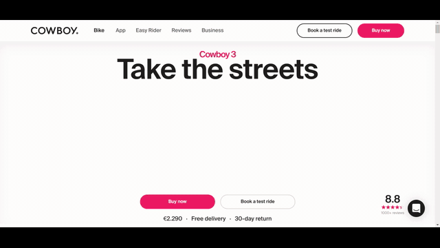
cowboy.com
attractive typography
The cowboy brand offers electric bikes characterised by an original design. You can buy your new bike directly from the manufacturer's website, which shows you what you’re getting with animations and videos.
In addition to great photographs and visualisations showcasing various details, the designers went with amazing typography to describe the bike in detail. There’s hardly a lot of text in there, but it's all big and hard to miss. The design “forces us” to read the description. Despite the rather sizable height of the page, finding the “Buy” button is not hard – it’s permanently attached to the top edge of the screen.
aiaiai.audio
eye-catching product presentation
The aiaiai.audio store offers high-quality headphones, presented interestingly on the product page. Unusual headlines and text layout, as well as original colours, suggest that this is a lifestyle and unique product.
The page contains a lot of descriptions and pictures, but navigating the description is hardly difficult – there is a menu with a button to add the product to the shopping cart attached to the top of the screen. The pictures of the product interspersed with the pictures of people are one of the most interesting design choices. The page design takes into account the shared colours in each image used on the site. What’s not to like?
choosemuse.com
original product, original solution
The choosemuse website offers an unusual product, which requires an extensive landing page to tell prospective buyers about the features that the device offers.
“Muse S is a comfy multi-sensor meditation device that provides real-time feedback on your brain activity, heart rate, breathing, and body movements to help you build a consistent meditation practice.” The neat and clean page attractively presents the device. It is a perfect example of achieving a great-looking design using static pictures, sliders and simple animations.

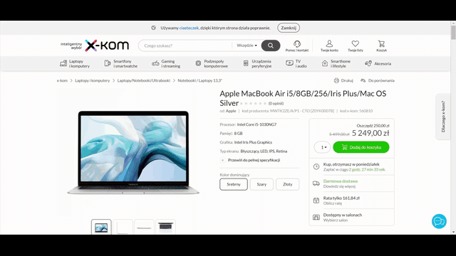
x-kom.pl
many products, minimalist design
The offer available at x-kom.pl is much broader than in the examples presented above since the store offers hundreds upon hundreds of products. This requires using universal solutions that fit a vast selection of products on individual pages.
Despite the great variety of goods offered, the layout on each page is consistent. This result was achieved thanks to the minimalist design, which is based on white and grey colours. In addition to the product picture, the “Add to Cart” button is one of the most eye-catching features on the page. This UX trick definitely has to improve the store’s conversion rate – the user instantly knows what to click to get the product.
The store offers many different kinds and types of products, some of which require more extensive descriptions. The pages with more content can easily take advantage of a navigation bar with links to individual description sections. When scrolling, the bar sticks to the top of the screen, clearly improving navigation within one long product page.
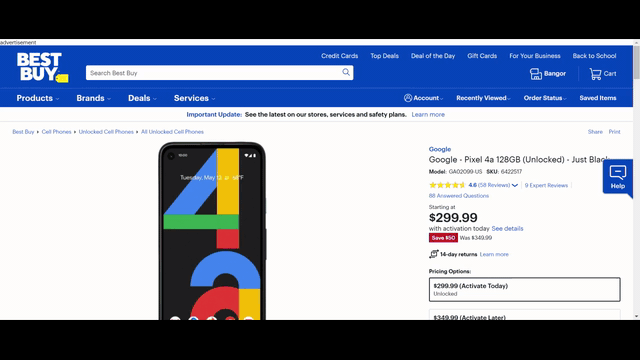
bestbuy.com
“hidden” product descriptions
The leading American electronics store bestbuy.com is an example of a website offering an extensive range of products – and it is clear that they put a lot of effort into their design.
Best Buy uses proven UX solutions. Despite extensive content, the website seems to be light and does not overwhelm the reader. The clear layout makes the content easy to understand. Descriptions and reviews have been “hidden” under expandable tabs, which effectively segregate the content on the site.
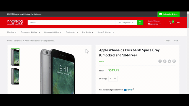
hhgregg.com
simple and effective
Best Buy’s competitor hhgregg.com has a different approach to product presentation. You won’t find extensive descriptions there. The page layout only provides enough space for a brief note. The rest of the page includes information about the price, delivery costs and a purchase button, complemented with a “relevant products” section. Hhgregg.com is most likely targeting customers who know what they are looking for by giving them a simple message with an offer and price.
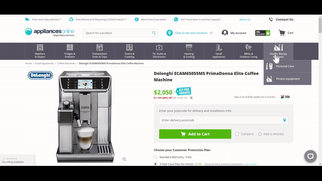
appliancesonline.com
extensive menu
The product pages at appliancesonline.com illustrate the household appliances offer in a visually attractive manner. In addition to a clear and visually pleasing design, the website offers an extensive menu, which visually lists the available categories – using icons. On the subpage, apart from the key elements, a significant part of the space is occupied by the review and feedback section. One could assume that users’ feedback is important for customers using the store.
The way questions and answers concerning products are published is also interesting in itself. All the questions and responses are public – anybody can read them. This in turn results in original content, which improves the value of the particular product page.
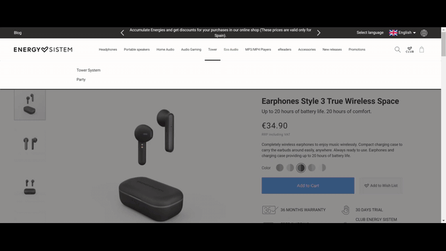
energysistem.com
functionality
Audio gear available at energisystem.com is presented via attractive product pages. In this case, the developers achieved a perfect mix of great design and functionality. One of the most noteworthy features is a well-thought-out and clear bar with a purchase button, which remains attached to the bottom edge of the screen during scrolling.
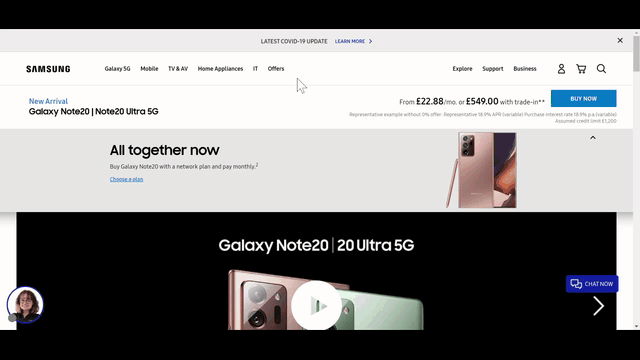
samsung.com
selection according to individual needs
If you want to purchase Samsung gear, you can do it right from the company’s official store. The company offers unique product pages, where you can buy your new phone together with a mobile plan.
They put certain emphasis on choosing the right solution for your needs. You can conveniently select the device and add the right mobile plan. The product description, in turn, was relegated to the bottom of the page, to one of the hidden tabs. Such a solution makes sense when the website offers a product, whose features and characteristics are common and easily available from other sites.
Conclusions
Product pages in e-commerce stores always feature similar components. Due to users' habits, a good page is always built according to a proven design; however, this does not mean that there’s no room for the designer to showcase their creativity. One of the key aspects of designing a great product page is to match its layout and structure to the product offered.
In addition to providing Drupal consulting services or Drupal support, in our agency we look at all interesting solutions in the field of Design/UX, and in the electronics sector, product pages are filled with beautifully rendered models, photos and – in some cases – product animations and short clips. One of the key challenges to make such a page successful is presenting the product description in a way that makes it easy for the user to read the description of the device and learn more about the details. After reading up on the content, the customer should feel that the product is at their fingertips and the purchase is simple and intuitive.