What are the Key Business Website Elements?

Web pages can vary in terms of their complexity. Some contain more subpages and use more functionalities than others. However, there are elements that shouldn't be missing from any company website. Find out what important parts you need to keep in mind when building a web page.
Necessary and additional website elements
Web pages may be very simple and consist of just a few subpages or they may contain a lot of elements. What functionalities and website components you add depends mainly on the industry which you operate in, and the goals that the site is to fulfill. Some pages are only a showcase, not all businesses use them as the main sales tools. Some sites sell products by using automation in many processes. Others are a communication channel through which the specific seller establishes a direct relationship with the recipient and negotiates concrete terms of collaboration.
Portals created with online sales activity in mind will have functionalities typical for ecommerce (product categories and filters, FAQ section, chatbots improving the purchasing process), while those focused on providing education or information will consist of a blog, a news section, and a forum for readers. However, there are some very important elements that shouldn't be missing from a good web page, regardless of its main function. Keep in mind that building an efficient big website may require using solutions other than just creating an uncomplicated business showcase. Think about what components are going to make up your website – even before choosing a contractor and technology. It's worth spending some time thinking over how to compose additional elements with those that are necessary for every company website.
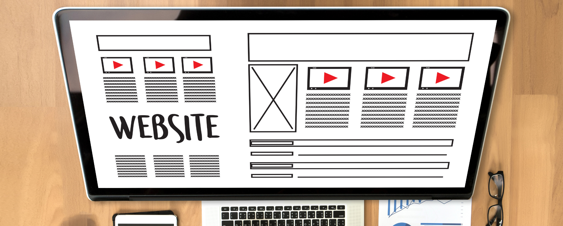
1. Visible and intuitive navigation
Well-designed navigation must be intuitive. UI designers don't have an easy task. The effectiveness of a website depends on whether they properly put themselves in the shoes of the customer, and whether they'll be able to design the path through individual subpages so that browsing the content for the client is a pleasant and natural journey further down into the site. The main element that allows you to navigate the web page is the main menu. You may remember that for a while on some web pages you could usually find the menu on the left side of the screen. Some website designers still opt for this solution. Nowadays, the menu of a website opened in a browser on a computer is usually horizontal and is put at the top of the website. Thanks to this solution, the user is able to locate the necessary buttons just seconds after opening the page, and there's no problem whatsoever with browsing it. Visitors should be able to quickly go back to the most important subpages or the home page – no matter how deep they are on your website.
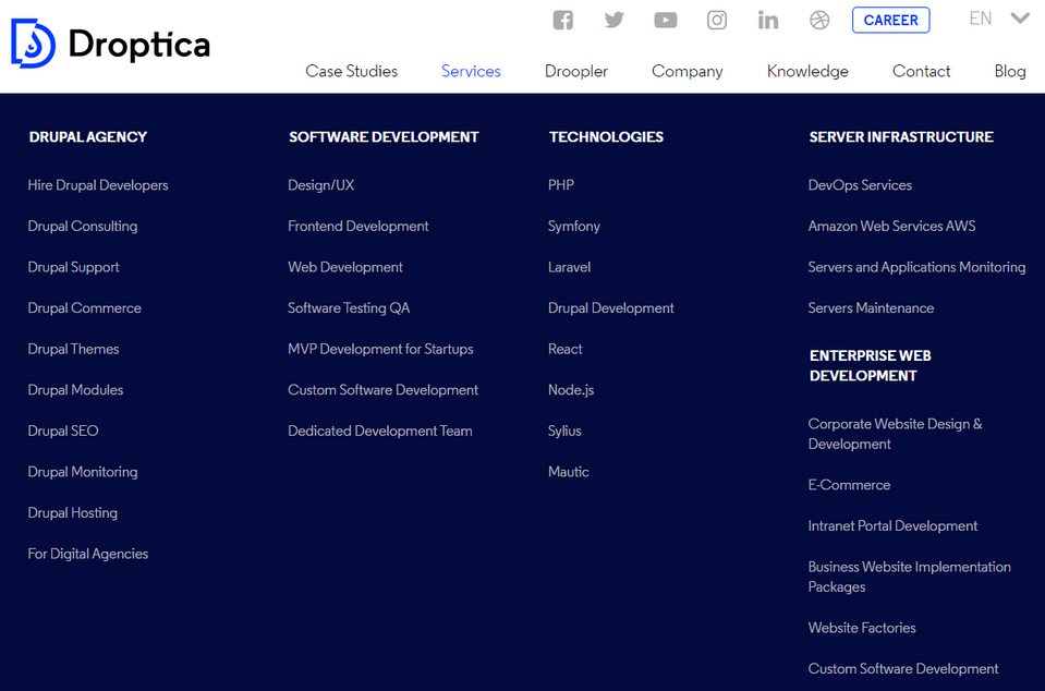
If your page is very extensive, you may combine a traditional horizontal menu with a drop-down menu (mobile versions of pages are dominated by such menu lists due to the limited space on the screen), creating expandable subcategories that appear after hovering over one of the buttons in the main menu or create a mega menu. The last solution consists of multi-level navigation. Moving the cursor over one of the items of such a menu expands a list of additional options which not only represent the next level but may also allow you to move to other levels. Such a menu may even consist of photos or videos. An example of a horizontally placed menu with drop-down lists is our website https://www.droptica.com. When you hover the cursor over the name of any subpage, you’ll see other buttons with which you can move deeper into our website.
2. Call to action buttons
The menu is of course only one of the navigation elements. It also includes any CTA (call to action) buttons placed between the content, graphics, and other sections. These types of buttons are usually distinguished from other web page elements by color or shape, and it's difficult to imagine a website without them. Their task is to guide the user to a place on the page where they'll be able to achieve their goal or solve the problem that brought them to your website (purchasing a service or product, subscribing to the newsletter, or providing their contact details to your consultant).
Often there's a visible CTA at the top of the page. Then the customer sees the button immediately and will remember where it is if they want to use it. This, however, isn’t the only layout strategy for CTAs. Buttons may be found on different parts of the page, usually under the sales-related content such as a paragraph or a video on the website that describes the benefits of a given product. This way, the customer's motivation to click the button increases. Take a look at how Here Technologies does it. The button has been placed in the Hero section at the top of the page, so the user will see it right after opening the page. The button is distinguished by its color (green on a light background). Audiense, on the other hand, doesn't stop at CTA in the HERO section, and puts various buttons at the end of short blocks of text, next to eye-catching graphics presenting the offered analytical tool. Putting the buttons there allows the customer to go to the content that interests them the most, and quickly obtain the information they are looking for.
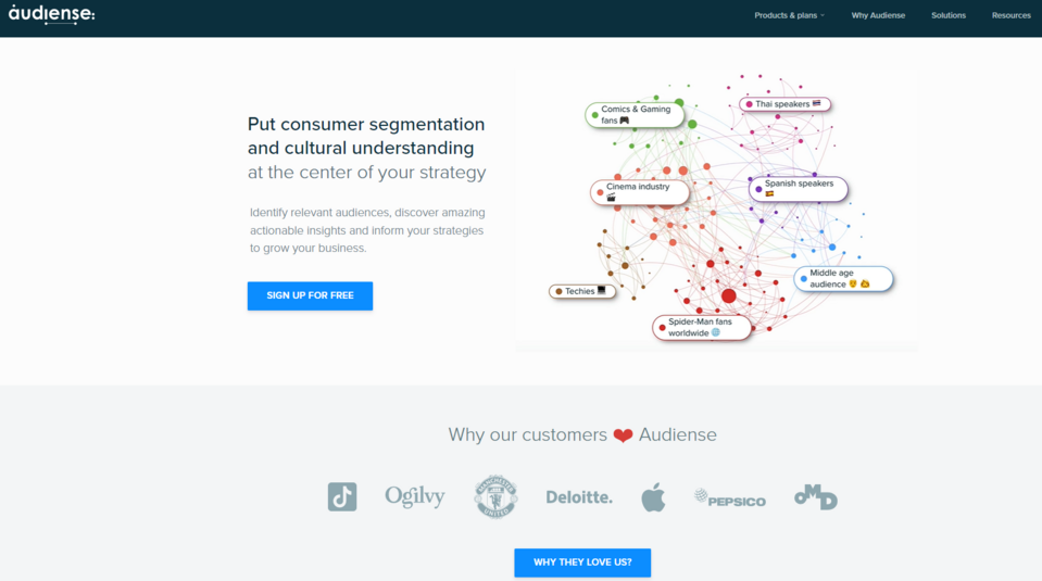
Source: Audiense
3. Subpages and sections with content
Regardless of the industry, a website is created for, its main goal is to convey a message to the customer that'll allow the company to move the potential customer further in the sales funnel and increase the profit. This may be done in many ways. Every company decides for itself which message would be best to achieve this goal. Businesses often choose:
- presenting specific values that guide the brand in order to build a specific image,
- motivating to purchase a product through the website (ecommerce section, order forms) by listing its advantages, presenting customer references or use cases,
- encouraging to send an inquiry via the contact form, email, or to visit the company's branch – thanks to a catchy CTA,
- proposing consultations aimed at adjusting the service or product to the individual needs of the customer.
These goals may be achieved through the use of text, videos, graphics, and sound. Sections filled with text are most often the dominant company website element. Of course, what you want to convey and in what manner is up to you. However, due to the readability of your brand's page, as well as its positioning, it's worth supplementing the created portal with basic information about the company and an appropriate number of descriptions, tips, and advertising slogans.
Individual subpages and sections may differ in the length and type of their content, but the texts should be written in the same way to maintain the consistency of the brand's communication style. The most important content pages are:
- home page – this is where communication with the customer usually begins,
- About us page where you can tell the customer more about your company,
- product subpages where you describe the offer,
- and a blog with which you try to interest the users with your activities and improve the position of your website in search results.
Almost every existing website may be used as an example here. Take a look at how different companies arrange the content section, and what blogs and news sections are being used for. An interesting example is an approach to the About us page represented by the Altitude marketing company. Instead of creating one subpage with a brief description of the history and the values important to the brand, the creators added numerous subpages under the Who we are tab in the main menu, logically dividing the content they wanted to share with the users. Thanks to this, the visitors can choose what type of information about the company they want to see. At Altitude, they're not afraid of large amounts of content and they know how to distribute it on the page so that it's legible and attractive.
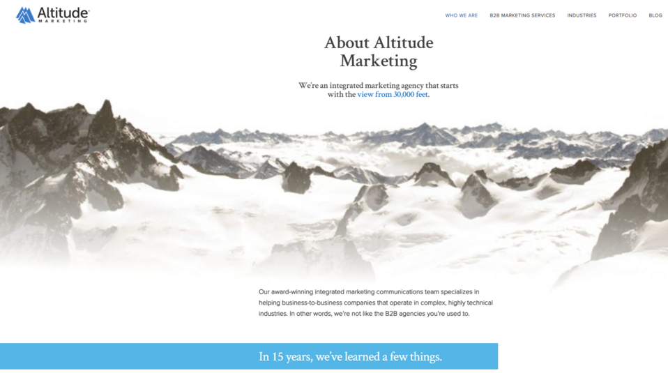
Source: Altitude
The Myva360 virtual assistant agency shows how to convey a lot of information to the customer while reducing the amount of text on a sales page. The website consists of numerous subpages, but both the company's values and its services are described briefly, with the use of slogans, calculations, and graphics. This doesn't mean, however, that the customer isn't getting the information they need. While the style of presenting important information is different, the user learns a lot about the offer.
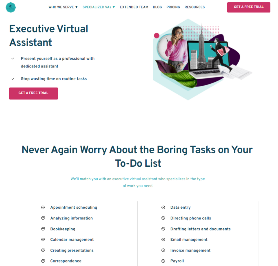
Source: Myva360
4. Company blog
While not all businesses have a blog, more and more brands are opting to create one. This is mainly due to the increasing awareness of website positioning and the role of the blog in this process. A blog may not only improve the visibility of your company website but also increase the customers' interest in your services or products, attract potential business partners, inform customers about new products or provide advice on how to use the goods you offer. By running a blog, you also get a lot of interesting materials to share on social media. Publishing interesting and substantive articles, and promoting them – e.g. on Facebook or LinkedIn – will allow you to build a professional image.
An example of an engaging blog is the LinkedIn blog. This social platform focuses on business and career-building issues. The brand not only allows the members of its community to publish articles but also has its own blog. Its authors raise various topics related to the market and work culture. You may view a specific author's LinkedIn account and subscribe to the blog. The Salesforce blog, on the other hand, is divided into sections. Scrolling down, you'll come across, for example, the Editor's Pick section, that is, the articles recommended by the editorial office, or a section with articles published as part of the series. The texts are marked with tags indicating the industry they relate to.
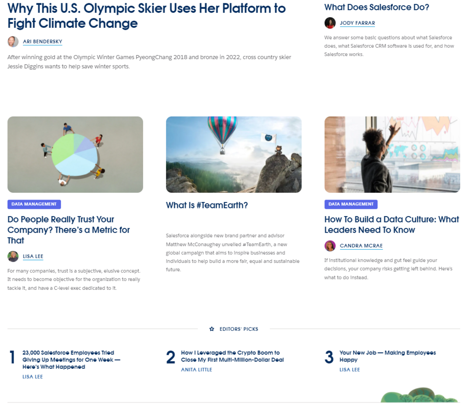
Source: Salesforce
5. Contact subpage
A potential customer will get to know information about your company, learn about all the advantages of your products, choose the best proposal from your offer and... What next? Nothing, if you don't have a subpage that allows finalizing a transaction or making contact. Some companies sell products remotely – online. They simply need to implement solutions that allow placing an order and making an electronic payment. There are also businesses that tailor the offer to a specific customer; they create a contact form or post their contact details, thanks to which the customer can send their quote request.
In both cases, it's worth considering using live chat or a chatbot for business. These aren't essential website elements, but nowadays they are becoming a standard among the brands that want to provide their customers with the highest quality of service. The most advanced virtual assistants built on the basis of artificial intelligence are even able to partially replace your human customer advisers and sell your products or services.
Choice Screening represents a great approach to customer service. There's nothing more encouraging to engage with customer service than the Talk to a human option in the header of the contact page, which also ensures that you won't spend half a day listening to automated messages. This is an example of a well-organized page containing the contact details (emails and telephone numbers) of various departments and a form. This particular one may be a bit long, but in the case of a company that conducts thorough research and prepares well to talk to a potential customer, gathering detailed information is probably necessary to create a good offer.
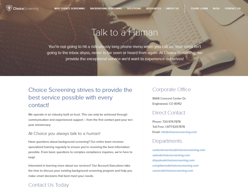
Source: Choice Screening
6. FAQ – subpage with comprehensive answers to frequently asked questions
The truth is, few customers spend time reading long paragraphs with shopping tips or learning the website's terms and conditions. All instructions should be provided in an easily digestible form – preferably as infographics or interactive elements so that the customer can obtain the necessary knowledge while having fun interacting with your page.
Ultimately, however, even if you make every effort to properly introduce the customer to navigating your portal, they may have some doubts or run into problems. Therefore, a FAQ (frequently asked questions) section is basically a necessary subpage for any website. It provides brief answers to the questions frequently asked by customers (e.g. "how to use a discount" or "what are the available forms of order delivery").
Creating a FAQ subpage shows concern for a potential customer and increases the probability that they'll be able to achieve their goal (e.g. order a product). Different companies have different approaches to organizing the content on pages of this type. The Youtube's FAQ answers many of the Internet users' questions. The user can choose one of the topics presented on the list or use the search engine and enter a phrase by themselves to find the answers to their questions. There's also a button below the list of topics that'll take you to a forum where you can find solutions to your problems.
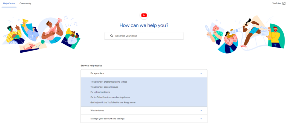
Source: Support Google
7. Social media icons
Conducting effective marketing activities requires the use of various communication channels. Of course, it'll be best for you if the Internet user decides to follow information about your offer in more than one of these channels, e.g. by subscribing to the newsletter and following your company profile on Facebook (or other social media). This way you make sure that your customers have constant access to information about interesting campaigns and promotional offers that may convince them to make a purchase. Even if they miss a message on Facebook, they'll receive the important information in the newsletter, or they'll see a notification on Twitter, etc.
Don't wait for the customer to find your company's profile on Twitter or Facebook on their own. Instead of requiring your customers to spend their time finding your brand online, create a straightforward path for them to build a closer relationship with your brand. It's a good idea to include the icons of the social media in which your company is active, along with an incentive to like your profiles (e.g. "like our Facebook profile in order to stay up to date"). By clicking such an icon, the user will be redirected to your company profile on the selected portal and will be able to view the published content immediately after leaving your company website.
The Isobar creative agency puts these icons in the footer of their page so that they are visible after scrolling all the content but don't interfere with its reception, while the Owltastic company has created a completely separate section for this need, which they have placed at the bottom of the page.
Source: Owltastic
8. 404 error page
Your page will change over the years. You will add new pages and rebuild or delete the old ones. It's possible that after many years an Internet user will try to visit a subpage you deleted, read your no longer existing entry or description of a product recommended on a blog from another company, or simply make a typo when entering the address. In such a case they won't reach the target page. They should then be redirected to a 404 error page. All well-designed sites should have such a page containing an appropriate message.
404 error page includes the information that the requested content cannot currently be shown. Its main purpose is to explain to the recipient what happened so that they don’t feel lost. The Awwward brand chooses simplicity. They inform that the page the Internet user is looking for doesn't exist, and then explain that the reason for this may be an incorrect address or a change of the page's address. Some companies are also able to use such a page to improve the experience of a customer who may be disappointed by not having access to the content they are interested in. The design of the Airbnb 404 error page definitely stands out among similar solutions of this type created by other companies. The information about the problem is accompanied by a funny and simple animation that'll bring a smile to the face of an Internet user. In addition, the portal offers the recipients the chance to go to other subpages where they may find details relevant to them./p>
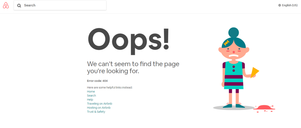
Source: Airbnb
Website elements – summary
There are many interesting elements that you can use to spice up your web page, but there are also a few that shouldn't be missing from any company website. These include, first of all, well-planned navigation, subpages filled with relevant information about the offer, a contact page making it possible to establish a relationship with a potential customer, links to other communication channels (e.g. social media), and the elements devoted to solving customer problems (404 page, FAQ, chatbots). Provide Internet users with ease of navigating through the various pages of your company website and make sure that they can meet the needs that brought them to your company web page. We can help you modernize your current website or create a web page for your brand as part of Drupal development.