Drupal Paragraphs tutorial, part 1: planning architecture and base types

This is part 1 of a two-part guide to building a component-based corporate website with Drupal Paragraphs. By the end of the series you’ll have a library of 10-12 universal paragraph types with style variants, responsive layouts, and editor-friendly spacing controls.
A Drupal Paragraphs tutorial is easy to find for the basics - install the module, create a type, add a field. What’s harder to find is guidance on building a coherent component library: a small, universal set of paragraph types that editors love and developers can maintain for years. That is what this series delivers, and part 1 lays the foundation: planning the architecture, setting up the module correctly, and building your first three paragraph types with real code.
This guide assumes Drupal 10 or 11 and a working knowledge of the Drupal Paragraphs module. You don’t need to be an expert - but you should be comfortable creating fields and editing Twig templates. If your current setup frustrates editors more than it helps them, our post on Drupal Paragraphs from unusable to empowering explains what separates a broken implementation from one that works in production.
In this article:
- What will you build in this Drupal Paragraphs tutorial series?
- How do you plan a reusable component library?
- How do you set up the Paragraphs foundation?
- How do you build your first three Drupal paragraph types?
- How do you test and validate the editor experience?
What will you build in this Drupal Paragraphs tutorial series?
The goal is not a pile of one-off sections but a versatile component library - a small set of paragraph types that combine to produce most of the pages a corporate site needs. Across the two parts you will build:
- Part 1 (this article): the architecture, the module foundation, and three core paragraph types - Hero, Text + Image, and Feature Grid.
- Part 2: color and style variants, dedicated responsive layouts, editor-controlled spacing, conditional fields, admin UX, performance, and long-term maintenance - plus the remaining types (CTA, Cards, Testimonial, FAQ, Stats).
The guiding principle throughout is reusability. A well-designed library is small - 10 to 15 reusable building blocks - yet covers a wide range of layouts because the components are versatile enough to combine in different ways. That mindset - thinking in components rather than page templates - is the same shift we describe in teaching clients to think in components.
Read also: flexible and easy content creation with the Drupal Paragraphs module and Paragraph View Mode review module for Drupal.
How do you plan a reusable component library?
Before installing anything, decide what you actually need to build. Component libraries fail when they grow into a graveyard of page-specific types, so plan for reuse from the start.
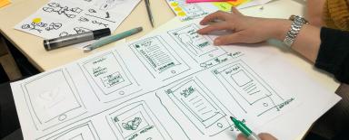
Start with an audit. List the pages a typical corporate site needs: homepage, product or service pages, about, landing pages, contact, news. Then, instead of designing each page, break each one into the repeating sections it’s made of. You’ll quickly notice the same patterns recurring - a hero at the top, alternating text-and-image blocks, a grid of features, a call to action, some cards.
Those recurring patterns are your components. A solid minimum viable set for a corporate site is:
- Hero - a prominent page-opening banner with heading, subheading, image, and a call to action.
- Text + Image - a heading and body alongside an image, with the image on the left or right.
- Feature Grid - a heading plus a set of repeating items in a configurable number of columns.
- CTA block - a focused call-to-action section.
- Cards - a row of linked cards for navigation or highlights.
- Testimonial - a quote with attribution.
- FAQ - a list of question-and-answer pairs.
- Stats / Numbers - a row of key figures.
- Content List - a dynamic listing of related content.
- Contact Form - an embedded form.
Finish planning with a simple paragraph matrix: a table mapping which paragraph types appear on which page types. This validates that your set is genuinely universal - if a type only ever appears on one page, question whether it belongs in the library at all.
How do you set up the Paragraphs foundation?
With the plan in hand, install the module and lay down conventions that every paragraph type will follow.
Install via Composer and enable it:
composer require drupal/paragraphs
drush en paragraphs -y
Next, add a paragraphs reference field to the content type that will host your components - typically a landing page or basic page content type. The field type is Entity reference revisions, which is what Paragraphs uses to keep revisions working:
# field.field.node.landing_page.field_components (illustrative)
field_name: field_components
entity_type: node
bundle: landing_page
label: 'Components'
field_type: entity_reference_revisions
settings:
  handler: 'default:paragraph'
On the field’s form display, use the Paragraphs (stable) widget and set “Add mode” to a button or dropdown so editors get a clear menu of component types. For faster day-to-day editing, tools like Geysir can improve the admin experience once your library grows.
A note on the “base type” concept: Drupal Paragraphs does not support type inheritance, so there is no literal base type to extend. In practice, “base” means two things - a field naming convention applied consistently across all types (for example, every type that has a title uses field_heading, every type with a style uses field_style), and, for genuinely cross-cutting settings, a Paragraphs behavior plugin. Behaviors are the way to add a shared setting (like a style variant or spacing) to many types at once; we introduce them in part 2 of this Drupal Paragraphs tutorial series. For now, adopt the naming convention - consistency here pays off in every template and stylesheet you write later.
Decide your field strategy up front:
- keep required fields to the minimum a component genuinely needs;
- make everything else optional, and design templates to handle empty fields gracefully;
- use consistent field types and names across components;
- order fields in the form by how often editors use them - most-used first.
How do you build your first three Drupal paragraph types?
Now create three types that exercise the core patterns: a simple banner (Hero), a two-column block (Text + Image), and a repeating-item grid (Feature Grid). Each follows the same field-naming convention from the foundation step and uses Twig templates you can extend as the library grows.
The Hero paragraph
Create a paragraph type hero at /admin/structure/paragraphs_type with these fields:
field_heading- plain textfield_subheading- plain text (optional)field_image- media reference (image)field_cta- link
Then add a template, paragraph--hero.html.twig:
{#
/**
 * @file
 * Default theme implementation for the Hero paragraph.
 */
#}
<section{{ attributes.addClass('paragraph', 'paragraph--hero') }}>
  <div class="paragraph--hero__media">
    {{ content.field_image }}
  </div>
  <div class="paragraph--hero__body">
    {% if content.field_heading|render|trim %}
      <h2 class="paragraph--hero__heading">{{ content.field_heading }}</h2>
    {% endif %}
    {{ content.field_subheading }}
    {{ content.field_cta }}
  </div>
</section>
The |render|trim check is a small but important habit: it prevents empty wrapper markup when an optional field is left blank. The same pattern appears in our guide to editing and customizing a Drupal paragraph quickly.
The Text + Image paragraph
Create a paragraph type text_image with:
field_heading- plain textfield_body- formatted text (long)field_image- media reference (image)field_image_position- list (text):left,right
Read the position field as a modifier class so the same component can flip its layout:
{% set position = content.field_image_position['#items'].value|default('left') %}
<section{{ attributes.addClass('paragraph', 'paragraph--text-image', 'paragraph--text-image--' ~ position) }}>
  <div class="paragraph--text-image__media">{{ content.field_image }}</div>
  <div class="paragraph--text-image__text">
    {% if content.field_heading|render|trim %}
      <h2>{{ content.field_heading }}</h2>
    {% endif %}
    {{ content.field_body }}
  </div>
</section>
.paragraph--text-image {
display: grid;
gap: 2rem;
grid-template-columns: 1fr 1fr;
align-items: center;
}
.paragraph--text-image--right .paragraph--text-image__media {
order: 2;
}The Feature Grid paragraph
For repeating items, the clean approach is nested paragraphs: a feature_grid type that references many feature_item paragraphs.
First create a feature_item type with field_icon (media), field_heading, and field_text. Then create feature_grid with:
field_heading- plain textfield_items- entity reference revisions tofeature_itemfield_columns- list (integer):2,3,4
{% set columns = content.field_columns['#items'].value|default(3) %}
<section{{ attributes.addClass('paragraph', 'paragraph--feature-grid') }}>
  {% if content.field_heading|render|trim %}
    <h2 class="paragraph--feature-grid__heading">{{ content.field_heading }}</h2>
  {% endif %}
  <div class="paragraph--feature-grid__items" style="--columns: {{ columns }}">
    {{ content.field_items }}
  </div>
</section>
.paragraph--feature-grid__items {
display: grid;
gap: 1.5rem;
grid-template-columns: repeat(var(--columns, 3), 1fr);
}Nesting paragraphs like this keeps each feature item independently editable while the grid controls only layout - exactly the separation of concerns a maintainable library needs.
How do you test and validate the editor experience?
Before moving on, prove that the foundation works from the editor’s seat, not just yours.
Create a test page and add all three paragraph types to it. Then check three things:
- Editing. Can you add, reorder, and remove paragraphs easily? Is the add menu clear?
- Output. Does the rendered HTML have a sensible structure and a correct heading hierarchy? Are optional empty fields producing no stray markup?
- Responsiveness. Does the layout already hold together when you narrow the viewport, even before the dedicated responsive work in part 2?
If editing feels clumsy now, it will only feel worse with ten types. Fixing the foundation here is far cheaper than fixing it later. Part 2 of this series adds spacing controls, color variants, and responsive layouts - the features that turn a rigid library into one editors trust on real pages. For a deep dive on why spacing always becomes a problem, see our post on Drupal Paragraphs spacing and layout gaps.
Want to build a component-based Drupal site with Paragraphs?
This Drupal Paragraphs tutorial is based on patterns we use on production corporate rebuilds - planning a small universal library, enforcing field naming conventions, and proving the editor experience before the library grows. The three types you built here (Hero, Text + Image, Feature Grid) are the same foundation we extend with variants, spacing, and admin UX in part 2.
Building a component-based Drupal site and want expert hands on the architecture? Our team designs and builds editor-friendly Paragraphs systems every day - from Twig templates and nested paragraph types to spacing controls and long-term maintenance. Visit our Drupal development services to see how we can help.