
How to Use Bootstrap Components in Droopler?

Creating a website is a very labour-consuming process. It requires quite a lot of time and resources. However, the people involved in building webpages and applications noticed that some elements repeat at times. In order not to reinvent the wheel, they began to isolate the repeating elements as components. In this text, I'll present how the components can be used based on the example of the Drupal distribution Droopler and the Bootstrap library.
What are components?
Components are elements that are reusable in different parts of the website. They allow for fairly quick creation and easy maintenance of pages and applications. The additional advantage of components is that if a change is required, you don't have to modify every element of the page, you only need to make the correction in one place. The change will automatically appear in other parts of the site that contain this component.
Bootstrap library
Bootstrap is a set of tools and components that simplify the creation of websites and applications. Using this library may speed up your site building as Bootstrap includes ready-made solutions for creating adaptive templates, forms, tables, navigations, etc.
This library mainly contains the CSS and JavaScript files that implement various ready-to-use components. After connecting the library, by using specific CSS classes you can quickly and easily modify the elements on a page.
There are several ways to use the Bootstrap library in Drupal. One of them is to use a base theme on which you can build your own. The most popular base themes are Bootstrap – which is based on the third version of the library, and Barrio – which was built on the basis of Bootstrap 4/5.
Bootstrap components in Droopler
Droopler is a Drupal distribution designed to quickly build webpages. It differs from other distributions in that it provides a ready-made website out of the box. You just need to add your own content to it.
Droopler is built on the basis of the Barrio theme, so it has all the benefits of Bootstrap. There are several ways to use the components of this library in Droopler. The first and easiest is adding the necessary elements to the content of the blocks.
When adding a new block, you should place the HTML code with the classes specified by the Bootstrap documentation in the section for entering the content. In order for the entered code to be recognised by Drupal as HTML, before entering the content you must activate the "Source" mode using the button in the field panel. After adding the HTML code, you need to turn off the given mode.
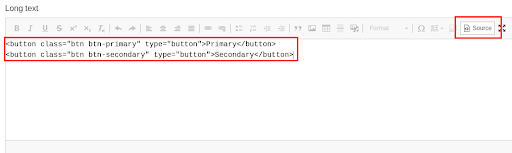
In this case, after saving the block, we get two buttons. The shape of the given buttons was determined using the "btn" class, while the background and text colours were assigned using the "btn-primary" and "btn-secondary" classes.

The second way to use Bootstrap components in Droopler is more difficult. It consists of adding your own theme based on the Droopler theme and modifying the source code. To do this, you need to use one of the starter kits found in the Droopler base theme directory, and then you can create your own solutions using the Bootstrap components.
I've shown you how to add basic buttons using the Bootstrap library. Now I'll present a few more examples of advanced components.
Dropdown menu
A dropdown menu is a very useful component for a website. It allows you to store and display information and links in a fairly compact block, which makes it possible to efficiently use the web page's space and allows you to include more information. This component consists of two parts: a block with elements, which is hidden by default, and a button, which – when pressed – makes a particular block appear.
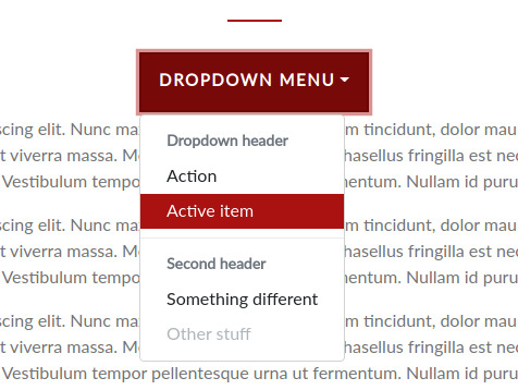
In the block itself, you can put headers, links, which in turn can be active or disabled. These parameters can be set using CSS classes provided by the Bootstrap library.
Progress bar
A progress bar is another useful element of a website. It allows the user to immediately see the progress of the performed activity, which improves the user experience.

As with other components, you can modify the style, colour and other parameters of a progress bar.
Tabs
Bookmarks are one of the menu types used on a website. They are useful for switching between the contents of pages, allowing the user to see more information in a smaller space.
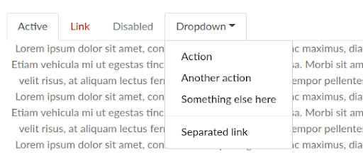
The bookmarks created with the Bootstrap library may contain active and disabled links, as well as the already mentioned dropdown menu.
Bootstrap Components - summary
Using the Bootstrap library components to build a webpage is a very effective approach, because it allows you to easily build and maintain the pages. I've shown a few examples of using components in Droopler, a Drupal CMS distribution. You can find more information about the available components in the documentation on the Droopler demo page.