Changing the Color Scheme in Droopler with the help of SCSS

Using Droopler, you’ve already had a full control over your website. Anyway in future you might consider customizing the theme elements.
Thanks to modular design and highly parametric SCSS, you can easily achieve it. Let’s see how easily you can change the color scheme of your website.
To achieve our goals we are going to need:
- Installed the Droopler distribution (check our tutorials how to install Droopler on Cyberfolks, Linode server or Platform.sh)
- Installed Gulp - a toolkit to automate & enhance workflow,
- Basic knowledge of SASS - the most professional grade CSS preprocessor.
How to work with the subtheme?
SCSS structure
Let's take a look at the SCSS structure Droopler offers:
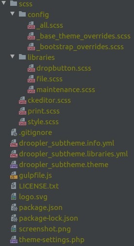
- style.scss - combines all SCSS code from base theme and subtheme,
- print.scss - combines all SCSS code for printing from base theme and subtheme,
- config/ - the most important directory, containing the subtheme configuration,
- libraries/ - additional files needed by Drupal.
You can use any structure you like. We recommend dividing files into layout/ and components/ directories. Just remember to include your files in style.scss.
SCSS Configuration
Droopler is designed to make your work easier. You don't have to override SCSS or CSS code to make your own adjustments. In most cases it is enough to modify the configuration scss/config/_base_theme_overrides.scss file.
There are many levels of variables:
• Simple colors
$color-agamemnon: #196dba;
$color-menelaus: #5d98ce;
• General variables (applicable to global HTML elements)
$link-color: $color-agamemnon;
$footer-text-color: $color-thersites;
• Paragraphs (with $d-p- prefix)
$d-p-subscribe-color: $color-odysseus;
$d-p-subscribe-header-color: $color-odysseus;
• Blog & Blog listing (with $d-blog- prefix)
$d-blog-font-color: $color-odysseus;
$d-blog-font-bold-color: $color-troilus;
Gulp
To compile your code and generate the CSS output a browser can understand we’ll need the Gulp. The configuration gulpfile.js file has been already included in the project.
Just run gulp watch in your subtheme's directory (remember to compile droopler_theme first) and it will track all the changes in theme source files and compile assets on the fly.
$ cd web/themes/custom/droopler_subtheme
$ gulp watch
Other Gulp commands for theme developers:
- gulp watch - watches for changes in SCSS and JS and processes them on the fly,
- gulp compile - compiles all SCSS/JS in the subtheme for DEV environment,
- gulp dist - same as previous but for PROD environment,
- gulp clean - cleans derivative files,
- gulp debug - prints Gulp debug information.
Action
Now let's pretend we want to change the footer color scheme.
The original look:

Step 1: Run gulp watch.

Step 2: In the configuration scss/config/_base_theme_overrides.scss file find the commented footer section.
// Footer
// $footer-background: $color-cassandra;
// $footer-text-color: $color-thersites;
// $footer-header-color: $color-odysseus;
To alter the colors just uncomment the line and/or add other related variables and change the value. We encourage you to follow our ideas and create simple color variables based on Roman mythology (check the explanations in file).
Nevertheless for the tutorial purpose we can omit this rule and deal with our own dummy naming convention.
Step 3: Define the custom simple colors.
$color-tutorial-1: #fff;
$color-tutorial-2: #fff;
$color-tutorial-3: #cf4647;
$color-tutorial-4: #2a3f6d;
$color-tutorial-5: #fff;
$color-tutorial-6: rgba(#cf4647, .3);
$color-tutorial-7: #fff;
$color-tutorial-8: #cf4647;
$color-tutorial-9: #2a3f6d;
Step 4.1: Override the components variables.
$footer-header-color: $color-tutorial-1;
$footer-text-color: $color-tutorial-2;
$footer-background: $color-tutorial-3;
$bottom-footer-background-color: $color-tutorial-4;
$bottom-footer-text-color: $color-tutorial-5;
$headings-color: $color-tutorial-9;
$stripe-background-color: $color-tutorial-6;
Step 4.2: Override the colors variables.
$color-agamemnon: $color-tutorial-8;Step 4.3: Override the custom selector.
.site-footer .social-media-wrapper a {
 color: $color-tutorial-7;
}
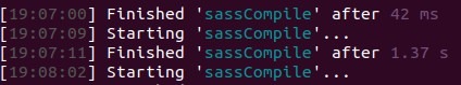
Step 5: After you save the file, gulp watch will recompile all SCSS with your altered configuration.
The result look:

Alternative theme 1:
$color-tutorial-1: #cf4647;
$color-tutorial-2: #20232a;
$color-tutorial-3: #fff;
$color-tutorial-4: #20232a;
$color-tutorial-5: #fff;
$color-tutorial-6: rgba(#5d5d5d, .3);
$color-tutorial-7: #5d5d5d;
$color-tutorial-8: #cf4647;
$color-tutorial-9: #0f1831;
Alternative theme 2:
$color-tutorial-1: #6aeae1;
$color-tutorial-2: #c4cdd6;
$color-tutorial-3: #0f1831;
$color-tutorial-4: #0c152e;
$color-tutorial-5: #c4cdd6,
$color-tutorial-6: rgba(#0f1831, .3);
$color-tutorial-7: #c4cdd6;
$color-tutorial-8: #0f1831;
$color-tutorial-9: #0f1831;
Protip
Let's dive into the improvements you can make right away. We can create some palette function, allowing us to trigger between different sets of palettes.
1. First create config/_helpers.scss file.
2. Add the next functionality.
@function val($map, $keys...) {
 @each $key in $keys {
   $map: map-get($map, $key);
 }

 @return $map;
}

@function palette($keys...) {
 @return val($palettes, $keys...);
}
The palette function will loop through the color schemes variable $palettes we are going to create.
3. Aggregate the file within config/_all.scss.
@import "helpers";
@import "base_theme_overrides";
@import "base_theme_overrides";
4. Then adjust the scss/config/_base_theme_overrides.scss file.
$palettes: (
 default: (
   color-tutorial-1: #fff,
   color-tutorial-2: #fff,
   color-tutorial-3: #cf4647,
   color-tutorial-4: #2a3f6d,
   color-tutorial-5: #fff,
   color-tutorial-6: rgba(#cf4647, .3),
   color-tutorial-7: #fff,
   color-tutorial-8: #cf4647,
   color-tutorial-9: #2a3f6d,
 ),

 alt-1: (
   color-tutorial-1: #cf4647,
   color-tutorial-2: #20232a,
   color-tutorial-3: #fff,
   color-tutorial-4: #20232a,
   color-tutorial-5: #fff,
   color-tutorial-6: rgba(#5d5d5d, .3),
   color-tutorial-7: #5d5d5d,
   color-tutorial-8: #cf4647,
   color-tutorial-9: #0f1831,
 ),

 alt-2: (
   color-tutorial-1: #6aeae1,
   color-tutorial-2: #c4cdd6,
   color-tutorial-3: #0f1831,
   color-tutorial-4: #0c152e,
   color-tutorial-5: #c4cdd6,
   color-tutorial-6: rgba(#0f1831, .3),
   color-tutorial-7: #c4cdd6,
   color-tutorial-8: #0f1831,
   color-tutorial-9: #0f1831,
 ),
);
5. Override the variables.
$headings-color: palette($p, color-tutorial-9);
$stripe-background-color: palette($p, color-tutorial-6);
$footer-background: palette($p, color-tutorial-3);
$footer-text-color: palette($p, color-tutorial-2);
$footer-header-color: palette($p, color-tutorial-1);
$bottom-footer-background-color: palette($p, color-tutorial-4);
$bottom-footer-text-color: palette($p, color-tutorial-5);
$color-agamemnon: $color-tutorial-8;
.site-footer .social-media-wrapper a {
 color: palette($p, color-tutorial-7);
}
In order to get the same results we had previously, set the proper $p value.
- $p: default; for default theme,
- $p: alt-1; for alternative theme 1,
- $p: alt-2; for alternative theme 2.
Defining the $p value we are able to change the color palette much easier. This is really helpful once you have different sections with the identical list of elements, but the first section has a light color palette, and thus the other - dark. Combining the palette helper function with custom mixins we can easily set the light mode elements (a color scheme that utilizes dark-colored typography, UI elements, and iconography on light backgrounds) and the dark ones.
// _buttons.scss
@mixin color-button($p: light) {
 background-color: palette($p, $color-tutorial-2);
 color: palette($p, $color-tutorial-1);
}

// _sections.scss
.section-light {
 @include color-text();

 @include color-button();
}

.section-dark {
 @include color-text(dark);
 @include color-button(dark);
}
Summary
As you can see above, Droopler is a powerful tool not just for content editors, but also for designers and front-end developers.
We used and configured the best technologies to help you on building your own high-quality websites. This tutorial shows how easy you can customize this already slick and powerful engine and add any color schemes you wish.