
A Beginner’s Guide to Tailwind CSS – What is it, and How Can You Use it?

There are many ways to style websites - from pure CSS, through preprocessors like Sass, to frameworks like Bootstrap, Foundation, or the eponymous Tailwind CSS. We’ll try to present the advantages and disadvantages of Tailwind CSS and explain how to harness one of the most popular and well-liked frameworks for website styling.
What is Tailwind CSS?
Tailwind CSS is, in telegraphic terms, a huge collection of classes that are used to style HTML elements. Each class has one task - for example, the .flex class simply adds display: flex, to an element, and the .text-orange-500 class will change the color of the text to orange.
You're probably wondering if it's a case of camouflaged "inline" style writing. Maybe it looks that way, and yet Tailwind framework is considered one of the best in its class. It quickly becomes apparent that this approach to styling saves us a lot of writing code ourselves!
Pros and cons of using Tailwind CSS
First of all, we don't have to come up with arbitrary names for classes, which we think is one of the most difficult things in programming. With Tailwind CSS, all classes have a consistent naming convention that another programmer will easily understand.
Another benefit is that if we want to change the color of an element's text from orange to red, all we have to do is change the .text-orange-500 class to .text-red-600 (the number next to the color, in this case, indicates the shade of the color - the higher the number, the darker the color) and we're done. We don't have to worry that by editing the CSS class, we’ll change the appearance of another unwanted element, and the whole design of the web page will fall apart.
Other advantages of the Tailwind framework:
- Less CSS writing and coming up with class names which translates into faster code development.
- Tailwind allows you to safely change the styles of elements. Even if you return to a given element after a long time, you can change, for example, the padding or color, without worry.
- Automatic removal of unused styles. Once the website is deployed to production, Tailwind will make sure that only the styles that have been used go into the .css file.
- Thanks to the adopted class naming convention, the HTML code itself will already tell us how a given element will behave and what it will look like.
Tailwind CSS Disadvantages:
- Overloaded with HTML classes.
- It requires additional knowledge of the framework. We need to learn how its classes work, how to use them properly, and how to extend the functionality with features that are important to us. Another type of abstraction comes to our project.
- To use the Tailwind CSS framework properly, certain tools are required, e.g., Vite or Webpack.
- Using Tailwind makes sense if our project has a component structure - we can use a given element multiple times without repeating code, e.g., React components, or Twig templates.
How can Tailwind CSS help you?
Tailwind will help us build a unique and responsive website faster than if we had to write our own CSS, while allowing more freedom than, for example, Bootstrap.
A useful tool
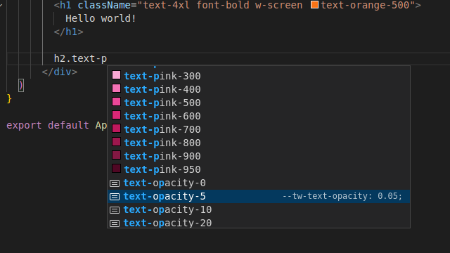
If you use VS Code, be sure to take an interest in the Tailwind CSS IntelliSense plugin, which will greatly improve your code writing. When adding CSS classes, the plugin will automatically suggest us the available options. In the case of colors, it will show us the given shade, and in other cases - it will show us what the class actually does.
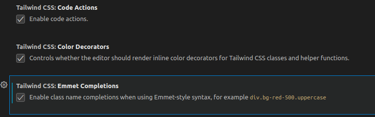
Tip: Make sure you have all the following options checked in the plugin settings.
Automatic removal of "zombie" styles
The framework itself weighs a few MB, but once the style files are created and ready to be uploaded to the production server, the CSS will weigh much less. Tailwind will select only the styles that were used to build the layout.
Dark mode
With Tailwind CSS, we can easily specify the default styles and those to be used in dark mode. All you need to do is add the prefix dark.
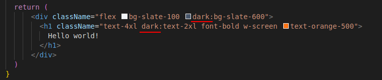
Responsiveness
The same is true for responsiveness. Just add the prefix of interest corresponding to the maximum screen width: sm, md, lg, xl, 2xl to decide what to display and how. For example, the element is hidden by default and displays only from lg resolution - default 1024px.

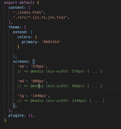
Configuration
If we aren’t satisfied with the standard color palette, or the breakpoints that are top-down fixed by Tailwind CSS, we can easily change them in the tailwind.config.js configuration file. Below we show an example of adding a custom primary color and changing the default breakpoints.
Handy Tailwind CSS components
Now we'll show how we can create a button that displays when the mouse hovers over a tooltip button, without writing CSS. In the example, we use React, so there’s className instead of class.
Let's start by creating a button and a tooltip. We’ll use the classes:
- flex - display: flex,
- bg-slate-900 - the color of our background,
- min-h-screen - a class needed to make our element occupy minimally the whole screen,
- justify-center - center the flex elements horizontally,
- Items-center - center flex items vertically.
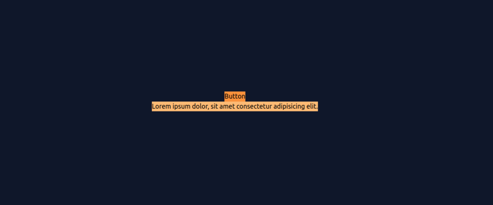
<div className="flex bg-slate-900 text-center min-h-screen
                         justify-center items-center">
       <div className="block relative">.
         <button className="bg-orange-400">Button</button>.
         <div className="bg-orange-300">.
           <p>
              Lorem ipsum dolor, sit amet consectetur adipisicing elit.
     </p>
         </div>.
       </div>.
     </div>.
For now, our button and tooltip neither work nor look.
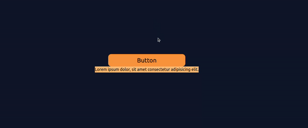
Let's add some styles to improve the appearance of our button.
- bg-orange-400 - the background of our button,
- px-5 - 5 units of padding horizontally,
- py-2 - 2 units of padding vertically,
- rounded-xl - large rounded edge of the button,
- text-2xl - large font,
- min-w-[300px] - rigidly set a minimum width of 300px,
- hover:bg-slate-600 - different background color when you hover over the button with the mouse,
- hover:text-white - a different color of the text when you hover the mouse,
- transition-all - by default smooth transition between color changes,
- cursor-pointer - paw when you hover over a button.
    <div className="flex bg-slate-900 text-center min-h-screen
                         justify-center items-center">
       <div className="block relative">.
         <button className="bg-orange-400 px-5 py-2 rounded-xl text-2xl min-w-[300px] hover:bg-slate-600 hover:text-white transition-all cursor-pointer">Button</button>.
         <div className="bg-orange-300">.
           <p>
              Lorem ipsum dolor, sit amet consectetur adipisicing elit.
     </p>
         </div>.
       </div>.
     </div>.
After adding the class, our button already looks better, and it also has an animation when the cursor is hovered. And that's without a single line of CSS!
Let's also style the element that will be used as a tooltip.
    <div className="flex bg-slate-900 text-center min-h-screen
                         justify-center items-center">
       <div className="block relative">.
         <button className="bg-orange-400 px-5 py-2 rounded-xl text-2xl min-w-[300px] hover:bg-slate-600 hover:text-white transition-all cursor-pointer">Button</button>.
         <div className="bg-orange-300 pointer-events-none absolute mx-1 w-max px-5 py-2 rounded-xl left-full top-0.5 translate-y-0.5 scale-x-0">.
           <p>
              Lorem ipsum dolor, sit amet consectetur adipisicing elit.
     </p>
         </div>.
       </div>.
     </div>.
Here we added the following:
- pointer-events-none - disables mouse response,
- Absolute - absolute position relative to the "parent",
- mx-1 - one unit of horizontal margin,
- px-5, py-2, rounded-xl - styles as in the previous element,
- left-full - setting the element maximally from the left,
- top-0.5 - setting the element at 50% of the parent's height,
- translate-y-0.5 - fix for the height of the given element, so that the center of the tooltip is in the middle of the button, not its top edge.
- scale-x-0 - setting the width of the element to 0, which hides it by default.
The tooltip is currently invisible, but we’ll fix that in the next step.

Now we can already add the functionality of showing the tooltip.
   <div className="flex bg-slate-900 text-center min-h-screen
justify-center items-center">
       <div className="block group relative">.
         <button className="bg-orange-400 px-5 py-2 rounded-xl text-2xl min-w-[300px] hover:bg-slate-600 hover:text-white transition-all cursor-pointer">Button</button>.
         <div className='bg-orange-300 pointer-events-none absolute mx-1 w-max px-5 py-2 rounded-xl left-full top-0.5 translate-y-0.5 scale-x-0 group-hover:scale-x-100 transition-transform origin-left'>.
           <p>Lorem ipsum dolor, sit amet consectetur adipisicing elit</p>.
         </div>.
       </div>.


     </div>.
We can do this by using the group class, which we add to the "parent" of our element. When we hover the mouse over the "parent", we activate the group-hover:scale-x-100 class, which overrides the scale-x-0 class.
Class
transition-transform - we set the transition effect for the transform effect,
origin-left - animation
scale 0->100
is to start from the left.
Here is the result:

As we can see, it has become quite crowded in the className attribute. There is a remedy for this! In our default CSS file, where we added Tailwind, we can add our own class consisting of Tailwind classes. Now our app.css file looks like this:
@tailwind base;
@tailwind components;
@tailwind utilities;


@layer components {
   .button{
       @apply bg-orange-400 px-5 py-2 rounded-xl text-2xl min-w-[300px] hover:bg-slate-600 hover:text-white transition-all cursor-pointer;
   }


   .tooltip{
       @apply bg-orange-300 pointer-events-none absolute mx-1 w-max px-5 py-2 rounded-xl left-full top-0.5 translate-y-0.5 scale-x-0 group-hover:scale-x-100 transition-transform origin-left
   }


}
And the JSX elements look like this:
     <div className="flex bg-slate-900 text-center min-h-screen justify-center items-center">.
       <div className="block group relative">.
         <button className="button">Button</button>.
         <div className="tooltip">.
           <p>
              Lorem ipsum dolor, sit amet consectetur adipisicing elit
           </p>
         </div>.
       </div>.


     </div>.
We moved the set of classes from the button and the tooltip from the HTML tag to the CSS file. This gave us a cleaner code. This is a good solution if the number of classes is already really large or we have a lot of elements that use the same set and we want to avoid repetition.
Tailwind CSS and React for frontend development
In the example above, we showed how Tailwind can be used with React in an application created with Vite. The advantage of React is that we can save individual JSX elements in separate files and use them as a Higher-Order Component. This way, even if our component, will be composed of many Tailwind classes, we won't be bothered, due to the fact that we’ll use it as, for example,
<Button />
instead of
<button className="...">Button</button>
React and Tailwind CSS are some of the most popular frontend development tools. The number of available resources (questions on Stack Overflow, blog posts, tutorials, etc.) is very large, making it easy to work with these technologies. Tailwind CSS, of course, also works with other frameworks, such as Vue, Angular, and Svelte. The documentation on Tailwind's website has step-by-step instructions for the most popular frameworks, making it very easy to start creating our UI.
What is Tailwind CSS? Summary
If you need a tool that will speed up the creation of styles for your project, while leaving you with a very high degree of freedom, Tailwind CSS is the solution for you. Most frontend developers agree that so far, no better tool has been invented, for this type of task, and the huge community, very good VS Code plugin, and clear documentation have a positive effect on working with CSS.
Wondering about the right frontend solutions? We can help you choose them and implement them as part of our frontend development services.