
Image gallery is currently one of the elements most frequently put on websites. I mean here slideshows, carousels, thumbnail galleries and banners. Galleries are particularly important and widely used in the e-commerce industry, where the visualization of the products being sold must be at the best possible level. Let's check out the possibilities Drupal offers in this regard.
Recipe for Drupal image gallery
There are many approaches to creating image galleries in Drupal, but they all come down to the following essential elements that you need to create:
- formatter for image fields,
- new content type or view in the form of a block, based on image fields,
- custom template / styling / handling actions in JS.
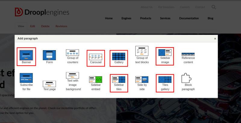
On the drupal.org website you can find many modules that'll do part of the work mentioned above for you, leaving some area for individual settings, for example Views Slideshow, Slick Carousel, Owl Carousel or jCarousel. However, interfering with the code, to a greater or lesser extent, will be necessary. Let's analyze some popular types of galleries and compare the processes of their creation in Drupal and the potential modification possibilities with what Droopler – a Drupal distribution – offers. All types of galleries discussed in this article can be added in Droopler as a ready-made type of paragraph. Below I’ve marked the ones that I used for this post.
Banner
In Drupal, you can easily create a static banner on your home page. By design, a banner is one photo or image put at the top of the page, at its full width. It can also be used as a background for other content (e.g. a title, an advertising slogan), creating a header for a given subpage. To achieve this effect using the default version of Drupal, not extended with additional modules, you can create a new content type, in which– in addition to the text – you'll put a field_image field. You can also create a custom block that you'll put in the header zone. Here, however, your background image must be defined from the CSS/SCSS level of your skin, using the background-image property of your element. Additional components, such as text or action buttons, can be added as part of the twig template. The raw version looks like this:
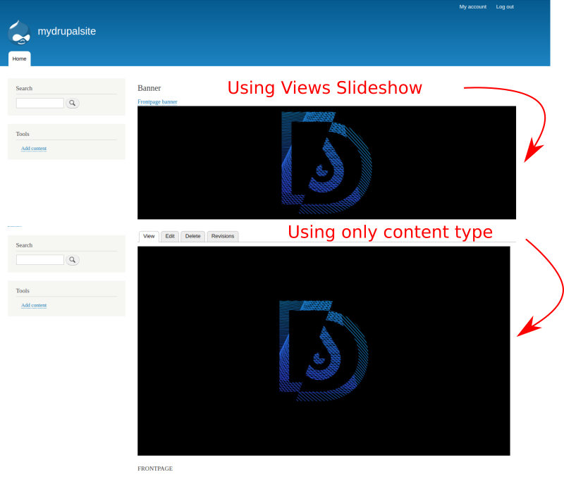
It's also a good idea to use the external Views Slideshow module and enable the Responsive Image module, which can be found in the Drupal's core. Thanks to these modules, you can create a view in the form of a block, using the field_image field from the previously prepared content type. By adding a new style to the image field (Configuration -> Image styles -> Add Image style), you define the dimensions of the banner and additional effects, such as how the banner should behave when changing the resolution.
This example still requires a lot of work regarding styling and taking care for the banner to look good at any screen resolution. In Droopler, you have a paragraph named d_p_banner, prepared especially for this type of requirements. However, remember that it doesn’t offer slideshow support, which is possible with the Views Slideshow module. This functionality, in a slightly different form, is handled by the d_p_carousel paragraph, which I will mention later in this article.
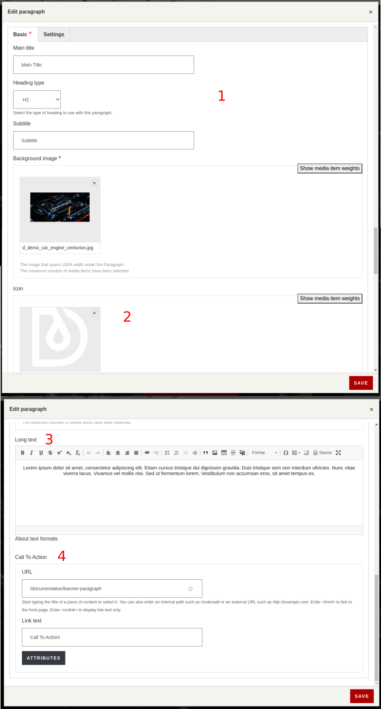
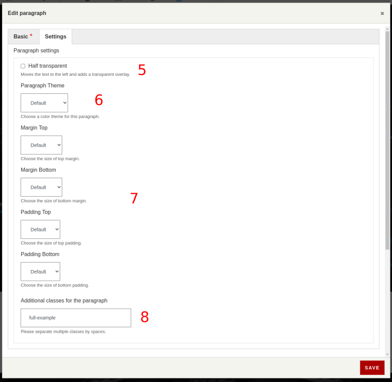
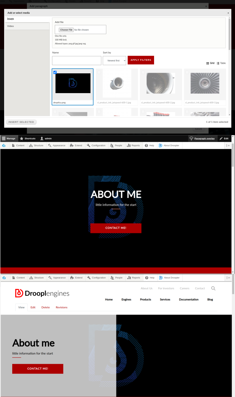
The "Background image" item is a mandatory field when creating d_p_banner. Here you upload the selected media. Why media and not just graphics? In contrast to the examples presented above, Droopler gives you the option of using a video as a background here. Additional properties that give you the ability to modify the banner are:
- adding a title and a subtitle that will be in the central part of the banner,
- ability to add an icon that will appear at the top of the banner,
- adding paragraphs of text (Long text section),
- adding an action button with the ability to configure all attributes,
- dividing the banner into two parts, the left of which will additionally cover the background graphics with a semi-transparent filter (here I recommend using the inverted colors option),
- using a light or dark version of the paragraph styling depending on how clear is the chosen graphic (this is to ensure good readability),
- initial styling - ability to modify internal and external margins,
- ability to define additional classes for a block if you want to make individual changes in the appearance or behavior of the banner.
Below you can see the possibilities of adding media - graphics and videos, and the end result of such an action in a natural form and after using the option of dividing the banner into two parts, where one of them is covered with a semi-transparent filter.
The art of tiling
In Drupal, the "Tile" or "Masonry" galleries consist of many touching (or not) graphics, creating a more or less regular mosaic. Using a previously created content type and adding several versions of it, we can readd a view in the form of a block with a grid layout where the image fields will be displayed. You can choose the type of formatter from the existing ones or create a new style. The result of these actions will be similar to this:
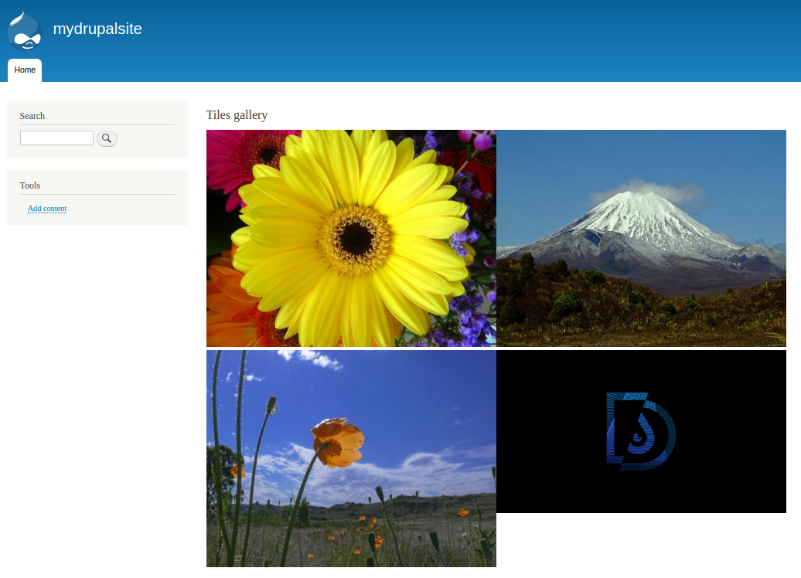
As you can see, images of different initial sizes don't fit together. In addition, images adjacent to each other in a row touch each other, and an empty space separates them from the next row. This can be fixed in a few steps.
- Add to the created content type a text field containing the list of available styles.
- Add the listed styles in the configuration (they'll handle each of the graphics individually).
- Prepare a template to be able to dynamically assign styles to graphics.
- Create additional classes to stylize the whole so that everything forms a neat grid.
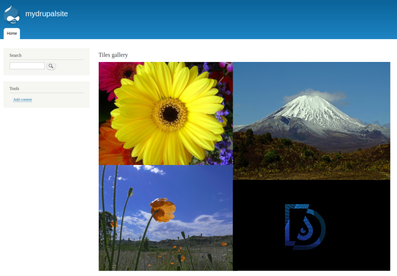
After carrying out these steps, you can achieve an effect similar to the one below. However, the entire process is extremely time-consuming.
In Droopler you'll find several types of galleries made of tiles. You have at your disposal:
- Gallery (d_p_gallery),
- Tiles gallery (d_p_tiles),
- Sidebar tiles (d_p_side_tiles).
Droopler Gallery
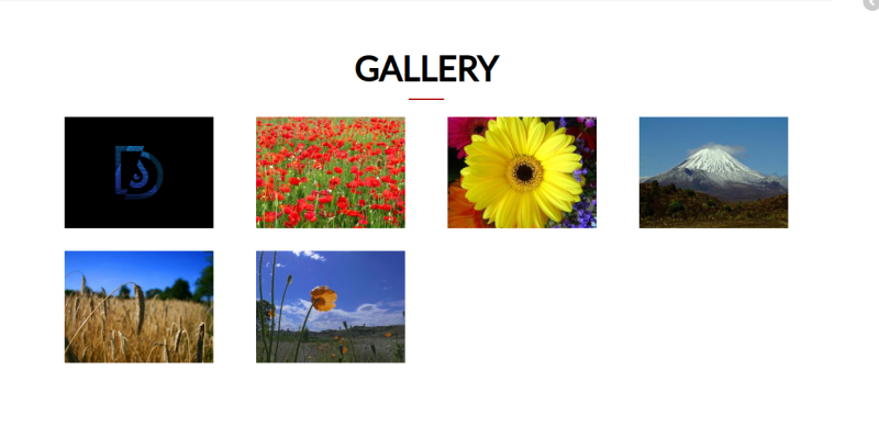
It’s a standard gallery in a grid layout, where the individual elements don't touch each other and the images are presented as thumbnails. After clicking on one of them, a slider with a full-size version of the graphic opens. There are four media items in one row by default. The layout changes depending on the screen resolution, and for example on a tablet three elements will be placed in one row, while in the horizontal view for the mobile version there will be two elements. The order of items in the gallery can be freely manipulated using the drag and drop method. For this type of paragraph, it’s possible to add an icon, title and description. Everything will appear in the form of a header above the gallery.
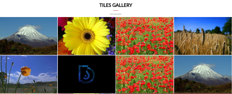
Droopler Tiles gallery
It is a gallery of the “masonry” type where the images fill the entire volume of the block. As in the case of d_gallery, the rule of 12 tiles was applied – four in a row for the desktop version, three for the tablet version, and two for the mobile version. Despite the differences in the dimensions of the images, they are evenly distributed. Here it’s also possible to add an icon and title.
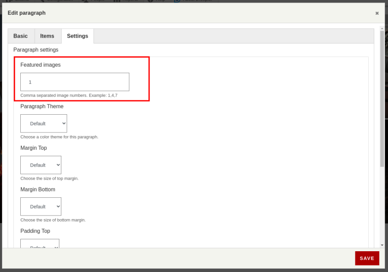
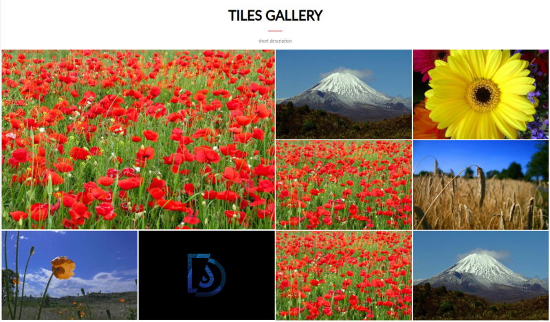
It's worth mentioning that you can easily use the "d-tiles-item-2x2" class prepared for gallery elements, which makes the selected graphic occupy two positions in a row. You just need to go to the "Settings" tab in the edit options of your paragraph and indicate in the "Featured images" field which of the selected media have to be double-sized in both dimensions. You'll achieve then an effect similar to the previously shown extended version of a gallery in Drupal. In addition, as with other paragraphs, you can manipulate the block margins.
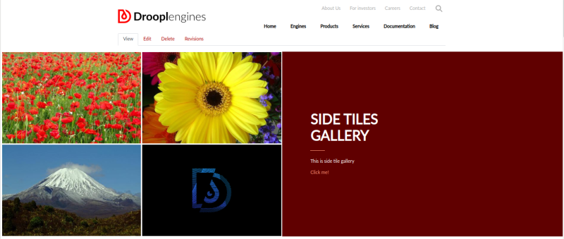
Droopler Sidebar tiles
In the case of this gallery, the tiles are only on one side of the paragraph that you can select. In the second part there are additional elements such as the title, description and action button with editable attributes.
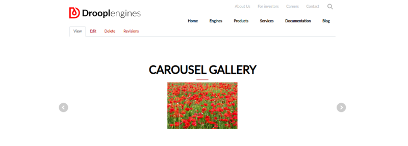
Carousel
The last, commonly used type of gallery is the so-called carousel - a looped slideshow controlled by the user. To achieve such an effect in Drupal, I'll use the Views Slideshow module mentioned earlier. I use a predefined banner style to create a block view that'll display the image fields of our content type. This time, however, in the "Format" section of the view, I configure how the content is displayed by adding a counter and control buttons. As you can see below, also in this case you'll need to interfere with the source code in order to make all the buttons look good.
In Droopler, the matter is much simpler, because you have another type of a paragraph prepared - d_p_carousel. As with the other types, you can add an icon, title and description to your block. In addition, it’s also necessary to define the number of columns (how many images need to be displayed at once). In the "Items" tab in the edit window, we add more carousel items. Each of these can be additionally provided with a title, description and link being an action after clicking on the element. In the basic version, our carousel could look like this:
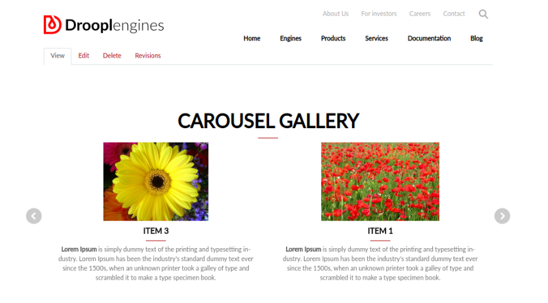
In the extended version, used to promote articles, review recently added entries or the most-bought items, we could do it like this:
Custom gallery in Drupal
Creating galleries on websites is undoubtedly an art. Many programmers spent hours trying to tame the tiles or make the carousel go. There are ready-made solutions for Drupal websites that you can and should use. However, you should keep in mind that in the end you'll face the need to create a few twigs and write dozens of lines of code for your skin. Droopler gives you on a plate ready-made working solutions which are not only flexible, but also look great! Therefore, you can quickly and easily meet the basic requirements for creating a functional gallery in Drupal.