
Recently, we celebrated the first anniversary of Droopler, our Drupal distribution. This presents a perfect opportunity to look at our project from the standpoint of design and user experience, as well as our main principles that guide us in the development of this project.
Create components, not subpages
We wanted to develop a universal tool for creating Drupal websites, which is why we ultimately came to the conclusion that we have to think about Droopler just like we do about Lego bricks, in that every subpage should be made up of pre-defined blocks that facilitate content creation. We wanted our users to have a wide variety of blocks – sections – at their disposal, that could be freely arranged on every subsequent subpage. As a result, creating subpages on Droopler feels exactly like playing with Lego bricks. The sections are selected from a graphical pop-up, presenting the usable blocks in the form of icons, which facilitates creating pages and shortens the time required to do it.
The selection of available sections enables you to choose the ones that you like and that enables you to do whatever you intend to do. The distribution offers you more than a dozen sections, including a banner, CTA, a contact form, content blocks, galleries and much more. The subsequent updates will add new possibilities and new sections.
Make content editing convenient for editors
Apart from offering an opportunity to build websites in a quick and convenient manner, we also wanted to offer ways to quickly edit content. That’s why we recently added the ability to add new elements on subpages and edit content via the frontend. Just move your cursor to the right place on the subpage and use the option to remove the section, edit the existing one or add a new one. This intuitive functionality enables the users to quickly and conveniently add a new content type to the subpage without having to visit the administration panel. All happens in a pop-up window on the subpage.
You can see this functionality in action in the following clip (starting from 1:11):
Adapt your website to mobile devices
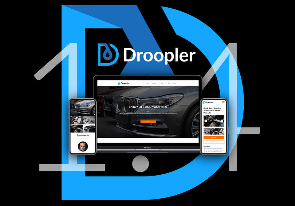
Droopler is a modern and innovative open source product, which takes into consideration the vast variety of devices used on a daily basis by internet users worldwide. That is why it works perfectly on both phones with different screen sizes, as well as on desktops and laptops. Thanks to the fact that the website is divided into blocks, we managed to make all the elements and content types work in a clean and logical way with mobile views. In this case, the main challenge stems from a small screen width on smartphones. Thanks to the use of responsive layouts, all the elements, which do not fit next to each other can appropriately scale and freely “move” to the next lines. Droopler enables you to freely use SVG files, which facilitate scaling vector graphics on screens, helping you to avoid pixilation – your graphic elements always stay sharp.
Droopler is universal
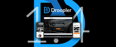
One of the biggest challenges was designing Droopler in such a way as to make it universal and versatile, enabling its users to create a variety of websites. In other words, we wanted to make sure that all the colours, typography, fonts and the general appearance worked well for as many types of websites as possible. The guiding principle behind the development of Droopler was building a distribution that looked good after a quick installation; hence we based the default layout on toned-down colours and the readable, universal Lato font. It seems that the solutions applied in line with our design principles work in real-world scenarios, since many Droopler-based websites simply go with our basic layout, including event pages, business websites and even pages built for national parks.
However, Droopler is also very open to fine-tuning by editing and overwriting existing CSS stylesheets, as well as adding new ones.
Building great UX in Droopler
We design great UX in Droopler for two types of users: First and foremost, for the people who create and edit the website. Having them in mind, we aim at developing tools enabling quick and simple editing, as we want to make sure that the website building process is as pleasant and satisfying as possible. Hence, we focus on adding new elements to subpages and editing existing ones, ensuring stability and expandability.
The second type of users we focus on our visitors, who peruse the finished website. We optimise Droopler with speed in mind, making sure that the loading time is short and that all elements are displayed correctly on various devices. We also focus on making Droopler visually appealing – in other words, we want to make people like it. This simple reason leads us to constantly updating the current version and adding new functionalities.
Plans for future
The entire Droopler team is working intensively on further developing the CMS. In terms of design, we are constantly working on new sections, offering a variety of new uses. We want to meet the expectations and needs of our users, who tell us what they need by sharing their feedback with our team. We can see the direction of development of Droopler-based pages, as well as all kinds of new blocks developed with them in mind, which gives us clear pointers regarding where we should be heading with our design in future. Coming soon is a new Droopler demo with brand-new elements, as well as changes making it a much better tool for building corporate websites.
Be sure to check out www.droopler.com on a regular basis and like our FB fan page at www.facebook.com/Droopler/