11 Best University Websites on Drupal. Features Overview

What do the University of Oxford, the University of Cambridge, and Princeton University have in common? The answer is simple - Drupal. The most well-known and respected universities have chosen this CMS to manage their websites. Drupal's scalability, customizability, and interoperability are just some of the arguments that often stand behind its choice. I’ve collected examples of top university websites to look at their features and design.
What makes university websites unique?
University websites are unusual because of their multifunctional nature. They serve as comprehensive platforms that cater to the needs of different users.
First, they act as information centers, presenting details about study programs, admissions requirements, and faculty profiles. Not infrequently, they provide interactive features such as virtual campus tours and multimedia resources that bring the academic experience to life.
In addition, college websites serve as key communication channels and thus facilitate seamless interaction between students, faculty, and staff. They often include sections for registering for courses, submitting assignments, publishing academic news, and supporting a dynamic online environment.
University websites also reflect the institution's identity through design elements, showcasing its values, achievements, or campus culture. The functions of social integration, alumni network, or calendar with events contribute to strengthening the sense of community.
The best college websites on Drupal
The university websites I reviewed and their functionalities have clear common denominators that support them in achieving the above goals. Functional design, a search option, a FAQ section, and elements that mainly engage users are just a few. In the list below, I distinguish a particular university by a feature worth noting as an inspiration to introduce on your web page.
1. The University Of Arizona - engaging the user
An essential element that should distinguish the best education websites is how they engage users. This increases the chances that such a person will stay on the web page longer and be eager to return there. A pretext for this could be the News section.
The section with updates needs to be readable and clear, and the content should be divided by topic so that it’s easy to find what the user is interested in. However, sometimes a topic is missing. What then?
The developers of the University of Arizona's website have provided an option whereby a user can use a form to propose their idea for - what they call - a story.
And so, in addition to the straightforward navigation in the section in question, there is an engaging CTA button, SUBMIT A STORY IDEA, through which anyone can submit an article proposal.
Source: arizona.edu
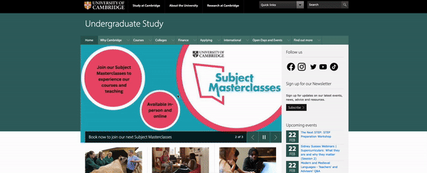
2. Oxford University - visiting schedule
Oxford University is one of the most famous colleges in the world. So, who wouldn't want to visit it? Especially if they’re seriously considering applying to this university. The option I found on this Drupal website should inspire anyone who wants to attract as many people as possible to their institution.
The main menu has a tab called OPEN DAYS AND VISITS. If you hover your cursor over it, you'll see a list with helpful information such as departmental working hours, travel and accommodation. There is also an option to plan your day in the Planning your day section. Oxford allows you to visit for 24 hours, 12 hours, or 6 hours, and each option is described in detail.
Source: ox.ac.uk
On the right is a button for the registration form with a specific CTA - REGISTER TO ATTEND AN OPEN DAY. This is also an excellent example of how the button should look and how to design it to serve its purpose. In this case, it encourages you to schedule an appointment online.
3. The University of Cambridge - the use of video
Like the example above, the University of Cambridge is also one of the most famous universities in the world. It attracts a lot of users, so navigating and guiding to successive sections on the website is an afterthought.
This university website abounds in a great variety of content. Therefore, it’s unsurprising that the web page's creators decided to use videos to show the school in a different, more attractive form and tell candidates about the advantages of studying at Cambridge.
When you go to the Courses section, you’ll see a video to help you choose a college. It's a video instructing you on what to look for when making your decision while also introducing the institution itself. But it doesn't stop there - if you click on a subject, you can watch material dedicated to specific studies.
I think it’s a simple and interesting idea to stimulate the imagination. The candidate will remember the images more than the words, which may make them choose this university.
Source: cam.ac.uk
4. Princeton University - attractive design
Princeton University, on the other hand, is an example of great design as implemented on Drupal 10. The developers focused on large graphics and the smallest possible but necessary amount of content.
This approach in no way detracts from the functionality of the website. I dare say that it even makes the university website more transparent and more organized. Just by clicking on the menu, sections are displayed. After selecting them, logically arranged subcategories lead to further subpages, and they immediately appear.
Moving deeper into the website, you can see the consistently maintained design, and the text blocks placed on top of the graphics become even more apparent. I encourage you to take a few minutes for a relaxing journey through this unique college website on Drupal.

Source: princeton.edu
5. Massachusetts Institute of Technology (MIT) - original search
For a university website to work well as an information platform, one of the most efficient tools should be a search engine. A great example is the Massachusetts Institute of Technology (MIT). The creators of this collage website approached the subject creatively, taking full advantage of its usability potential.
Firstly, because the search bar is placed in a custom place (as an additional element). Secondly - thanks to its dynamic presentation, it stands out and is clearly visible. Thirdly - after you start typing the search term, a large screen with found materials appears, and as you type more letters, the search results automatically narrow down.
I admit that this is one of the most original search solutions I've seen for a website on Drupal. And here's what the process looks like live:
Source: mit.edu
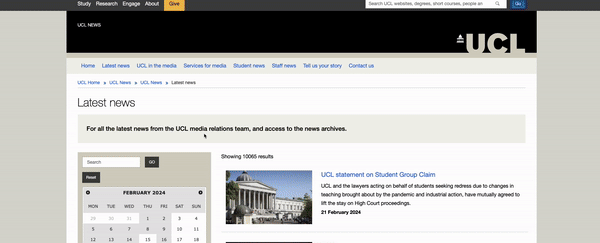
6. University College London (UCL) - calendar and filtering
I couldn't leave University College London off the list, not just because it's been named the University of 2024 (according to The Times and The Sunday Times). While browsing this university website, my attention was drawn to the calendar and filtering used in the articles' context.
When you go to the News section, articles can now be filtered by date, subject, business units, article type, and audience. This is a great example of the use of this functionality, which allows you to narrow the search field to the parameters you want.
Source: ucl.ac.uk
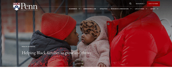
7. University of Pennsylvania - light home page and events
There is something special about the home page of the University of Pennsylvania. The first word that came to my mind was "lightness." Maybe the paddings between paragraphs are responsible for my feelings? Or perhaps the streamlined menu? Drupal gives many options to choose the website layout to suit the needs of editors and users. Here, it's clear that the web page’s developers spent a lot of time exploiting the system's potential.
Another thing is the Events section, which has a calendar and convenient filtering again. The main, upcoming event is highlighted with a circular box and a detailed description, along with the option to share it as a social media post. Lower down are upcoming events, and below them are helpful links to get more information about them.
Source: upenn.edu
8. PSL Université Paris (PSL) - language versions and accessibility
As the college website administrator, one shouldn’t forget the need to prepare it in different languages. If the university opens up to the international community of students or the academic staff, all content should have its counterparts in other languages, depending on the needs. Drupal is a system with multilingual support, so it works well for this.
In addition, one should consider facilitation and accessibility for the broadest possible range of users. This approach is also represented by the PSL Université Paris website, where you can choose how the website is presented, among other things:
- the contrast between the default, enhanced, and inverted,
- customizable font,
- increased interlineation.
All this makes the service meet the expectations of people who need to facilitate browsing on a daily basis.
Source: psl.eu
9. The University of Texas at Austin - menu and page scrolling
The website of the University of Texas at Austin has a remarkably interesting way of revealing elements in the main menu and a method of scrolling the web page.
In the first case, when I hover my cursor over some categories in the menu, a custom block with an image and description appears after the listing is expanded. Such a solution grabs your attention and encourages you to read more content. It’s also an excellent way to "liven up" the menu, which is usually just a list of links in a minimalist form.
In addition, the above feature remains consistent with the second case - an interesting way of browsing the web page. When scrolling through the photos, the next one overlaps the previous one, while a text block appears at a different pace. This is undoubtedly an original and practical eye-catcher. The exposed content attracts the eye and allows you to stay on the website longer.
Source: utexas.edu
The design and specific navigation solutions on the University of Texas website, of which there are more than the ones I have mentioned, definitely deserve attention. They can be an inspiration in the context of building a university web page as a thoughtful whole, where nothing is left to chance.
10. Kyoto University - the FAQ section
The FAQ section is a valuable functionality. It serves as an answer to the most frequently asked questions, can minimize the number of question forms sent, and thus - reduce the time required to handle responses to these inquiries.
For an example of how you can transparently build such a section on a website, I moved virtually to Japan. Kyoto University is another Drupal 10-based web page that shows an unconventional approach to the layout of the FAQ subpage.
From the layout used here, it appears that topics can be placed on the left side of the screen and answers - on the right. This layout allows for more content development, additional headings and links, and clarity of information. It’s unlike most websites, where the questions and answers are located one below the other, limiting the possibility of editing.
Source: kyoto-u.ac.jp
11. Yale University - counter and ecommerce
One of the functionalities in Drupal is a counter, quite often used on websites, for example, to show the number of company employees, completed projects, or years on the market. In the case of Yale University, however, this tool has a more advanced function and original design.
The counter is located in the Giving section, and its function is to show the amount of donations collected against the goal set. In addition to the sum expressed in numbers, the donations graphically "fill" a rim around the globe, illustrating the percentage of the plan's achievement.
Also noteworthy is the subpage itself, which is focused on grants. Although almost every college has a similar section, how it’s presented and how the purchase path is developed here is particularly simple and friendly. Yes, I deliberately used a phrase straight out of an online store. By selecting financing, we add more items as if they were in a shopping cart. So here we have integration with ecommerce.
Source: yale.edu
The best university websites - summary
The features listed in this article are examples of what you can gain by using Drupal. However, this CMS offers even more ways to make a university website run smoothly and securely. These include custom integrations, permission control, and SEO optimization modules.
I hope the colleges I've listed will be a reference in your search for the best solutions. And if you need help with implementing a specific functionality or building a web page from scratch, get support from developers who specialize in Drupal for higher education.