
Corporate Blogs – 6 Examples That Can Be an Inspiration for Your Company Website
Blogs have been an integral part of websites for many years. Almost every corporate site has a tab where you can find a list of news or articles. In this post, I will present 6 blogs of famous brands that stand out in terms of design. Based on the selected examples, I will present features that make the blog visually attractive, modern and stand out from the rest.
1. Evernote – or minimalism of form
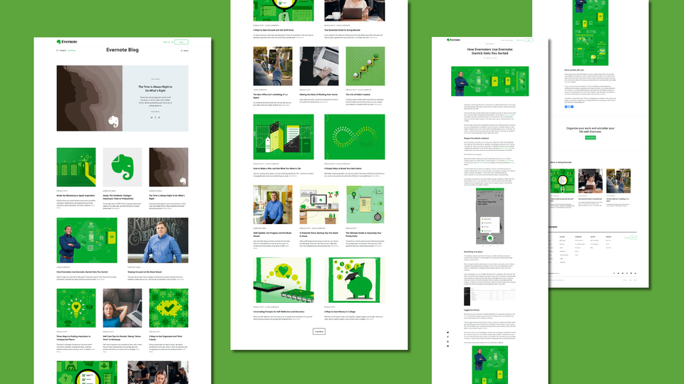
The blog's main page is distinguished by a sense of cleanliness, order, and readability. Using a lot of white colours and not overloading the reader's eyes with too much text means that the user is happy to go through the list of articles, and can easily choose an eye-catching post that stands out thanks to a photo or an abstract illustration accompanying it and referring to the content of the article. All of this is kept within the company's chosen colour scheme, which builds a sense of coherence in a non-pushy way. The webpage layout is based on 2 and 3 columns, thanks to which administrators can promote selected content by choosing a larger image. The "featured" section at the top of the webpage, which is entirely dedicated to a single entry, also helps to promote posts. The reader immediately knows what Evernote "finds to be the most important".
The entry's subpage makes the users focus on the content. They are not distracted by visual elements. The most important thing is the content. One might even get the impression that the article web page is simply a well-formatted note, with emphasis put on the selection of headlines, links, pictures. You will not find a comment section here, which actually very rarely appears on corporate websites. Instead, a CTA section can be seen at the bottom of the entry, encouraging you to try the product out.
2. Starbucks – curiosity-arousing diversity
https://stories.starbucks.com/
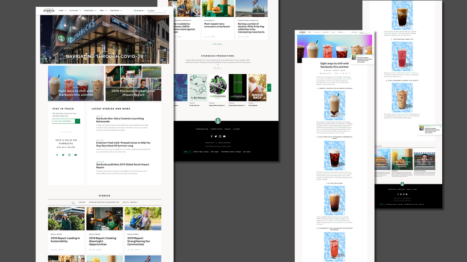
When visiting the world's largest coffeehouse chain blog's home page, you can immediately experience the variety of the presented content. There are many types of visual blocks dedicated to the articles. Administrators have many different modules, arranged based on a clear hierarchy, at their disposal. The lower the article is the smaller its area. Promoted entries are accompanied by an illustration; those that are less important do not have a title-related picture. The Starbucks website can be browsed like a lifestyle magazine. When you scroll down, new types of blocks with content appear. There is a clear division into topics (stories) and a presentation of the company's VOD library. The Starbucks blog has a slider presenting covers. It looks like a Netflix library, but on a lower scale.
The entry's subpage consists of eye-catching typography, as well as highlighted photographs and illustrations. The reading progress bar – which is quite useful in navigating many long articles on this blog – is also noteworthy.
3. Samsung – a tool for communicating with the whole world
https://news.samsung.com/global/
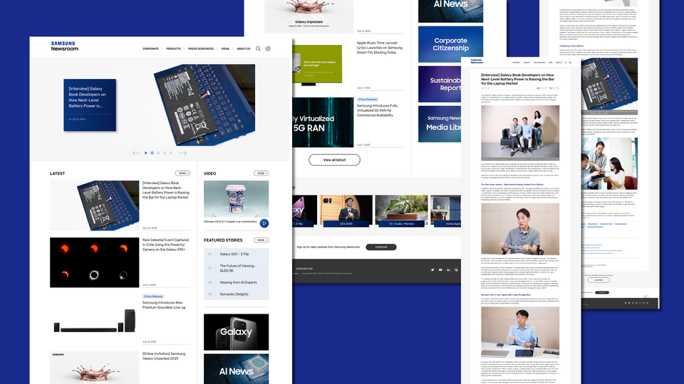
This giant electronic company's blog is a tool for presenting the company and product news. There are not many lifestyle and feature articles to be found here. The Samsung website is the company's information board presenting the many operations of this Korean group. Just like on the Starbucks blog, you can find here many types of blocks containing lists of articles. Among many other elements, there is a slider with highlighted entries, a list of the latest posts, a video section, a list of highlighted links and a column with clearly defined labels of the main categories. Despite its wide variety of content, the website is easy to read. Mainly due to the limited number of articles. There is not much scrolling here, the reader's attention is attracted by eye-catching product photos or highlighted headlines. You can quickly find interesting content and go to the subpage of a given post. The blog website also includes the option of subscribing to the newsletter.
There is enough space for an extensive article on a subpage of a single entry. Still, usually, you will find short entries there that are press releases regarding company-related news. Samsung took care of convenient navigation between categories and tags. This electronic giant wants to make it easier for users to navigate between related articles by serving a clear list of related content. At the end, the user is asked to take a look at the producer's portfolio.
4. Slack – the power of a simple illustration
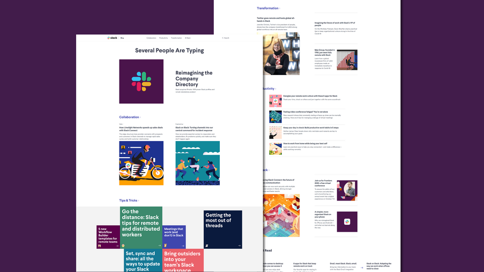
Visiting the Slack's official blog is an experience that creates the image of a professional company in the user's mind. Coherent visual identification can be seen in the thumbnails of entries, which are geometric illustrations. Slack has accustomed us to their graphic language, which is easily associated with this brand. The Slack's blog is minimalistic, but many types of content can be found there. From promoted entries, through featured categories, to the most-read articles. Many different types of articles have their own dedicated sections. Standing out, for example, is the part collecting the "Tips & Tricks" posts. Short slogans on colourful tiles lead to instructional content and guides. This visual division of the blog's main page allows you to quickly find the way around the diverse content.
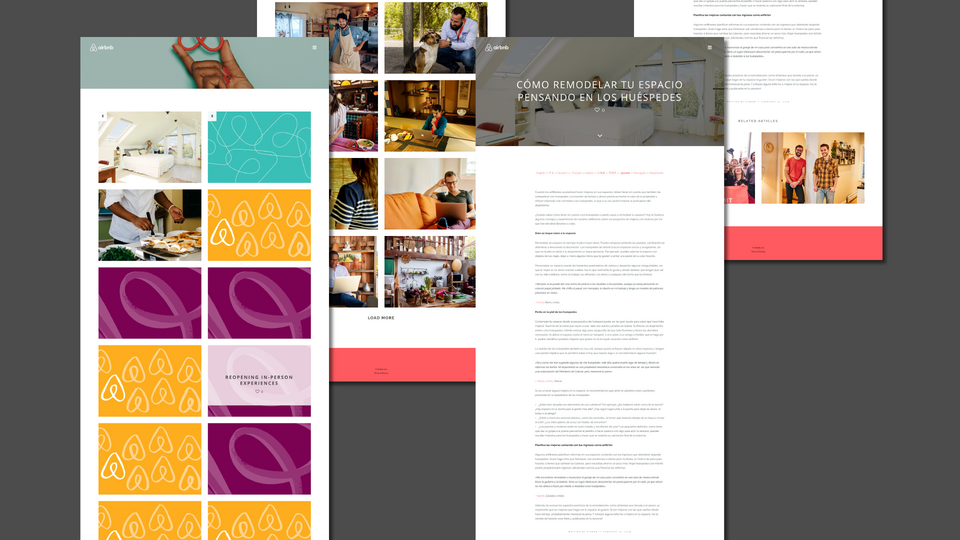
5. Airbnb – non-obvious minimalism
The Airbnb blog is very minimalistic. The striking thing is the fact that the article titles are invisible. Only after hovering the cursor over one of the rectangles with pictures, the hidden text, which is the header of the article, appears Not all posts have dedicated graphics, and for such ones a placeholder was provided – a rectangle with a pattern based on the company logo (apparently not every article must have a photo). Due to such a solution, you need to search for interesting articles by jumping between segments. It can be said that this blog landing is just a list of entries. Apart from the hidden menu and the "load more" button, nothing else can be found here. This is the epitome of minimalism!
The form of webpages containing separate posts is also limited. Among more interesting features, you can find here a reading progress bar and a list of languages in which a given post is available. Choosing one of these changes the language version.
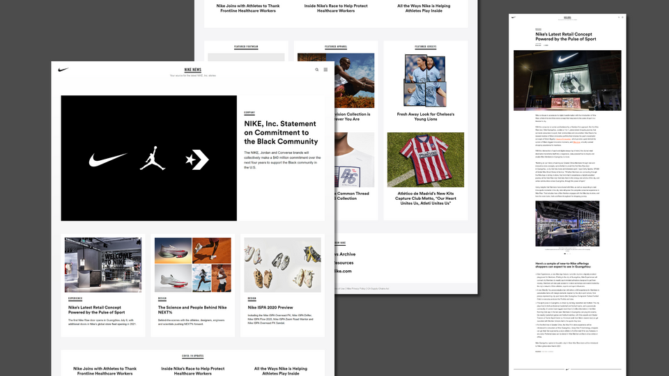
6. Nike – News presented using great product photos
The Nike products have always been characterised by a strong emphasis on their design. On the tab containing the news on one of the largest sporting goods manufacturers, you will find a layout firmly focused on presenting the company product. Nike cannot complain about the amount of great advertising photos, and the company blog is the perfect backdrop for presenting new campaigns or products. The black and white colour scheme makes it even better for this purpose. The photos are the content here, as well as an incentive goes deeper into the news collection. The simple 3-column layout is disturbed only by the promoted post (at the top of the webpage) and the section with the highlighted links between the successive rows of blog tiles.
The subpage of a single post consists of strong black and white typography with many colourful photos. However, in this minimalistic form, there is a place for an interesting feature. When you finish reading a post, another one automatically appears. Thanks to such a solution, you do not have to stop reading, and you can stay on the same subpage. You can scroll down ad infinitum, finding more and more articles.
Droopler – company website with a blog
If you are thinking about building your company website, I encourage you to base it on our Drupal distribution. Droopler is a pre-designed and ready-made website that looks great already after the installation. In Droopler, we have provided a minimalistic blog that will work great as a news section on a corporate website. We took care of a readable and attractive appearance on the screens of both computers and mobile devices. If you want to learn more about the details, click learn the details about 5 reasons to build your company website with Droopler.

