

When designing an online store, special attention should be paid to the appearance and operation of forms. Most people do not like filling them out, and it is usually a tiresome experience. Online stores are full of forms. Registering an account and placing an order requires the user to fill out a large number of fields. It can give one a headache. It is an important issue for the e-commerce industry, as every abandoned form can mean a lost client. A professional online store based on Drupal Commerce should be characterised by good UX solutions, and well-prepared forms are an important element here.
Limit the number of fields
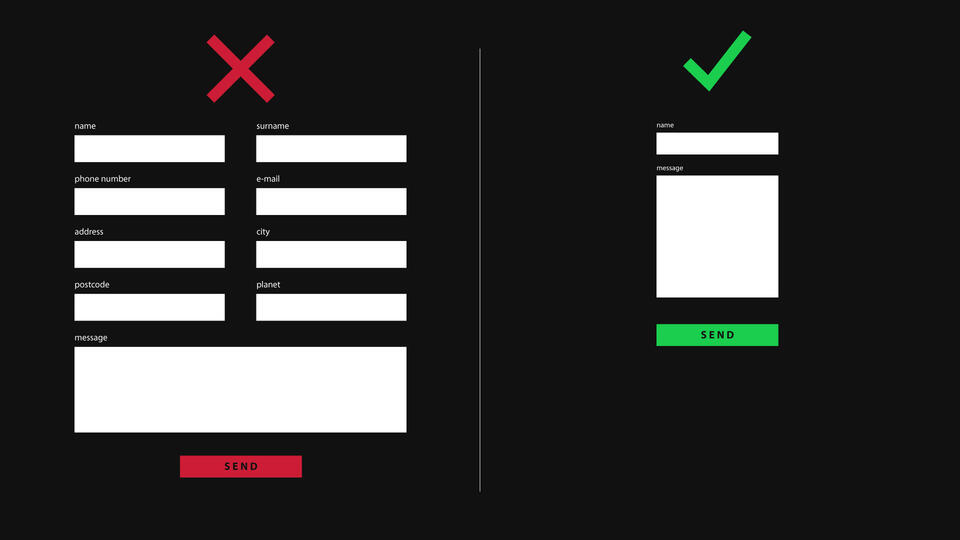
All forms should be as simple as possible, and the number of fields – kept to a minimum. You should ask the user about the essentials only. In a form, there is no space for fields that will not be used for order processing purposes. Every additional window in which the user has to enter more information distances them from placing the order. Oversized forms function as a deterrent to the users. The number of fields directly translates into the number of users who will go through the entire form.
Layout of fields in a form
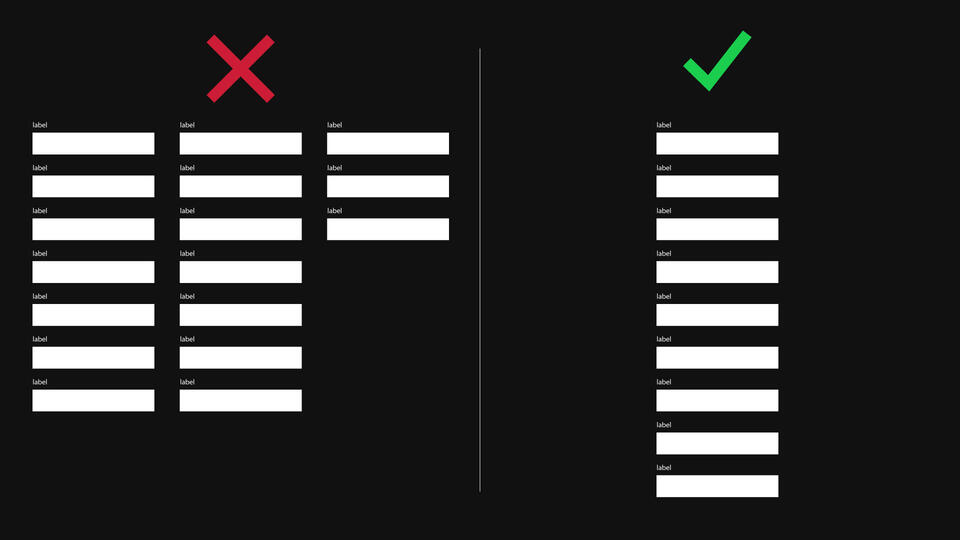
If you have already limited the number of fields to fill out, it is time to focus on their layout. Here also you should consider what is more convenient for the user. In order to make the process of filling out the form more pleasant, the fields should be arranged in one column: one after another. If the form has multiple fields, it is tempting to arrange them into two or more columns. Repeatedly, in cooperation with clients, as part of our Drupal Commerce services, we paid attention to it, because such an arrangement makes it difficult to scan the page's contents with one's eyes. If the fields are arranged vertically, the user can fill them out from the top to the bottom, without looking aside. Thanks to this, you get the impression of going straight through a path – from the top to the bottom. The user does not leave any blank fields, as is sometimes the case with multi-column forms. You should follow the rule: the longer the form is, the more sense it makes to arrange the fields vertically.
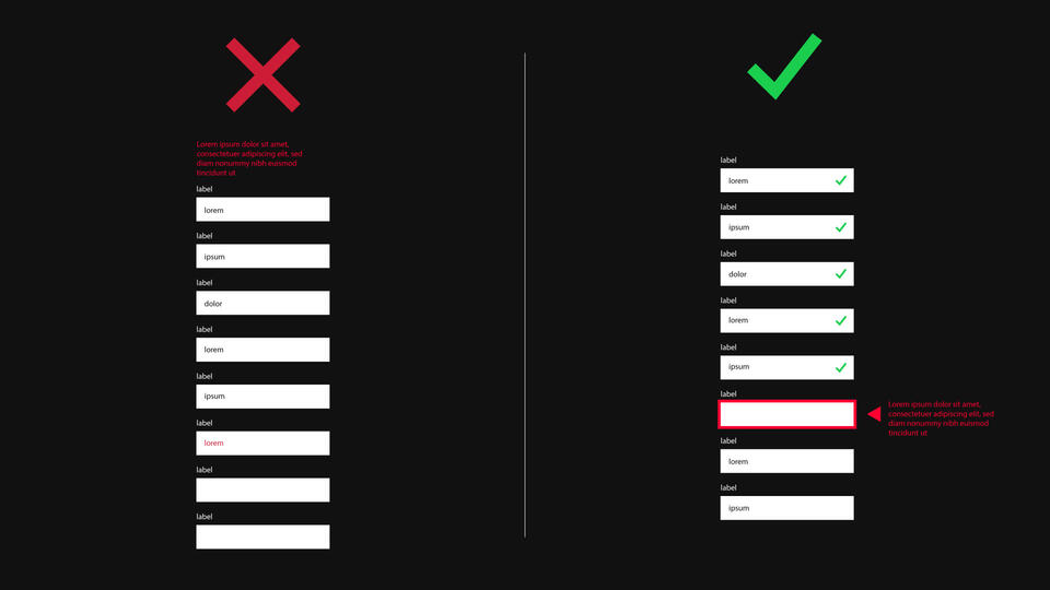
Labels of fields in a form
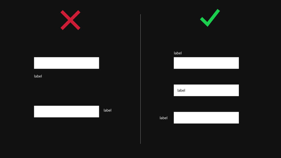
Every field in a form must have a label. The label is the description of the field that tells what the user should enter. Ideally, the label should be above the field. It is also important that the user has no problem understanding what to enter. If there are fields in your form that may cause difficulties, it is good to add a hint or to present an example of filling it out. Show how the entered tax identification number should look like, show an example of date, or inform what the minimum password length is and what characters it should contain.
Grouping the fields
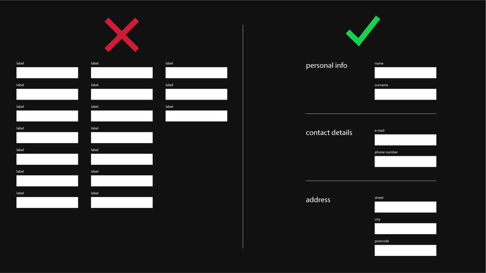
Fields within a form should be grouped. A group of fields covers the same topic. For example, all contact details should be placed in one group, so that the user can provide all information concerning the delivery in one place. The order of the groups should be logical. You should follow the "top-down" principle, in order to obtain a sensible structure. The important fields at the top – the less important ones below.
Validation
Even in a perfectly designed form, the user can make a mistake. Therefore, an effective validation system should be added to the form. The validation system shows a message when the user makes a mistake or misses a required field. The validation should work in such a way as to frustrate the user as little as possible. The messages should be formulated unambiguously and legibly. Their content should clearly show how to solve the problem that has arisen. A good validation allows you to immediately locate the obstacle that has occurred in the form.
The user should not scroll up and down looking for the error. The most effective solution is validation in real-time. The user can immediately see if they filled out the field correctly. If they were wrong, the system immediately signals the error and the user can immediately correct the mistake.
The worst solution that sometimes appears in some forms is deleting the contents of all fields and the need to fill them out from scratch. Such a solution is an absolute disaster. The user will get very angry when they will have to enter everything from scratch. You should avoid this at all costs. Do not allow the form to be deleted when an error occurs!
Simplify and help the user out wherever possible
As part of numerous works in the field of Drupal development services, we have repeatedly found out that, when creating a form, you should focus on filling it out requiring as little effort and taking as little time as possible. Do not force the user to enter the information they have already provided. For example: if the client provided their e-mail and address in the registration process, you can enter it by default in the delivery form. If there is a need to change it, one can click the "do you want to make a change?" option which will allow making adjustments.
Particular attention should be paid to mobile devices
When designing forms, you should take mobile devices seriously and adapt the forms to them. When using a smartphone, there are some limitations and difficulties concerning filling them out. The screen is small, the user is using a finger. This means that the fields should be large and easy to click on. The same goes for the buttons in the form. Because of the smartphone users, you should also strive to shorten the forms.
Form analysis
When you have an online store, you should systematically analyse the website traffic. You should pay particular attention to the forms. Analysis tools such as Google Analytics or Hotjar will allow you to observe how your forms work and perhaps indicate the elements that need improvement. Thanks to this, you will know how many per cent of users abandon the form and what elements are difficult for clients.
It is good to experiment with forms. Even a small change can make a big difference in your conversion rate. Deleting a field, correcting descriptions, resigning from requiring providing phone number can make the on-line store earn more.
Summary
Forms are the issue that every online store owner encounters. By using the best UX practices, properly designed forms improve the user experience. It is good to observe its operation and introduce changes to improve the conversion rate. There is always something that can improve the performance of the form on your website.