A Good-Looking Blog Post is the Key to Keeping the User on a Website

Let us imagine a situation like this: you did a thorough literature review, you have distilled your knowledge into a well-written article that you just published on the Internet on your blog and… nothing. You are an expert in this field, but nobody stayed longer than through the first two paragraphs! Did you know that 93% of the most-read posts on Facebook had pictures relevant to the content? This is what I call the power of attraction!
Visualisation - graphic elements that speak
When writing blog posts, we usually follow a few main principles that will allow us to attract the attention of the reader. We focus on making the topic we are discussing original, define the target audience, come up with a catchy title and the first paragraph so as to interest the reader. However, we often forget about a very important element, which is the format – or organisation and appearance of our post. And it matters a lot!
We do not want to admit it, but… we buy with our eyes! The same goes for blog posts. If they are not visually appealing, you can be sure that the reader will move to the next tab in the browser before reading the second paragraph.
The power of visualisation is clearly visible in the example below
The one that matters the most
The first thing the reader notices after the title is the image, photo or infographic that reflects the content of the article. A thumbnail of such an image is often a link to a given blog post and will be used in all the social media you use to promote your blog. A clickable image is much more effective than a link itself. When graphics or videos are embedded in the text, the number of words ceases to matter. According to the Jeff Bullas portal, articles with graphic elements attached are more popular with readers than posts without any graphic elements and gain as much as 94% more views.
Remember that you only have a few seconds to attract the reader's attention, so always put the main graphic at the top of the post, to the right or left of the first paragraph. This forces you to shorten the number of characters in the first few lines of text. Narrowing it matters for the way the reader perceives the entire content of the post – the text appears less complex and easier to digest. This helps to make decisions about the text faster and easier and increases the retention and engagement. A similar effect can be obtained by using a much larger font size for the first paragraph.

In the article on corporate blogs, however, we have provided six blog examples as inspiration for a corporate website. I encourage you to read it.
Use photos with people
It turns out that photos in which you can see people increase the engagement of readers. This is also confirmed by the research of Jakob Nielsen, who tried to answer the question of how long internet users stay on one website. In his article, he states that users spend 10% more time viewing photos of people on a page than reading biographical information about them. However, this did not apply to the photos which were only decorative, despite the fact that they contained the image of people. Therefore, posting a photo of the post's author is a very good move – it allows you to create a bond that would be impossible or significantly difficult to make without the possibility of "meeting face-to-face".
Below, in the example of an article published on the website of our Drupal agency, is a visualisation of what I am talking about.

Organise and conquer
Not only graphic elements make a post visually attractive. The formatting and organisation of the post itself play an equally important role in this. The way its content is arranged has a huge impact on readability. It is important that the whole thing consists of smaller fragments, so that the reader can glance over it quickly and initially assess the value of the article.
Prepare the canvas and adjust the frames
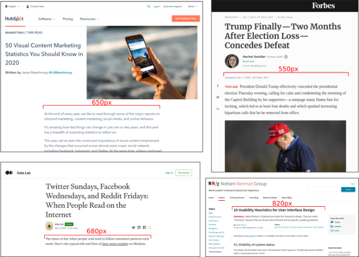
It is commonly believed that we prefer to read shorter sentences, and the optimal number of characters in a line – facilitating quick reading – should be around 100. So, what should the ideal width of a column of text on your blog be? In order to meet the above-mentioned requirements, your block should be 300-400 pixels wide, which rightly seems to be too narrow. There are, however, a few tricks allowing you to reach much more reasonable values between 500-600 pixels. The help comes in the form of… graphic elements! Do you remember the rule: image to the right or left in the main paragraph line? This is another reason to apply it! Using graphic elements in the text shortens the length of lines; while using graphics that take up about 200 pixels, the width of your paragraph perfectly meets the above-mentioned standards. Another way is to tamper with the type and size of the font and the spacing between words.
One of the first questions to ask when listing the characteristics of a perfect post is: how long should it be? As you can imagine, the answer to this question is not simple. It all depends on what you are writing about, for whom, and for what purpose:
Do you care about comments?
Brevity is your key to success. Posts like this get the most comments and cause a long discussion. They are easier and more pleasant to read, as well as to create. For such short text lengths, the number of keywords search engines use as their basis is too small. Keep in mind, however, that only posts starting from 300 words are being noticed and positioned by search engines.
Are you aiming at achieving the largest number of shares on social media?
Then use about 300-600 words in your article. This is the standard length used by many bloggers. Such articles are most often shared and commented on social media. The price? Such articles are too short to be more respected, and definitely cannot count on the favour of the search engines. If you add a few more words, you will achieve the standard text length for professional journalism – 750 words. Then you can count on more shares by other bloggers. The upper limit for medium-length posts is 1,500 words.
Do you care about good positioning in search engines?
If you want to follow the SEO requirements, aim for texts with the minimum length of 1000 words. Experts argue about the upper limit preferred by the Google search engine, but all agree that the post should not exceed 2,500 words. According to Forbes, posts longer than 1500 words were 68% more likely to be shared on Twitter, and the likelihood of them being liked on Facebook, when compared to shorter posts, increased by over 22%. This is in line with the data indicating that the ideal length of a post should be equal to 7 minutes of reading – the average of 1600 words. Good positioning will allow you to gain many new readers, especially if you write an article on a topic that everyone is searching for.
Title, subtitles and even more subtitles
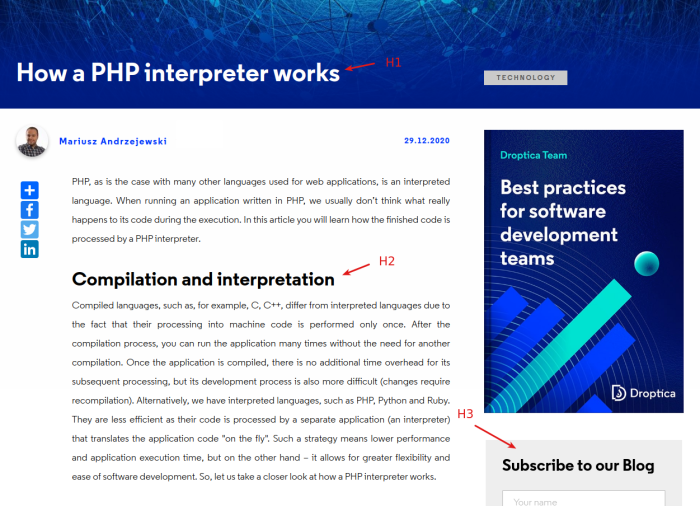
Reading on the Internet has its own rules, although I should actually call it "scanning". This is why it is so important to use subtitles, that here function as tags or markers, and also act as text separators. Usually, titles are marked as "Heading 1" or h1 in word processors. The hierarchy, also in terms of the importance of the text, is reflected in the consecutive numbers for sub-headings and following sub-headings, and these are h2 and h3 respectively. Usually, the name of your blog will be tagged as h4, and all minor side headings will be tagged as h5.
You can also use additional font styles such as bold, italic or underline in order to make particular words, quotes or sentences stand out. Remember, however, to use them only when necessary. Abusing it may have far-reaching consequences and prove to be counterproductive.
The very organisation of the text lines is also an extremely important aspect. I mean line spacing, which is the space between subsequent lines, paragraph spacing, etc. You can find a great article on using typography in UI on prtototypr.io.
Summary
When we start to write a blogpost, we often focus only on the content itself, on what we want to convey to the reader. It is, however, worth taking a moment to decide on its formatting and graphic design based on the draft content. When you have a template ready, it will be easier for you to add more articles in the future.
Below is a short checklist to follow:
- text column about 600 pixels wide,
- eye-catching main photo, half the line's width, put at the beginning of the article,
- the author's photo in the post itself or in the "about me" tab,
- separating the content into thematic blocks,
- interludes in the form of photos, infographics, bold, large-font quotes,
- determining and consistently applying the same font sizes for the header and the subtitles,
- properly choosing the spacing between the paragraphs, lines and words in relation to the selected font,
- assembling a section of the content into numbered or unnumbered lists.
Good luck, and good writing!