10 Visual Changes That Will Improve Your Website

In Droptica we work with clients a lot to improve their corporate websites. Your website can always be better. We have prepared a list of things you can change to improve it visually. Thanks to this list, your website will look better.
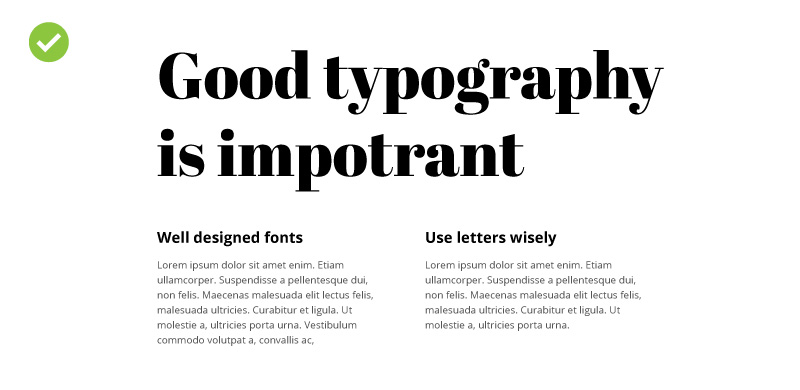
1. Ensure a consistent typography
One of the main elements on a site is text. For texts to look good, they should be created using properly selected fonts. Make sure you use up to 2-3 font types on your site. A larger number of typefaces used gives the impression of clutter and inconsistency. It also gives the impression of carelessness and randomness. Choose one font type that you will use to make headers, and one for longer texts divided into paragraphs. You can find some inspiration by checking the font sets on google fonts (free) and downloading them to your website.
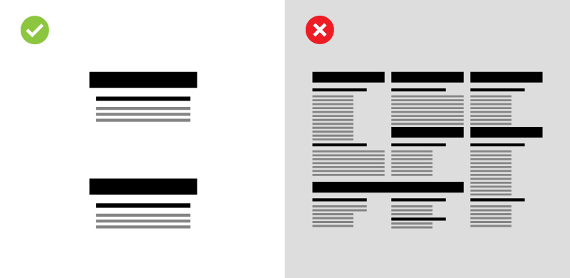
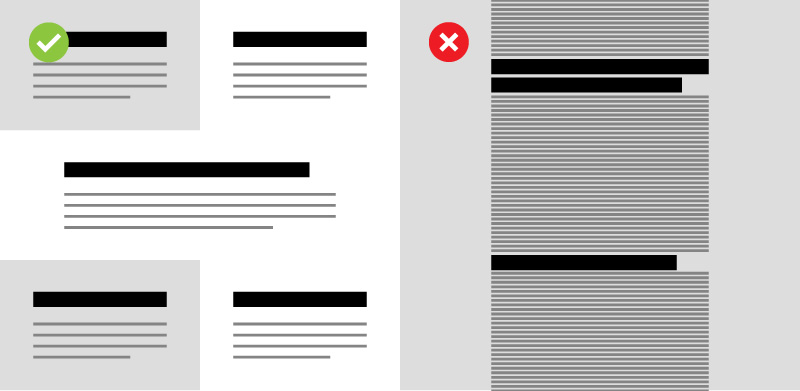
2. White Space
A visually attractive site is one that is legible and orderly. One of the methods of obtaining a professional and readable effect is using white space. These are the parts of the site (and graphic designs in general) containing the background only. They provide a "breather" between the site sections. Using white space makes the site easier to read and – as a matter of course – prettier. The masters of this solution are apple designers, who have been applying the WS principle on their websites for years.
In order to improve your site, take a critical look at it and think about whether it is not too tight in some parts, and if the amount of content is not overwhelming. If there are such areas, separate them with a white space. Start with headers and paragraphs. Increase the space between the paragraph and the title above it. Remember though, that the created distance should not make it difficult to understand the content. The headers should refer to specific paragraphs. Too much distance between the headers and the content can cause them to look disconnected from each other. There is never enough of white space.
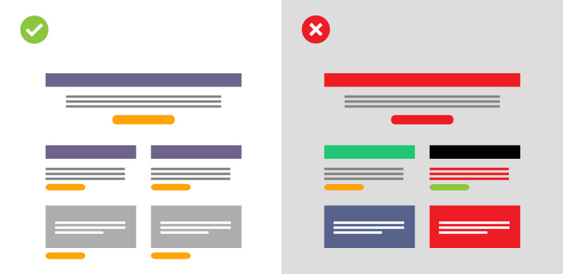
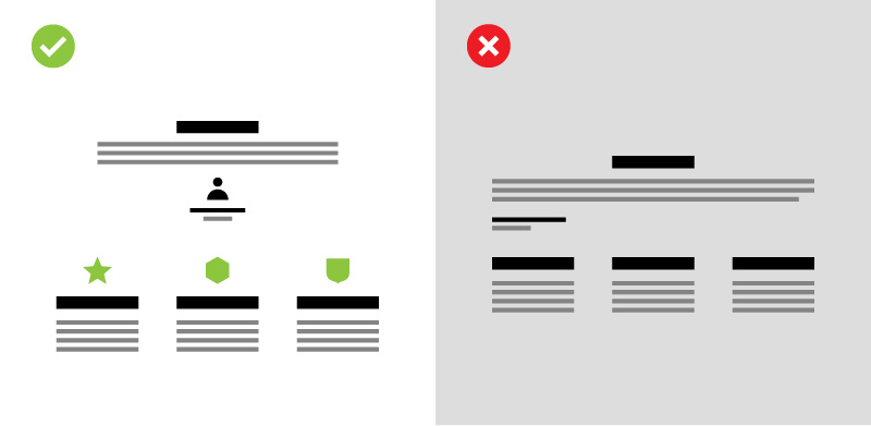
3. Colour scheme of the site
Make sure that your site has a well thought-out colour scheme. As with fonts, it is not good if there are too many colours. All headers should have the same colour, the same goes for paragraphs and buttons. If you want the headers to be blue on your site, make sure that every header of the same type is blue. Of course, if the background makes reading difficult in some places (e.g. it is blue also), then you can create, e.g. a white or another legible type of a heading. It is important that there are not too many of them.
Choose one colour for text in paragraphs. Black always looks good. If you want to highlight some text, you can use a different colour, but remember to do it in moderation. Highlighting works only when it actually separates an element from its environment. If everything around is rainbow-coloured, then the highlighted part will be difficult to read.
If you have buttons on your site (and you probably do), specify a uniform colour system for them. If you have two types of buttons (main and support), always let the main one be in the same colour. It will help the user to familiarise with the website and teach them how to use it. More colours cause a sense of clutter and randomness. Create colour guidelines for repeating elements.
4. How to choose the right photos
Photos make your site more interesting. We all like nice pictures. Choose photos so that they are consistent with your site. If you have more minimalist photos, try to make the next ones look similar. Try to avoid popular stock photos. Some of these shots are very popular and can be found on many sites. Sometimes the characters from stock photos become memes. Avoid using them, so as not to expose yourself to ridicule. In order to achieve the effect of professionalism, try to choose photos that are original. It would be best to use photos taken by yourself or to hire a professional photographer. It will make your site unique and inimitable.
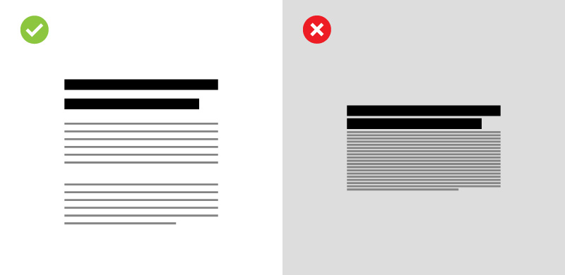
5. Line spacing and breaking down long texts
Not many people know that the readability of a text is influenced by the size of line spacing, i.e. the spacing between individual lines of text. To ensure comfortable readability, increase the space between the lines. The ideal spacing is at least 150% of the letter height, with a line containing 40-80 characters (including spaces).
Another important step is to break down long paragraphs into several smaller ones. This increases readability and encourages the user to read the text. Paragraphs up to 10 lines are best for reading. Remember that on the Internet, people rather scan text than read it. Make it easier for them, and they will be more likely to get acquainted with what you want to convey.
6. Use icons
If there is a lot of text on your site, it' is a good idea to use graphics that will diversify the look of the page. Such images may be icons or symbols. Icons are very good as eye-catching elements. They will work great when accompanying headers or bringing attention to a paragraph of text. For example, if you describe delivery options in your online store, you can use an icon showing a parcel or a courier truck. If you ask for providing contact details, you can add next to it an icon showing an envelope or a phone. It will make it easier for the user to locate relevant content because it will be easier to spot.
7. Favicon, or your icon
Favicon is a small icon in the browser's tab. It is a distinctive image that makes it easier to locate your site among all open tabs. If your site does not have a favicon yet, it is worth to add it. It is a simple procedure that will make your website look more professional.
8. Divide the contents of sub-pages into sections
Nobody likes to be bored with a wall of text. Make sure that your user can locate the fragment that interests them. Breaking down long-drawn-out passages into smaller, clearly distinguished sections will make it much easier. Use headers and divide the text into comfortable portions. It is a simple procedure that will improve the user experience on your site. Use colourful backgrounds in sections, so that the divisions are clear and legible. Diversify the parts of the site between individual texts using visually appealing objects. Photos and other images will work well here. You can also use large headers that will catch the eye and divide your site into smaller parts.
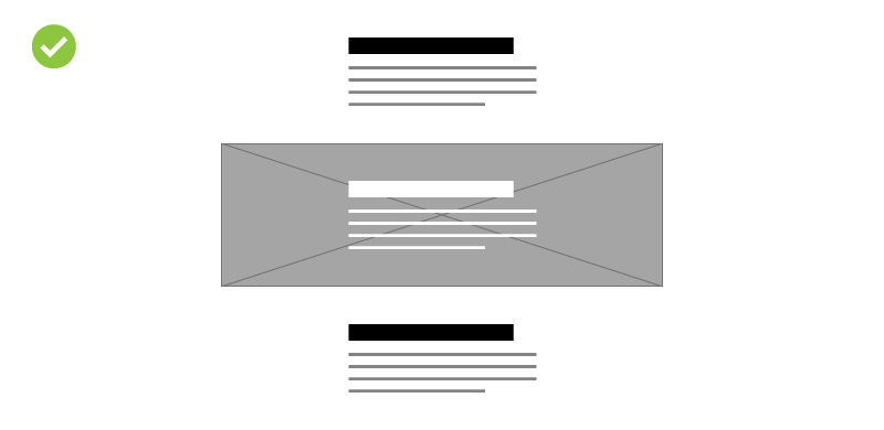
9. Use images as a background
Adding images, textures or patterns as a background can make your site to take on some character. It can be a photo or a repeating graphic motif. If the site is text-based, a subtle pattern or a blurry photo can make it more eye-catching, and it will keep the user's attention for longer. This procedure works perfectly in places that you would like to distinguish more and make sure the reader will not miss them.
10. Less is more
Finally, a very important, general advice. Focus on the content's quality rather than its quantity. A clear and readable message will be more attractive to the user than too elaborate, long texts. Do not try to "talk" too much on the site, just say as much as needed. Remember that most users will use your site on their smartphone. A large amount of text will not look good on it, and as a result, it may scare away your guests.
Summary
Most of these improvements should not take more than a few hours of work, and the visual effect of your site will be noticeable immediately. Do not forget that your site should be constantly updated. Anything that – according to you – does not need any changes right now, might need them soon. Therefore, visit your site often, and look at it with a critical eye, taking on the persona of a typical user. Improve, experiment, try.