
Best Insurance Websites – Examples of Health and Life Insurance

Do you run an insurance agency? Or want to expand your current web page and implement new solutions? In the following article, I present some examples of insurance websites that can inspire you to work on a website that should aim to increase conversions.
Website for insurance company - characteristic
The business website of an insurance agency should contain the necessary information about the offer and have functionalities that are useful to the customer, which, at the same time, will cause conversions. It certainly cannot lack a calculator, contact form, or search engine. It’s worthwhile for the web page to stand out with design and responsiveness and offer something more, such as a mobile application.
The website should also be tailored to the type of business within the industry, divided into sub-industries (health, auto, travel, or life insurance).
Best life insurance websites
Such websites should be distinguished by the transparency of the presented information. It’s also important to allow customization of the offer, both in terms of the amount of insurance and the duration of the policy. Professional insurance platforms also often offer online calculators to facilitate quick comparisons of different options and costs.
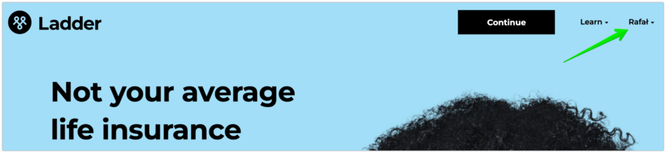
Ladder – simulator and personalized offering
There are some interesting things going on on the website of Ladder Life, a company that sells flexible life insurance policies. First, the web page remembers me. Because I have logged in before, it addresses me by name on my next visit. And not just in the upper right corner but also lower in the header content.
Source: ladderlife.com
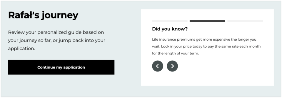
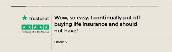
Second, there is an original presentation of opinions on the website. As a user, I don't have to search for tabs with customer testimonials because they’re located just below the Rafal's journey section and are presented in a dynamic form.
Third (and here I return to the top of the website), there is a conspicuous CTA button Get my price, thus immediately moving to the substance.
Once clicked, I fill out a survey consisting of questions:
- What is your name?
- What is your email address?
- What is your sex?
- What is your height and weight?
- Have you used tobacco or nicotine products in the last 3 years?
- When is your birthday?
- Has a biological parent or sibling died of cancer or heart disease prior to the age of 60?
- What is your annual household income?
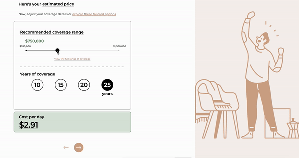
After answering, a calculator appears with the recommended insurance amount. Using the slider, I can change this amount at this point, and each modification immediately presents a simulation of the daily insurance cost.
Attention is also drawn to the descriptions of each section of the texts, which explain how they should be understood. Below, you can see how this simulator works.
There are further, slightly more detailed questions about diseases, medications taken, and tests performed in recent years. After answering them, I receive the insurance offer.
However, if I don't want to go through such a detailed interview, I have option B, which is an abbreviated insurance calculator that lets me know what my expense coverage should be.
Haven Life - calculator and individual offer
The calculation is never too much. A simple calculator that can compute the insurance cost in seconds is a way to convince customers to fill it out. Haven Life – a digital insurance agency founded in 2014 in New York – offers such a solution right from its homepage.
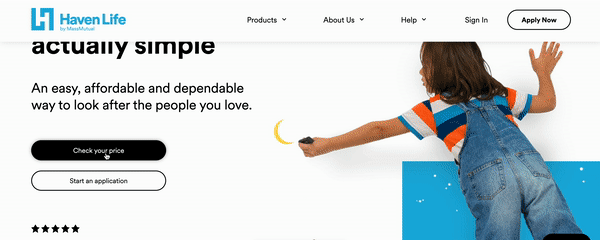
Source: havenlife.com
It’s worth noting that the CTA button leading to the calculator is available in many places on the website. It’s apparent that the web page's developers have thought through the topic, so the option to do a simulation is always at hand.
However, the calculator cannot be the only argument for the customer. When choosing life insurance, we care about the credibility of the insurer. That's why another procedure used by Haven Life attracts attention here.
The Press section provides links to articles and videos where this insurance agency has been written or talked about. Among the many titles are The Economist, USA Today, The Wall Street Journal, and Bloomberg.
Best insurance agency websites
Insurance agency websites should find a balance between attractive design and minimalism. On the one hand, they need to attract attention, while on the other hand, they need to convey information concretely and informative.
Charles Milnes – design
Once you visit the website of the insurance agency Charles Milnes, whose mission is to provide professional advice and insurance with an emphasis on cost control and efficiency, your attention is immediately drawn to its remarkable design. As the cursor scrolls down the website, successive segments are presented so that the given background moves more slowly relative to the foreground. At this stage, you can read general information about the company.
Source: charlesmilnes.co.uk
A slightly different layout is seen when you enter the Production insurance section. You then go to the Fastscreen subpage, where you’ll find the offer and price list. In the introduction, however, you can see a diagram that acts as a menu for the landing page's sections. This is also an example of how a menu can be presented in an unobvious way.

To sum up, the approach of the Charles Milnes web page developers shows that an insurance website doesn’t have to be boring at all - that's first. Second - an intriguing design makes the user likely to stay on the website longer, thus increasing the chance of conversion.
Brooklyn Brokerage – minimalism
At the other extreme, compared to the above example, is the Brooklyn Brokerage, which offers insurance products and services with an emphasis on personalized solutions and risk-free pricing. The website is dynamic and characterized by a minimalist approach.
The content in the About, Services, and Contact sections fit almost on a single computer screen – just a mouse scroll is enough to read the whole thing. This solution is also eye-catching and works well when a website visitor needs to find information quickly without feeling overwhelmed by the content.
Source: brooklynbrokerage.com
This insurance website stands out not only for its clarity of information but also for its intuitive approach to customer interaction. The web page features strategically placed CTA buttons that direct users to a contact form. This makes the application process friendly and easy to access.
Best health insurance websites
For health insurance websites, it’ll be essential to establish credibility with the company. How to achieve this? Through a well-conducted customer path or specific information for potential policyholders, such as under the heading, "What will I have(s) for one dollar?".
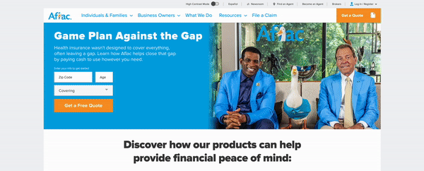
Aflac - a thoughtful path and newsroom
What about the situation when an insurance company's offer is extensive? How to find information on such a web page? With the answer comes an example Aflac, which offers additional financial security in case of unexpected medical expenses.
The first element on the web page that draws attention is the ability to change the contrast. Seemingly nothing, but this detail can be helpful to many people and make someone stay on the insurance website longer. Not all sites use this simple procedure, and it's worth remembering it and asking yourself: will this be a nod to a potential customer?
Aflac's website has a clear layout. The subject blocks are named clearly, and when you hover your cursor over them, they highlight, and you can immediately move on. You then learn what the insurance is, how it works at Aflac, the difference between this and similar insurance at this company, and how much the package you are interested in costs. The whole process ends with the ability to submit a form.
Source: aflac.com
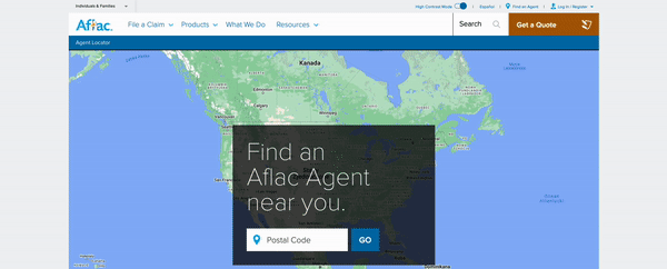
The Find an Agent option is also helpful. When you enter your zip code, the details of insurance agents are displayed.
My attention was also drawn to the Aflac Newsroom section. This is a large area where, in addition to information and news about the company, there are sources such as financial results, ads that have appeared, reviews, or surveys.
Oscar - from the general to the specific
When someone is looking for an insurance company, they usually glance around for information about the price and what they can gain with the insurance in question once they get to a particular website. The example of Oscar – a health insurance company whose online platform behaves like a family doctor – shows prices precisely, dollar for dollar. In this case, it's about the price of a drug that a person will pay if they opt for the insurance offered. I don't think the benefits can be shown any better.
Source: hioscar.com
Another feature worth noting is the application, which allows me to describe my health problem and get help quickly. Below, you can see how the process works.
Best insurance websites – summary
As you can see, insurance companies are diverse. However, their websites have common denominators and functionalities required by the industry. Undoubtedly, one of them will be an offer calculator for a specific person. At Droptica, we build websites for insurance agencies, which we can equip with multi-step forms, maps and listings, service search engines, and other sought-after solutions.