
Interesting Contact Us Page Examples from Various Companies

It would seem that companies are trying to reduce direct contact with the customer in favor of the automation of many processes. Although more and more companies use chatbots and online chats, some customers will always strive to directly contact a business representative. A contact page makes it possible, so it shouldn't be missing from your website. We’ll present contact us page examples that are worth drawing inspiration from when planning your company website.
What is a contact us page, and why every company should have one?
Contact pages are usually visited by users who want to contact you directly. This subpage exists to provide the visitor with information on how to contact you.
Virtually every company should have such a page, as it'll be extremely difficult for the customer to find your contact details without it. Putting them elsewhere on your company site isn't necessarily a good idea (the customer may not notice them). By choosing not to create a contact us page, you force the customer to perform a time-consuming search for the ways to contact you or, even worse, you prevent the customer from directly communicating to you that they have a problem or want to make a purchase.
What are the most important elements of a contact page?
Before you start creating a contact page, there are a few things to consider. In addition to choosing the right technology, it's also important what elements you'll use in this part of the company website.
The basic part of such a subpage is a description of the available methods of communication with customer service (telephone number, email address, contact us form, or chat). Close to the section with relevant information, it's also worth putting CTA buttons redirecting to the appropriate communication tools (chat, form, or application) or other subpages that may interest the potential customer if they ultimately decide not to contact your employees directly.
The optional element that's worth considering is additional content. Contact us pages usually don't have much content, which doesn't mean that you can't add a paragraph encouraging the user to send a message and tell them why it's a good idea to contact the seller directly (making a purchase, solving a problem, getting an answer to a specific question).
Although not a necessity, an interesting solution is also putting on the contact page icons, which are also buttons redirecting to active social media accounts, such as Twitter, Facebook, Instagram, or LinkedIn. This way, you'll show your potential customers additional communication channels and sources of information about your brand.
When analyzing various examples of contact pages, you may notice that maps showing the location of the company's headquarters are also often included. This not only makes it easier for the customers to find the registered office of the company but also increases its credibility.
How to encourage the customer to contact you directly via the contact us page?
First of all, your contact page needs to be easy to find so that the potential customer doesn't have to search for it. The classic solution is to add it to the main menu. It's also extremely important to carefully design such a subpage.
Follow these best practices:
- Determine what may be the exact purpose of establishing contact (selling, problem-solving, information gathering) and design your communication strategy, contact forms, and methods accordingly.
- Keep it short and don't ask for unnecessary information – this will simplify the conversation with the customer, increase the likelihood of establishing contact, and shorten the time necessary for this purpose.
- Offer your recipients a variety of options for conducting a dialogue (chat, phone call, SMS, email) and let them choose the most convenient one for them.
This sounds rather simple in theory, but achieving satisfactory results in practice isn't that easy, though. Therefore, before you start designing your company website, it's good to check out some interesting examples of existing contact us pages.
1. Unbounce
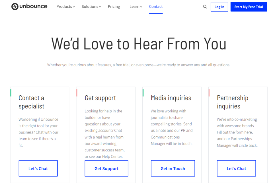
The Unbounce's simple and legible contact page targets every type of user. The brand emphasizes this with a single sentence put right under the heading, which cordially ensures that the company would be happy to establish direct contact with the user. The company's communication is distinguished by a friendly tone that encourages making contact.
The user may receive help or establish direct contact with company representatives by choosing one of four options: chat for customers, technical support, email contact for journalists, and a contact form for the people interested in submitting a cooperation proposal.
Source: Unbounce
The brand even invites a face-to-face meeting at the company's headquarters – the page provides not only the telephone numbers to customer service centers in different parts of the world but also the exact addresses of two business offices. Thanks to such detailed information, the customer can quickly and easily contact the brand, regardless of the preferred method of communication.
2. Moosend
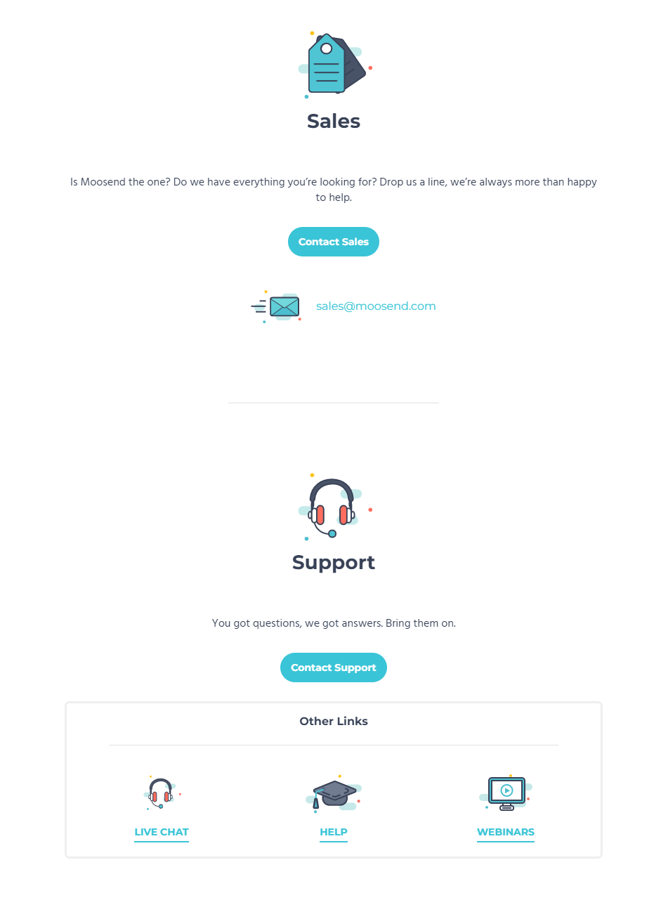
Moosend is an email marketing software provider. On its website, you'll find dedicated contact pages with forms for the people interested in speaking with the sales, marketing, or technical support departments. The site stands out due to creating various types of forms for the users, an interesting, minimalist design, and putting the sales contact page instead of the main contact page in the main menu. The CTA buttons on this page direct the recipient to one of the forms that differ depending on the function they perform.
Source: Moosend
In the sales form, you need to provide the information necessary to create an offer. The brands that want to cooperate with the company (e.g., affiliated marketers) choose a specific type of preferred cooperation from the list. The people who need technical support choose the answers that allow them to describe the problem in detail from several drop-down lists. In addition to filling out the form, the potential customers may also use the live chat to obtain an immediate response or check out the webinars and the extensive knowledge database.
3. Podia
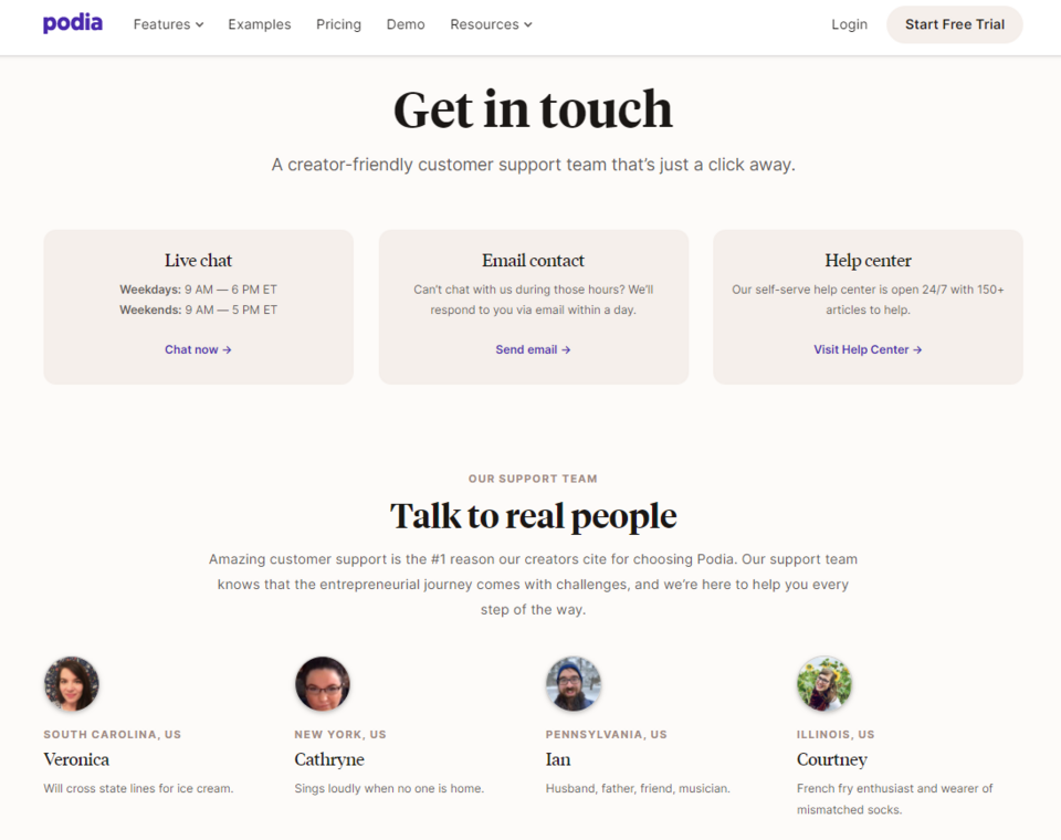
Like the brands mentioned above, Podia offers its customers many ways to get in touch (visiting the online knowledge database, using chat, and sending an email). The page stands out due to providing detailed information on the working time of customer service employees. You'll learn at what hours the chat is operating and how long you'll have to wait for a reply to a message sent by email. The detailed information about the working hours of customer service specialists and the waiting time for a response reassures the customer and encourages them to establish contact.
Source: Podia
The brand emphasizes its human face by letting the users know that real people are answering their questions. On the company's contact us page, you'll find not only the information on the employees but also their photos – thanks to this, the brand reduces the distance between the customers and the team.
4. IMPACT+
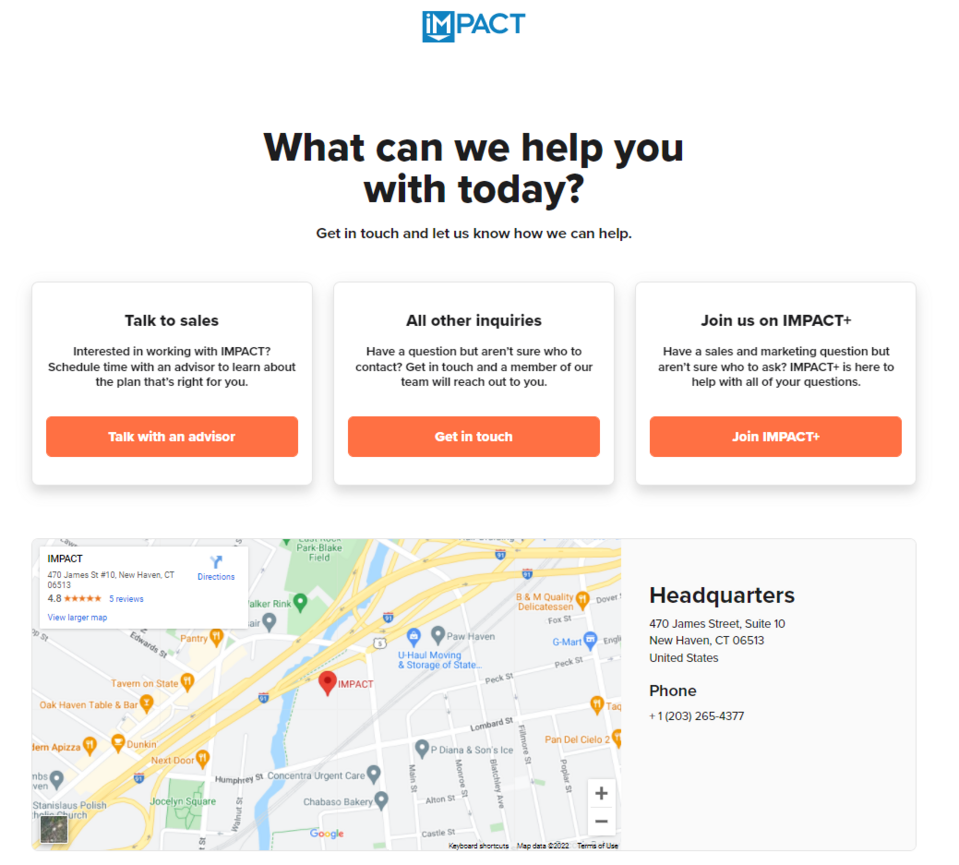
IMPACT provides users with three buttons redirecting to contact forms and the tool itself. The customer chooses the option that best suits them. This allows the company to more easily break down the messages received by the customers and determine which ones have the highest priority. The contact page also includes a map, telephone number, and the registered office's exact address, thanks to which the customers may quickly contact the company.
Source: IMPACT
An interesting solution used by the company is the use of an online schedule, thanks to which the customer may choose the time convenient for them to consult with a customer advisor. They will see the schedule after clicking the Talk with an advisor CTA button, and entering their email address. They don't have to wait for an answer to the inquiry sent in the contact form because they may immediately arrange an interview with a company representative. Booking automation certainly improves the work of the customer support team.
5. Let’s Travel Somewhere
The functionality of a contact us page is the most important thing, but when you make sure that it fulfills its function, it's worth considering how it should look. The creation of the Let's Travel Somewhere website had to be included on our list of truly inspiring examples of contact pages.
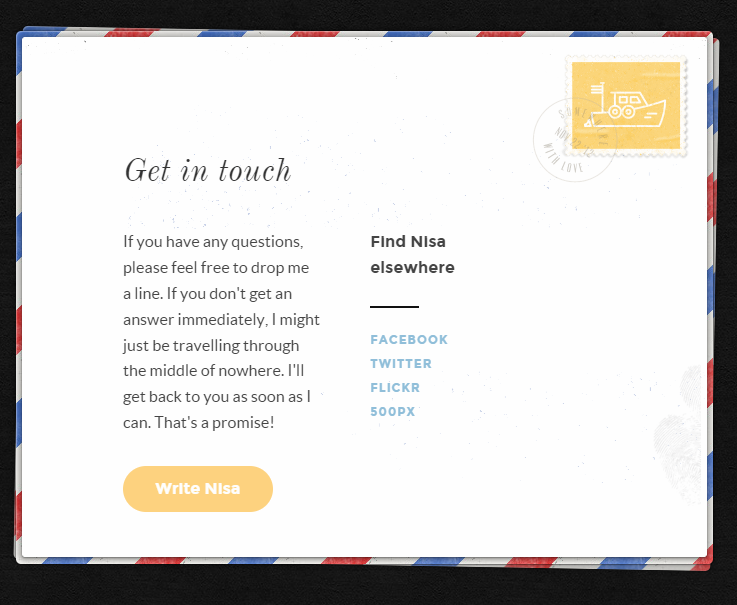
Source: Let's Travel Somewhere
This contact page has been designed to resemble a postcard, which is an obvious reference to the journeys that the website of the traveler Nisa is dedicated to. The simplicity of the design and limitation of content and other distracting elements allows the reader to quickly focus on the visible CTA, clicking which allows to easily send a query. On the other hand, in the place where an address is usually put on a postcard, the creator of the page posted links redirecting the user to communication channels on social media.
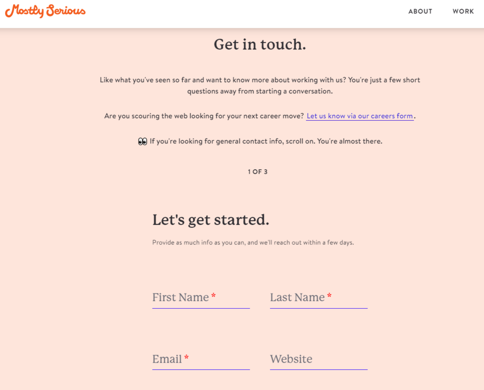
6.Mostly Serious
Mostly Serious is a brand that focuses on simplicity. There's little text or other elements on the contact us page, and the form is quite simple and short. At the same time, the content creators took care to bring the user to the information they needed – in one of the paragraphs, there's a link to the recruitment form. Thanks to this, the brand immediately divides messages from its users into those related to the recruitment process and others.
Source: Mostly Serious
Below the form, you'll find the company's contact details (office address, email, telephone number). In addition, the adjacent column contains the links to social media profiles for the users who prefer these communication channels. The page is decorated with simple yet funny animations.
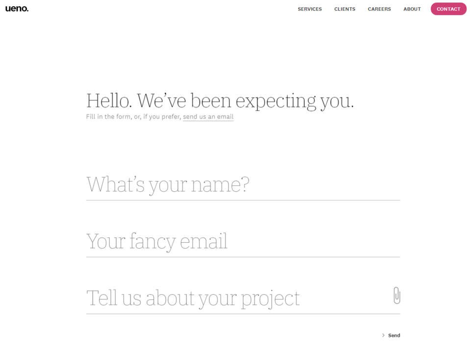
7. Ueno
Ueno has a minimalistic and at the same time aesthetically pleasing contact page. Its most important part is the content – not in quantitative, but qualitative terms. The brand welcomes the potential customer with the words We've been expecting you. This way, it makes the recipient feel expected, and they willingly fill out a short contact form (they may add an attachment to it).
Source: Ueno
The company offers several methods of establishing contact. In addition to filling out the form, the customer may also send an email message. There are also the exact addresses of several locations at the bottom of the page and buttons redirecting the user to Google Maps.
Contact us page examples - summary
There's no doubt that the most common mistakes of the entrepreneurs investing in their own company website include:
- choosing not to have a contact us page,
- providing few communication methods,
- failing to put the contact page in the main menu or other visible places.
The creators of the above-mentioned examples show how to create a high-quality contact page that will not only make it available to solve the problems of concerned customers but also to sell or start cooperation with new business partners. The examples also show that a contact page may be more than just a short contact form or a section with the phone number and email address.
Many years of experience in creating company websites allow our experts to choose the best solutions for specific contact pages. We'll be happy to help you as well. As part of developing your Drupal company website, we may design a contact page for you that will allow you to achieve your business goals.