Color Scheme for the Website - How to Pick It for Your Web Page?

Color is a powerful design tool in web design. It not only emphasizes the aesthetic value of the project but also conveys information and defines the atmosphere. The right use of colors on a website can make it look professional. On the other hand, the wrong color choice may cause the web page not to be perceived seriously by the user or even make it difficult to perceive the whole thing properly. A color scheme will be helpful in choosing a color palette.
What is a website color scheme and why is it important?
A very important way to use color in web design is to employ color schemes. You can use these models to create a sense of hierarchy, organization, and consistency throughout your project. This helps users quickly identify the most significant elements and navigate the website more easily.
Color wheel
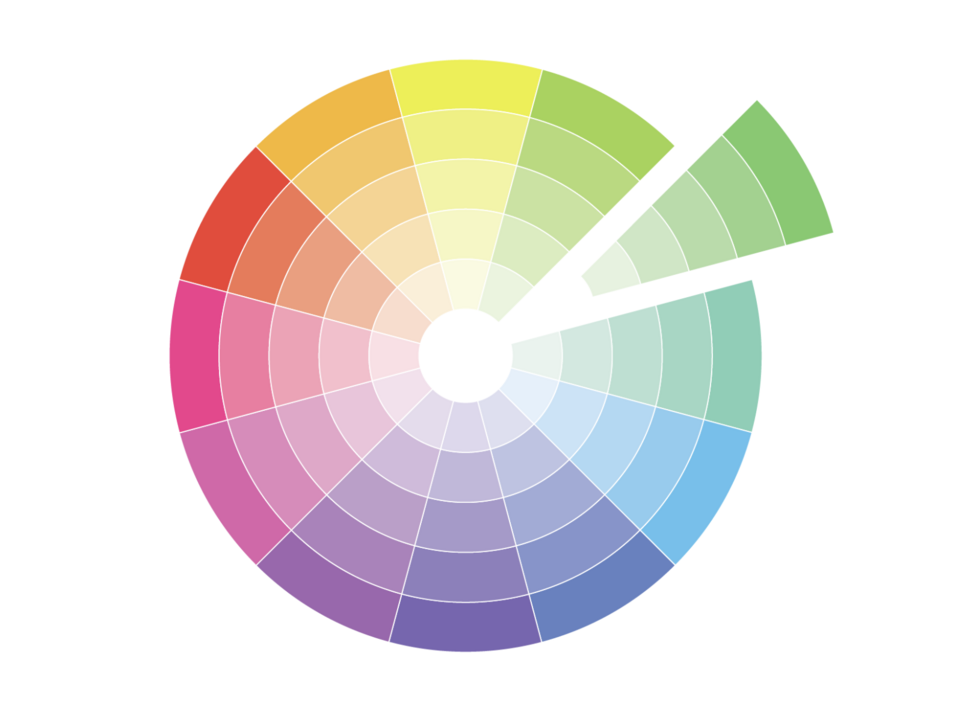
Source: Color Meanings
One of the simplest methods to create a color scheme is to choose one color and match it with the ones that will form a palette of similar colors. Such a scheme is called a monochromatic scheme.
The second, slightly more complicated approach is the complementary scheme. This consists in choosing one color from the color wheel and matching it with another on the opposite side of the palette. Such combinations are interesting, but you have to be careful with their use. It's best to set only one color as the dominant one.
The final color scheme is the triad. As the name suggests, we are dealing here with a combination of three colors, which, however, aren't accidental. The colors for the triad are selected at approximately 120-degree intervals from each other. By sticking to this rule, you'll achieve a beautiful color combination.
How to choose a color scheme for a website?
Selecting a color scheme for a website, it's worth following a few simple rules that will ensure the colors usability and good design.
1. Know your audience
When choosing a color scheme for a website, remember that colors have their meaning. For example, research shows that women and men rate blue very highly as one of their favorite colors. It's the perfect color then to inspire confidence in the brand. Companies such as Microsoft, Twitter, and Facebook use it. On the other hand, colors such as yellow don’t inspire trust among adult users but are often liked by children.
Colors also gain or lose popularity over time. When choosing colors for your website, make sure that they match your target audience. In the long run, this is more important than the current popularity of a particular color.
2. Keep the color palette simple
Colors are a key aspect of any website. Thanks to them, the user distinguishes the essential elements from the less important ones. Therefore, when determining the color scheme, focus more on simplicity instead of using a complicated, "lively" color combination. However, it's worth using strong color accents on buttons and other elements important to the user. It’ll allow them to react faster in the areas you care about (e.g. CTA button).
3. Use contrast
Contrast is one of the most important aspects of a good interface. By applying it, you can highlight the layout’s most important and functional elements. If you don’t consider this, your website may not properly guide the user, which will result in them leaving the web page. It’s also important not to forget about people who have vision problems. High contrasts will be helpful especially for them.
One way to check if the contrast on your website is correct is to apply a screen blur. If you look at your web page after using this effect and can still distinguish where the key elements and buttons are, you've done a good job with choosing contrast.
4. Implement the golden ratio of 6:3:1
Balance in every sphere of life is the key to success. The same goes for web design. 60%, 30%, and 10% is the best proportion in the use of colors. The first two colors should be used as the less dominant ones, while the last 10% is the website’s signature contrasting color. Using the golden ratio, you'll avoid chaos and make it easier for users to navigate the web page.
Color palette generator
Determining your color scheme is an important step in web design. When choosing the right colors, it's worth using practical tools to make this process more efficient and enjoyable.
Adobe Color
Adobe Color, formerly Kuler, is one of the most famous and oldest color picker tools. Over the years, Adobe has refined its application to perfection. In addition to the color selection module, it also provides an extensive Explore section, where you can find various inspirations composed of ready-made color palettes.
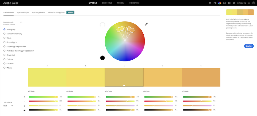
Source: Adobe Color
Coolors.co
Coolors.co is a very professional color sampler. It has numerous options in the Standard version and in the Pro version. It allows you to select a color palette based on images, but not only. You can specify one base color, lock it in, and use the spacebar to mix colors and choose matching colors for your palette. In addition to the color, you can also choose its hue. If you're looking for an advanced tool, you've just hit the jackpot!
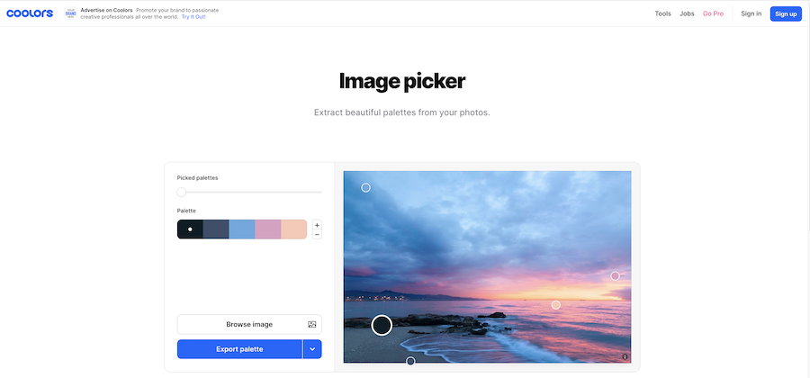
Source: Coolors.co
Paletton
Paletton is a color palette selection tool very similar to Adobe Color. One of the major differences is the fact that Palleton can select colors for more than five hues. It's the perfect tool if you've already chosen your primary colors but are looking for the ideal match for your complementary palette.
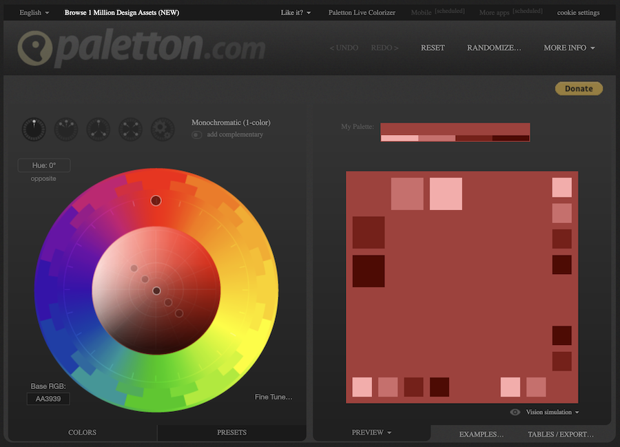
Source: Paletton
Colormind.io
Every designer, at least once in their life, has had a situation when, upon seeing a given painting or view, they thought "I would like to have these colors in my project." Colormind is a tool that helps in such cases. This color palette generator can try out and create a palette based on the colors of an uploaded photo.
Colormind is one of the most interesting tools using deep learning.
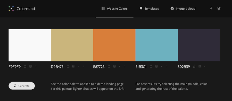
Source: Colormind.io
Color scheme for the website – summary
The website colors are one of the most important issues that need to be determined at the early stage of design. As you can see, this isn't an easy task at all. Sometimes searching for the perfect colors to organize information on a web page requires time and knowledge. Fortunately, there are tools that can inspire you to create a design that catches the users’ attention.
If you want the web page colors to be visually attractive and useful, it's worth considering the UX/UI design at the website planning stage. Our design team will help you choose the right color scheme and other elements that will translate into a coherent and refined design.