10 Startup Websites that Stand Out with Their Design

Do you dream of a website for your startup that will "pull" users deeper and deeper? A unique and at the same time functional page isn't only a showcase of the company, but also a business tool that allows you to present the product of a new company and gain clients. Minimalism is in fashion, but that doesn't mean you can't design a site with a few surprises for your audience. Check out 10 startup websites that may be an inspiration for your new website.
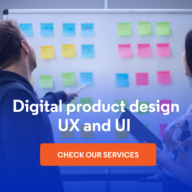
Creating a business website
Building a web page for business doesn't always have to equal a large expense. Microenterprises and small businesses often choose to create a corporate website without coding, using one of the many website builders available on the market. If you have a limited budget to build your startup website, but you want to create new subpages by yourself, modify the existing ones and develop the page using your own skills, you should consider such a tool.
If you dream of more advanced solutions (e.g. introducing dynamic animations or gamification elements), you can create a basic version of the website on your own, and then hire an experienced Drupal agency, which will add more complex solutions when your business is dynamically developing.
As a startup you should focus on:
- creating a clear interface,
- preparing an interesting visual identification,
- clear and understandable presentation of the offer,
- using social proofs, videos, and animations to increase the clients' trust in your brand,
- building a page that's easy to position,
- designing a good UX and UI of the company website.
You're probably wondering what's website UX design and whether it's really so important to positively surprise the audience of the site. Yes – making a good impression on the user is extremely important. Below, I'll explain why.
Why is startup website design important?
Interesting web page design is important for any company – especially a startup. In the business world, the website is the showcase of a particular company. A company website isn't only a few subpages with a detailed offer and contact details. By choosing the right design, you have the chance to present the values that are important to your brand. A potential client or investor is looking for companies sharing common values with them. Show them what's important to you and increase the chance of working together.
A well-thought-out and expressive design should be extremely important for a startup, primarily because a new company must clearly and quickly present its product and reach clients. By definition, a startup is a young company that's still working on its services, as well as their form and quality. Usually, these types of companies are considered innovative and creative, but being inexperienced, they must present a professional image from the very start.
Appropriate website design helps to achieve various business goals, such as building the company's image or clients' trust. By creating a functional page, a startup may significantly increase sales, primarily by adding an additional channel for communication with potential clients. By investing in an interesting page that'll attract people, you can reduce future advertising expenditure (keep in mind that startups usually don't have a huge budget).
New companies have to work hard on positioning to compete with their experienced competitors, and an interesting design can generate a lot of website traffic and make the intrigued users stay on the page longer, which will indirectly affect its positioning and develop the brand awareness among clients.
Inspirational websites of startups
The current minimalist trends seem to be still strong in the website design. This doesn't mean, however, that startups don't use unusual animations and colors. Here are 10 websites with good design that also impress with their practicality.
1. ZOOX
The website design of the ZOOX startup, which creates modern, autonomous, automated city vehicles, focuses on the product from start to finish. Immediately after loading the page, we see a video in the background. This element immediately draws the user into the world of the product and indicates what this website is about. However, if the user wants to go straight to the home page, they can skip the video using the visible skip button.
Source: Zoox
The entire home page is full of dynamic, surprising animations. In the center, there's a vehicle – the interactive graphic elements allow us to look inside it through the roof and see the entire interior. As we move the cursor towards the roof of the vehicle, the outdoor scenery changes from day to night. One of the animations describes in detail the construction of the car, indicating the key elements. We can also watch various videos showing the construction and operation of the vehicle.
Even despite the large amount of animations, the design is still minimalist. There's little content to see – only slogans and uncomplicated short descriptions that clearly express the purpose of the startup: to create a reliable, autonomous vehicle for the comfort and safety of travelers.
2. Gutter Cat Gang
The startup that built the Gutter Cat Gang DAO website uses NFTs (non-fungible tokens) with a certain value. These tokens give the members of the Gutter Cat Gang community the opportunity to vote on specific topics such as community initiatives and ventures. Gutter Cat Gang DAO works with various existing companies and brands via Gutter Labs. This organization allows the community to conduct various operations in the real world.
The non-standard approach to animation reflects the modern approach to business. The movement of the graphic elements on the page may be shocking at first, and the user's sense of vertical and horizontal directions may be disturbed because the movable sliders with images of cats are placed diagonally here. This seems chaotic at first glance only – when browsing the startup website, we quickly realize how carefully planned the use of every free space is. The page of this company brings to mind a game interface, even the cursor has an original look.
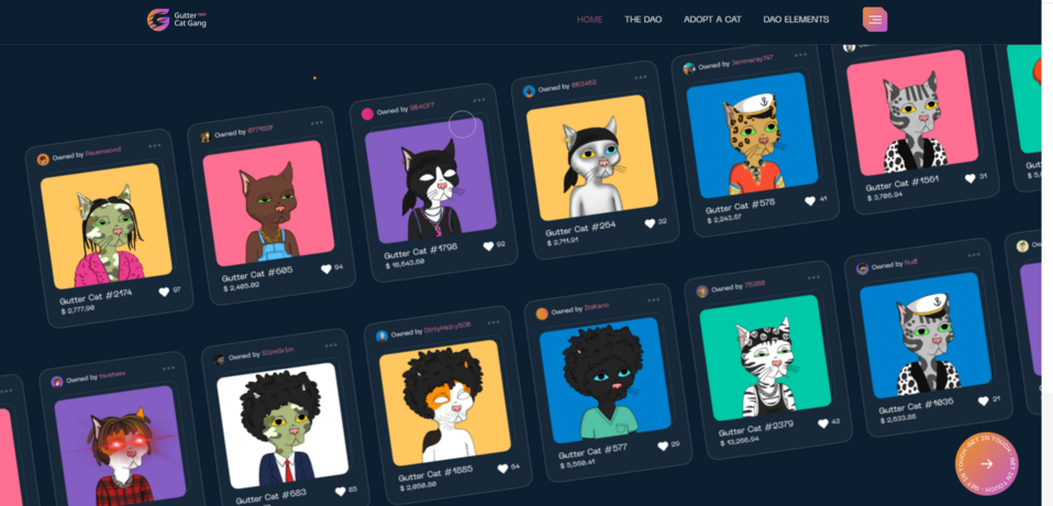
Source: Gutter Cat Gang DAO
Every attempt to select a few elements or move the cursor on the page reveals hidden content, which there is tons of. The startup's business idea itself is quite complex, so its founders make every effort to explain to potential clients what it's all about.
3. Kimi Aviation
The Kimi Aviation company organizes private plane transport for individual clients. The website is quite minimalistic and its purpose is to encourage the potential client to establish direct contact with the representatives of the organization.
The website design is consistent with what the company does. When browsing the page, we already feel like we’re on a flight because in the background we see a video showing a view of the clouds from above and other animations showing the landscape that a traveler may see during a flight.
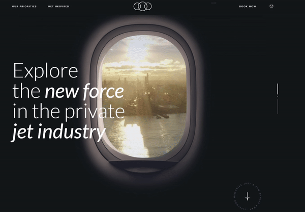
Source: Kimi Aviation
As we scroll the pages, the headlines and graphic elements that pass before our eyes also give the impression of movement. Animations and videos are creatively integrated into the website. Also, well-thought-out is the placing of social media icons, which after clicking redirect us to the company's profiles on Facebook and Instagram. They are visible, but don't interfere with browsing and receiving the content.
4. Core Studio
Corebook is a company that offers a tool for creating a visual identity for a brand, corporate identity guidelines, etc. We put Core Studio – the Corebook tool extension's page – on our list. Everyone should see the creative presentation of the company logo at the top of the home page, driven by scrolling down the content. The logo is hidden in a stone resembling a piece of coal. It's probably a reference to a diamond. The designers of the page evidently understood the importance of a good call to action. From the very beginning, we are encouraged to delve into the website content by the slogans on the two visible buttons: explore and book a demo.
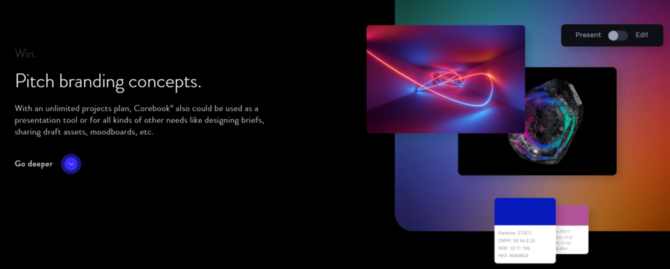
The authors of the Corebook page have created an interesting solution for those users who don't like reading long texts. They can listen to an audio file with information about the company's tools and mission. On the Core Studio website, however, we see a video showing the operation of the tool, as an alternative to extensive descriptions of functionalities. If we decide, however, to browse the page, we'll see dynamic animations showing the tool's operation. This solution means that a potential client can immediately see some interesting functionalities of the tool and extensions before deciding to buy a trial version.
5. Sarah Guo
Sarah Guo is a venture capitalist from Greylock. She becomes a business partner of startups with interesting – but risky from a financial point of view – ideas for a business based on software development.
Maintaining the user's interest while loading more complex pages isn't easy, as users lose patience very quickly. While Sarah Guo's website is loading, the user can see the text hidden behind the background when they move the cursor. The cursor has the shape of a large circle that changes the color of the fill as it moves through the various sections, which in itself attracts the attention of the user enough for the page to load.
The large circle-shaped cursor on Sarah Guo's website
There are many moving animations on the website. The menu buttons create a circle when switching between the subpages. When we get to the end of the page, we'll find the blog post section. When scrolling, we scroll horizontally the list of entries – this way we can conveniently view the content of the blog without going to its page.
6. Contra
Contra is a freelance community website where professionals from various fields can present their skills, as well as describe and sell services. The home page of the brand impresses with animations and moving headlines. We focused, however, on the subpage design for The State of Independence 2021 report on freelancing development.
The animation at the top of the page, although simple, can hold the user for a few good seconds. It resembles a solar eclipse, and the lighter element can be moved so that it protrudes from behind the dark one from different sides. Subsequent animations enhance the impression of the page's spaciousness and depth. As we scroll up, at the bottom of the page appear the buttons that allow moving quickly between the report chapters. At the same time, in the upper part of the website, we always see the button that allows downloading the report.
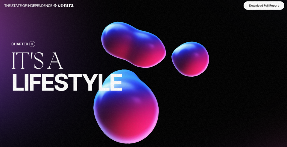
Source: The State of Independence 2021
The authors of the report also presented selected statistics in an interesting way. Instead of wasting space on the page by publishing numerous graphs, they created a dynamic graph, the elements of which change their values and size when the user selects a different field or query for which they would like to see the results. This website proves that you can present your research results in an exceptionally creative way.
7. Passbase
Passbase is a startup that offers solutions increasing user safety on the web (e.g. multi-stage verification). The creators of the website opted for bright colors and a relatively large amount of text. To give more lightness, they used the possibility of separating text blocks into columns. Thanks to this simple method, the order is maintained even with a large amount of content on the website. The descriptions of services and products have been supplemented by animated diagrams that show the operation of some solutions and the company's concept in an interesting and simple way.
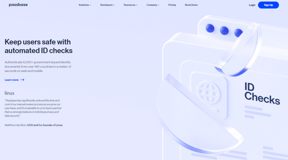
Source: Passbase
There are also interactive elements on the website, thanks to which the involvement of the user can be increased, and original graphics on some subpages. They make the site look interesting.
8. Fussy
Fussy is a startup that offers the possibility to compose and purchase a deodorant in eco-friendly plastic-free packaging that can be refilled with a cosmetic. In addition to an interesting product, the company can boast a well-thought-out website design. It contains short slogans instead of long descriptions, thanks to which the message is clear and the page doesn't seem chaotic. Strong colors emphasize individual sections: the blog and redirect to the store, making it easier for the user to find the most important places on the website. Dynamic animations also make navigation easier.
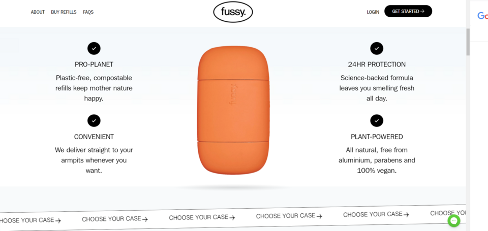
Source: Fussy
The skillful use of pop-ups is also striking. On the other startup sites on our list, the messages and forms that weren't a permanent part of the page were less visible. In the case of the Fussy company’ss website, the pop-ups that appear don't disturb the reception of the page, and the button to disable them is clearly visible. An interesting idea is also the division of the purchasing process into stages, during which the client receives order personalization tools.
9. Vectornator
The Vectornator startup offers an illustration creation tool. As on many other pages mentioned by us, dark colors are dominant here also. Immediately after opening the website, before we take any action, we see a clear call to action. The functionalities of this tool are presented and described throughout the whole page.
After entering the website, we are shown an unconventional graphic and a brief description of the illustration creation software. When we start scrolling the page, the image will start to zoom out and we'll see that what we were looking at is the visualization of a laptop screen which we are now seeing in all its glory, along with the tools coming from the illustration software.
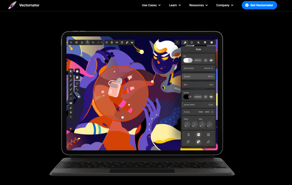
Source: Vectornator
An interesting idea is also putting the amazing illustrations created with the Vectornator software between the descriptions of the moving gallery. Below we'll find the buttons that allow switching between the animations.
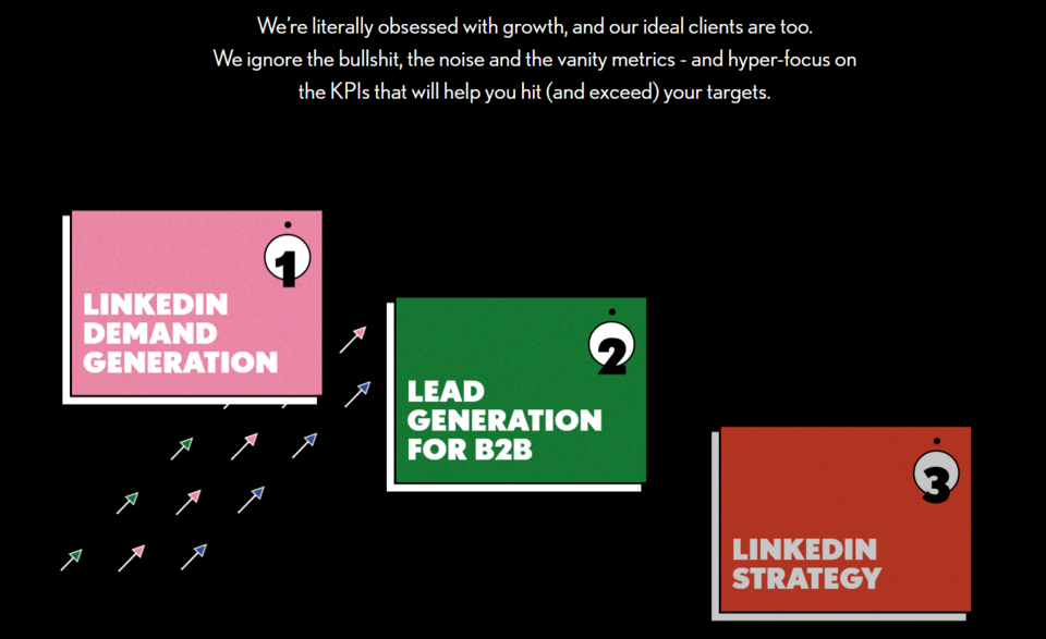
10. Remotion
The website of the Remotion advertising agency, specializing in creating and running campaigns on LinkedIn, uses the contrast between white and black, thanks to which all information is very visible. From the very beginning, we're encouraged by the visible get proposal CTA to contact them directly for a personalized offer.
By choosing only two highly contrasting colors for the background, publishing the animations and graphics doesn't disturb the consistency of the website. Nevertheless, the page's creators added elements sparingly. They are an add-on that adds dynamism to the site but doesn't dominate it.
Source: Remotion
An important part of the page are the clients' reviews presented against a black background, without any additional distracting elements. The company managed to create a clear message and minimalist design on its page.
Building a startup website in Droopler
Droopler allows creating a responsive website quickly, easily, and for free. It's a great choice if you want to have full control over your page. This website builder will be suitable for entrepreneurs lacking technical skills, as it allows building a company web page for a startup from ready-made components. You compose the website design by selecting elements such as graphics, headers, texts, and then indicate the appropriate area for them on the page.
The main advantage of Droopler is that, on the one hand, it's easy to use, but at the same time, it taps into the power of a modern Drupal engine. It offers great options for personalizing a website by enabling at least some of the solutions used by the startups from our list, for example:
- Using the Banner Paragraph element, where you can put a video in the background of a subpage, or Sidebar Embed Paragraph, where you can place a video (by pasting a link from YouTube) or an interactive map on one side, and text on the other.
- Adding a Counters Paragraph, that is dynamic meters that show the numbers important for the company (e.g. sales statistics).
- Introducing a carousel composed of many elements, e.g. text or graphics that move when the user moves the cursor or without the user intervention, and various types of galleries.
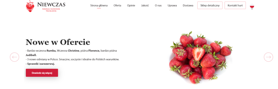
The carousel on the Strawberry Plant Nursery Niewczas website, created using Droopler
These are just a few examples of the solutions that'll make your startup website more attractive. You can introduce many non-standard functionalities to a page, using additional modules and system extensions. You can do this at any stage of your website development because Droopler allows creating an unlimited number of subpages and sections in any order.
Start building a basic version of the website for your startup with Droopler, and over time you'll be able to easily expand it. If you don't know where to start and want us to help you with your company page, check out our Drupal development services.