What is Parallax Scrolling Website? Examples of Engaging Websites
Parallax is firmly established on the Internet, attracting more and more designers, and is one of the web design trends. The effect was first used in animations and video games such as Super Mario Bros. However, it was only in 2011 that it penetrated the Internet with the introduction of HTML5. Through minor manipulation of graphic elements, the parallax effect can bring a design to life and draw the user into the stories presented on a given website.
What is a parallax scrolling website?
A typical website with a parallax effect is one in which the background of the website moves slower than the elements in the foreground. The visual effect we’re able to achieve gives the impression of movement and depth as if there is space between the foreground and background. At present, designers use parallax to achieve a variety of effects, such as enlarging or reducing components, fading in and out, or rotating 2D or 3D elements.
Examples of parallax websites
As the success of the parallax effect depends on the loading time of the website, it’s recommended for smaller websites. This is a great way to showcase an original landing page for a new product such as a new model of shoes, breakfast cereal, or a new car. For larger projects, subtle parallaxes are recommended to minimize the load on the website and not affect loading times. Designers and front-end developers also use parallaxes to demonstrate their level of expertise and rich imagination.
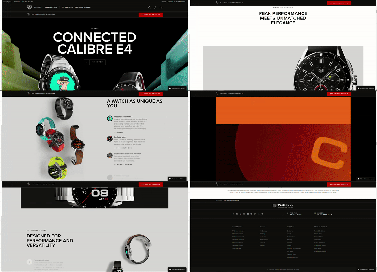
1. TAG Heuer
The website of Tag Heuer is a great example of the use of parallax for a multi-dimensional product presentation - unique watches. It uses 3D models that appear, rotate, and respond to scrolling down the website. In this way, the user can familiarize themselves with the strengths of the presented product. The typography is also interesting - large captions complement the product presentations, making it seem like a TV commercial.
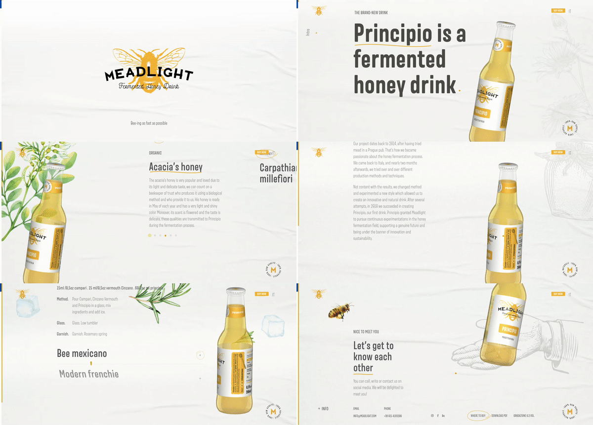
2. Meadlight
The Meadlight website is an enjoyable presentation of a honey drink. Parallax has been used here in several ways. In addition to the rotating bottle that accompanies us down the website, the designers also used parallax in the relationship of the typography to the background. These tricks make the website appear very light, with a huge amount of space between the elements.
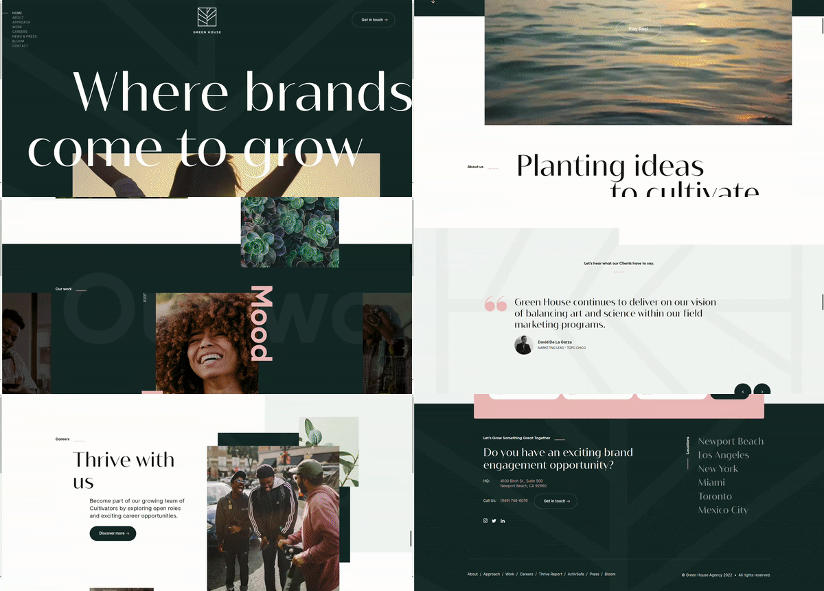
3. Greenhouse Agency
Sometimes parallax is an effect that gently makes the website appear lighter. This is a very good trick if the designer opts for large graphic elements and expressive typography, as in the case of Greenhouse Agency, which supports brands with marketing and sales activities.
4. Okalpha
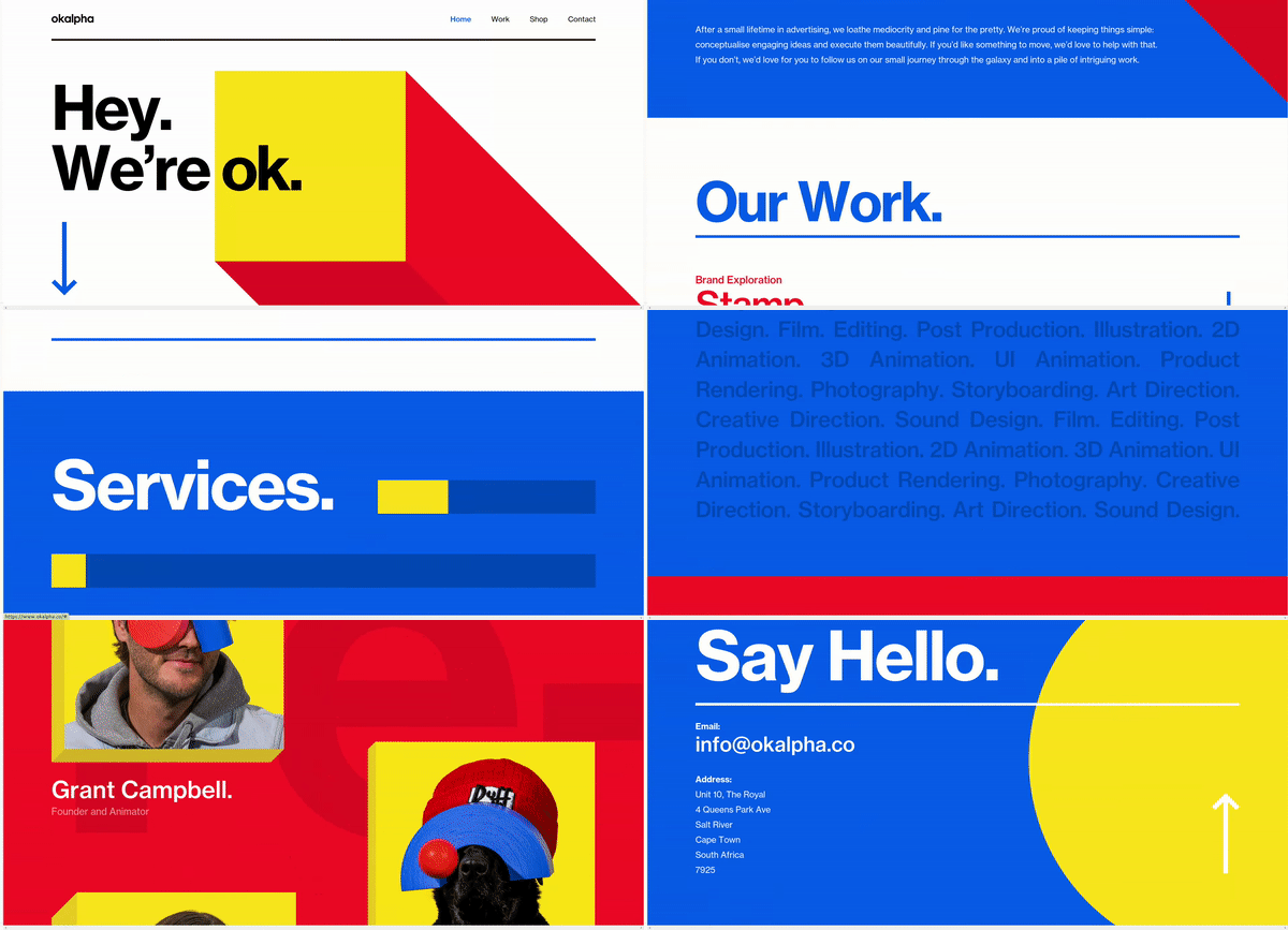
On the website of Okalpha - an animation studio - the designers used huge geometric elements in flashy colors. Parallax, on the other hand, was used as a way of animating the geometry, which retreats as the website moves, giving space to the texts.
5. Longshot
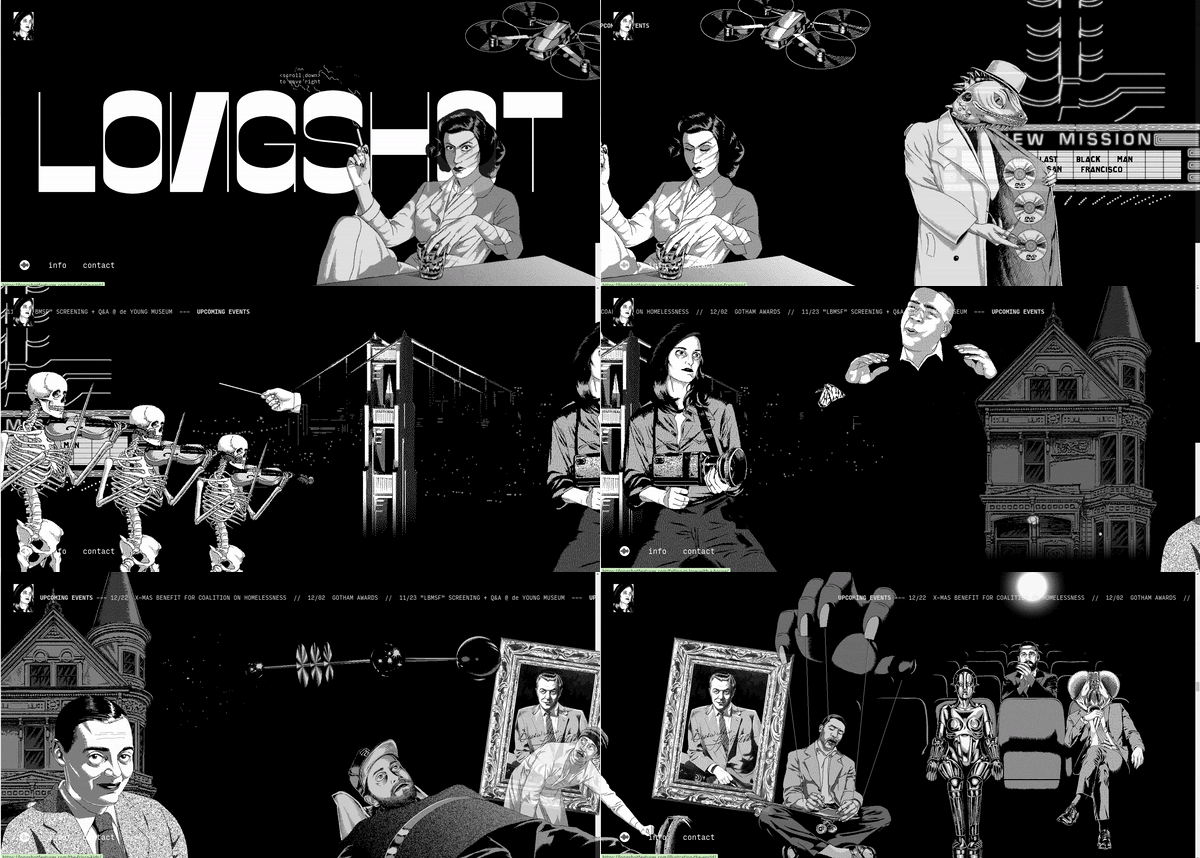
The Longshot Film production studio uses horizontal parallax to present illustrations, achieving a spatial comic book. This peculiar menu leads to a portfolio of artists' works. In the case of this website, parallaxes have been used at various levels, introducing the viewer to the atmosphere of discovering new elements.
6. The Goonies
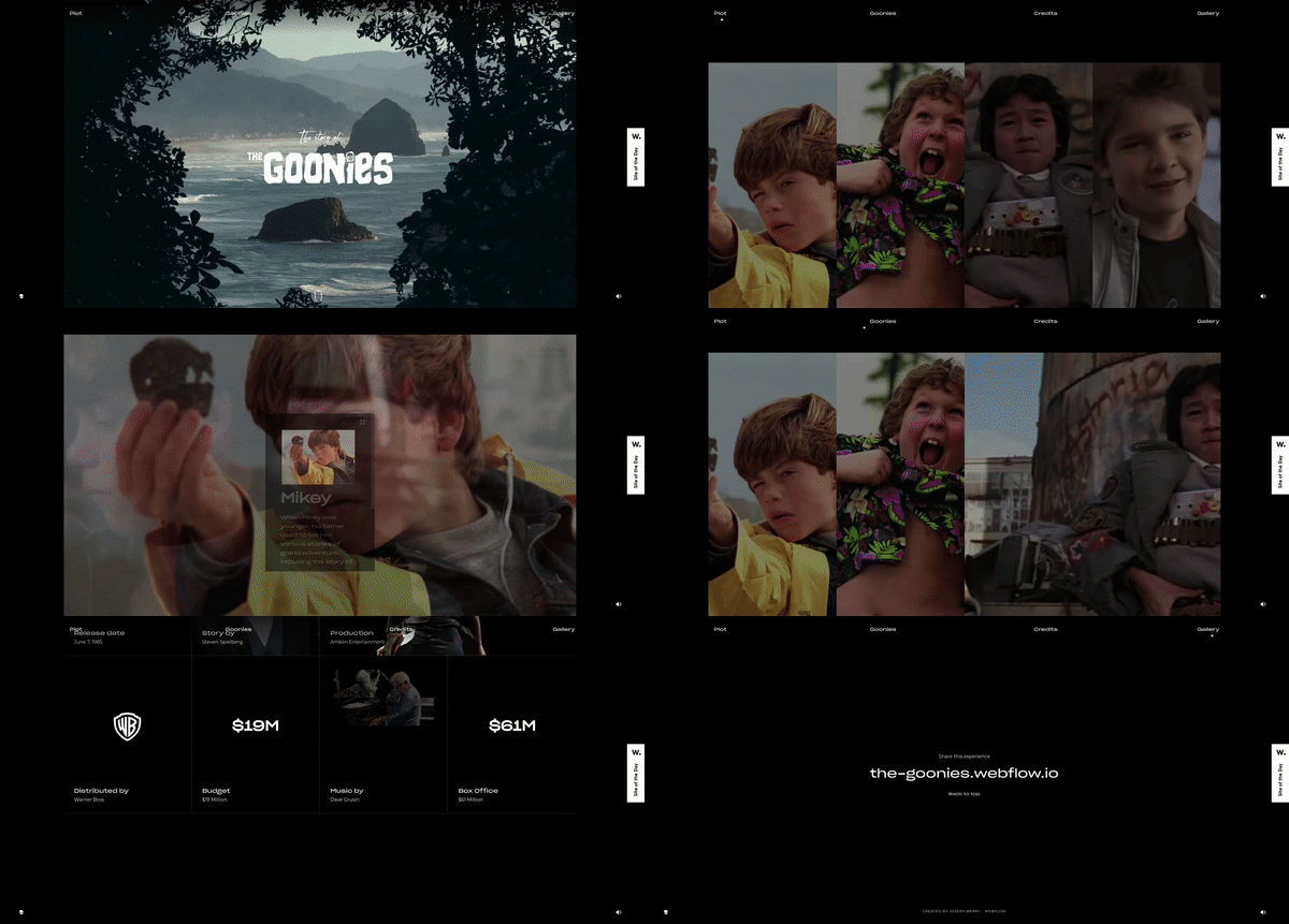
The website for the movie - The Goonies uses parallax in several planes, and the third plane is a fixed element that doesn’t move. In the layer with the scrubs, the designers used a zoom effect when scrolling, which automatically gives the impression that we’re approaching the view behind them. In addition, by fading out, the logo gives way to a layer with the text. These types of effects are very easy to produce, and user involvement is much greater.
7. Custo
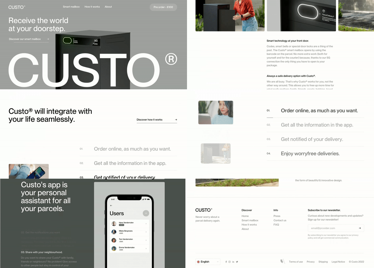
Custo is a classic website dedicated to the presentation of a product - a smart mailbox. The movement when scrolling through the website is very subtle, but this gives the impression of a dynamic website and reinforces the impression of high-quality technology. Parallax has been used to present the features of the product. The left-hand side of the screen shows views of the application, while the right-hand side shows descriptions of the functions. In this way, the user pays more attention to the information that the website's authors want to convey.
8. Porsche
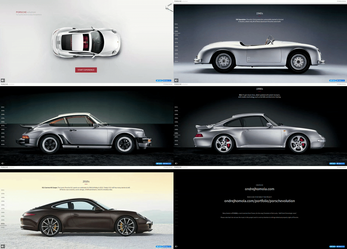
An interesting idea for the use of parallax is all kinds of history websites, where the main element is the timeline. Porsche has created a beautiful website showcasing successive models of the car, starting in 1920. As we move down the website, each of our movements reveals further images, passing from the bottom, showing how the cars have changed over the decades. The prerequisite for the success of such parallax is undoubtedly that the photographs are taken similarly and that the objects are of the same size. Then we have the feeling of replacing the product.
9. Anton & Irene
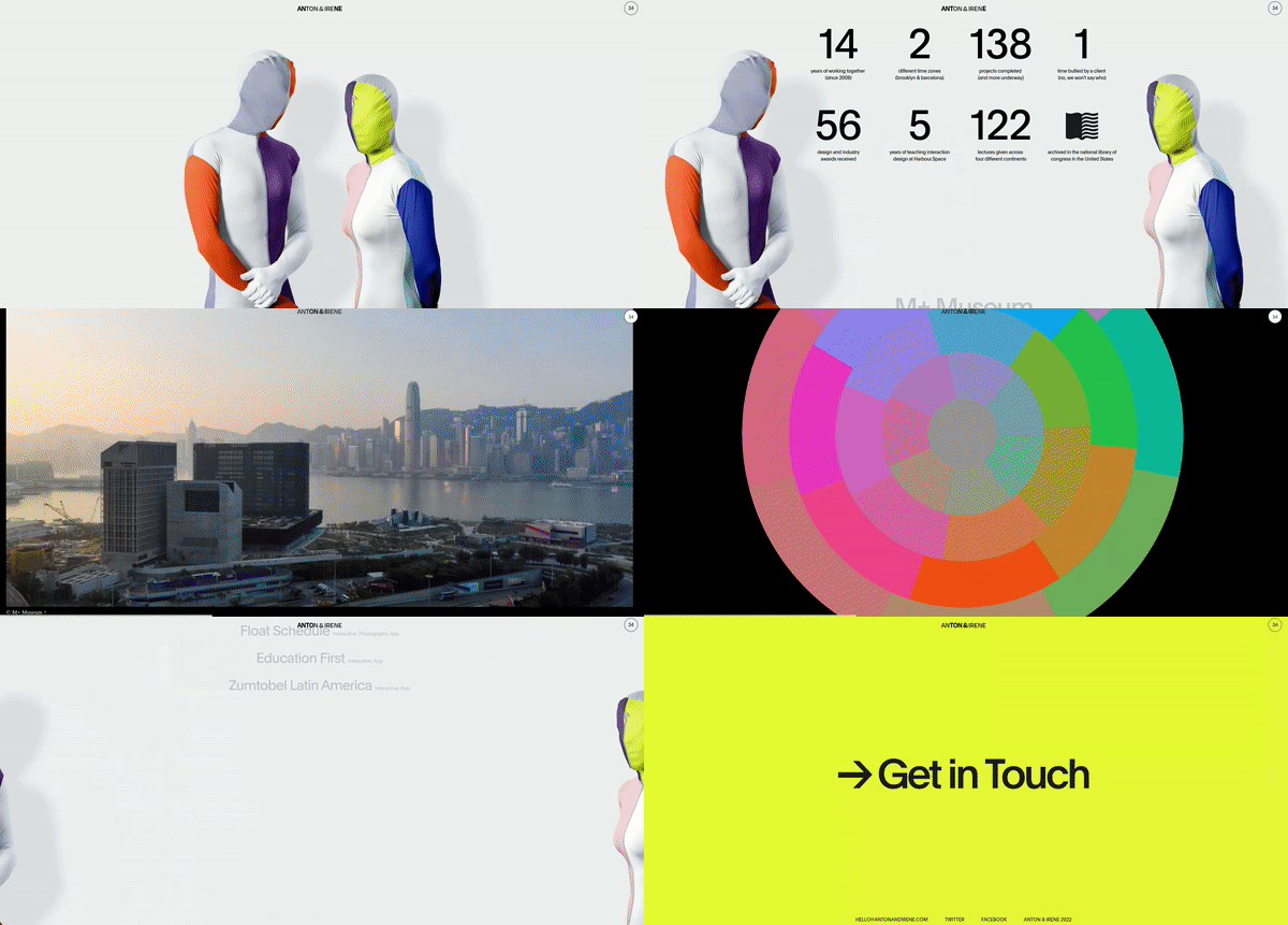
Visual artists have a very difficult task when they want to present their portfolio online. The websites on which they present themselves and their works shall demonstrate an infinite imagination and sense of taste. Anton & Irene - the artistic directors - made the website using parallax, which moves them away as if they were presenting something on a blackboard. The shadows behind their figures and the parallax moving the figures sideways create a beautiful impression of the space behind and between them.
10. Dior by Starck
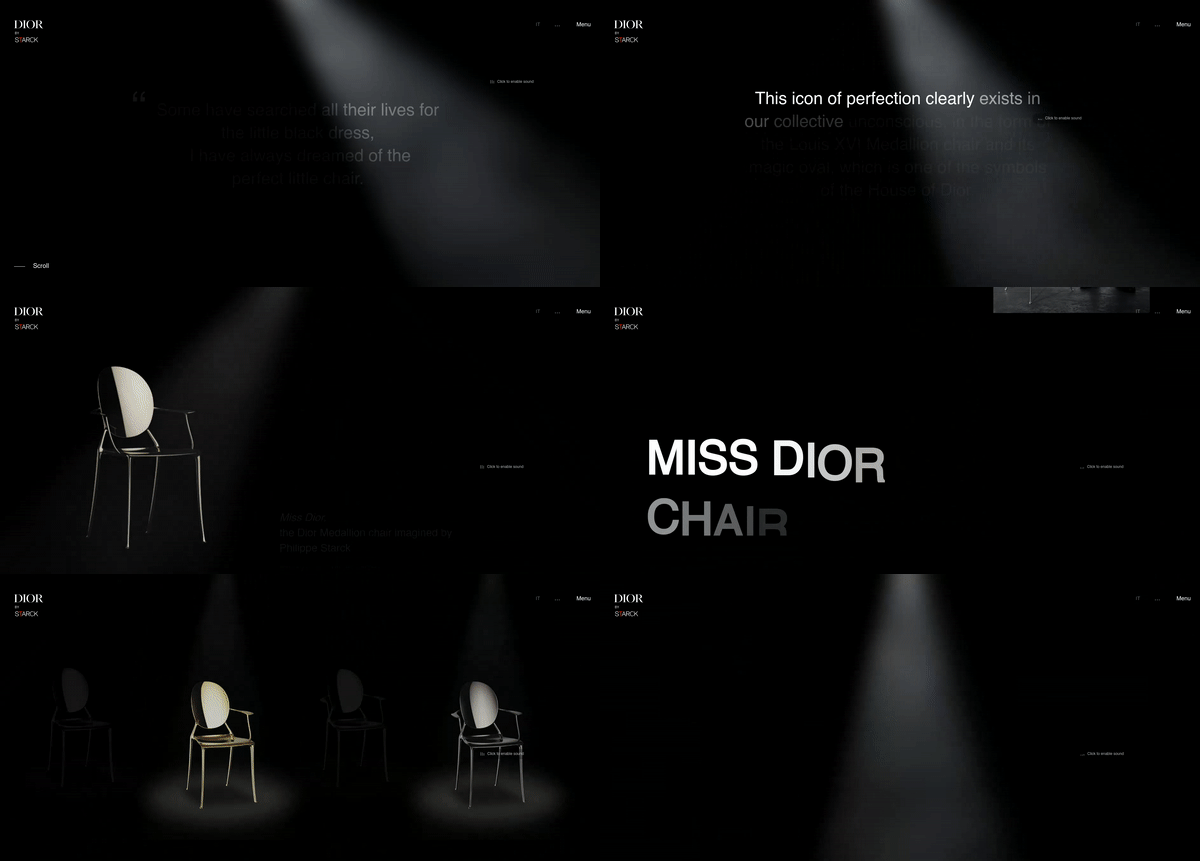
The authors of this website used parallax to create a peculiar story about the creation of a unique chair. As users move down the website, they are drawn into the story with the help of appearing captions, lights, text, and images. All we see are the images moving against each other and the use of transparency.
11. Blok Watches
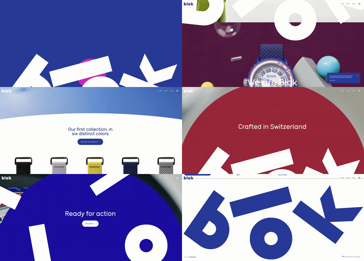
This is another product website, this time featuring watches for kids. The designers used a play on letters and decided to set them in motion using parallax. To enhance the effect, the artists used animation of the watches together with 3D elements, scrolling in relation to the adjacent paragraphs. This gives the whole website a light, spatial, and even three-dimensional effect.
Parallax scrolling website - summary
We’ve seen 11 websites with different applications of parallax. Some were just light animation, enriching and giving lightness to the website, while others told stories and drew us into their world like a movie or a computer game. This shows how much potential web designers have gained by applying a very old principle of building animation. However, it’s important to remember that this type of solution works well on desktop versions of websites. The second aspect that will ensure the success of such a solution is the amount of information we want to convey. If we know that there will be more information on our web page, it’s better for the transitions and animations to be softer and serve to improve dynamics and create space.
Are you wondering if the parallax is a good solution for your website? Our UX and UI design team will analyze your project and advise you on which effects are worth incorporating.


