13 Landing Page Tips That Will Help You Boost Conversions on Your Pages

Want to learn how to create a landing page that will help you achieve your company's goals? Are you planning to design an LP, or maybe you already have a subpage that needs optimization? The tips we'll share with you will make it easier for you to increase conversions. Read our article and see how to create landing pages that convert.
Landing page conversions - what level should they keep?
The reason for creating a landing page is to achieve conversions at the right level. The specific goal depends on the landing page type. It may be designed to convince Internet users to sign up for a newsletter, use a trial version of a product, make a purchase, etc.
The average landing page conversion rate is 2.35%. The top one-fourth of landing pages score above 5.31%. If your website scores below average, you should consider implementing changes to it. You can start by looking at what landing page elements that increase its effectiveness may be missing. Then, make sure you stick to best practices for building and creating content for landing pages that positively impact conversions.
1. Adopt one goal for the landing page
To maximize the plan, you should eliminate elements that distract the user. A landing page that converts should have an intuitive and short path leading to a key location on the website (such as a call to action button or form). If you want to have several marketing campaigns, create a new landing page for each goal you want to achieve.
Some content may distract the user from achieving the action the website developer intended. Remove information or functionality that diverts the Internet user and then guide them to a specific goal.
2. Avoid overloading the landing page with content
The landing page should make the user complete the set goal as quickly as possible. Extensive descriptions unnecessarily slow them down while browsing the website. It’s also likely that the web page visitor will tire of reading. To avoid this, create texts that are concise and specific.
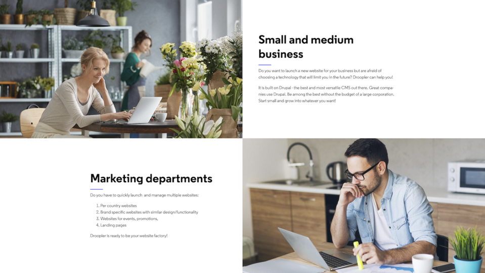
Example of landing page about Droopler tool with short content presentation
Research by The Ubounce shows that landings with shorter content have better conversions. How can you design according to the “less is more” principle? Use intriguing headlines, and present the benefits of your offer in slogans and graphics whenever possible.
3. Make the contact form as simple as possible
The most popular landing page tips indicate that the simpler the form, the more likely the user is to fill it out. Limiting the fields has a positive effect on conversions. So, ask only for the data you really need. Internet users don’t want to waste their time providing information they feel is unnecessary for your business. They’re also often concerned about their data security.
When designing, think about where to put the form on a landing page. Consider inserting it in the hero section (that is, in a place immediately visible when you enter the page), on the right side (it will always be visible), or in the footer. And remember to ensure this element is responsive so that it displays well on computers and mobile phones.
4. Ensure brand credibility
According to BigCommerce, 72% of consumers say that positive customer testimonials increase their trust in a brand. When planning landing page design, making room for a section with comments from satisfied customers is worthwhile.
Testimonials should consist of a review, name, surname (and position if the landing is aimed at business clients), and a photo of the statement's author. This way you can show website visitors that the content is authentic and comes from people who have actually used the company's offerings.
You can also add social proof to the landing page in the form of logos of partner companies or information about the awards (e.g., software awards for the best UX design).
5. Make the CTA stand out from other elements
CTAs are one of the essential elements of landing pages. Among the tips for high-converting landing page is to design a visible and compelling call to action. You can easily achieve it by choosing an intense color for the button that will contrast strongly with the web page's background, while remaining consistent with the branding.
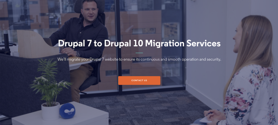
Example of a contrasting CTA button from a landing page on Droptica.com
Reviewing good CTA button examples, you’ll notice that a large button size has two advantages. Not only does it minimize the likelihood of overlooking it, but it also makes it more convenient to click on a mobile device. You can also bet on an unusual shape. It could be a star, a shopping cart, a shopping bag, or any other symbol associated with the process that initiates a click while remaining in line with your brand identity.
As with the form, it’s also worth considering the possible location of the CTA (the button can be placed in the hero section, in pop-ups, on the right side of the website, for example). Conversion-optimized landing pages often have multiple CTA buttons in different places.
6. Offer additional value to users
Potential customers usually have to be persuaded to realize an action the company cares about. It's worth offering them added value or eliminating the elements that cause objections in order to achieve your business goal faster.
Internet users are more likely to fill out a form if you offer them something in return, such as a discount code, a free e-book, or a 2-in-1 promotion. If you want to make a sale, you can also encourage customers in other ways. Provide them free delivery or a complimentary product, which will be available if they purchase within a particular time or for a specific amount.
7. Indicate the value above the fold line
You should highlight the advantages of your offer on the web page as soon as possible. Whether it's the benefits, the additional values, or the opportunities for practical use of the product, mention it above the fold line. This is the part of the website you see immediately after entering - the equivalent of the first page of a folded newspaper. The user will quickly notice this information and can easily return to it.
It's also a good idea to include a call-to-action button in the offer values section. This allows the user to click on it immediately when they feel convinced instead of searching for other contact options or a CTA button below the fold line.
8. Consider removing the main menu
The goal of a landing page is to get the user interested in a product or service and keep them on the website until they complete the main action set up by the company (conversion). The presence of a main menu organizes the web page content but can sometimes cause the viewer to explore it for too long and lose interest in taking action.
The menu on the landing page allows you to jump between its sections. This can lead not so much to user distraction as to miss some of the content. If you want to avoid this, ensure that the only way to navigate the landing page is by scrolling through the content.
9. Resolve the doubts in FAQs
When doubts and questions arise that you don't answer on the website, potential customers may abandon the activity you want to convince them to do. There's a simple solution to this - anticipate what information Internet users might be interested in and provide a comprehensive explanation.
You can collect the most frequently asked questions in the FAQ section of your landing page. This way, you’ll present all vital information in one place. Users won't be annoyed that they can't find them, increasing the likelihood that their visit to the landing page will result in a conversion.
10. Follow landing page SEO tips
It's hard to expect the number of visitors who complete your desired action to be high if few Internet users visit your landing page. Many factors affect your website's search engine visibility. Follow website and landing page SEO tips to appear in search results and achieve higher rankings.
It’s necessary to choose the correct key phrases to position the page and use the proper headings. You should also remember to optimize the landing page for mobile devices. Google robots pay attention to a good user experience and verify the developed content's quality.
11. Make it easy for the user to contact the company
It may happen that a visitor to a landing page, despite the FAQ section or comprehensive descriptions of an offer, doesn’t find all the information necessary to make a purchasing decision or to fill out a form. This may even lead to leaving the web page.
You can prevent this action by ensuring that the user can communicate with your employees, for example, through a contact form. Even better will be to answer their questions in real-time and convince them to purchase. You can do this by integrating a chatbot or live chat with your landing page.
12. Take advantage of content personalization
You can enhance your landing page. Tips are often about improving the user experience. You can dynamize several elements to affect conversions indirectly by turning ordinary browsing into an enjoyable activity.
Display messages tailored to users' activities or profiles. Personalizing web content involves tailoring a direct return to the website visitor, recommending specific services to them, or showing content consistent with their expectations. Personalized messages are made possible by collecting and processing data of users visiting your web page.
13. Perform A/B testing when optimizing a landing page
Increasing conversions is also possible by performing A/B tests. Without them, you can only rely on intuition and your knowledge, and these, as you know, are sometimes unreliable, as user preferences depend on many factors and can change over time.
With A/B testing, you can compare the effectiveness of several versions of the same item. The process involves determining which of two digital product variants (such as a website) better achieves the desired goal. The test versions always differ in only one element. This way, you can check which CTA, advertising slogan, or graphic works better on the viewer and helps increase conversions.
Why build a landing page in Drupal?
You can quickly create an effective landing page in Drupal. This open source CMS allows you to build simple and complex websites using modules. With their help, you can equip your landing page with engaging functionalities (such as those necessary for online stores). By opting for this technology, you can count on flexibility in shaping your web page according to your individual business needs. Check out the possibilities offered by Drupal.