What Types of Landing Pages are Suitable for Your Company?

A landing page is a standalone web page designed to achieve a specific goal of your company – it may be selling a specific product, establishing contact with the customer, or providing them with useful information. There are various landing pages, some of which help achieve certain goals more effectively than others. The choice of business tools often depends on the industry within which you operate, the product, the service, or the type of your recipients. Learn about various types of landing pages.
Landing page vs website – what's the difference?
A landing page is an independent web page and a very versatile tool that can be used in marketing, advertising, and lead generation campaigns. It is designed with a higher conversion rate in mind and has elements (forms, CTA buttons) that make it easier for users to perform the desired action. Its layout should also minimize any distractions that may divert users' attention from the activities that they should perform on this subpage.
Unlike a regular website, a landing page doesn't have numerous subpages with different functions or classic navigation. Not every page within your site is as highly conversion-focused as a landing page. However, a company website and a landing page can work great together, e.g., a landing page can help promote a product before it becomes available in an online store.
Squeeze pages
Data collection landing pages may have various names, e.g. squeeze pages, capture pages, etc. Their purpose is to obtain the user's contact details (email address) for marketing or sales purposes. Having an email address allows you to send offers, advertisements, and other materials to a potential customer. Of course, the form can be much more extensive and used to collect additional data (on shopping preferences and more), enabling user segmentation and content personalization on the page.
Usually, a form or a call to action (CTA) appears on a landing page for data collection, redirecting the user to the page with a form. Many brands use the so-called gated content, i.e., free content made available after filling out and sending a form. Such a "gift" is an additional incentive for potential customers who hesitate to provide their data. You may offer access to special blog articles, an e-book, online training courses, etc.
A landing page created to obtain information on the customer should be simple and concise. Consider where it's best to put a form. Your call to action, together with the added value of the gift, should be tempting enough to entice the user to submit an email address.
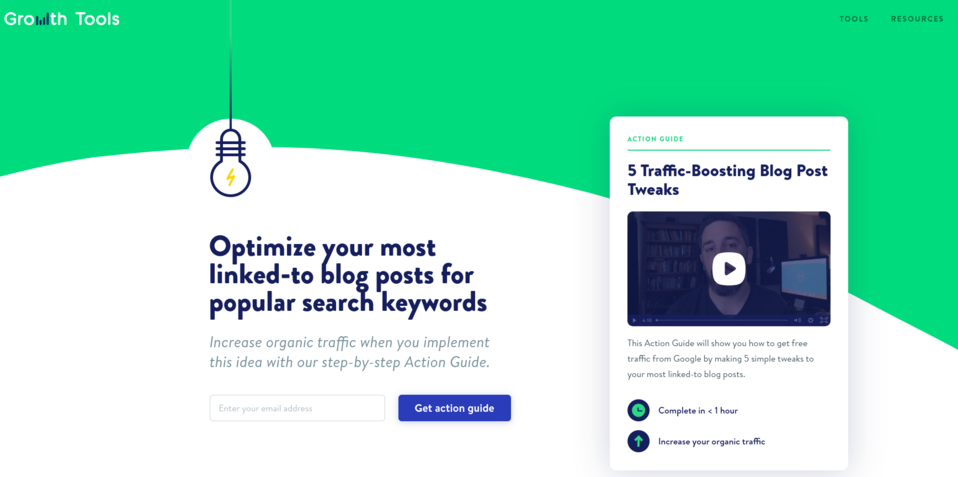
Take a closer look at the Growth Tools landing page. Despite the small amount of content, it explains well what the practical guide on how to get traffic from Google offers the user. The CTA describes exactly what the user will gain in return for submitting their email address. The interesting, aesthetically pleasing design attracts attention. After providing the email address, the user is redirected to a short registration form, and then they can take advantage of the offer.
Web splash pages
Filling out the form isn't always the goal of a landing page. Some landing pages exist solely to improve the user experience and to provide additional impressions or information. Such landing pages may open when you click on a social media link or text. Instead of being sent directly to, for example, an article, the user is directed to a splash page – a welcome page.
A splash page may have various functions. You can ask here for the data necessary for personalization. For example, on a clothing store website, you can ask whether the customer is interested in women's or men's fashion. This type of page can be a virtual announcement informing about an ongoing sale or upcoming trade fairs. Nothing prevents the landing page you create from containing an advertisement that redirects the user to another page when clicked.
The Zara brand uses a splash page to allow the website visitor to choose their language preferences and location. In this way, they can collect the data needed for personalization and provide customers with content in the appropriate language.

Sales landing pages
Sales pages may take many forms. You can focus on a detailed description of the offer, dispelling doubts of potential customers and answering their numerous questions. An alternative is to build a landing page that will evoke specific emotions in potential customers and quickly convince them to take action (trying a trial version or making a purchase). Choosing the right approach often depends on the type of your offer, the industry within which you operate, and the target audience at which you are aiming your landing page.
Pre-order landing pages
When introducing a new product to the market, you don't have to wait to promote it until the full offer is published on your website or in your online store. Build a landing page with information about the product before it's made available to customers.
Publishing the information about the advantages of the new offer gradually can make customers wait impatiently for news and the start of sales. In addition, creating an expectation atmosphere can help increase your range and reach a larger group of recipients, even before the product is available. Such a landing page has an informative function, but it can also help you sell – all you need to do is create an attractive offer for the customers who decide to make a pre-order.
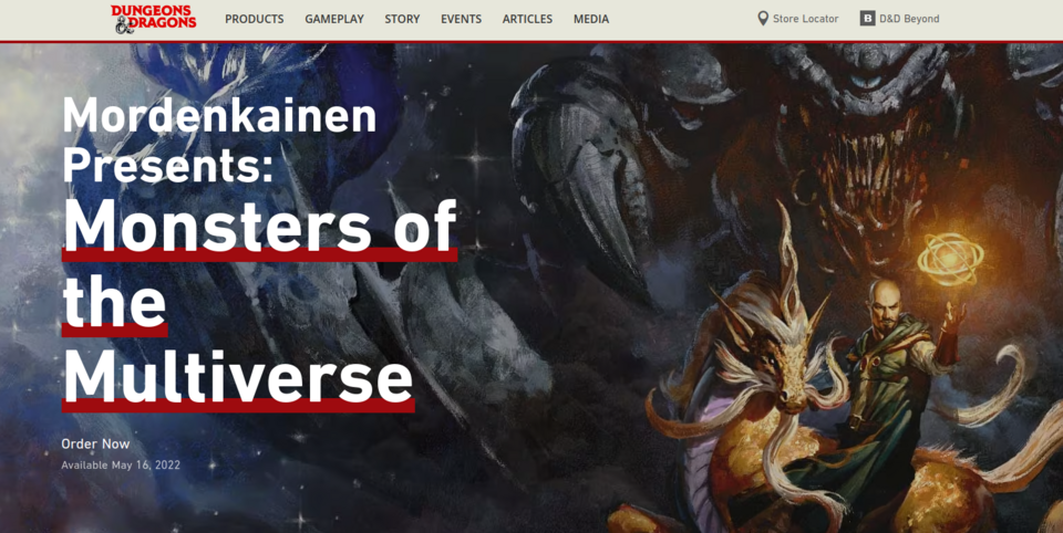
The creators of the Dungeons & Dragons landing page chose an interesting approach by making the Hero section similar to a film poster. Below the main header is information on when the product will be available. In the next section, the customer sees the buttons that lead to numerous sales platforms where they can buy the game. They quickly receive information about the available purchase methods and can complete the transaction. Further down, they can find the detailed product description, video, and additional sections with recommended products and newsletter subscription option (putting the form here is a very good idea). In the game industry, where consumers form communities, the likelihood that they'll fill out the form is high. Thanks to this, even if the user doesn't make the purchase immediately, the brand has a chance to establish a long relationship with them, thanks to the newsletter.
Click-through landing pages
A click-through landing page shows a product's or service's benefits and functions. This allows you to accurately present your offer, dispel the potential customers' doubts and explain what problems your product will solve, even before you ask the interested people to make a purchase. An important part of any landing page is a CTA button that allows the user to take some kind of action.
A landing page of this type is usually designed to encourage the customer to try a free trial version of a tool or service or to arrange a conversation with a seller. After clicking the call to action button, the customer will be taken to another landing page which, for example, provides detailed pricing information and requires payment information to be filled out to start the trial period. Such a procedure allows you to confirm the customer's belief in the high quality of your product or the effectiveness of your services before presenting them with the actual price offer. This is a way to make the ground for the client's decision-making process and lead them to the page where they can choose the best option for themselves or take advantage of a trial period.
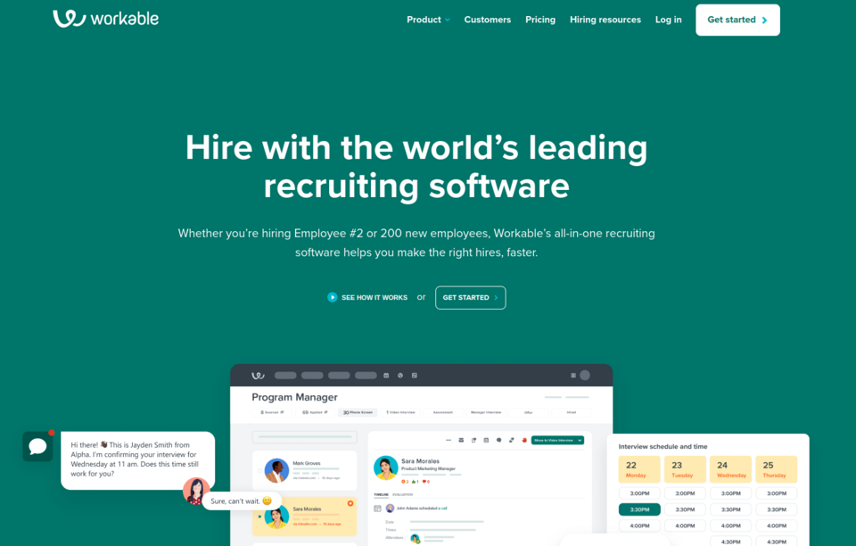
The Workable landing page contains a detailed description of the offered tool. When browsing this page, you'll see graphics showing the solution in action. You'll also find many links to the blog for more detailed information. The page contains descriptions of functionalities and testimonials confirming the effectiveness of the tool. The extensive landing page ends with the large CTA button that encourages you to start a free trial period.
"Get started" landing pages
Contrary to the previously discussed type of landing page, "get started" landing pages have a visible button at the very beginning, encouraging the user to take advantage of your offer immediately. The CTA is at the top, put in a prominent area, next to a very brief description or headline explaining what the tool or product is used for and what the benefits of using it are.
Additional information for hesitant customers may be presented below, but it's the eye-catching Hero section, the catchy headline, and the call-to-action that are most important on these types of landing pages.
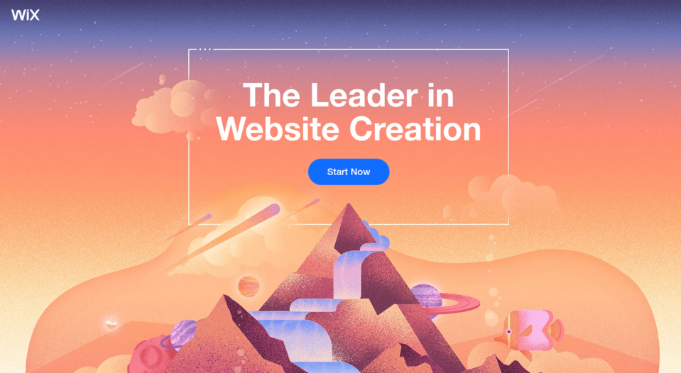
The CTA button on the Wix landing page stands out due to its color and already appears in the Hero section. The header clearly indicates the offered solution, and below is a brief explanation of its functionalities. The CTA button is repeated in every section, constantly motivating the customer to start testing the website builder.
Campaign landing pages
Paid advertisements are used to redirect potential customers to the pages where they can take actions that will bring them closer to purchasing services or products. A landing page can be used not only for sales but also for generating leads. You don't necessarily have to redirect your audience from your advertisements to the websites where they'll make a purchase. Redirect them to a landing page that'll help you achieve your goal (e.g., obtain customer data or present the benefits of a product to them).
Sometimes it's worth creating a landing page for a specific advertising campaign you intend to run at a given moment. Then you can enhance the advertisement's message and achieve your goal.
On Facebook, you can find tons of advertisements that lead to landing pages made for a specific campaign. One of these redirected us to a landing page that encouraged us to try a team management tool. The page includes such elements as the full description of the functionality and testimonials, and clicking the CTA redirects the user to the registration form.
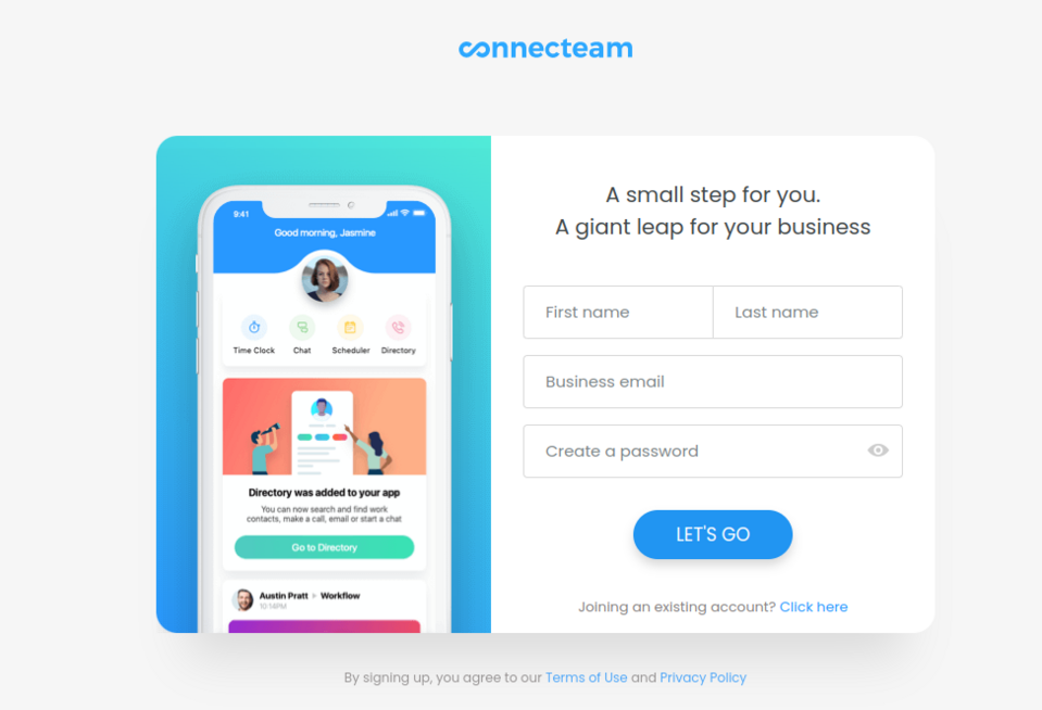
Source: Connecteam
Information landing pages
As we've already mentioned, a landing page doesn't always have to sell. There are also pages of this type that have an informative function. Brands often miss the opportunity to redirect traffic from one subpage to another. Don't make this mistake. It's better to take advantage of the fact that a landing page focuses the recipient's attention on one activity and encourage them to take a specific action.
404 error page
Subpages on websites are being edited or deleted, and it's likely that sooner or later, users will end up at an address that no longer exists. A 404 error message is tantamount to the fact that the customer won't see a given content, but it can be used to evoke positive emotions, improve the user experience, and even recommend other interesting content.
Such a landing page should always redirect visitors to a different subpage or landing page so that the customer doesn't leave your site with negative impressions. Consider the potential customer's needs and what you can offer them in exchange for the page they haven't found. Maybe the customer service support, another article to read, or a subscription to the newsletter?
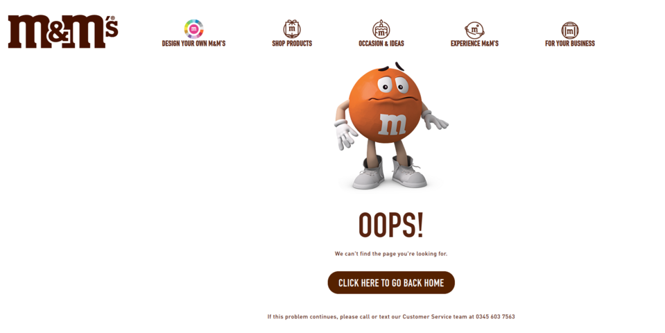
On its 404 page, the M&M's company uses the characters from its advertisements. When you come across such a page, you see a worried character. This simple graphic element enhances M&M's branding and entertains. Below is a large button that allows the user to return to the home page and encouragement to contact customer service if the problem with using the web page persists.
Thank you page
Many companies don't have a thank you page, and a large proportion of those brands that do have one, don't use it effectively. When creating a landing page, it's worth considering what function it should perform. Instead of just saying thank you, you can encourage customers to like your social media profiles, give them a discount on future purchases, or invite them to become your brand ambassadors. First and foremost, such a landing page can be used to enhance a positive customer experience. After the transaction is completed, you can grant the customer a special discount for future orders or send a free product (e.g., an e-book or access to special content). In this way, you increase their loyalty and satisfaction with the purchase. You can also invite customers to follow your blog or subscribe to your newsletter.
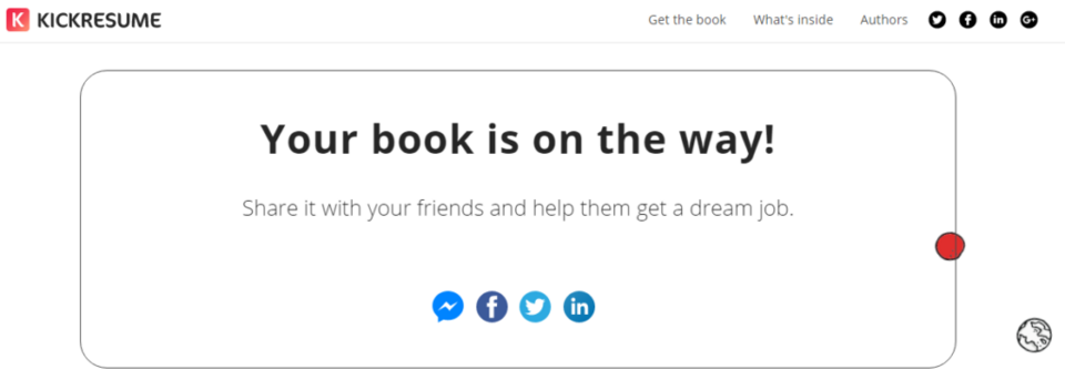
KickResume informs that the transaction was successful and, at the same time, encourages the customer to recommend the purchased product to friends through one of the popular social media channels.
Source: Mailmunch
Types of landing pages - summary
Landing pages are effective promotion and sales tools used by brands worldwide. One of the most important advantages of landing pages is that they focus the attention of a potential customer on a single issue and lead straight to the activity that a given company cares about.
Before designing a landing page, carefully analyze your target group, its needs, and expectations. The type of landing page you want to use in your campaign should be selected with the specific service or product and the goal you want to achieve in mind. Tell us what you want to achieve. We'll be happy to help you design and build an effective landing page in Drupal.