
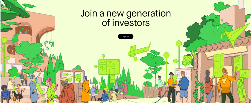
Fintech Websites Design - Interesting Examples from the Industry

Fintech websites include web pages of various companies, e.g. those developing new payment methods, providing investment and banking services, offering home budget management tools, and many others. A lot of these organizations rely on modern design to symbolize their innovation. We’ll present selected and interesting examples of websites.
The design of fintech websites - why does it matter?
Financial services are much more accessible today than they were a few years ago. They can often be accessed at any time of the day or night, regardless of where the customer is located. Companies compete with each other, constantly making their offerings more attractive, improving the quality of service, and applying the most advanced marketing techniques. The development of the finance industry is constantly driven by the improvement of existing solutions and the use of new financial technologies, known as FinTech.
A high-quality website is a great promotional tool for fintech organizations. However, it must look good. Customers expect innovation from this type of company. This means that they should choose state-of-the-art web design solutions that not only impress the users but also facilitate communication with them. Efficient exchange of information is helped by live chats, and chatbots, but also interactive elements such as forms, quizzes, and surveys, which allow for quick transfer of information between a potential customer and the company and its systems.
Minimalism isn’t characteristic for the design of fintech websites. These web pages often contain additional elements that make it easier for the customer to make decisions, such as financial indices, rankings, calculators, or offer comparison engines). They can speed up finding necessary information on selected products and services.
See also: What are the best financial websites? Key elements and examples
The decision-making process of customers of fintech companies significantly improves the presence of elements that increase brand credibility and provide high-quality products and services. These include social proof, sections with statistics, and customer testimonials, combined with a description of specific product applications (or correlated with a detailed portfolio).
Payments technology
Fintech companies develop landline and electronic payment methods, as well as provide services and sell related software. Their websites should be transparent so that potential customers can easily understand what the service is about.
1. Wise
The Wise company product enables global payments in multiple currencies. On the home page, there is a calculator that allows you to see how the application converts currencies. The brief content accompanying this tool informs that it’s much more cost-effective than more traditional payment methods. Next to the calculator, there is a CTA Get started for free, which informs the customer that they can start using the service at no extra cost.
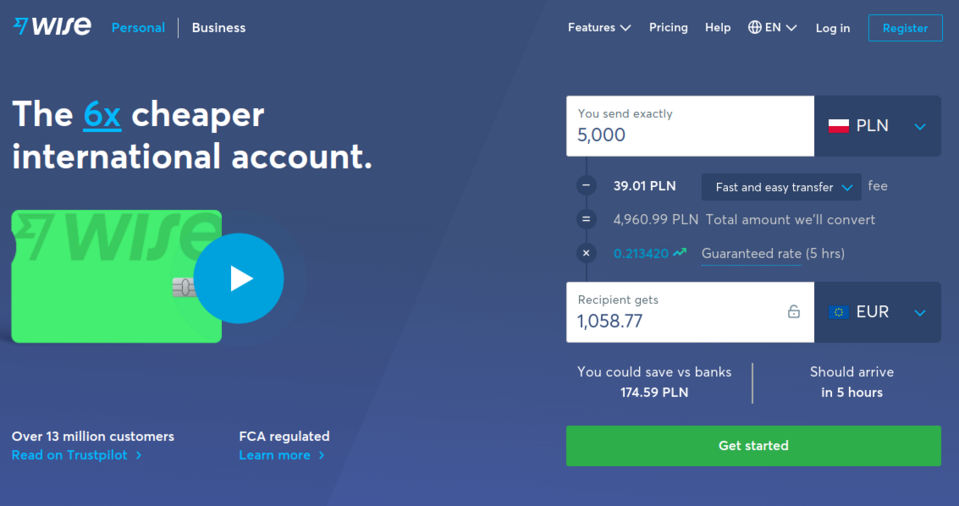
A white background, short paragraphs, highlighted headings and large, striking graphics give the impression of order of this fintech website. The advantages of the solution offered by Wise are presented not only in the descriptions but also through simple animations and static graphics. This definitely simplifies and speeds up the reception of the message. As a result, the customer can quickly become convinced of the proposed service and make a purchase. The graphics and texts are also accompanied by short and specific CTA buttons, motivating the user to take action or explore the website further.
It’s worth noting how the video has been integrated into the home page. At first glance, it appears to be just a graphic that is part of the website's background, but the user's attention is drawn to the blue, pulsating play button. By clicking on it, a small window opens in which the video advertisement is played.
At the bottom of the website, the user will find flag icons for each country in which the services are available. By clicking on the icon, the visitor will be redirected to a subpage dedicated to the person who wishes to send money to a given country.
2. Checkout.com
As soon as we reach the Checkout.com website, we learn that the company it belongs to offers digital payment methods for online business. In the Hero section, there is a graphic suggesting one possible way to apply this solution in business (in an online clothing shop) and sample payment methods that can be used within the company's services. When the cursor is hovered over this graphic, it enlarges slightly and moves, making the user curious.
Slightly below, the potential customer finds social proof in the form of logos of companies that have used the Checkout offer. This element strengthens brand credibility and trust. Immediately below this, there are customer testimonials with tiles leading to contents describing how the offered solutions contributed to the increase in revenues and improvement of the functioning of the given business.
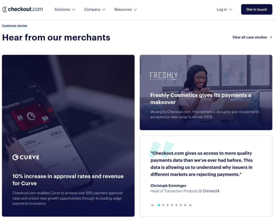
Placing customer testimonials here, combined with thumbnails of texts that describe in more detail the advantages of using the services, encourages further exploration of the offer, allows the user to better understand it and see why it is worth using it. Comments are located in an interactive section, so you can easily browse through the various published testimonials, without leaving the home page.
Investment services
Investing is not an easy matter. It can be challenging to correctly estimate the potential of a given investment without the right tool. To give users a comfortable start in the world of investments, fintech companies are creating applications that can be used for simple and quick investing. Websites presenting these solutions should contain interactive elements, allowing the visitors to quickly learn the most useful functionalities and advantages of using the offered tools. These elements often enable the generation of leads and the exchange of information between the company and potential customers.
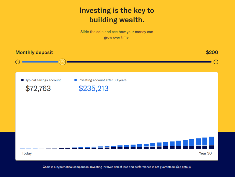
3. Betterment
Betterment is a solution for individual customers, companies, and advisors. The top part of the website highlights the most important features of the offered product - the simplicity of use, automation, and the ability to customize the account to your individual needs. Noteworthy are also the graphics created especially for Betterment which not only decorate the website but also help to assimilate its content quickly and effectively. The web page is also characterized by the presence of interesting interactive elements but also by a sensible design that doesn’t give the impression of excess, despite the use of numerous colorful graphics and intense colors throughout the home page.
A slider chart built into the website allows the prospective investor to see what their return might look like after 30 years with a specific monthly contribution. Another important interactive element used on this website, which often appears on various fintech sites, is a quiz. Not only does it engage the users, extending the time they spend on the web page but it also helps the brand gather information about visitors and tailor the service to their needs.
4. Robinhood
The animated Hero section of Robinhood, a fintech company that offers an application for investing, trading cryptocurrencies, and more, features a telling headline: Investing is simple here, which suggests that investing can be easy if visitors choose the organization's solutions. Just below this, there is a Get Started button to encourage the use of the application. Using simple graphics and short content sections, the company explains to the potential customer what they will gain by using the application and clearly illustrates its features.
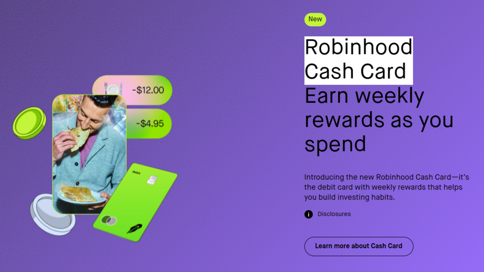
The bold color scheme of this website is striking - the intense colors, gradient, and comic book-inspired elements indicate that the brand is focusing on a younger age group (20-30 years old). In addition, this website also makes use of interactive elements, which correspond well to its modern style and engage the user in learning about the offer. Thanks to a minimalist approach to the amount of content, the user finds relevant information without feeling overwhelmed.
This fintech website contains appropriately positioned buttons to make it easy to explore the website. A website footer helps with navigation. This is where the user can easily find links that will quickly take them to relevant subpages, making it much easier to browse the website.
Private equity management
Private equity management websites and applications usually have functionalities to classify expenses, settle liabilities and facilitate saving. Websites promoting this type of solution are usually simple. They focus on explaining how it works - so they may contain more content or they may demonstrate functionality through graphics or videos.
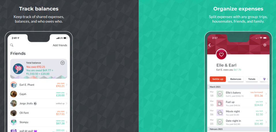
5. Splitwise
The Splitwise tool is used to settle financial obligations towards friends during joint trips and events. We already learn what the application is used for from the headline and the short, specific content in the Hero section.
The design of this fintech website doesn’t involve the use of a lot of content. Instead of extensive texts, the functionalities are presented by graphics. Screens embedded in the design show how the application can be used - to track someone's expenses or to plan them. By presenting the functions in this way, the user quickly learns what the tool is used for. The information provided in this way is supplemented by references from various portals and magazines.
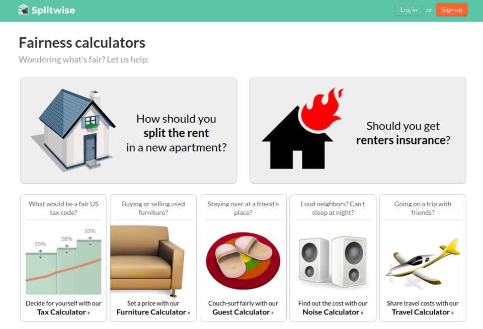
An interesting element of the website are the calculators placed in a separate tab (some of them useful, others making the user smile), which allow you to calculate, for example, the current value of used furniture or how much more a tenant who makes noise and disturbs the neighbours should pay for the room. The website also has a simple and interactive tool that advises users whether they should insure their property.
6. ClearScore
On the website of ClearScore, a fintech company that offers a credit scoring tool and credit-related services, we see at the beginning an incentive to use the tool. Already in the Hero section, there is a field to enter an email, and after the user enters it, they will be redirected to a registration form that allows them to create a free account.
The website uses high-quality, stimulating graphics, engaging animations, and dynamic change of the background color. Each scroll of the website surprises the user with a new graphic element or color change. In the center of the screen, there is a graphic representing a smartphone. The smartphone is the most striking when scrolling. As you navigate through the website, the information on its display changes, presenting views from the offered application.
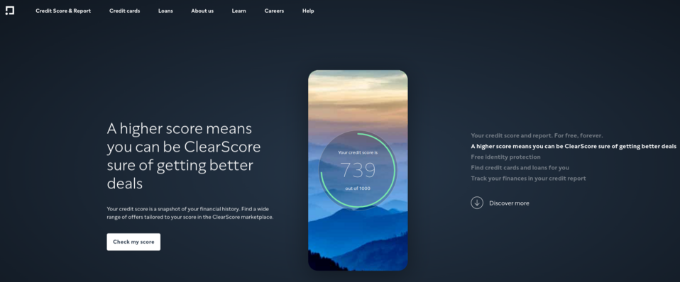
Thanks to this trick, browsing the content is fun, surprising and provides knowledge about the services provided by this company. Such a careful design of the fintech website makes potential customers spend more time on it, which can be used to convince them to use the offer.
A tool for finance professionals and agents
Managing the products of multiple customers and advising them on new services isn’t easy. The website of a fintech company should demonstrate to potential customers the differences between other brands' products and the offered solution. The easiest way to present these advantages and functionalities is through screenshots of the tool and statistics.
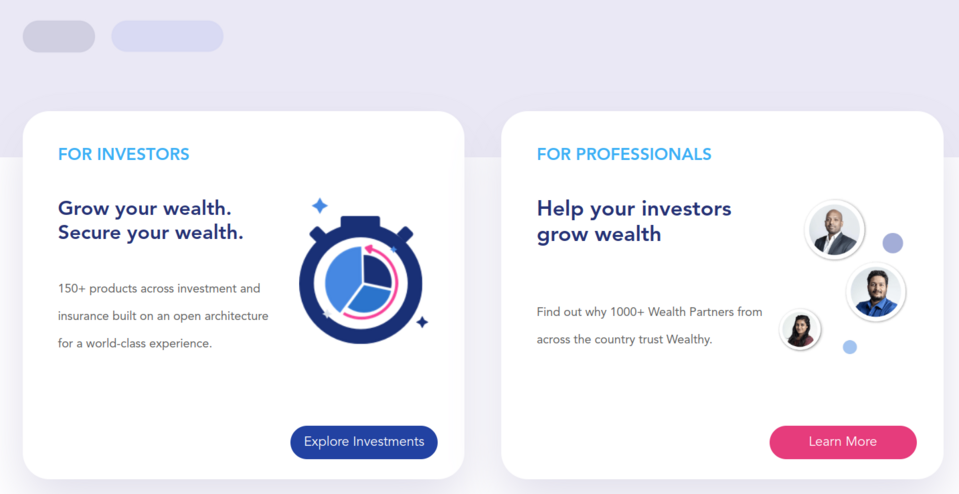
7. Wealthy
A fintech company - Wealthy - clearly declares its mission - enabling professionals to make money for investors - in a large headline centrally placed at the top of the website.
The website contains interesting animations showing how to use the solutions offered by Wealthy. It’s more extensive than it looks at first glance, which is undoubtedly due to the well-thought-out design. The website is designed in such a way that it doesn’t scare the customer away with a large amount of content and allows them to explore it in a natural way. The subpages, which aren’t visible in the minimalistic (containing only three items) main menu, can be accessed through links placed in the footer and buttons available on the home page and other subpages.
8. RightCapital
From the first moment on the website of RightCapital, a fintech company, the user can see that the brand's offer is aimed more at the B2B sector. The graphic depicting the offered platform presents a wide range of financial fields in which this particular product can be useful.
A very well thought-out design catches the eye. Graphic elements in the background have been designed to highlight important elements, e.g. an arrow running across the whole website points to the CTA. Further down the website, there are other arrows that indicate descriptions of functionalities.
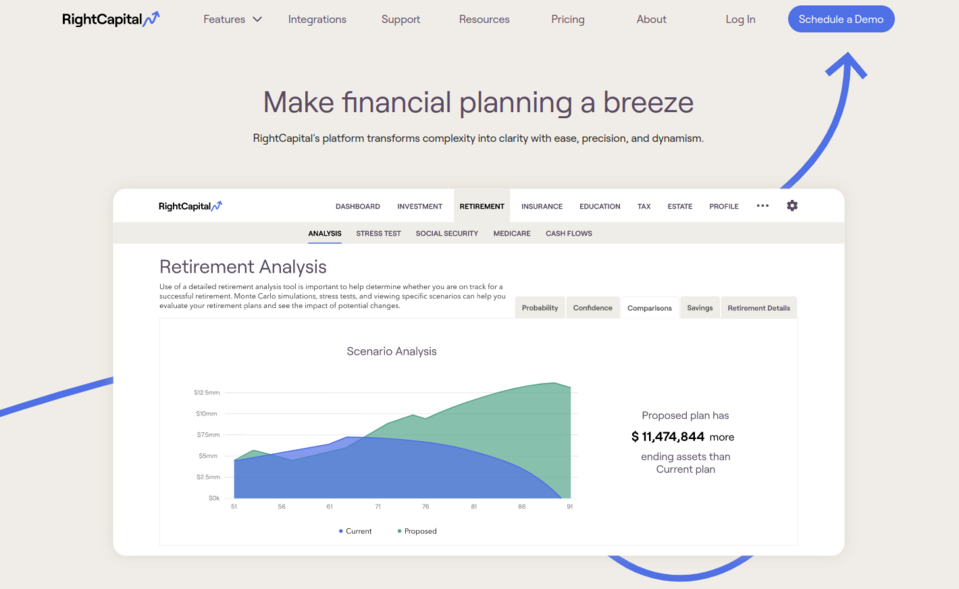
RightCapital uses social proof to increase potential customer trust by featuring logos of brands that use their solutions. In addition, the home page features customer testimonials accompanied by a photo and information about the position held by the author of the testimonial.
Digital banking
More and more banks that deal exclusively with e-banking are emerging. Fintech companies offering this type of service must not only ensure that the website runs efficiently, on which customer satisfaction depends, but also introduce new features and improvements on an ongoing basis to keep their customers. These companies need to use their websites to stand out from the competition.
9. Oxygen
The entire design of the website of Oxygen, a fintech company, offering e-banking services, is created according to the slogan placed at the very top of the web page Say no to normal. Indeed, the website doesn’t resemble a typical bank website. It uses original fonts in different sizes and high-quality images but it doesn’t stop there.
When browsing this website, it’s clear that the brand is targeting young visitors. The user may initially be confused by the elements that move across the website and in multiple directions. When scrolling down the website, you don’t just move downwards all the time - the design also redirects you sideways at some levels, which has a really interesting effect. The use of these techniques allows the company to build a modern image.
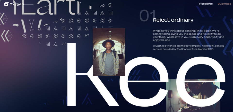
The website also has interactive elements - buttons to move more quickly between elements on the home page and to browse photos, and graphics representing cards that move when you hover over them with the cursor.
10. Sofi
The SoFi online bank has applied a carousel in its Hero section.This is a good way to present more information at the top of the web page or, as has been done in the case of this company, more advertising slogans.
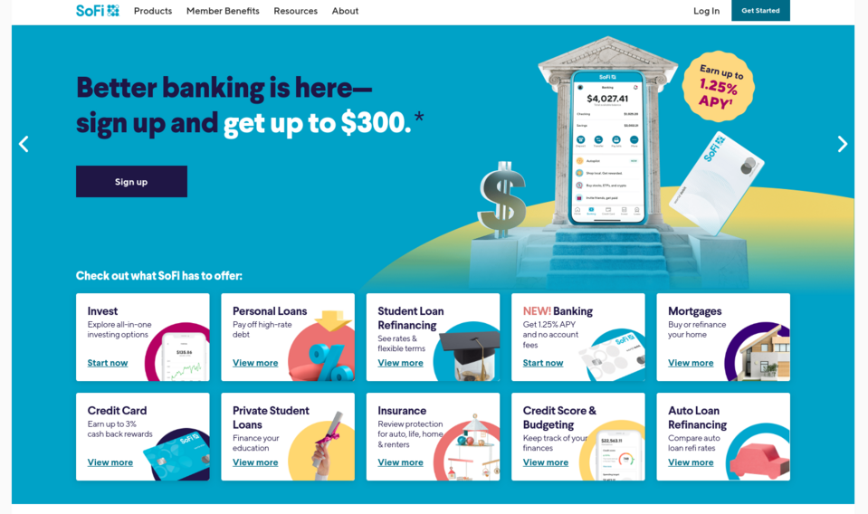
All the bank's services and products are shown below in tiled form. The names of specific services are accompanied by one sentence - sometimes it’s an advertisement, and sometimes it’s simply an explanation of what the service is. Such a presentation of the offer ensures that the user won’t miss any of the services.
There isn’t much content on the home page. Instead, the organization has placed links with short keywords in tiles. These lead to subpages containing additional information. In this way, you can attract the interest of potential customers without overloading your website with information.
To explain the use of the application, a 30-second promotional video has been published on the website, briefly explaining what the product is. This allows communicating quickly the most important information to the users.
Fintech websites - summary
Some fintech companies shock with their design, while others opt for simplicity. There is, however, a trend to limit extensive content in favor of presenting features and benefits in slogans, images, or videos. It’s common for animations and interactive elements to engage the user and make exploring the website an interesting adventure.
Companies also want to acquire leads as quickly as possible, so they use methods (CTAs, free registration, promotions for completing a quiz, etc.) aimed at acquiring customer data in a few clicks. Your fintech website can consist of many interesting elements such as out-of-the-box animations, calculators and charts with synchronized data from external systems, and a map with company branches, which can be filtered depending on what services a person needs (e.g. mortgage, company account, financial advice, etc.). We can build your fintech website with these or other elements of your choice.