
Our Tips on What to Put in Website Footer With Examples

The website footer isn’t usually the first element we think of when imagining our website. Perhaps that is why on some websites it doesn’t seem to have any specific function. Instead of helping you achieve your specific goals, it turns into a place for all the information you couldn't put anywhere else. Find out what a website footer is and what good practices in designing it are.
What is a footer?
It’s virtually a basic element of the backbone of any website. It's hard to imagine a web page without a header and footer. The footer is the area at the bottom of the website, and its primary function is to inform the user about the website and the brand it belongs to. The footer usually contains basic company details, the date the website was created, and copyright information for the design. However, this isn’t its only function.
Functions of the web page footer
It all depends on what you decide to put in this section of your website. In principle, there aren’t many limitations, although as it’s in a way the "end" of the website, it’s worth ensuring that the footer contains the most important information and functionalities that the visitor should notice before leaving the website.
The footer can not only inform but also:
- generate leads or enable subscription to a newsletter (if we include a form in it),
- facilitate navigation on the website (additional navigation),
- redirect to other communication channels (if we add social media buttons).
Design of the website footer - which elements to use?
The footer is an element that increases the usability of websites in many ways. Therefore, it’s worth spending a lot of time and energy on its design. What elements can the footer contain and how can they help achieve various goals?
1. Copyright information
The copyright notice is one of the most common elements appearing in the footer. It has a purely informative function and constitutes a declaration of your rights to the website design.
The copyright notice is quite an important element, especially if your design is unique and it was expensive to create. It should appear in at least one place on the website, but some companies forget about it completely. This element of the footer should have a symbol indicating that the copyright is reserved (©) and data such as the date of publication of the website or update (the year is sufficient) and the business name or surname of the copyright holder. This ensures that if another company copies your website design, the law will be on your side. The notice itself can effectively discourage others from copying a design, animation, content of your website, or any other type of "borrowing" of your work.
2. Contact details
One of the primary goals of creating a website is to establish contact with potential customers. Your website probably already has contact forms and information on how to contact your organization, but you should consider including your company's contact details (email address, phone number, postal address) in the footer. You can simply add a link here that will take users to a contact page or form. Including this information (or a link) in the footer increases the likelihood of a potential customer deciding to contact your company, even if they haven’t previously noticed your contact details or the CTA leading to the form.
Due to restrictions on the size of the website footer, companies don’t always choose to add a map, but it’s worth considering its inclusion in the footer. To improve communication between the company and its customers, social media icons are also often added to the footer so that users can select their preferred communication channel.
3. Navigation in the website footer
A potential customer of your company often reaches the footer of your website very quickly, but this doesn’t mean that they stop browsing. If your main menu doesn’t "follow" the user, they have to return to the top of the website to continue browsing. You can make it easier for the user to navigate between subpages by creating additional navigation points in the form of a navigation map in the footer.
The simplest approach is to create a sitemap that coincides exactly with the main menu. However, you can add buttons to other parts of the website (e.g. those that are directed to by CTAs located between content) that you consider particularly valuable for your users (contact subpage, terms and conditions for returns and purchases in online shop, etc.). Additionally, if your website uses the functionality of creating an account and logging in, consider placing the login button just in the footer. If the customer is unable to find it elsewhere on the website, they will surely check it in the footer.
4. Logo
The logo in the footer primarily has a navigational function - it refers the user to the homepage. However, it can act as a branding enhancement. Here you can present the logo in a different way than in the header to attract the user's attention and provide additional information about the values that are important for your company (you can choose a larger logo size, include additional graphics or content - e.g. a slogan explaining the ideas that are important for the company).
5. Forms and privacy policy
There is a reason why contact forms are rarely at the top of the website. It’s best to lead users to them gradually, providing them with the key details and benefits of the offer. This way, you make every effort to ensure that the customer reaching the registration form understands the value of your content and wants to learn more. This increases the likelihood of acquiring a lead.
A person who has reached the end of your website has probably already learned something about your company and is interested in your content. That's why it's a good idea to place a form or CTA button leading to it in the footer of your website. A newsletter sign-up form consisting of a single field is often placed in the footer as well.
When collecting user data, you shouldn’t forget to publish a link to the privacy policy information on your website. This is necessary due to legal regulations. This element is also usually placed in the footer. By following this practice, you can kill two birds with one stone - you fulfill your legal obligation, and you also satisfy users who expect to find this information right there.
Inspirational examples of website footers
The footer of a website is usually a small section. Its permanent element is usually the copyright notice. The use of other elements depends on the vision of the website creator. Some companies design really impressive footers.
The Designest
The footer of The Designest portal is styled like a newspaper column and impresses with its distinctive design. At the top, there are buttons for other, numerous communication channels. Below, on the left-hand side, there is a newsletter sign-up section, which stands out from the other elements not only in terms of size but also in terms of font sizes and diversity.
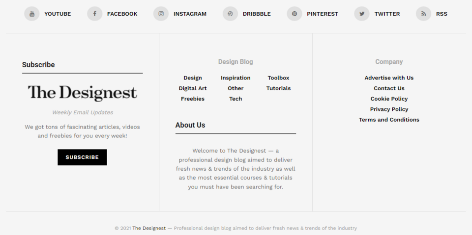
The footer of The Designest website also includes a small version of the main menu and additional links that users might be interested in, leading to contact subpages or privacy policies. In addition, the footer contains information about the copyright to the design of the website.
Orbit Media
The footer of the Orbit Media website fulfills several functions. First of all, it allows you to gain a new email subscriber by encouraging: Join 16,000+ people who get our web marketing tips twice a month. It's worth noting that the company eliminates the user's fear of spam right away by telling them how often they will receive emails.

Below, there is a link to the privacy policy, with social media icons beneath it, allowing the visitor to use other communication channels. Next to it, there is information about Orbit Media's relationship with the B Corp non-profit organization.
The footer also contains detailed contact information (including address) and a button redirecting you to the contact form.
Avo
In the footer of the Avo website, users can enter their business email address to arrange to see a demo version of the tool. The company deals with possible doubts from potential customers, immediately informing them that they don’t need to enter a credit card number to test the solution.

Avo motivates and reinforces the message by communicating the high effectiveness of the application: Ship quality insights in an hour, not days or weeks. The footer also features additional navigation with links to an about us website, job opportunities, a privacy policy, and website regulations. There is also an invitation to get in touch (Let's chat!), an email address, and social media icons.
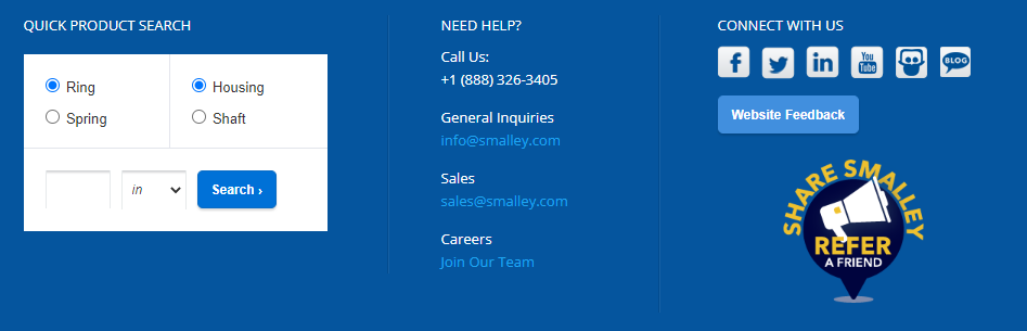
Smalley
In addition to placing icons for various communication channels and contact details in the website footer, the Smalley company also attempted to redirect customers to offer pages. For this reason, a product finder was placed in the footer of the website. It allows the customer to quickly check whether the product they are interested in is available on the website. The company makes sure that the customers have a chance to check whether its offer corresponds to their needs before leaving the website.
Shantell Martin
Main menu in the footer? This unusual solution, which Shantell Martin uses on her website, can work well for simple websites with little content on the home page. Besides, this part of the website is small and simple. It contains a copyright notice, as well as links to social media accounts.

This solution is perfect if you want a minimalist, but unusual design. Deciding on it, you even increase the probability that the user will get acquainted with the entire content included in the individual subpages, as it’s necessary to scroll the entire website to get to the menu.
Think32
The Think32 agency has a small and simple footer. It stands out from the rest of the website with a darker background. Here, the website creators have included the company's motto: Thoughtful marketing for growing dental practices, which briefly summarizes all of the above content and services provided by the company.

The footer includes a simple newsletter sign-up form and a CTA button - Subscribe. Next to it, the user will find buttons taking them to the company's social media websites and a contact phone number to the company. In addition to this information, links to the privacy policy and terms and conditions are also provided below. This is an example of a minimalist footer that contains only the most important information.
What to put in website footer? Summary
In our article, we’ve discussed the most common footer elements. However, that doesn't mean you can't put something else there (e.g. a short video, a section with thumbnails of blog posts, or a calendar of events your company participates in). When designing the footer, think about what the potential customer expects to find there, and also about the function of this element of your company website. We’d be happy to advise you on your footer. We can also support your company by creating a professional Drupal website.