
Our Tips on How to Make a Website Mobile Friendly

The large variety of devices on which you can browse web pages, as well as the constant efforts aimed at improving user satisfaction, have made website responsiveness a standard today. However, there are still pages that aren’t optimized for viewing on many devices or are optimized incorrectly. Learn what exactly is responsiveness and how to adapt a website to mobile devices.
What is a responsive website?
Users may open web pages on various devices: desktops, laptops (they may have screens of various sizes), tablets, and mobile. Responsiveness of a company website means that it will display the content correctly and in such a way that it’s legible for the viewer, regardless of what device they use. However, it isn't only about the user seeing the texts and images, but also about displaying them in the right place on the web page and harmonizing with the entire design.
A professional website must be aesthetically pleasing, efficient, and easy to view on a screen of any resolution. The lack of responsiveness of a page may have a negative impact not only on user satisfaction, but also on the website's rank in the Google search engine, so it's worth taking care of its correct optimization.
How to make a website mobile friendly?
If you decide to launch a new website, it's good to test its responsiveness first. However, if your site has been running for some time, you can also check its compatibility with mobile devices. In many cases, such a web page can be optimized.
1. Test an already existing website
If you already have a web page, there are two ways you can check if it's well optimized for mobile devices.
Your specialists may use one of the tools for testing website responsiveness and evaluate your web page by themselves. There are both free applications, for people without advanced technical knowledge, and paid ones that provide more advanced functionalities.
You can also ask for support from a team of experienced experts who will thoroughly check your company website for responsiveness, as well as formulate recommendations or immediately implement the necessary corrections. Sometimes during web page audits, it turns out that a cheap and fast-built website isn't very high-quality and it's more profitable to create a professional company website from scratch using the latest technologies.
2. Create graphic designs of subpages for the most important devices
Before starting the programming works, you should create a graphic design for the most important subpages in four versions: desktop (1200 px), laptop (992 px), tablet (768 px), and phone (576 px). Bootstrap, a popular website building framework, supports these screen widths and allows you to efficiently design all versions of your website.
It's worth using the tools available on the market (like Gridset, Wirefy, and Adobe Edge Inspect) that allow you to guarantee the responsiveness of the graphics that you want to put on your web page.
3. Plan a simple menu
A very complex menu simply won't work on a mobile device. It'll be difficult to navigate, and even just familiarizing oneself with the structure of the page will be challenging and frustrating for users. If you want to ensure good UX of a website, focus on creating smooth navigation in all its versions. A popular solution used for the mobile version of a company website is a vertical menu. If your website is extensive, you can consider using drop-down lists.
4. Limit, modify or remove pop-ups
Pop-ups can be useful, but many websites abuse them, making browsing their content more an annoying struggle with pop-up windows appearing all over the place than a pleasant pastime. In the case of a mobile version of a website, a pop-up often causes users to leave, because disabling the window and returning to browsing the content without opening thousands of ads is usually impossible. Considering the customer experience, adding pop-ups is hardly a positive thing. If you can't put a large and easy-to-find button that closes such a window, it's better not to use pop-ups at all.
5. Create easy-to-fill forms
The task of filling out forms on the mobile is hardly pleasant. An accidental click or swipe may disable the page, and then the likelihood that the customer will return to filling out the form is close to zero. Optimizing forms for mobile devices will not only improve user satisfaction but can also increase the number of successfully sent forms.
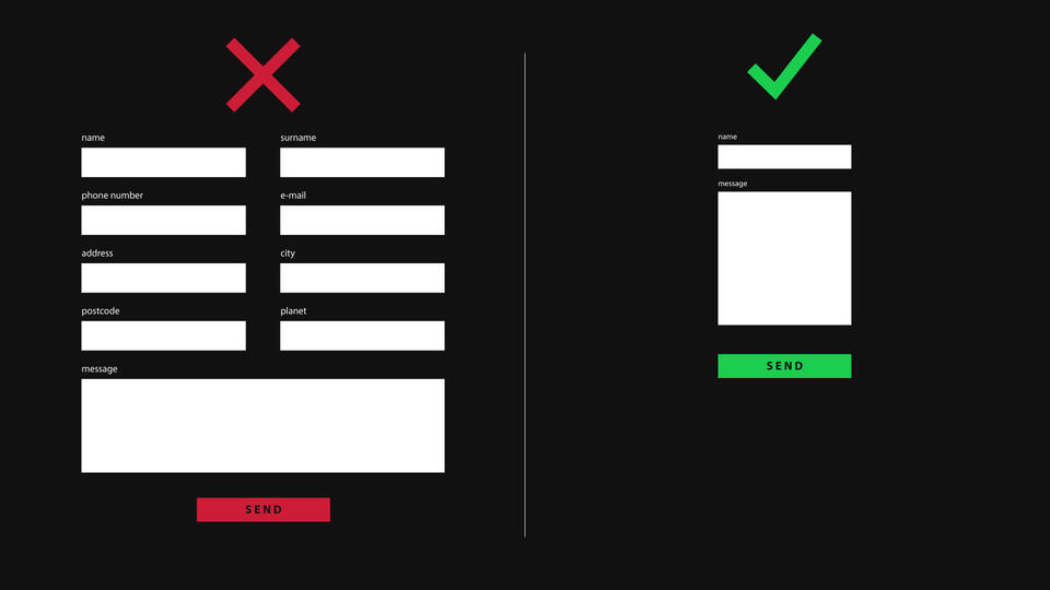
If it's possible, design them so that the user selects their answers from the available options in a drop-down list, instead of manually typing the answers to your questions. Also, make sure that the clickable elements (drop-down lists, windows for entering answers, and buttons in the form) are sufficiently large.
6. Take care of the website performance
It's not only the look of a web page that counts, but also its speed. High-quality graphics in the mobile version of your website will be useless for your customers if they have to wait for more than a minute for some elements to load. During optimization, you need to remember not only about creating visually attractive designs, but also about choosing the right, modern technological solutions.
Creating a mobile friendly website in Drupal
When choosing the technology, you'll use to build your company website, find a solution that guarantees its responsiveness. Drupal allows you to create high-quality, efficient, mobile-optimized websites thanks to the use of fluidic layouts, advanced CSS functions, and special modules.
Drupal offers many solutions for creating responsive website designs, such as the abovementioned Bootstrap, Omega, AdaptiveTheme, Sky, etc. In Drupal's core, there's a module supporting responsive graphic files. The tool's name is Responsive Images, and it not only guarantees the responsiveness of graphics but also allows you to optimize images for various devices and helps in building responsive website designs. This module renders different versions of the image. The browser will select and display the image best suited to your device. This allows images to scale depending on the screen size and resolution. A mobile will display a file with a lower resolution, and as a result, the page will load faster. On desktops, the files will be larger and of better quality. There are similar modules for video files (like Rumble or Vimeo).
You can take care of the menu responsiveness using the Responsive and off-canvas menu module. Web developers may choose between different responsive menu styles and define what screen sizes the specific menu types should be displayed on.

The users of Droopler, the Drupal distribution created by our team, can count on convenient solutions. This tool already has a template adjusted to mobile devices. All components are adapted to phones, tablets, and desktop versions. By using this solution to build a company website for computers, you already have a mechanism for adjusting its components to the screen's width.
How to make a website mobile friendly? Summary
Taking care of the responsiveness of the company website is necessary if you want to be sure that the experience of your customers while interacting with the website will be positive. There are many things that need to be analyzed before you start working on optimizing your website to adapt it to mobile devices. We can help your company by conducting an audit of the website responsiveness and optimizing it, or we can build for you a corporate website on Drupal that's efficient, aesthetically pleasing, and optimized for many different devices.