Interesting FAQ Page Examples that will Inspire You to Create Your Own

Are you preparing to create an FAQ page for your company and looking for inspiration? Before you start designing it, take a look at the sections with frequently asked questions on company websites of small, medium, and large brands. Below you'll find ten interesting examples of FAQ pages.
What is FAQ page and what is its function?
FAQ is an abbreviation of the phrase "Frequently Asked Questions", meaning the questions asked by users about using a web page, services, or products. An FAQ is a subpage or section that contains a series of questions and answers prepared by the company. They cover topics such as making a purchase, paying, using the products or services, working hours, prices, etc.
The purpose of an FAQ is to quickly and efficiently resolve user problems that could result in impairing their digital experience or in failure to make a purchase. Thanks to such a subpage, you can save time of both the customer and the employee. Customers don't have to bother contacting customer service to get answers to simple questions, and the company can offer standardized answers to recurring questions.
The FAQ page has an informative function - repeated customer questions and company answers are collected in one place on the page, creating an extremely useful, simple, and easy-to-understand knowledge base. However, this isn't the only function of such a subpage. Creating it and filling it with content has a positive effect on its visibility in search engines. An FAQ subpage may also serve as a navigation tool to help you find your way around your company website. Include in the content buttons and links making it easy for customers to find the subpages they’re looking for. It's surprising that some companies choose not to create such a subpage. An FAQ, however, is quite an important element of a company website, included in most good customer service strategies.
How to approach creating an FAQ on a company website
Users are often looking for additional information about the company's offer. They may have problems with using the product, with application functionality or simply have questions about the goods and services that weren't answered in their descriptions. A well-thought-out page with supplementary information is a great help for users.
In addition to doing research and getting acquainted with the FAQ section designs used by other companies operating on the market, you should identify the problems of your users. How to do this? Analyze their activity on your company website or in the application to find out where they stumble upon problems most often, but most of all, to find out what topics they raise in conversations with your customer service and what are the most common questions concerning your offer. Also, take a look at the questions that customers ask on the forums dedicated to your company and on your pages on social networking sites. If you want to create a more detailed FAQ page, you may also use a keyword planner. By searching (e.g. in the Google Keyword Planner) for the phrases closely related to your product, you can find out what the most common questions of the users are about similar services or products, and use them in your FAQ section.
There's a lot of general information that you can provide the customer with in response to one of the questions in an FAQ and thus help them make a positive purchasing decision (e.g. "how to choose the right size" – if you sell clothes or sports equipment). These more general issues may then be expanded in blog entries which you'll link to in the FAQ, thus creating a denser network of internal links on your company page. Also, remember that as your page and company grow, new concerns may arise. Update the content and add more answers over time.
Also, decide how you'll organize and design your FAQ page in terms of graphics. It's worth considering using drop-down sections, buttons transferring to other subpages, and contact forms. Remember also to leave some space for email support or real-time support options, for example in the form of a chatbot. Allow users to express their opinion on your subpage containing the frequently asked questions. This way you'll be able to monitor the performance of the FAQ page more effectively. Put a short questionnaire asking about the usefulness of a given entry in the FAQ (e.g. "Was this answer helpful?" and add the "YES"/"NO" buttons). You can also check the popularity of this subpage among users, as well as its traffic using Google Analytics, and monitor whether the frequency with which the customers communicated problems about using the web page or application has decreased.
Interesting FAQ page examples you may draw inspiration from
Each subpage on a company website can consist of many elements. A section with questions and answers is a core part of an FAQ page, but that doesn't mean there aren't many other interesting solutions to use in this area of a business portal. Take a look at some interesting FAQ page examples and see how different companies help their users find the answers to the frequently asked questions.
1. WhatsApp
WhatsApp makes it much easier to find the answers to the questions that really interest you. At the very top of the subpage, you'll see a search bar where you can enter any phrase. After placing the cursor in the field, the search engine will suggest some of the topics most frequently searched by users that may be of interest to you. Below the search engine, you'll also find the lists of issues divided by topic, e.g. depending on the type of operating system of the device you use (iPhone or Android). After clicking the search icon, under the search engine, you'll see a list of queries related to the phrase you entered.
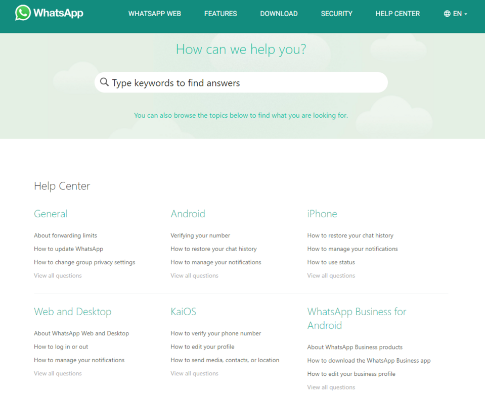
Source: WhatsApp FAQ
What's characteristic of WhatsApp's FAQ page are the extensive answers – detailed, structured somewhat like blog entries. The individual text pieces are separated by headings, and similar articles are linked at the end. The text pieces are often accompanied by graphics or videos. Assigning questions and answers to specific thematic groups is becoming more and more popular among companies that decide to create FAQ pages containing a lot of information. In the case of WhatsApp, it increases the transparency of the subpage and helps to quickly find a specific question.
2. Dropbox
The Dropbox help center is a real knowledge base. This company's FAQ is an example of exceptional care for the user. At the very top of the page, in the upper right corner, there's a search engine where you can enter any phrase to search for specific articles. Indicated below in the form of tiles and a list are the most frequently asked questions. The subsequent sections contain buttons for subpages with articles on specific topics, e.g. payment or integration. After entering text and pressing the search button you'll be taken to a list of topics in all available languages, and you can use a filter to select only the articles in the languages you know (not all articles are translated into multiple languages).
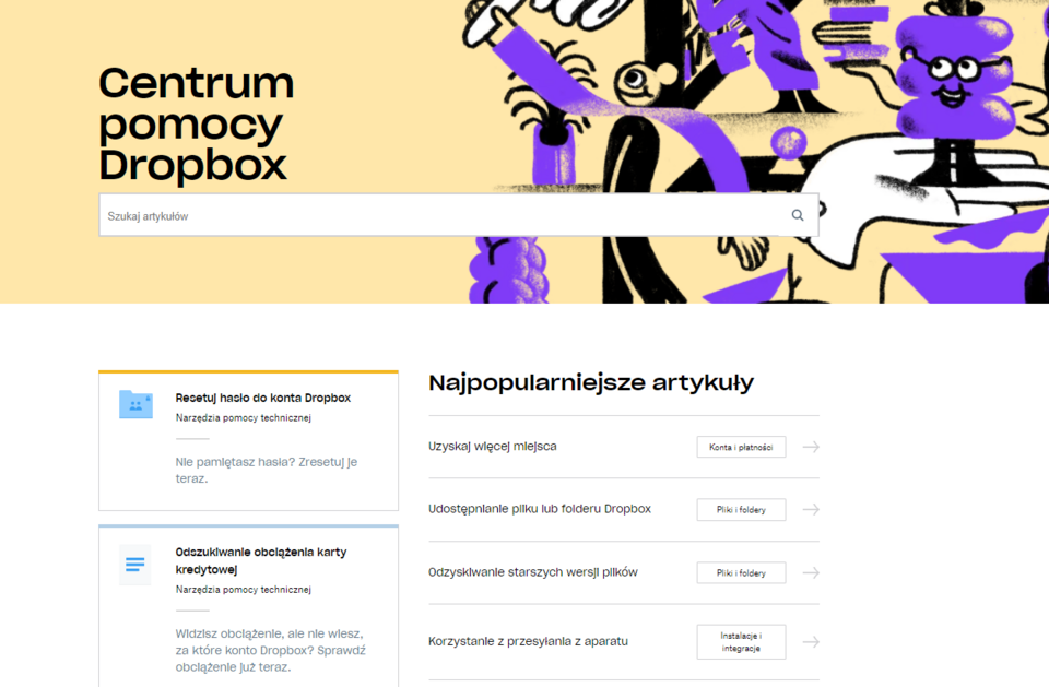
Source: Dropbox
The Dropbox FAQ page stands out among other companies due to pointing to multiple paths to solve the user's problem. If you scroll further, you'll see the extensive graphic element with recommended additional tools that may help you find useful information, such as the community (forum), live training courses, and quick tutorials available on the platform. The instructions and tips are available in text and video form. Under each entry, there are buttons that take you to the community, Twitter technical support, or Dropbot (the Dropbox chatbot). The company makes every effort to ensure that the customer who has a problem won't leave the FAQ page without finding a solution.
3. AdEspresso
The AdEspresso FAQ page attracts attention with its style of communication with the customer. The company chooses light and playful content, starting with the headline: Do you have questions? We have answers (well, most of the times!), clearly suggesting that its database of questions and answers will help a potential customer in almost any situation. Links to other useful sources are provided above two lists, as well as a sincere encouragement to contact the AdEspresso team if you’re having difficulty finding the right answers.
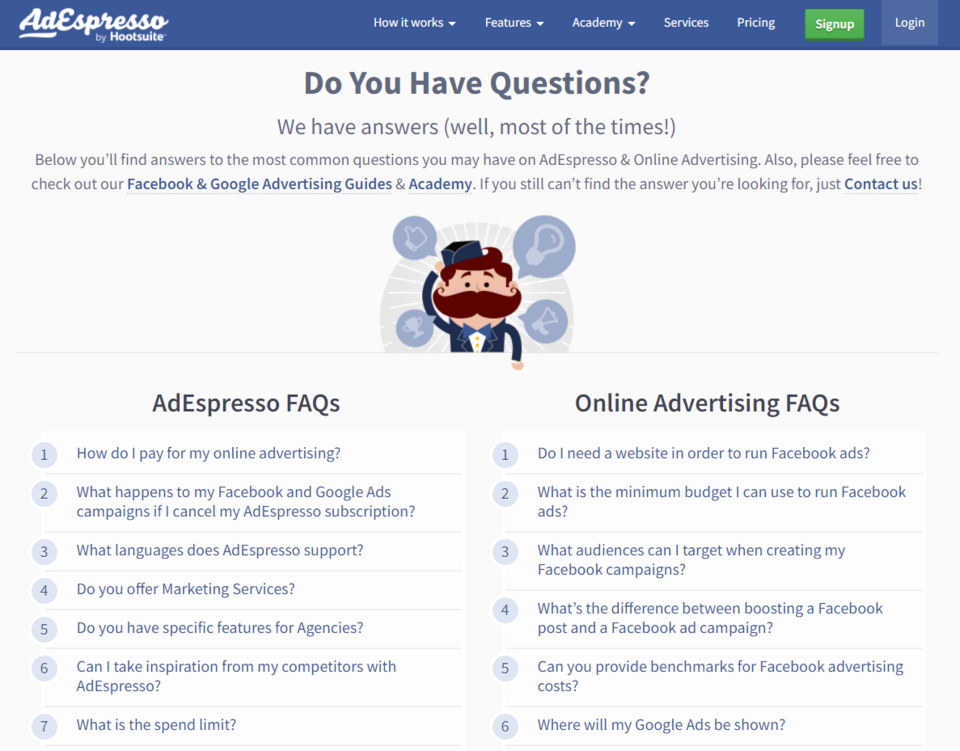
Source: AdEspresso
AdEspresso aims to simplify its FAQ page. In contrast to the two big brands mentioned above, it doesn't create an extensive FAQ but provides the customers with a relatively short list of questions in two categories (questions about the platform itself and online advertising in general). After clicking on any of the questions, the user is taken to a microblog on the selected topic, containing hyperlinks to further information. There's a Back to FAQ button under the entry, which enables a quick return to the list of answered questions.
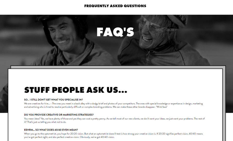
4. 40/40 Creativity Agency
The FAQ of the 40/40 creative agency is a unique subpage – creations of this type are characteristic of original brands with a distinctive image. The interesting graphic design and the casual and direct communication style lined with jokes make you want to read the answers to the most frequently asked questions selected by the company.
Source: 40/40 Creative Agency
This subpage greets the user with a large-scale picture from the "Dumb and Dumber" film – which in a way is a harbinger of the humorous tone of the answers to the questions. The answers are not too extensive and are placed immediately under the related question (without using drop-down fields). There are a lot of them though. Thanks to the use of small font size, the creators of the FAQ section managed to fit quite a lot of information on the page but kept it legible.
The strong point of this FAQ page is the content and the specific way the brand communicates. It gives the answers some light-heartedness and makes the FAQ not only a problem-solving tool but also provides entertainment for the reader.
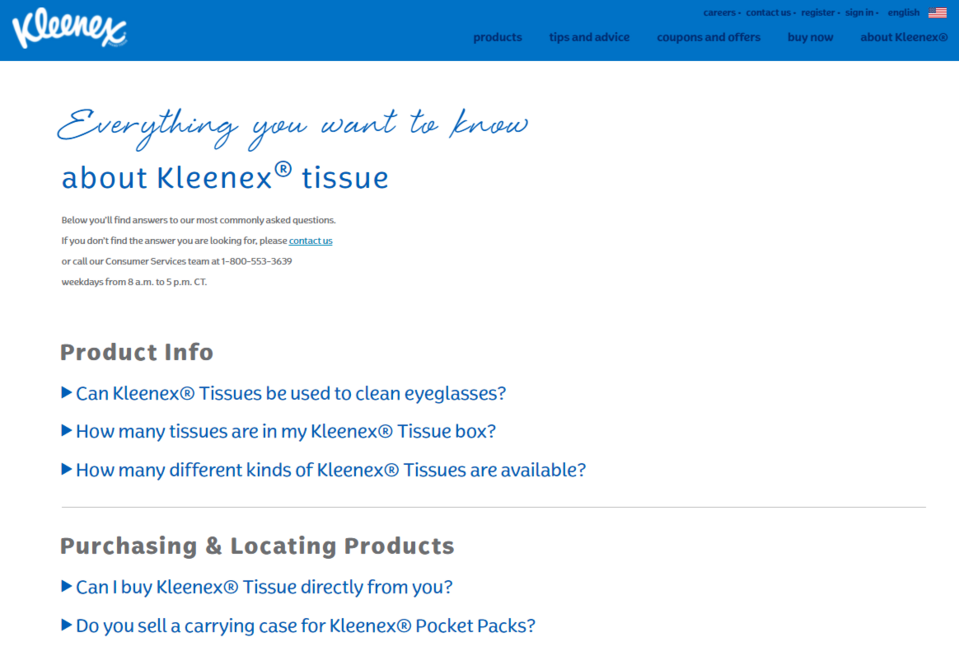
5. Kleenex
Kleenex, a company offering its customers paper towels and tissues, is one of the brands that limit the amount of content on its FAQ page. At the very top of the page, you'll find details about the work of the customer service office (working hours, phone number) in case you don't find the answer to your question below.
The solutions that deserve particular attention include dividing the answered questions into groups according to the subject they concern. The most extensive topic – environment – also draws attention. By making this collection of information stand out, the company emphasizes its interest in ecology and improves its image.
Source: Kleenex
In the case of this brand, however, the subtle use of branding stands out the most. On the Kleenex FAQ page, there are many blue-colored details associated with cleanliness – obviously referring to the products offered by the company. Various types of fonts have been used in a way that attracts attention but isn't distracting and doesn't give the impression of overdoing it or being inconsistent.
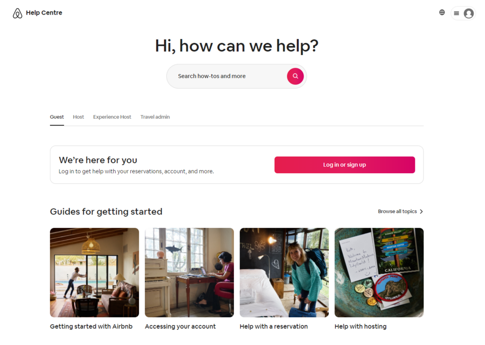
6. Airbnb
You'll find the search engine at the top of the Airbnb FAQ (similar to the WhatsApp FAQ). It works in a similar way to the ones described in the previous FAQ page examples. The entries, however, are quite concise. A user interested in a specific topic will find a list of related texts at the end of each answer. In the foreground of this help center, in the separate Guides for getting started section, the articles that may be helpful for users just starting their adventure with Airbnb are marked with buttons in the form of graphics. Below you can go to one of the most frequently displayed entries. In the next section, there are buttons highlighted with a black background (contrasting with the white-colored page) that allow you to contact the portal staff.
Source: Airbnb
The most distinctive feature of Airbnb's FAQ page is its well-thought-out design. The unique consistency of this page with the design of the entire portal is striking at the very first glance. Companies sometimes treat the FAQ page as an unpleasant necessity and don't care about the look of this part of the company website. Airbnb shows that their FAQ page is as important as any other page. It uses tiles, graphics, buttons, and a search engine, creating a legible and aesthetically pleasing FAQ subpage. It also stands out due to the possibility of rating whether the answer turned out to be helpful with the use of a button. This allows the company to monitor the effectiveness of this section and further enhances the customer experience by allowing them to provide feedback.
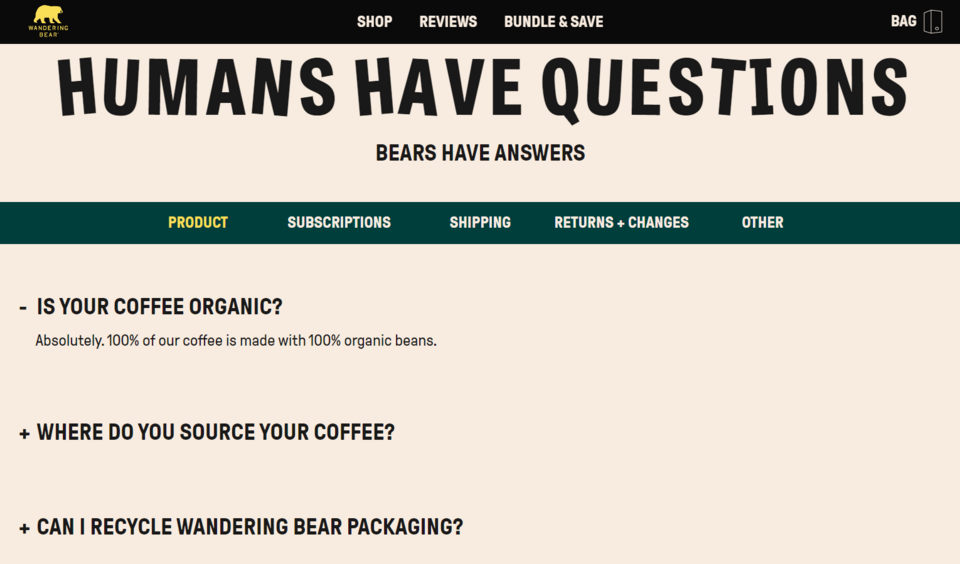
7. Wandering Bear
By using contrasts – not only in terms of colors, but also the sizes of fonts – Wandering Bear created a simple, and at the same time interesting and aesthetically pleasing company web page. The brand, which mainly sells cold brew coffee, has opted for minimalism by creating a short FAQ that answers only the most general questions. This is a universal section with information useful for the fans of this type of coffee brewing, as well as for the people who haven't brewed it in this way so far but want to try it. You expand individual answers by clicking on the related questions, and you can hide them by clicking again, which makes it easier to read the content, and allows maintaining order on the page (as you only display the useful information). In the middle of the bottom of the FAQ page, there's a large and clearly visible Contact us button, which takes the user to the contact form if they want to ask the company's employees a specific question.
Source: Wandering Bear
Such a solution for an FAQ – creating a concise knowledge base consisting of only a few of the most important issues – is worth considering if you offer niche and unusual goods or services. This allows you to quickly present your offer and its value to the customer.
The brand also took care of having high-quality content. Funny but substantial text pieces not only provide relevant information but also show the personality of the company and are able to effectively amuse even an irritated customer who is looking for a solution to their problem, improving their experience while interacting with the page.
8. Spirit Airlines
The Spirit Airlines FAQ collects and organizes a large number of typical questions asked by passengers into one short list of frequently asked questions. The customers can use the search bar to obtain instant access to a given answer. Below, you'll also find separate thematic categories into which the remaining answers have been grouped. You can go to the individual categories by clicking on one of the buttons decorated with graphics referring to the topic that the issues in this category relate to. These icons help users more quickly identify the group of answers that may contain the information they are looking for. This speeds up finding the information you want.
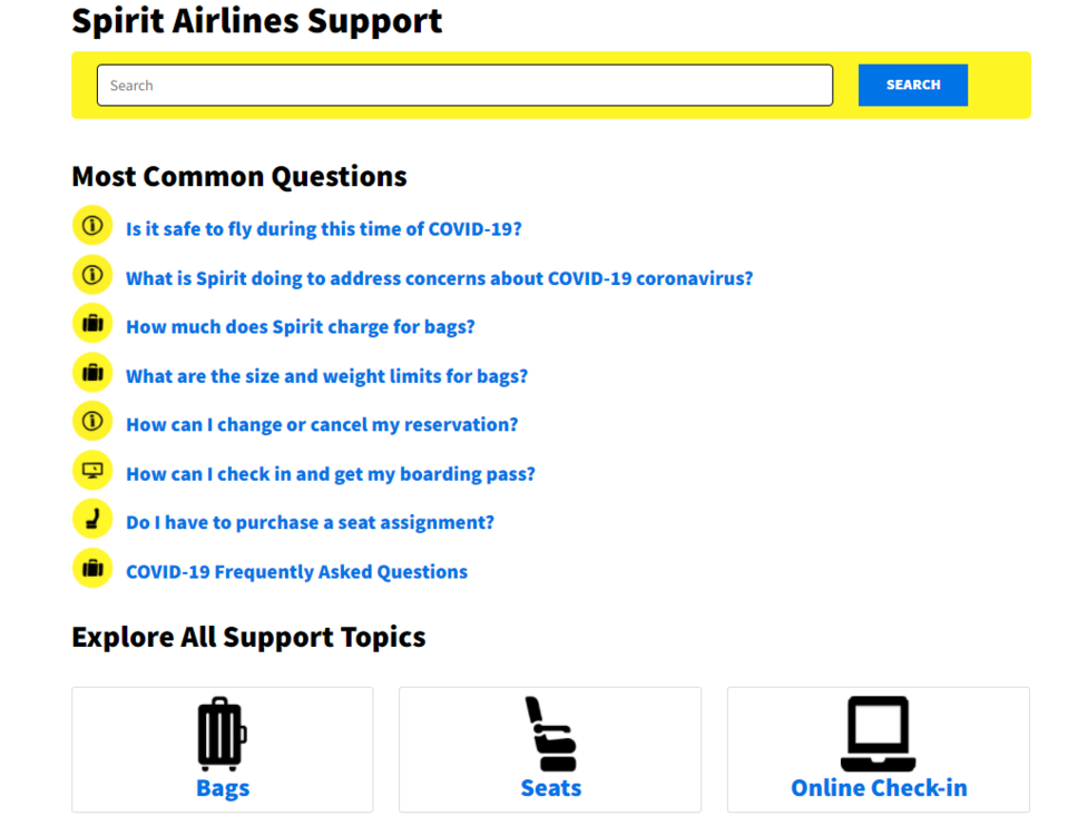
Source: The Spirit Airlines FAQ
After clicking on one of the most common questions from the main list, the user is redirected to an entry with content and infographics. After entering one of the categories below the basic list of questions, the customer sees a long list of issues where they may be able to find their problem. When they click on their question, they'll be redirected to a page with a short answer.
9. Mejuri
Simplicity and elegance are important features for the Mejuri jewelry company. This site is an example of a minimalist online store. The FAQ page of the Mejuri brand consists of three parts – the graphic element at the top, a column with topics, and a list of created entries concerning a specific topic. This example of an FAQ page shows that a good knowledge base doesn't need to have many sections and elements or be filled with a significant amount of text.
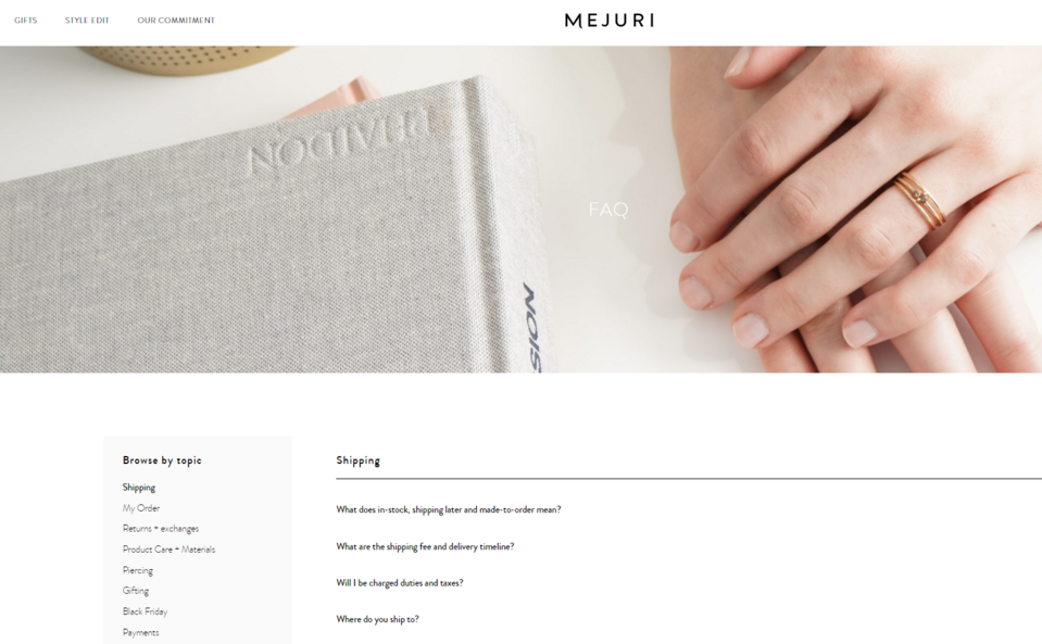
Source: Mejuri
Switching between individual entries is very easy and efficient thanks to the categories section on the left side. When you select any topic from the column, a list of frequently asked questions for that category appears on a light background. When you click on a question, a short answer will unfold underneath it.
The Mejuri company's FAQ not only provides the customers with a lot of valuable information but also improves the navigation within the page. Some of the answers contain links that redirect to other locations on the website.
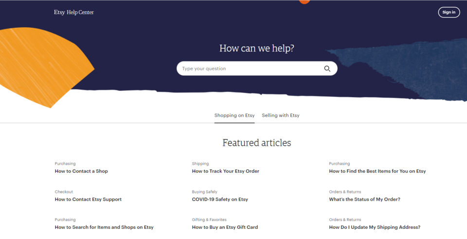
10. Etsy
The Etsy FAQ is an example of a website containing frequently asked questions. They are categorized according to whether you want to view them as a seller or as a customer. The issues in a specific section have been divided thematically to make it faster to get the required answers, and to reduce the risk of frustrating the user. The clear layout and a low number of questions prevent the site visitors from feeling overloaded with information, which often leads to reduced page display times. The entries contain useful links and describe the steps to be taken in the purchasing process or when returning products.
Source: Etsy
Under the questions, there's an alternative to the FAQ in the form of a forum or contact with the support. Simply press a button to get support from the Etsy team.
FAQ page examples - summary
Individual pages of an FAQ may differ in complexity, number of elements, length, and form of answers to the frequently asked questions, as well as interactivity. The diligence with which the FAQ pages described in this article have been created indicates a great deal of care for the customer and their satisfaction when interacting with the company website. Keep in mind that every contact of a potential customer with your brand on the web has an impact on its image.
We have many years of experience in creating company websites and are well-informed on current FAQ-related trends. We'll be happy to advise you on the best solutions for your brand and to create an interesting FAQ section on your website as part of Drupal development.