Good Services Page Examples and Useful Tips for Creating Your own Page

Service pages are a fundamental part of any company website. They may serve many functions. They present a product to the customers, motivate them to get in touch with the company, make it possible for them to make a purchase, as well as allow the company to collect the customer's data. Service pages are made up of many different elements. Choosing the ones that’ll help you achieve a specific goal is crucial to the success of your business.
What is a service page and what is its purpose?
A service page is a part of a company website. As the name already suggests, it allows presenting the services or products offered by a particular brand to potential customers. A service page may be a subpage of your company website or a standalone web page in a different domain.
Due to the function of service pages, their location, and use, they’re known by different names. You may also come across the term product page (or subpage), sales page, or simply landing page, as this is where advertising campaigns often link to.
Service pages shouldn't just contain product descriptions. Consider mentioning the benefits of taking advantage of your offer. Service pages can consist of many elements that’ll allow a potential customer not only to learn about your products or services but also to make a purchase (buy a product or service online or contact your sales agents).
What elements should the services page consist of?
A service page serves both the customer and the company. The user visits it to obtain the information necessary to make up their mind about making a purchase, and to contact the seller. It’s here that the entrepreneur showcases their products or services, and gathers data about their potential customers.
Service pages allow the generation of leads, regardless of their form (a simple subpage or a landing page). Some of their elements allow Internet users interested in the offer to ask the company a question.
For the users, the elements of a service page are all the things they may see and interact with. As a seller, you need to apply the right steps and choose the right objects to put on the landing page, so that your products or services are presented in the best way possible, and so that you may persuade the potential customer to buy from you.
Content
A page may contain descriptions, advertising slogans, headings, bullet points, and quotes (e.g. feedback from satisfied customers). Descriptions are the most important element, as they explain to the customer what your offer is exactly about, and how the product or service benefits them. All other content is used simply to reinforce the message (customer testimonials or a section with blog posts) or to interact with the company (e.g. buttons or words that link to the portfolio and other parts of the website). Content should be easy to read, linguistically correct, and catchy.
Graphics and galleries
The first thing to do is to attract the user with interesting graphics and photos because they decide whether to read the text or not on the basis of visual impressions. Putting product photos on the service page is recommended. If you sell services or offer application subscriptions, you may put screenshots from your software that explain its functionalities or include charts confirming the effectiveness of your tool or service. Another great idea is to put infographics pointing out the simplicity of using the product or listing its many benefits.
Forms
Using the form in the content management solution, the company collects data about potential customers, and they can express a desire to establish direct contact with brand representatives. Think carefully about what information might be useful to you. A form that’s too long may have a discouraging effect. What should you ask about then? If it's a business customer and you have a lot of business solutions in your offer, ask them to indicate which department or industry they represent, so you may recommend relevant content and products. If it's a retail customer, you may ask them about their interests. Also, think carefully about where to put a form to collect the information (it may be in a pop-up window, at the bottom of the page on the side, move when the user scrolls the page, or be located between different pieces of content). It doesn’t necessarily have to be directly on the service page. If you place a suitable CTA button among the content, it may redirect the user to a separate subpage with the contact form.
CTA buttons
CTA stands for the call to action. It’s a button with a short slogan that stands out from other elements in terms of size, shape, or color. You may put it anywhere, in the content or graphics section, Hero section, footer, or header. Its purpose is to persuade the user to perform a specific action (e.g. make a purchase or subscribe to a newsletter). Putting it in a strategic spot on your service page may increase its effectiveness.
Animations and interactive elements
There are certain ways to make your service page more attractive. Interactive elements on a website enable two-way communication, i.e. exchange of information between the customer and the company (such elements are, for example, the previously mentioned forms or like and dislike buttons). When the viewer performs a certain action on the page, they see a certain effect. Animations, on the other hand, cause the page to seem more "alive" and trigger movement on it. Examples of animations include a carousel (a section in which different elements, such as photos or short texts, appear alternately) or a slider (a window in which new information appears periodically) in which you may present customer reviews or related products and services. You may use these elements and others (such as interactive flipbooks) to reinforce the text message – individual pieces of content may appear when you scroll the page or hover over a button or field.
Tools needed by services page administrators
When creating a page, think about how you’ll measure its effectiveness. There are quite a few tools available. Choose them based on what information you want to obtain about the activity of your viewers. You may analyze many different things, e.g. sources of traffic on the website (from which channels users go to your product page), target fulfillment (sales, sending a reply through a contact form), and many others.
There are a lot of tools available, including:
- Google Analytics — shows the number of users who’ve visited your website, the most popular subpages, and traffic sources (organic sources, ads). This tool also makes it possible to assess the effectiveness of advertising activities to some extent. If the bounce rate (the number of visits that start and end on a given subpage without interaction or transition to another subpage) is high and the average session length is short, this may mean that a certain group of consumers who visit your site doesn’t find what they are looking for or aren’t interested in your content at all.
- Google Tag Manger — we need it to set up the events that we want to measure. It’s up to you to decide what these events will be. Make your decision based on what customer action is important to you and what do you think their “journey” through your website should look like. The interactions you may care about include transitioning to a thank you page (meaning the customer has submitted a form or made a purchase), clicking a button, or scrolling to a particular place on the page.
- HotJar — this tool provides you with the heat maps which show, among other things, where on your website the viewers are most likely to click. This allows you to plan necessary changes to your page (e.g. adding a CTA button or placing it in a different place) or to measure the effectiveness of your website. HotJar also monitors user sessions, which lets you see how they move around the site, if something is blocking them, or if they're having trouble with something (like completing a transaction or filling out a form).
These are just a few examples of tools that you may use. There are many free and paid solutions on the market that could help you achieve your business goals.
Services page examples - business and product sites
Brands put a variety of elements on their service pages. You can make your landing page more attractive in many ways. However, remember to be guided by the goal you want to achieve with it. Every element on a sales page should play a specific role: inform, motivate, or redirect the user to a different place on your website. Check out the effective service pages created by different companies.
1. Medallia
The various product and service subpages of the Medallia brand differ from each other. Some have sections leading to a blog, others don’t. Some have numerous CTA buttons, others feature contact forms. Differences can also be seen in the length of texts published on the pages. This reflects the great care taken in planning and creating the website.
The developers of the Athena solution page have placed the talk to an expert CTA already in the Hero section. This makes it easy for the user to find the button should they decide to contact an expert. The CTA redirects the user to the contact form which is placed at the bottom of the page. This allows the potential customer to express their desire to learn more about the offer and provide the seller with general information about their business needs.
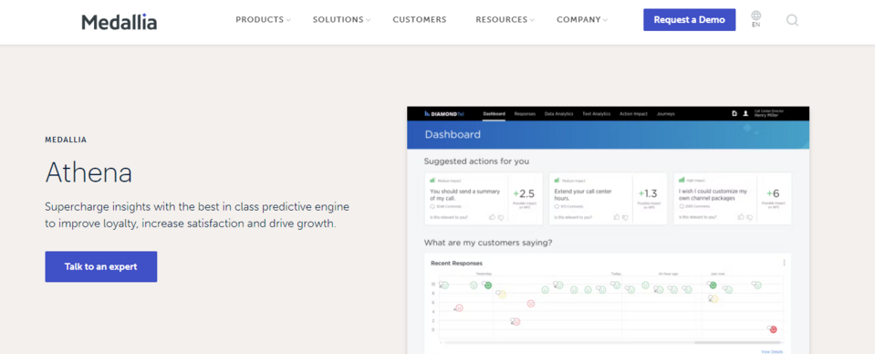
Source: Medallia
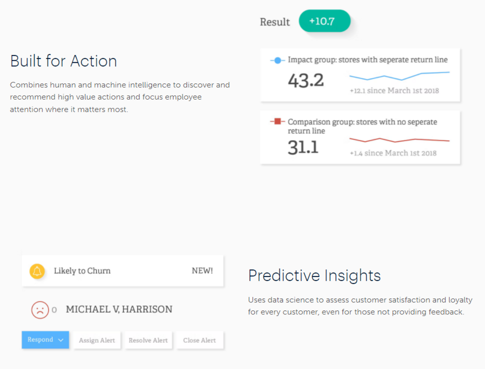
Medallia goes for a minimalist approach when it comes to content and makes great use of graphical elements to present functionalities that may be of interest to their potential customers. Concise descriptions are accompanied by images. They emphasize the words, increasing their impact on potential customers. The listing of advantages motivates the viewer to buy access to the tool.
2. Achievers
On the Recognize tool's subpage, the Achievers brand favors the use of short slogans over lengthy messages, with graphics playing an important role. Descriptions of the benefits of purchasing the product are engagingly combined with visualizations of the specific tool functionalities. On the sales page, potential customers see many screenshots from the application offered by the company so it isn’t necessary to create extensive content. The customer gets to know the tools just by looking at the graphics.
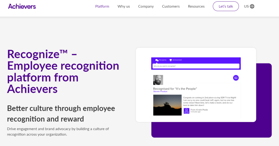
Source: Achievers
The possibilities of integration with other systems are also demonstrated, which is important for many companies using numerous applications in their daily work.
The elements are interactive – they have buttons that, when clicked, display new information in a given element. This not only saves space on the service page but also raises customer interest, allows them to enjoy exploring the site, and extends the time that they spend on it.
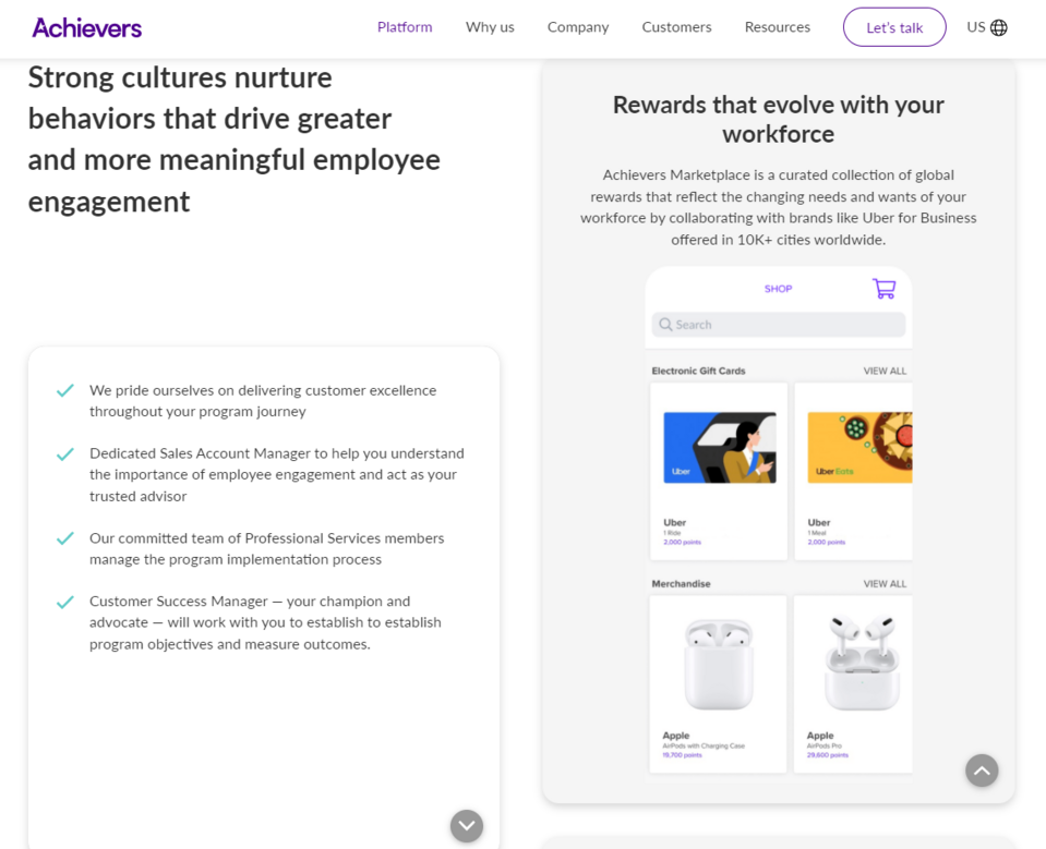
The button allowing to send a request for a demo version of the tool has also been highlighted. It redirects the viewers to a short contact form, which includes questions about the number of employees and the type of tool needed by the given company. Obtaining this information at an early stage of communication with the customer allows the salesperson to better prepare an initial proposal.
3. Timely
The service page of Timely, an attractively designed product by Memory, deserves special attention. The big slogan in the Hero section clearly explains the function of the solution (measurement of working time). In a short description under the headline, which explains exactly what Timely is, the company emphasizes that they actually use this tool in their daily work and believe it to be highly effective. Furthermore, the Hero section immediately motivates the potential customer to take action immediately, by including information about the possibility of enjoying a free trial period. Immediately below is a box where the customer can immediately enter their e-mail address to begin the trial period now.
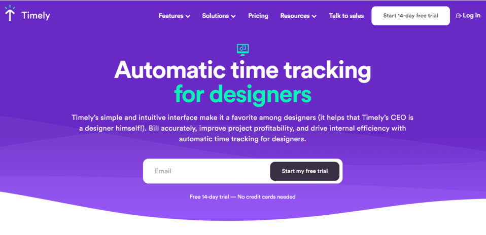
Source: Timely
The page is divided into two columns. In the one on the left, there’s a CTA button below the icons showing the awards given to this product and its commendations. It redirects straight to the registration page where the customer may create an account in order to start using the free trial version of Timely.
The section with the CTA button stays visible at all times. The column in which it’s located remains static while the user scrolls through the content in the right-hand column to learn more about the tool. Thus, at each stage of getting to know the content by the consumers, the button reminds them of the possibility to test the tool for free and motivates them to take advantage of this option.
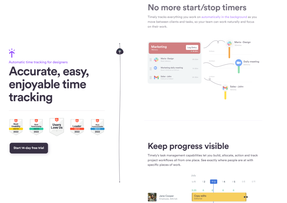
The column on the right lists the application's functionalities and benefits, presented with simple yet original graphics. The advantages of the tool are confirmed by the feedback from satisfied users. The testimonials are further highlighted by a video in which a customer tells how Timely has improved work at their company.
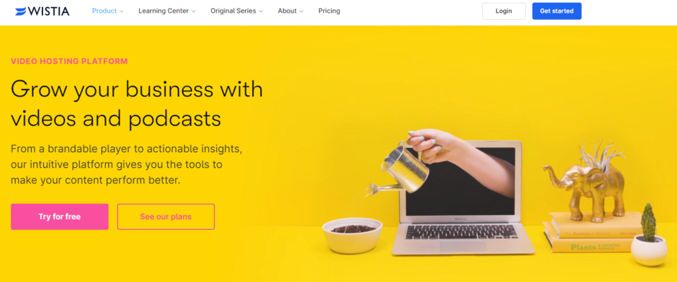
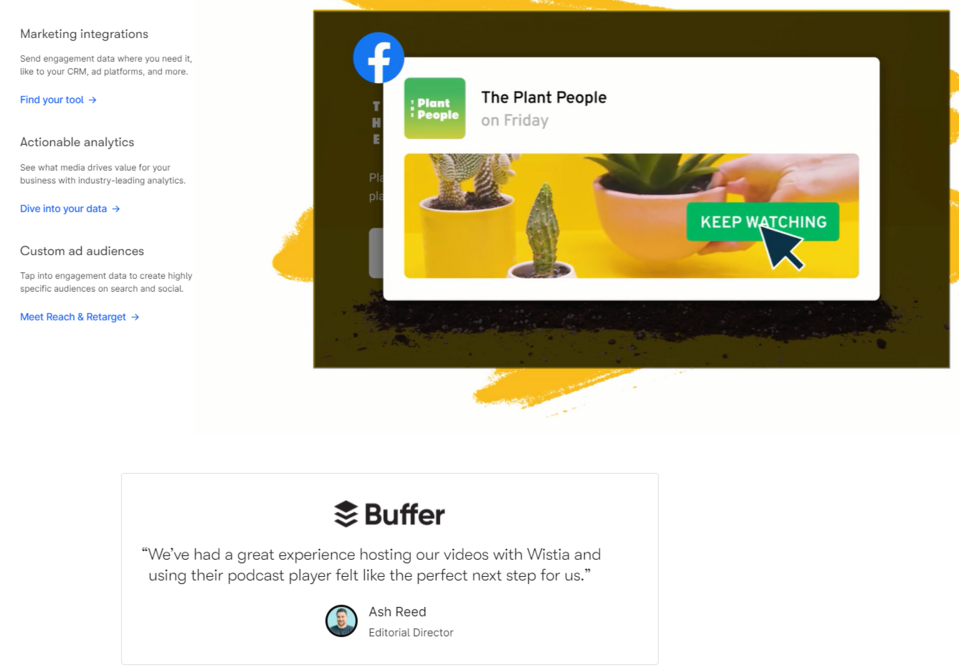
4. Wistia
Animations play an important role on the service page of Wistia. Some of them show the functionalities you’ll be able to utilize as a user. In this way, without bloating the content, the company demonstrates to the viewers what kind of practical video and podcast management tools it offers on its platform. The brand presents its product and motivates people to buy it in an efficient and interesting way.
Source: Wistia
Numerous links and CTA buttons lead to different places on the company website, providing the viewer with many opportunities to explore the page and allowing the brand to convey the solutions available to potential customers, as well as make them interested in the topic.
The content and animated elements are interwoven with testimonials from satisfied customers. The testimonials reinforce credibility, enhance the company's image, and encourage making a purchase consistently throughout the entire browsing process.
5. PandaDoc
The PandaDoc brand structures its service pages according to how the tool is being used, or to the industry or department within the company that may be interested in the product. This allows the PandaDoc team to focus on the functionalities and benefits that are most important to the selected target audience.
In the Hero section of the service page created for companies in the finance industry we immediately see two CTA buttons, one encouraging us to use the trial version (redirecting to the login page) and the other – to give the demo a try (redirecting to a short contact form). The small print underneath says that trying out the tool doesn’t require providing a credit card number when registering, which effectively removes one of the most common objections raised by the users.
Below, we may see three windows that briefly describe the three most important tools (e-signature, templates, and the analytical tool). One of the boxes is interactive and takes the user to a more detailed description of the functionality and the benefits it may bring the business. This approach reduces the amount of content on the page, while still providing the customer with all the important information about the product.
The function of the tool itself isn’t difficult to understand, so the company focuses on describing the benefits of using it. Original graphics appear next to each of the listed benefits. The testimonials section includes not only a quote from a satisfied customer but also statistics indicating to what extent and how the tool has improved productivity in that company.
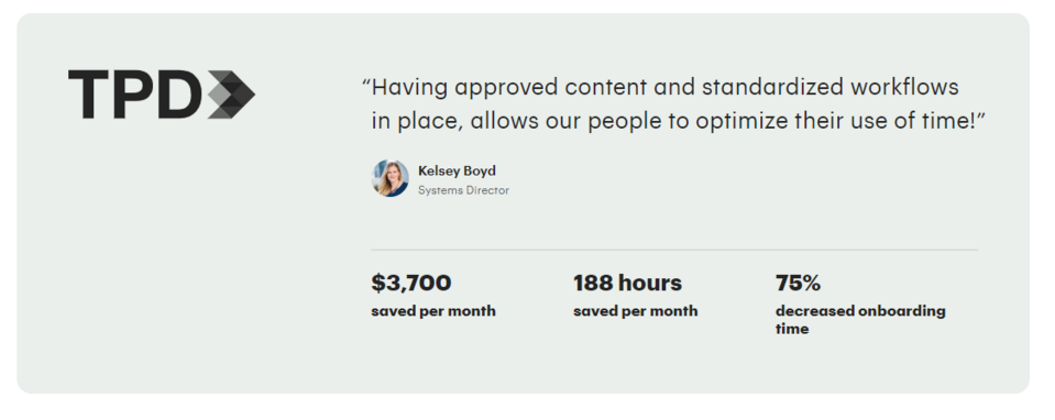
Source: PandaDoc
6. Aanika
Interesting design corresponds to the sector in which the Aanika company operates, and it emphasizes the innovative and modern nature of the solution. The company develops and uses special microbiological markers to facilitate the monitoring of supply chains. The clear and concise description of the service's functions makes what may seem a rather technical and difficult subject easy to comprehend. The customer will easily understand how the solution may be applied in their own business.
An interesting idea here was to break down the benefits of the offer with the environment, the consumers, and the business customer in mind. The potential customer may clearly picture the business benefits they’ll receive by choosing to use the brand's services, as well as learns how using the offered solution will change their image in the eyes of their own customers and business partners.
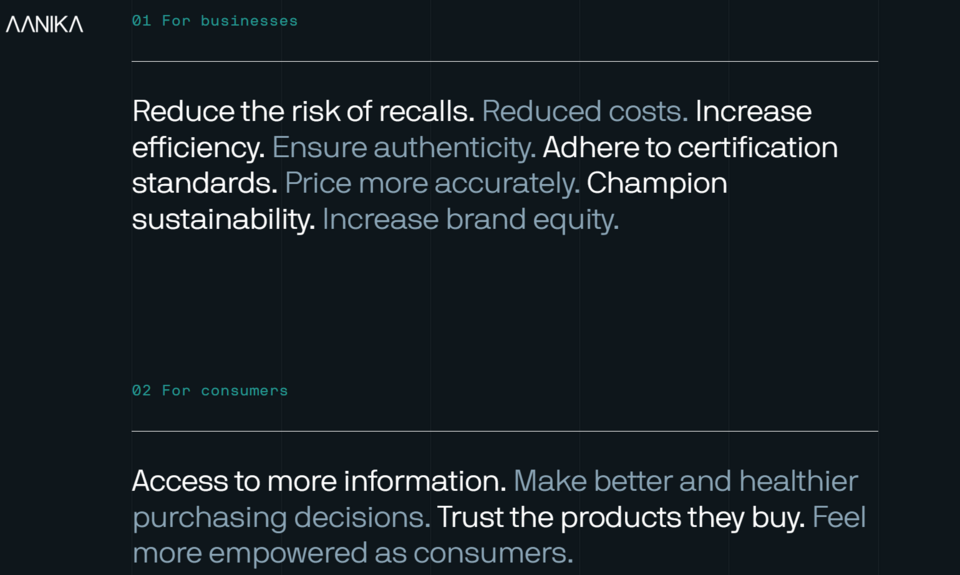
Source: Aanika
The brand also doesn’t neglect the generation of leads. At the very bottom of the page, there’s a short prompt for making a contact and a Get in touch CTA button. The probability of reaching this element is high due to the decision to limit the amount of content on the page.
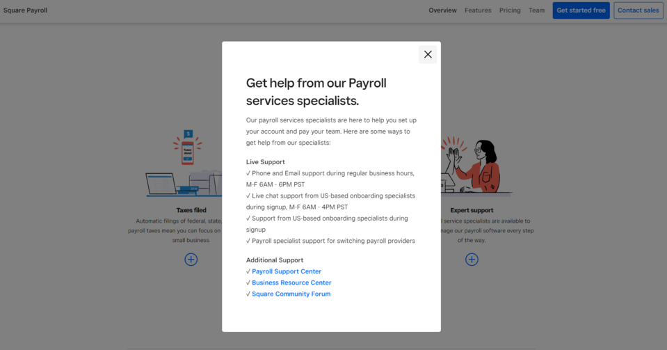
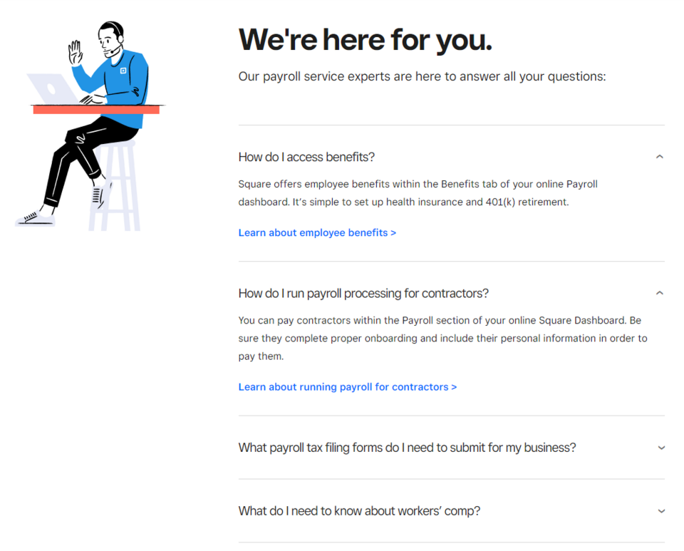
7. Square
In the Hero section of the Square company product page, a large CTA button can be seen right away, prompting the customer to begin the trial version for free. It redirects to the registration page, meaning that the customer may start testing the application right away. Below that, we can also see a smaller, interactive Connect with us slogan, which, when clicked, redirects us to a contact form, so that we may get in touch with the company's salesperson.
The page contains many interactive elements. After clicking on the "+" button under the description of each service, windows containing a detailed description of the service open. CTA buttons may be found in almost every section, constantly motivating the customer to learn more about the benefits of the company services or to take advantage of their offer.
Source: Square
The benefits of using the services are confirmed by customer testimonials, and for those customers who need more detailed information, a short FAQ section has been provided. Placing answers to frequently asked questions in the product subpage allows to quickly resolve the basic doubts of potential customers and remove their possible objections. The answers themselves contain links that redirect the user to more in-depth information.
Creating service pages in Drupal
Are you wondering how to create an engaging landing page? The most important thing is to have access to the right tools and technologies. Drupal is a CMS that offers many possibilities, suitable for building even the most complex websites. You may use it to build high-quality service pages for your company. It contains a variety of useful modules, including those for preparing forms, which are practically indispensable on service pages. Some of them will allow you to easily create attractive banners with graphics or text, sidebars (small windows with additional information or buttons), and so-called carousels (a type of gallery, i.e. a section in which graphic or text elements appear alternately), etc.
The Contact module is available in Drupal core, allowing you to exchange emails with viewers. You may also install a more advanced module, Webform, which allows you to build any type of form that can collect the business information your company needs.
Droopler, a Drupal distribution created by our developers to build websites quickly and easily, will present you with interesting tools for designing service pages. Droopler gives the user access to over a dozen ready-made components, which is all that you need to create a responsive service page. It also makes it easy to manage your company website.
Services page examples - summary
As you can see, there are many ways to make your service page stand out among those of your competitors. Accurately describing your services or products doesn’t always have to involve publishing extensive content. However, building a service page as impressive as the ones we’ve shown above isn’t an easy task. It requires both good intuition and experience in website design. We create high-quality service pages as part of our Drupal development service. Don't hesitate to contact us to tell us your ideas, and we’ll help you bring them to life.