What Should a Good Food Website Design Look Like? 8 Examples

There are many types of food websites, each with its own unique functionalities. They often shape the design of such a web page to some extent. Despite various functional limitations, some creators are able to nimbly overcome the barriers of common solutions and build truly unique websites. Check out the most interesting examples.
Food websites – characteristics
Today, virtually every company needs a website. It's one of the basic tools for communicating with customers (together with social media). Having a web page will also be of use to food brands. We aren’t only talking about restaurants or food ordering websites. There are also industries such as FMCG (Fast Moving Consumer Good), web pages with recipes, and catalogs of catering facilities. When talking about food, it's hard not to mention drinks, so the discussed group of web pages could also include the company websites of producers of alcoholic and non-alcoholic beverages.
As you can see, food websites constitute quite a large and varied collection of web pages. They differ not only in the style of graphic elements, but also in the presence of practical tools, e.g. search engines, applications for reserving tables, or panels to manage your orders and profile after logging in.
What should stand out for food website design?
Among the interesting web pages related to food, we'll not only find those belonging to small and medium-sized brands, but also corporate websites. They differ a lot, but they also have some common features, which include:
- Responsiveness – restaurant customers often want to find a place within their area quickly, using a smartphone. A person who can’t comfortably view the content on a phone will quickly leave the website. Remember to adapt it to mobile devices.
- The right way to present the content – getting to the most important information should be as easy as possible. One of the mistakes restaurants make is putting menus in PDF format. This is a particularly bad idea if you assume that customers will be opening your website on their smartphones, as it means having to switch between the document and the browser.
- Aesthetic photos – good photos can suddenly make your mouth water, even if you aren't particularly hungry. It's worth investing in professional photos, as low-quality pictures can effectively scare restaurant guests away or stop people from ordering your dishes.
What should be included on a food website?
The right website design is just a framework that needs to be properly filled out to create a one-of-a-kind web page. A tasty story is essential. When buying services and products, consumers want to support certain ideas that resonate with them. On a food website, you can allow yourself to share a more detailed history of your brand with your users. Tell them something special and stand out from other companies. You can mention a multi-generational tradition, ecological processes, local products, or a unique atmosphere.
Another important issue is visible company details — it's less important in the case of portals focused strictly on placing orders, but crucial in the case of restaurants. If customers don't know where to find you or how to contact you, they'll most likely look for another venue.
Also, you shouldn't forget about customer testimonials. Don't let your audience waste time looking for opinions on your restaurant in rankings. Put testimonials and customer opinions about your website and service on your web page, so that positive feedback is immediately visible to your visitors.
Email marketing, personalization, and retargeting are important parts of a marketing strategy in almost any industry because, when used well, they can make it easier for you to retain a customer or acquire a new one. To take advantage of these marketing solutions, you need to obtain the data of customers. Forms for collecting information should be placed prominently on the website (e.g. on the home page or contact page). You can encourage visitors to register, e.g. by offering a 20% discount on the next order.
The tools for making reservations or placing orders should be on the web page of virtually every restaurant. The website should be integrated with the system for placing orders or making reservations – this will facilitate not only the work of the company's staff but also the ordering of food itself.
1. FIG restaurant website
The simple yet elegant web page of the FIG restaurant refers to the style characteristic of the venue. The Restaurant page describes the brand's mission, thanks to which you get to know it better before you go to the menu or reservation. The content is accompanied by photos of the staff (whose members are presented below), kitchen, restaurant, and employees at work.
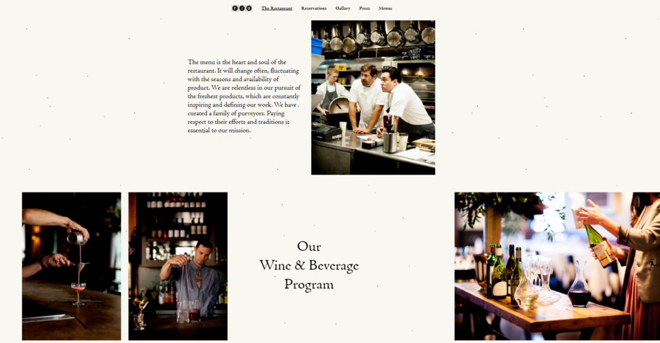
The website creators prepared a photo gallery so that customers could better feel the atmosphere of this place and see what the dishes look like. A section dedicated to publications mentioning FIG has also been created, allowing customers to learn more about the brand.
Reservations can be made by selecting the number of guests and the date in a special calendar and then choosing one of the free hours in the window of an external system integrated with the website. At the bottom of the web page, there's an artistic map with address details and a section with job offers, as well as a link for subscribing to the newsletter, and social media buttons.
2. Aesthetic food – Black Star Pastry
No one would probably guess at first that this is a pastry shop website. It's definitely a breath of fresh air in this industry. The Black Star Pastry web page shows interesting animations and the design is the opposite of simplicity, despite using just two classic colors (black and white).
The products are divided into groups – each product is described, and the description is provided with an aesthetic photo. It's worth paying attention to the way each product is presented. Nice photos stand out against the white background and attract the attention of visitors. On this page, the arrangement of items in the product category is interestingly combined with unusual graphic designs, creating a unique and practical food website.
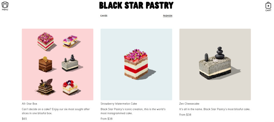
You can buy cakes via the page. In a separate store you can purchase coffee, clothes, ceramics, as well as gift cards. The user can configure them themselves, after switching to the external system.
The Locations page clearly presents the addresses of all stores of the brand and their opening hours, and this information is presented in an unusual way – on "pieces of paper" resembling notes.
3. Field & Flower food company website
The web page of the Field & Flower food selling company is an example of a food store with a really broad offer range. The brand solves the problem of presenting all products and keeping order on the website by creating subpages for each product and using navigation based on drop-down lists. The main menu also includes special offers.
An interesting solution for those who don't have time to go shopping is the option of ordering a box with more products. Next to the offer, the seller suggests for how long and for how many people the ordered amount of food should be enough. You can choose a subscription, as with the popular box diets, which is extremely convenient as you don't have to remember to reorder each month. The company donates a certain amount from all the sold boxes to the FareShare South West foundation fighting world hunger.
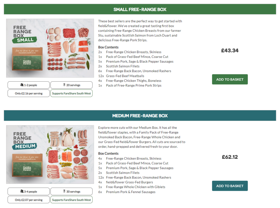
The website, together with its design and graphics, brings to mind rustic, rural motifs – closely related to the offered products (cold meats, cheeses, etc.). The About us and Our farmers pages look very nice. They allow you to learn more and understand the company's mission, its history, and the quality it offers. The web page has a lot of CTA buttons placed in strategic areas – Shop Now, Get Started – which increase the likelihood of making a purchase. The company also promises a discount for referring it to your friends.
4. Slate Milk protein drinks manufacturer website
Almost immediately after entering the Slate Milk web page, the visitor learns that the mysterious, designer cans, more typical for carbonated drinks, hide chocolate milk. The minimalistic graphic presentation of the advantages and properties of the product, located just below the Hero section, attracts attention. In a simple way, without making the content bloated, the brand conveys the most important information about the product.
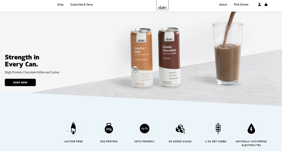
The content created by Slate Milk is supported by testimonials, placed also on the home page, from satisfied customers who explain how the product affects their quality of life.
From the brand's website, you can go to the online store. Next to each product, you'll find detailed information on its ingredients, as well as advice on what time of the day is best for eating it. There are testimonials from customers under the description. If in doubt, the user can quickly obtain additional information using a chatbot – this solution not only fits the modern style of the brand but is also very convenient for potential customers. In addition to a one-time purchase, you can also take advantage of a subscription.
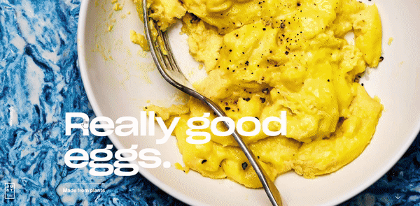
5. JUST Egg healthy food website
The JUST Egg brand makes great use of wordplay. The website's strong advantage is its economical but catchy content. The headline isn't just informative, but also intriguing, promising potential customers very good eggs… made from plants.
Scrolling down the web page, you see more and more new photos and CTAs that signal the unique properties of the product (e.g. the possibility of reheating the egg in a toaster). By clicking the CTA button, you can go to subpages that describe every issue in more detail (advice is given in the form of videos and high-quality photos). On the website, you'll also find a list of recipes (for different times of the day) related to using the company's product.
There are fantastic animations on the Learn page. Here you can read more about the idea behind the brand and the manufacturing process. After viewing the content on this page, the potential customer learns how choosing this specific product, which is an alternative to traditional chicken eggs, helps to improve the condition of the natural environment.
At the bottom of the website, there's a newsletter subscription form (very simple – you just enter your email address) with the promise We send really good emails in the header, referring to the main header of the web page. This isn't hard to believe after browsing such an amazing food website.
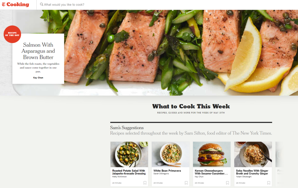
6. NYT Cooking recipe website
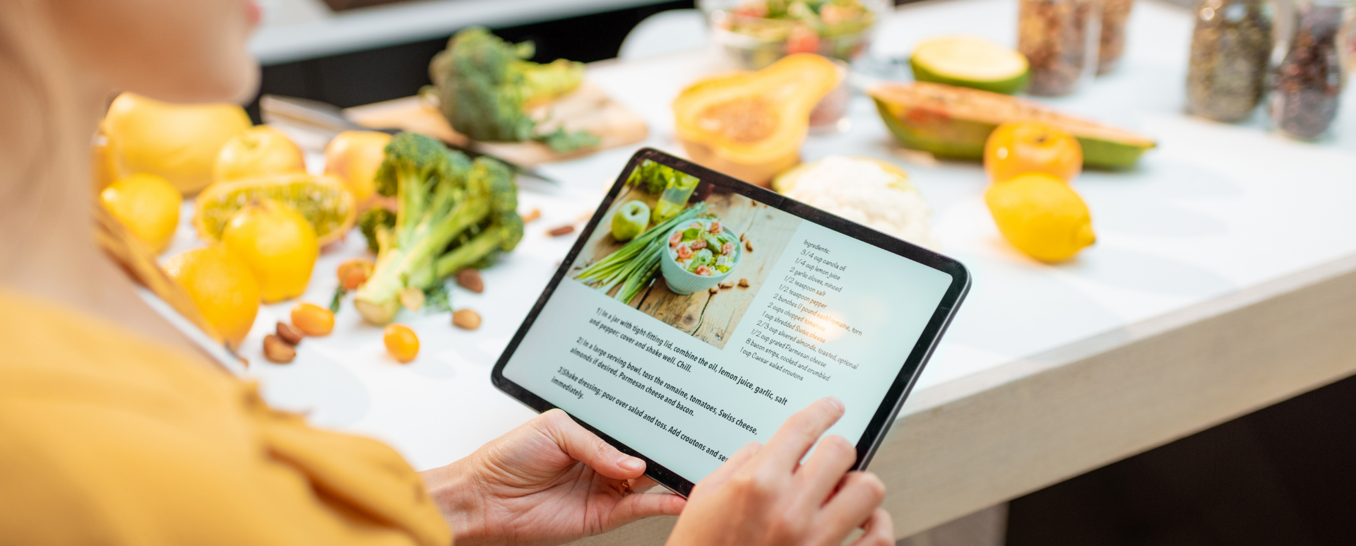
The NYT Cooking recipe website can successfully replace your favorite cookbook. At the very top, you'll find a recipe search engine, thanks to which you can quickly find the dishes you currently feel like eating. You can also create your own account and save your favorite recipes, as well as create your own shopping lists after logging in.
The web page has a section with weekly recommended recipes. The thumbnails consist of a photo, the dish name, and the approximate preparation time, which makes it easy to find a recipe that is right for you. Recipes are divided into different thematic categories, e.g. the best chili or hot chocolate recipes. At the very bottom of the page, you'll find entries with basic cooking tips, together with encouragement in the header - Master the basics.
7. Good looking food – Lou Malnati's Pizzeria
The Lou Malnati's restaurant website contains high-quality photos featuring tasteful dishes made from fresh ingredients, bold colors, large headings, and visible CTAs. The Hero section consists of various photos and messages presented in the form of a carousel – they're a bit like seasonal menu inserts.
The navigation takes you to the page with the history of the restaurant that has been around since 1970. The authors of the website emphasize the long tradition of the restaurant and the family nature of the business. Above all, however, you discover the passion of its creator and his path to success. Additional subpages allow you to follow the history of the pizzeria decade after decade, from the beginning of its operation.
The website offers pizzeria customers many interesting functionalities that make placing an order easy. The useful Join a waitlist feature allows you to reserve a seat at the restaurant and place an order before arrival, so the restaurant staff can start preparing the dishes before the customer shows up at the restaurant. The people who frequently order pizza (and other dishes) with delivery will appreciate the Reorder option, which allows logged-in users to quickly order the dishes they ordered before.
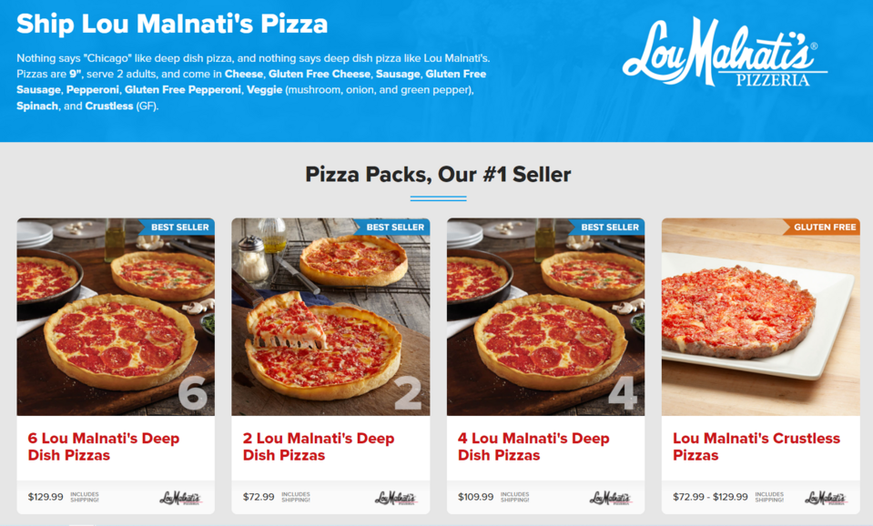
You can also use the Ship a pizza option, which allows you to order dishes to be delivered even to another state. On one of the pages, you can find tips on how to properly reheat these dishes.
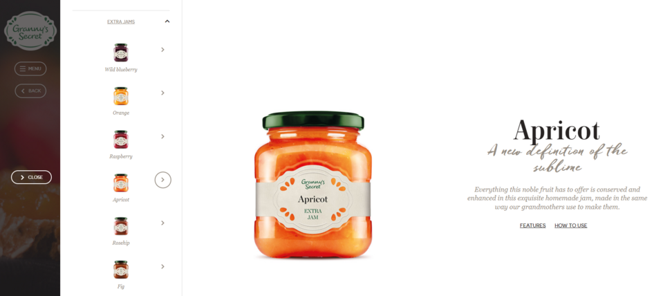
8. Granny's Secret preserves shop website
The Granny's Secret brand uses the popular association of delicious preserves with the culinary talents of our grandmothers in its branding. The consistent design uses interesting header styles and high-quality photos. The design is complemented by subtle animations when moving between the pages and a special animation signaling loading the content of subpages.
The company's page is proof of great storytelling with the use of various forms of communication – written content, videos, and photos. The video showing the history of the brand makes an amazing impression.
An interesting element that can affect sales is putting the advice on the use of individual products next to their descriptions. It's a way of showing the customer why they might need that particular product.
Challenges in creating food websites
The main challenge is determining what functionalities and elements a food website should have to meet the brand's goals of serving customers, providing entertainment, but at the same time not giving the impression of being overloaded. Choosing the right solutions may turn out to not be easy. In addition, food web pages have a lot of active users, which means that any changes or difficulties in using the website will be immediately noticed. The team handling the portal needs to act quickly and come up with a good plan for improving the website.
Developing the right system for making reservations or placing orders requires the right approach to the project and the use of appropriate technologies. Such a tool has to be able to deal with growing traffic without any problem, as your company's popularity will increase. It was one of the challenges that our team had to face when creating the Tablein reservation system. To solve performance-related problems, we conducted an in-depth system analysis and optimized the key functionalities. In addition to improving various parts of the code, we focused on database optimization. We also improved the interface and added new payment methods. As a result, we managed to improve the operation of the system and guarantee its high-level performance, regardless of the growing number of users.
Kwestia Smaku, on the other hand, is one of the most popular recipe websites among Polish users. Its visitors needed a search engine that would quickly recommend relevant suggestions. We used Apache Solr solutions and Search API modules to build a convenient tool for searching content by the names of recipes or ingredients. For user convenience, we also created the option of adding favorite recipes to a special list, making it easier to come back to them later. It’s also possible to create notes in individual parts of the selected recipes, visible only to a specific user.
At Droptica, we use Drupal to create high-quality corporate websites for our clients. We can help you improve your web page or build a food website from scratch.