
What Website Elements Are Worth Testing? 5 Examples of A/B Testing

More and more companies are choosing to conduct detailed tests on their websites in order to improve them. No one can tell you better what solutions best appeal to users, who are your potential customers, than they themselves. Then what elements of websites are worth testing? See 5 examples of A/B testing that have led to improved results for the real business web pages.
Why is it good to perform A/B testing of website elements?
A/B testing involves presenting users with two (or more) different versions of certain content and checking which one is the most effective (allows for achieving a specific goal adopted by the company).
The tests focus on verifying the effectiveness of a single element, meaning that in a given trial, the distinct variants differ in only one element (such as the color of the CTA button or the size of the headline).
Companies have various goals. Some want to increase sales, while others wish to increase traffic or engagement on the website. What can A/B tests help you with? They are worth performing if you care about:
- Increasing user engagement. Not all content will interest them to the same extent. A/B tests allow you to determine with high accuracy which headlines, videos, graphics, and animations will intrigue visitors the most and keep them engaged in interacting with your web page.
- Reducing the bounce rate. Recipients leave a website within seconds of being on it for a variety of reasons. The culprit can be archaic design, chaos on the web page, lack of intuitive navigation, or errors. By performing A/B testing, you can find out which solutions are most understandable to users.
- Improving conversions. You can't even imagine how much seemingly minor changes can affect conversions. Sometimes it's enough to use a different button color, headline size, or content to achieve conversions tens of percent higher than before.
Here are some examples of how various companies have achieved success by modifying their websites based on the A/B testing they've done.
1. Yuppiechef - A/B test of website navigation
A website should be intuitive, which is why companies often opt for a classic yet practical design for a company web page. The basis of navigation in such cases is the main menu and buttons placed in various places on the website. They enable the user to navigate freely. Certainly, it would hardly occur to anyone that the lack of a menu visible at first glance can positively affect conversions.
An example of A/B testing conducted by Yuppiechef - an online store with kitchen accessories - is interesting in that it concerns precisely the visibility of the menu, which is usually one of the most basic elements of a website. The company's goal was to get more registrations from one of its landing pages (Wedding Registry). The test authors wanted to see if removing the menu from the landing page could positively affect conversions.
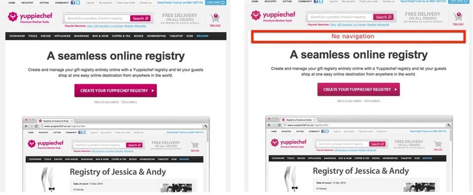
Source: VWO
In the course of A/B testing, two variants of the website were compared. One featured a classic main menu, while the other didn’t have one at all. The web page was tested for traffic coming from different sources - direct search, organic search, Google Ads, and Facebook ads. The results were surprising. The company achieved a 100% increase in conversions (from 3% to 6%).
The complexity of a website can sometimes distract users and pull them away from completing the activity you care about. It's worth seeing if fewer elements on your web page will bring better results.
2. Arenaturist - A/B testing of search engine
Arenaturist (currently Arena Hotels) is a portal for booking a hotel or apartment in Croatia. In 2013, the company's strategy included launching three new booking websites. Faced with this challenge, decisions had to be made about what they should look like.
A key element of booking web pages is search engines. The specialists from Arenaturist weren't sure how this element should look to bring in the most revenue possible. That is why they conducted A/B tests, comparing two versions of the portal - with a horizontally oriented search engine and a vertically oriented one.
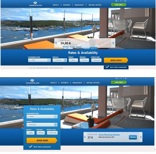
Source: Carmelon Digital Marketing
The vertical variant achieved a conversion rate of 0.32%, while the horizontally oriented one scored only 0.23%. The first version thus proved more effective. It brought 119 transactions from 37770 visits, compared to 87 transactions from 38121 visits that came from the second option. Then the A/B testers recommended that the company implement a vertical search engine on the website.
It’s worth taking the time to test the placement of functional elements of the website. After all, they are the most important for customers, as they help them achieve their goals - to get in touch with a company, purchase a product or compare offers.
3. Workzone - A/B testing of how to present customer testimonials
You might think that in customer testimonials, the most important thing is their content, and this is true, but the way they are presented also has a big impact on achieving the company's goals. Entrepreneurs often forget that the presence of certain elements of a website can distract users and pull them away from completing activities that are desirable from a business perspective. This has happened to visitors to the Workzone portal, which provides entrepreneurs with team management solutions.
The company wanted to increase the number of requests for demos of their solution. One Workzone specialist was convinced that the colorful logos placed next to the testimonials next to the contact forms were distracting users. To test his hypothesis, they created an A/B test. The first variant included colored logos, and the second - black and white. The test was conducted only among new visitors.
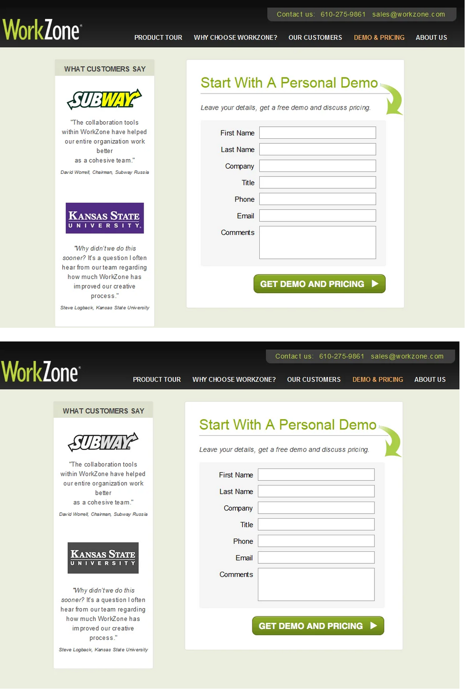
Source: VWO
The new variant achieved 34% more conversions than the original version of the website, so Workzone made modifications.
4.NuFACE - testing free delivery over a certain order value
NuFACE is a manufacturer of rejuvenating accessories and cosmetics. The company was looking to improve sales performance on its website. Despite high traffic, many customers weren’t finalizing their purchases.
The purpose of the ecommerce website's A/B test was to determine whether free delivery for orders over $75 would convince more customers to buy.
Two versions of the web page were compared during the test. On one, there was no information about the possibility of free delivery, while on the other, there was a clear notice above the main menu, above the button taking a user to the online store, that orders over $75 would be exempt from the delivery fee. As a result, the number of orders increased by 90%, while the average order value jumped by 7.32%.
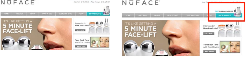
Source: Ignite Visibility
The incentive to purchase in the form of free delivery has proven to be extremely effective in this case. However, this doesn’t mean that such a treatment will increase sales on your e-commerce website. The problem with online stores can be low intuitiveness, errors on the web page, difficulty in managing the shopping cart or finding the products the users are looking for. Running tests will help you determine what changes are worth implementing in your store.
5. Training Realm - A/B tests of headline effectiveness and customer testimonials
A/B tests are a very important work tool at Droptica. Thanks to them, we’re able to improve conversions on our clients' websites. Sensible planning and execution of several A/B tests can bring really beneficial results.
While working on a website for Training Realm - an app for creating a personalized workout plan - we conducted headers tests. We suggested that the client change the headline to contain more specific information so that the website visitor would know in the first second what type of offer to expect.

As a result of changing the headline, compared to the previous version (Training Realm - the ultimate training instructor), registration increased by as much as 18%.
We also tested a subpage where a user can purchase a subscription. We decided to add an additional motivation to buy in the form of customer testimonials. Next to users' opinions, we added their photos, which increased the credibility of their reviews. As a result, the conversion from page viewer to paid subscriber increased by 11%.
After testing and determining the effectiveness of the abovementioned solutions, we made changes to the Training Realm website. Both modifications led to an increase in subscriptions by as much as 31%.
What should you keep in mind when planning A/B testing of website elements?
The basis for success when it comes to using A/B tests to increase the effectiveness of a company website is to plan them carefully. Conducting an ill-considered test can bring disastrous results. It happens that it’s misleading, as a consequence of which you can make changes to the website for the worse. However, if you have the support of knowledgeable professionals, you can design A/B tests of the key website elements, which can contribute to better results of your business.
If you have enough time, resources, and skills to conduct A/B testing, keep in mind a few best practices:
- Test your company website regularly. Website standards are changing, as are user preferences. Keep track of trends, check your web page's performance, and the effectiveness of new design, navigation, or communication with your audience.
- Test the effectiveness of individual website elements. Entrepreneurs are sometimes tempted to test several elements of their web page or marketing campaign at once. However, this will make it difficult for you to interpret the test results. By testing one element at a time, you can determine with greater accuracy what change helped you achieve the desired result.
- Conduct tests on a sufficiently large group of users. Achieving a significantly higher conversion or user engagement score can get the tester excited and motivate them to make immediate improvements to the website. This is a great idea, as long as the group of users taking part in the tests is of an appropriate size. Rushing during A/B testing isn’t advisable. It’s necessary to test new solutions on a large number of people so that the results are reliable.
Also, remember to choose the right time to conduct tests. Increased user activity during periods of seasonal promotions may favorably affect your results and cause you to make modifications to your website that won’t positively affect its performance (traffic, conversion, engagement) in the future.
Examples of A/B testing - summary
A/B testing is a simple and effective method that allows you to choose the best solutions for your website. Companies that test their design do it regularly to improve their web page on an ongoing basis and keep conversions as high as possible. Sometimes modifying a seemingly insignificant element can positively affect the performance of a company's website. It’s worth conducting tests both on an existing web page and when designing a new one from scratch. We’ll be happy to help you build or improve your corporate website in line with the latest standards and market trends and using A/B testing.