7 Inspiring Examples of Website Design for a Manufacturing Company

Manufacturing companies are most often B2B companies. Their products end up in stores or are bought by other organizations. A website created for such a business should emphasize professionalism, brand experience, and the high quality of products. What elements shouldn't be missing, and how such a web page should look? In this article, you'll find 7 interesting examples of websites for manufacturing companies.
Key elements of website design for manufacturing
A well-designed manufacturing company website encourages new people to familiarize themselves with the offer. It can also help you gain new clients or take over those who have been sourcing from your competitors so far. However, to have such potential, it should contain a few key elements of business websites.
Offer description
The most important thing is to explain the offer in detail. The best-designed websites of manufacturing companies have visible buttons leading to product subpages, so the user can find them quickly. Such subpages should contain the most important information about the offer, but at the same time shouldn't be overloaded with content. It’s a good idea to use bullet points, graphics, and videos presenting the products.
Contact details or a form
Companies should assume that their potential business clients will have additional questions or ask for a special offer. The contact page is a mandatory element of a manufacturing company website. It should contain an email address and telephone number for the customer service department. It's a good idea to put a contact form in this area of the website. The website's side border or the hero section (if you create a multi-stage form in the form of a survey) would also be a good area for this, or you may hide the form window under a button and put it in a strategic area on the web page. By adding a few more specific questions to the form, you can significantly shorten the process of preparing a personalized offer and complete the sale faster.
Intuitive navigation
Good navigation is essential for any website, and in the case of product web pages, it guarantees a competitive advantage. Due to the very broad offer, the manufacturing websites are often complex, have extensive menus, and seem disordered. It's difficult to find the necessary information and contact details on them. Take the time to plan the user's path and use buttons (including CTA – call to action), to create intuitive navigation on your web page and make it easier for visitors to navigate it.
Blog or news
A news section or blog allows companies to build a professional image and position their website more effectively. Although it's an additional element, it's worth including in your manufacturing company website design. This way, you give potential clients a better understanding of your brand and its products.
The best manufacturing website examples
Corporate websites for industrial and manufacturing companies aren't easy to design, as they usually have to present a broad offer and contain a lot of information. They also often have e-commerce functionalities. Which websites are worth being inspired by?
1. Mitsubishi Electric – clear main menu
Mitsubishi Electric Critical Power Solutions builds various types of batteries, among other things. The clear main menu is characteristic of this manufacturing company website. Interestingly, it isn't modest at all. It links to many pages, including those devoted to particular groups of products, of which there are quite a few. The creators of the website achieved a simple, aesthetically pleasing effect by dividing the main menu into two parts, placed on two separate bars. The top bar contains buttons for basic pages such as blog, news, contact, or technical support. On the bottom bar, there are links to product groups. When you hover the cursor over one of them, a list appears, from which you can go to the subpage of a specific product.
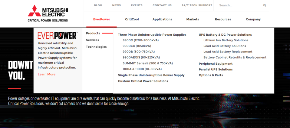
By designing their two-piece menu in this way, Mitsubishi created a practical navigation without introducing a sense of chaos on the web page. You can easily find subpages of specific products as well as other pages relevant to company websites (contact, events, news or blog).
2. Giti Tire – video in the hero section
What draws the user's attention from the first seconds on the website is the hero section. This element is intended to catch the user's eye and intrigue. It's quite common practice to include here high-quality, interesting graphics, slogans and a CTA button. Modern companies choose slightly more unusual solutions.
Giti Tire is a car tire manufacturer that decided to put a video promoting the company in the hero section. In just a few seconds, the video shows what the brand is about. It emphasises the high quality of products and their intended use (sports). Highlighting the power of machines and driving dynamics is typical for companies in the automotive industry, regardless of whether they manufacture cars or parts for them. The Enjoy driving slogan suggests that the purchase of these specific tires will increase the driving comfort and performance of the car.
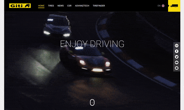
By putting a video in the hero section, we increase the likelihood that the user will actually make a longer visit to see the offer. If you choose this solution, make sure you prepare concise, but at the same time engaging material.
3. Titan – intuitive user path
In the manufacturing industry, too often the offer is presented in the menu. This makes the website much more difficult to navigate, as there are usually a lot of products. It's true that a determined client will eventually find what they need within such a maze of letters, but the whole experience will be tiring. A company website is a business tool, it's supposed to make it as easy as possible to make a purchase or obtain information.
Titan Systems produces machines and their components for industrial sectors. It's worth noting how the company presents its offer to potential clients. Titan does away with extensive, multi-level menu lists in favour of tiles. When you go to the Machines tab, three tiles appear, each with a category name and photo, giving the client some idea of what they'll see when they choose a category. By clicking on individual icons, the user moves step by step from the most general categories to specific products that interest them. Ultimately, the visitor reaches the product page, where they see photos, specifications, a list of functionalities, and additional information necessary to make a purchase decision.
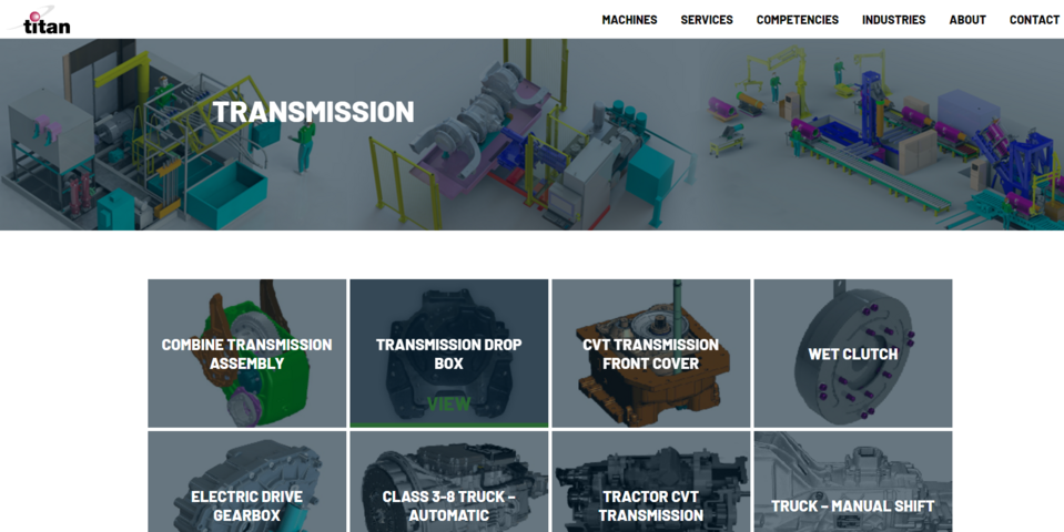
Interactive website elements, such as buttons and tiles, engage the user in browsing the content on the web page. Titan Systems diversifies the user's path by encouraging them to act, and also removes any potential negative impressions by keeping it simple.
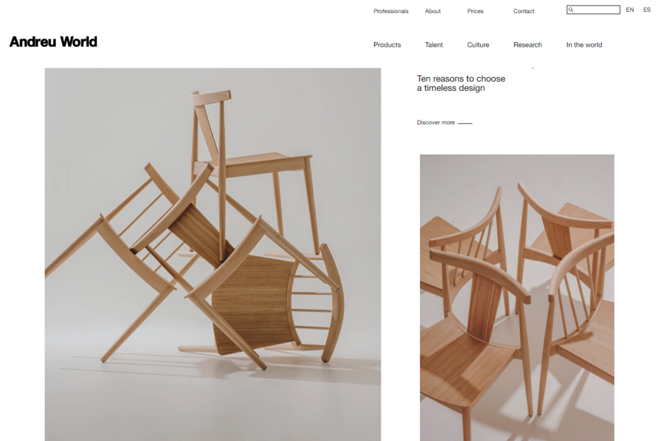
4. Andreu World – high-quality photos
Photos on the manufacturing companies websites are more than just decoration. Graphic elements can evoke various emotions and impressions in those who look at them and make them perceive the brand in a specific way, e.g. as more professional, exclusive, or quite the opposite – as open to all types of clients.
In the case of Andreu World, a manufacturer of designer furniture, the photos present the offer and ready-made suggestions for combining the company's products. There are also some that only show where one section ends and another begins, helping to divide the page. Regardless of their function, all the photos on the website are original and interesting. They provide an excellent visual background for the offer posted on the website and for the minimalist, lightly written content.
5. Cree Lighting – concise and concrete content
The text on the website is one of its most important parts, because through it you present the values of your company and your offer to users. Content creators, however, often make the mistake of overdoing it. But it's the quality, not the number of characters on the web page that is important.
What catches the eye from the first moments of visiting the website of Cree Lighting, a company operating in the lighting industry, is a well-thought-out presentation of its content. Instead of creating long and tiresome paragraphs, the designers of this website decided to fill small sections, located all over the page, with short texts. You can see that the editors are skilfully using the headlines. They aren’t unnecessary advertising slogans, but they effectively signal what the user will find in specific sections or under individual buttons.
With larger amounts of content, it's sometimes a good idea to hide some part so that it doesn't interfere with the perception of the web page as a whole. Cree Lighting uses this in the Insights and Inspiration section, allowing visitors to reveal some of the content on their own. In this way, they add an interactive element to the website and engage users even more in browsing the content.
6. Hawthorn – comfortable navigation and process description
The Hawthorn company produces clothes. The home page of this business is quite simple. It describes the advantages of choosing the services of this manufacturer and presents the process of order fulfilment step by step. Thanks to such sections on the home page, the potential client can immediately find out what the terms of cooperation are and whether the company meets their requirements.
In addition to the main menu, the user can use the CTA buttons located in different areas on the web page to navigate more efficiently. Note the uniqueness of each CTA. The use of repetitive calls to action (such as learn more, see more) is a common practice on websites. Try to stand out among your competition by formulating varied CTA.
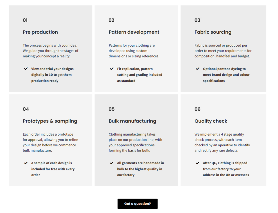
The calls to action on the Hawthorn website have been formulated using a colloquial tone (Got a question?, Check out our gallery) that encourages people to explore the website. The appropriate number and arrangement of buttons mean that the user interested in taking action doesn’t have to waste time and return to the main menu. Due to the thoughtful use of CTA, Hawthorn company ensures comfortable navigation.
7. Rice Lake Glass – a properly designed form
Rice Lake Glass is a company that manufactures glass products (windows, larger elements) to order for various institutions. There are two forms on their website. The simple and very short one is on the contact page and is used to collect inquiries. The more expanded one is displayed in the form of a window after pressing the Get your bid button in the upper right corner of the page. This form contains interesting solutions that are worth paying attention to.
There are many good practices for creating contact forms. Some companies choose to use a form in the form of a survey that displays one question at a time and informs you of the completion progress. Others create a long form that uses drop-down lists and other solutions.
The Rice Lake Glass company decided to present all inquiries simultaneously on a long form, ensuring that the user didn't take too long to complete it. How did they do this? They prepared the possible answers for the users and limited the number of fields to be filled out to a minimum. This form includes drop-down lists, checklists, and a mini-calendar. Completing the whole thing goes smoothly and without major problems, it takes 1-2 minutes.
When creating this type of contact form, it's also worth remembering about setting acceptable answers, e.g. in the budget section, the form may only accept amounts, and the answer entered in the window for the email address should contain the "@" symbol. You can also consider creating required and non-required fields, as well as using Captcha to verify the user and prevent spam from being sent to the company mailbox.
Website design for manufacturing - summary
The most important elements of a manufacturing company website are the offer and the content that describes it. Carefully thought-out navigation is also very important, as it'll help the user to find the products and services they are looking for. An important part of the navigation is the call to action (CTA) and additional buttons put on the web page.
In the world of B2B, an individual approach to the client and the possibility of negotiating the offer are necessary in many cases, so you should make it easier for the customer to contact an advisor. This can be done by creating an easy-to-read contact page and putting appropriately designed forms in other parts of the website. It's worth considering the use of state-of-the-art solutions, i.e. implementing a live chat or chatbot.
A blog, news page, galleries and photos are additional elements that help to interest the user visiting the website, as well as build a professional image of the company.
The design and development of a manufacturing website require much experience. For many years, we’ve been creating modern corporate web pages for manufacturing and industrial enterprises. We'll be happy to help you create your company website.