5 Corporate Websites From The Industrial Sector As an Inspiration For Your Website

Are you still wondering what your company's website should look like and what functionalities should it have? In the last article, I have given some examples of corporate websites of the medical companies found on the S&P 500 list. The following text contains further Drupal inspirations – this time in the context of big players from the industrial sector.
As much as 20% of large organisations from the industrial sector use Drupal. Among them are heavy equipment manufacturers, construction and transport corporations, as well as consulting companies. The global reach of companies' activities is reflected in their websites.
Cummins
Cummins Inc. is a corporation specialising in construction and production of diesel engines and drive systems for manufacturers of trucks, buses, as well as construction, industrial, agricultural, railway, marine and military equipment.
However, after loading the main page, attention is drawn to the element that is most associated with media industry websites and is usually used in website footers. I mean the "Latest News" section, from which you can learn about the company's activities in the context of the current events. Entering this block takes you to the "Cummins Newsroom", where all the articles are found. This very simple procedure phenomenally implements the assumptions of brand's identification with the so-called "here and now". This is, of course, a simplification, but extremely effective in engaging the recipient at the level of indirect reception.
I should duly add that the block I describe here works on the basis of scrolling – so you can choose the article you find the most interesting. It does not look like much, but the time spent on the website becomes longer.
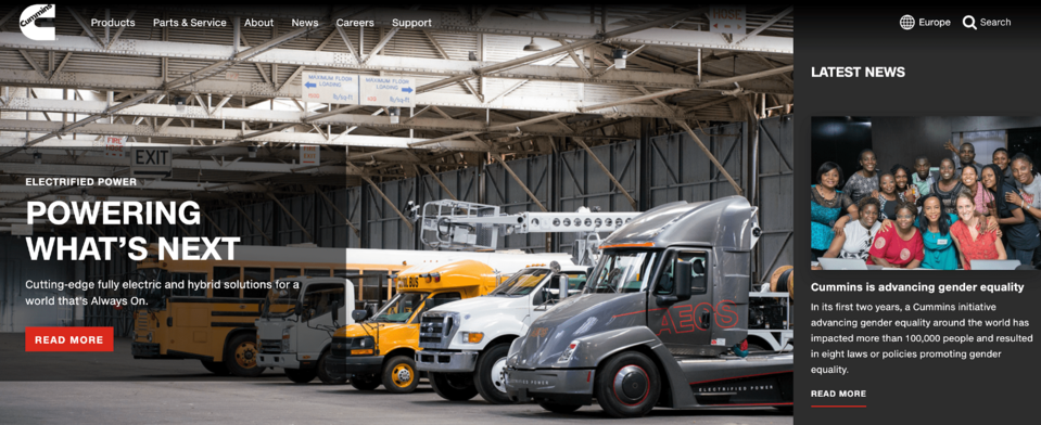
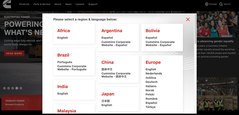
Staying on the topic of the main page, it is impossible not to praise the high-quality video appearing as the background. The slides change automatically every few seconds, but you can also do it by yourself. In the upper right corner, there is a search engine and a region selection icon; after pressing it you get a very clear list of countries to choose from.
The headline, and thus the menu, looks rather light-weight as if to counterbalance the rest. After hovering over the section, the option of further navigation appears.
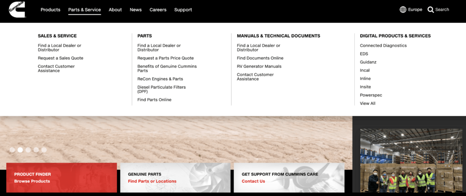
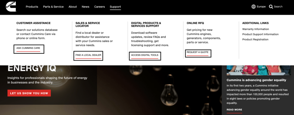
I would like you to take a closer look at the "Support". That is because n interesting solution has been put to use here, consisting of abbreviations referring to individual segments. This effectively limits the effort and time needed to search for information.
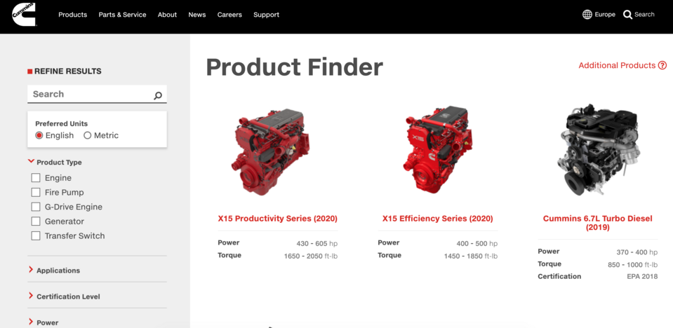
Anything else worth taking a peek at? Of course! If you want to put an emphasis on the sale of products and/or services on your website, it is worth to check out how Cummins does it. Located in the lower-left corner is the "Product Finder" highlighted in red. After entering this block, you are taken to the search engine, where you can define the further search. The "Product Finder" is also available after expanding the "Products" section in the top menu.
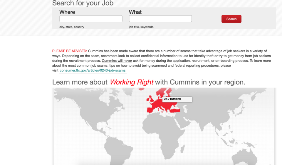
I left an element that should be particularly important for every owner of a corporate website for the end of the part dedicated to Cummins. I mean the recruitment and acquisition of valuable job candidates. The first search allows to enter the location and keywords related to the workplace. However, you can use the map and after clicking the region of interest – go to the next steps.
On the next screen, you see a very content-rich and attractive subpage. Information on the HR policy: vision, values, news are divided into small thematic blocks. After hovering over the block, the text lights up, and after pressing it... surprise! – you are not taken to another subpage, but like on Instagram, a picture with expanded content is shown.
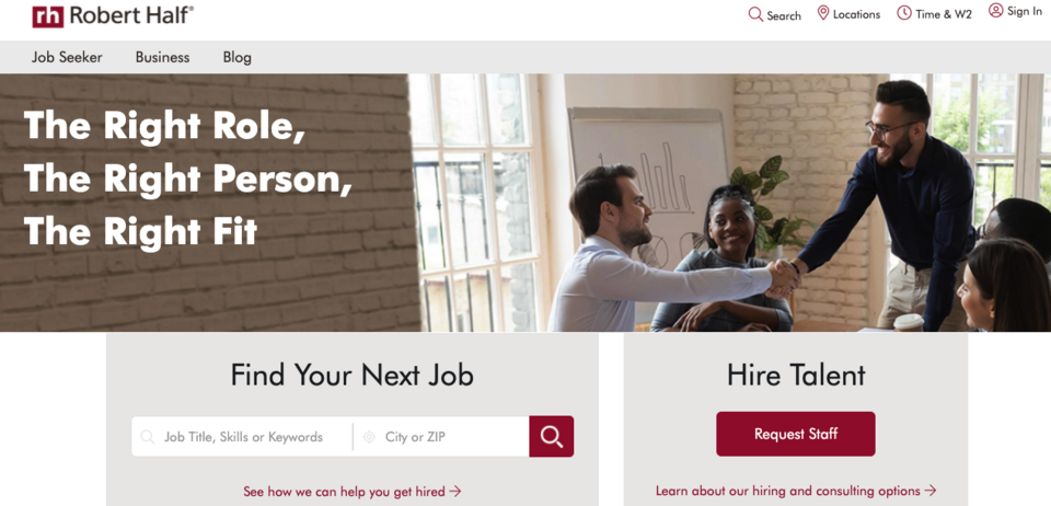
Robert Half International
Still staying within the topic of HR, I need to cite the example of Robert Half International – a global human resources consulting company, with over 345 locations around the world. The corporation operates in three segments: temporary employment, permanent employment and advisory services in the field of risks and internal audits. In short: the company's website is a large platform for searching job offers and looking for specialists. Already on the main page, you can see an obvious division into these two parts. The screen below shows the shortcut.
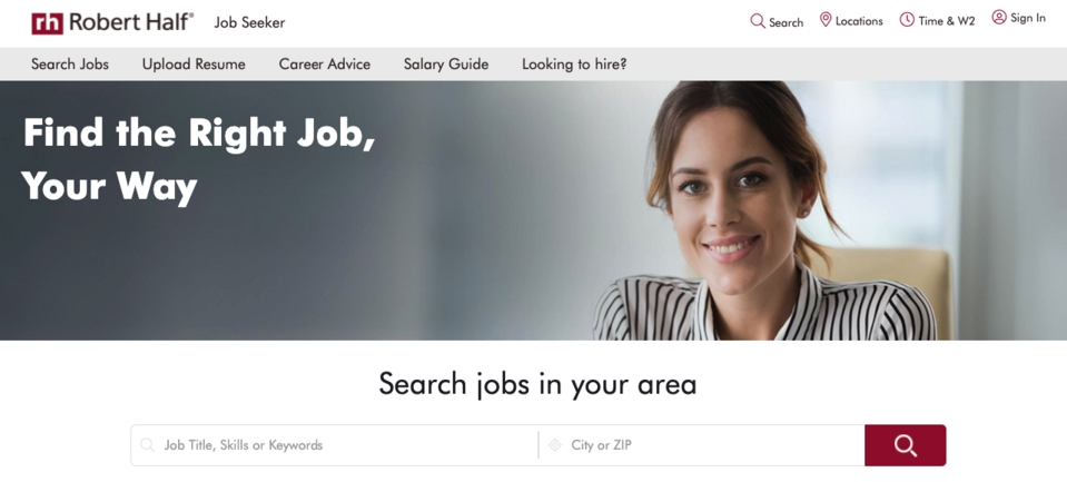
The further, deeper search option can be found in the main menu. After entering the "Job Seeker" you are shown a subpage with the option to import résumés, HR tips, a guide on remuneration.
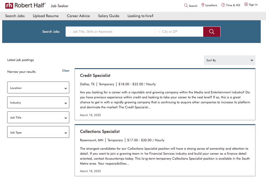
Upon choosing "Search Jobs", you can see more filtering options: location, industry, job title, type of employment. However, the descriptions divided into segments look light-weight, despite the obvious need to take into account a large amount of content.
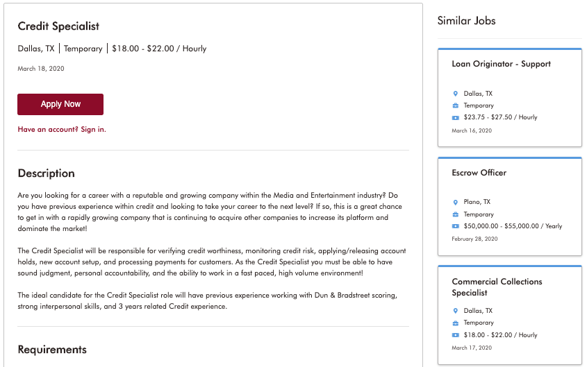
Let us go further. After entering a given block, you can see the full content of the advertisement. However, I would like you to look at the "Similar Jobs". It is a simple yet effective measure, which – by catching the attention – increases the likelihood of the user staying on the website longer.
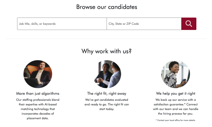
Now let us take a look from the employer's perspective. Almost everywhere you can find a "Request Staff" CTA. It gives you the option of completing the form, and on the basis of the information provided, you will gain access to the database of résumés of the people corresponding to your expectations. In addition, you can use the alternative: "Browse our candidates".
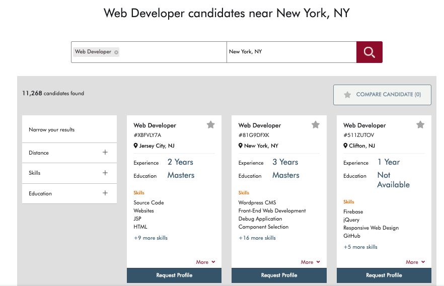
And if, for example, you care about finding web developers from the New York region, then after defining the query you will be presented with 11,268 candidates in this case.
So, if you are the owner of an HR company, I highly recommend these solutions. And if you work in another industry, then you can consider the features of this Drupal-based website in the context of partial implementation.
Fortive
If your company is listed on the stock exchange and you would like to present the results in a simple way, the Fortive website may be used as an example. In its upper left corner, in the header, there is the "Stock Info" presenting the current listing. So, you can learn about it just after entering the main website, but it is balanced and unobtrusive.
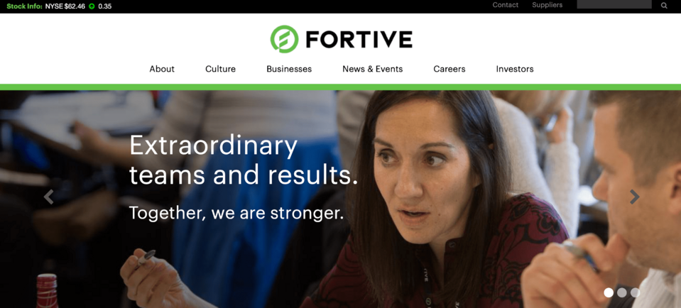
Fortive is a diversified industrial conglomerate company based in Everett, Washington. It controls over 20 companies in the area of field equipment, transport, automation and franchise distribution. Therefore, you would have the right to expect the website to be an extremely complex, heavy-weight platform. You could not be more wrong. The lightness is a consistent narrative here. The menu has six main segments, the slider has three scrolling boards, and slightly lower you can see clear and legible blocks.
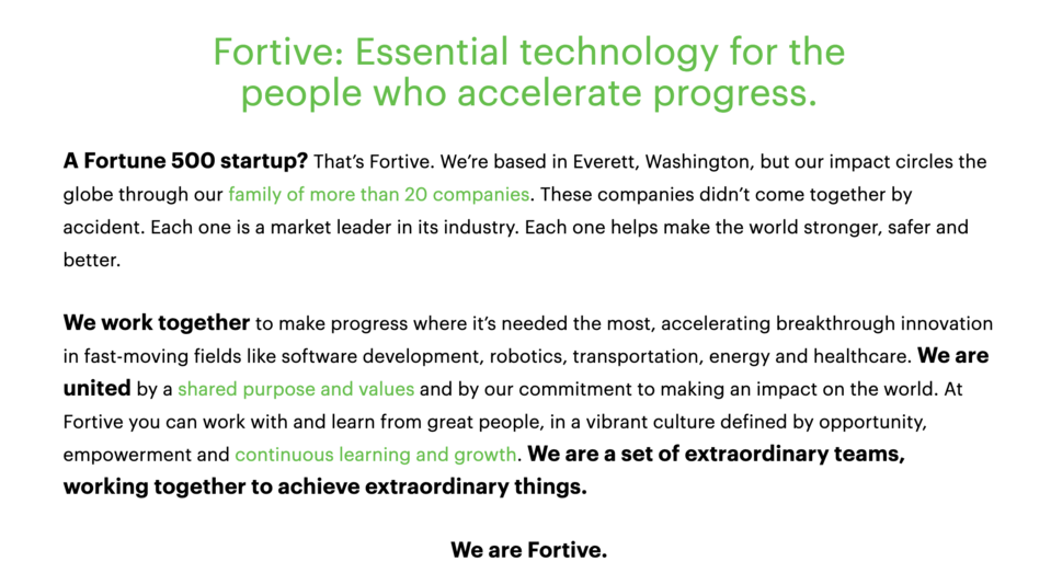
It is also worth to note that, unlike many other websites usually putting their mission and vision in the "About" section, in the case of Fortive you can find a few sentences about the business profile of this corporation at the very start, just below the slider.
General Electric
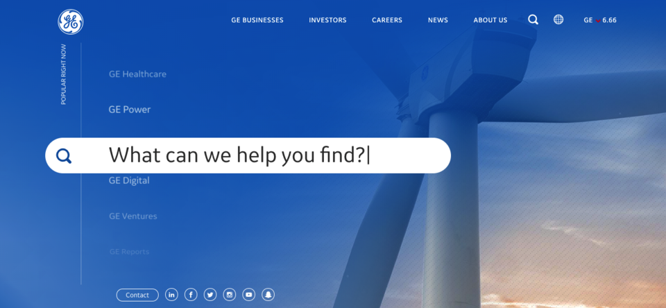
Staying on the topic of the stock market and business conglomerates, I would like to draw your attention to GE – one of the largest global corporations. You surely know this, but I will just remind that General Electric is a company operating in the machine, equipment, energy and oil industries. Their logotype belongs to the group of the most recognisable ones, and their main page is characterised by its unique beauty and its functionalities.
It is hard not to get the impression that the "less is more" principle guided the vision of creating the concept of the GE website. The colour consistency has been maintained – shades of blue are dominating, the menu is divided into five main sections, there is also the current stock market listing, and at the bottom – the "contact" section and redirection to company profiles on social media. However, the most attention-grabbing part is the centre with the subpages sliding in the background and the search engine.
On many websites, the search element is being neglected, and the paths to content are managed through navigation. I think that it is good to point the user the easiest way, especially since Drupal offers effective tools for this.
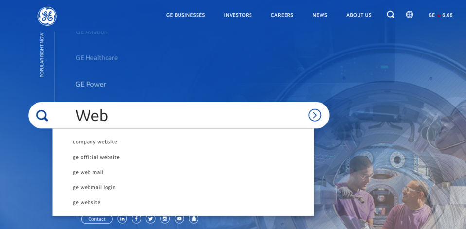
After selecting the content, we go to the results page. This is also made easier for the user, because in addition to the article's title and the link, you see a fragment of the description, thanks to which you can decide whether the content is just what you are looking for. What is next? Next, you see the "Newsroom" section, where in the subsequent steps you have the opportunity to narrow/expand your search. Seems like looking for breadcrumbs on the trail? By all means – and it is also quite spectacular.
Each of the subpages of the main menu, corresponding to a particular GE department, are designed with the same aim, i.e. readability. Would you like to know what readability means? There are many ways to achieve such an effect. In the case of GE, high-quality graphics were used: large-sized as the backgrounds and smaller ones constituting specific covers for the content blocks; the blocks are clearly separated from each other. The more clearance and space you provide your guest with, the longer the user will stay on your website, and the impression left by this visit will certainly be positive.
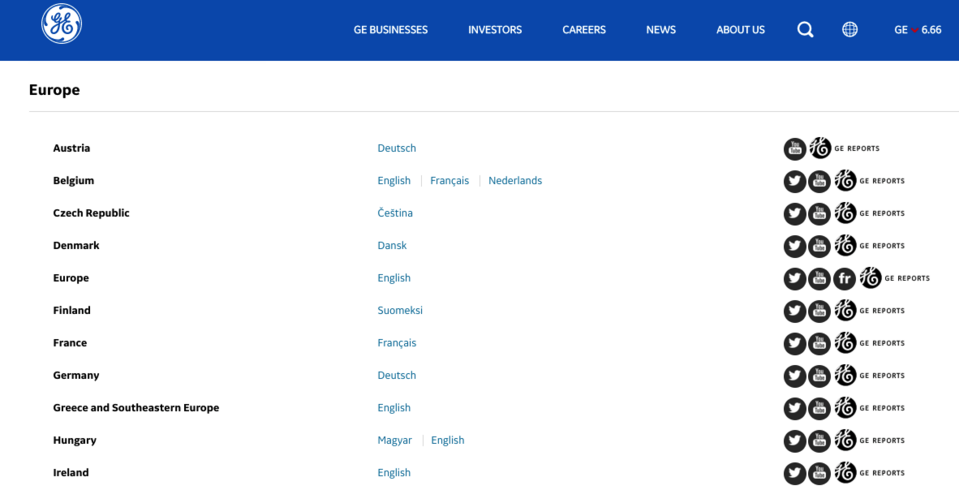
Let me take you back to the main page for a moment. In the upper right corner, there is an icon presenting the globe, clearly suggesting that after clicking it you will see the option of choosing a country. Sure, but... once again there is also one detail that makes all the difference. Because you can decide whether to filter by "Global Web Sites" or "Business Web Sites". In other words, you can choose between the direction and the content. However, sticking to the direction, you see a list of countries divided into continents, with information about the language version, but also with references to social media and the GE report dedicated to a given location.
GE.com is actually not just an example, but rather a model for building or rebuilding a website. So, if you want to have a framework concept for your organisation's website, you can open the General Electric page on one screen, and a notebook on the other, in order to record everything that inspires you.
Jacobs
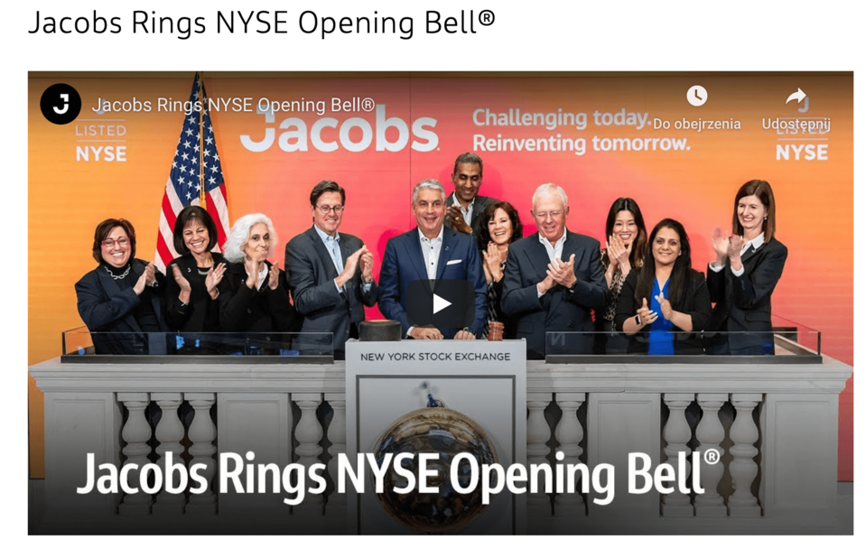
The New York Stock Exchange and presenting a company there has a different nature than the analogous activity of European companies, for example. This is caused by the obvious management style of American corporations but also relates to the tradition and history of the Wall Street Stock Exchange. I will not analyse this phenomenon here – I would just like you to give more emphasis on the fact that your company is listed in the stock indexes. Because Jacobs mark their presence at the stock exchange even more than the previous organisations. On the company's Drupal-based website there is a video from the grand opening of the stock exchange by Steve Demetriou, CEO, as well as his talk with the vice president of the NYSE. Maybe you should think about how to show that your company's presence goes beyond just the stock exchange?
 Founded by Joseph J. Jacobs in 1947, Jacobs Engineering Group Inc. is an American company that provides professional technical and construction services, as well as those in the field of scientific consulting for other organisations and government agencies. In 2018, the company took first place in the ranking of the best 500 design companies in the engineering industry.
If the above interests you and you would like to know more about Jacobs, and thus see how their "About" segment is presented, I would like to turn your attention directly to a video. The material titled "What we do and why it matters" obviously has a specific function: it is a message and refers to the mission of the company. Above all, however, it is presented in an attractive form. Have you recently thought about the style and narrative of a video about your organisation? Or maybe you are thinking about producing it? And finally: is the slogan that you identify with, the one that others identify you with?

I have mentioned the readability earlier. Looking through the Jacobs website, another word comes to mind: neat. This is my subjective feeling, and this term can, of course, be named differently at your discretion. I think of it this way because of the use of icons in the information blocks of the "Solutions" section. If you would like to commission a Drupal development service to a professional Drupal agency and get that effect of neatness, copy the screen below into the documentation.
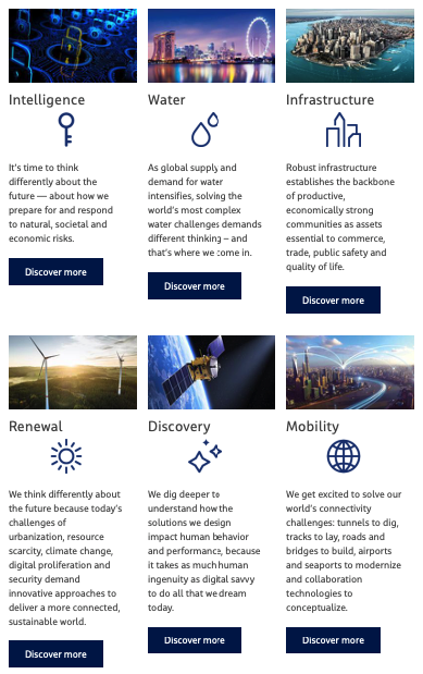
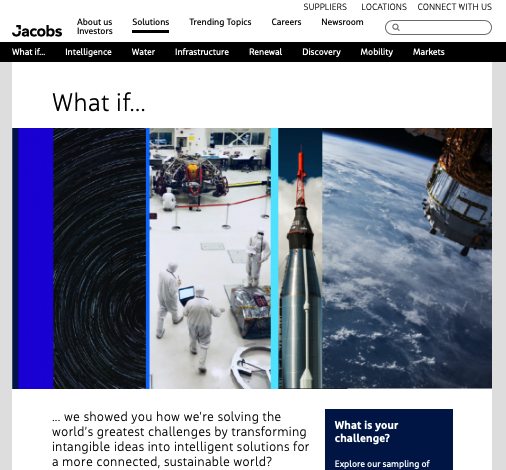
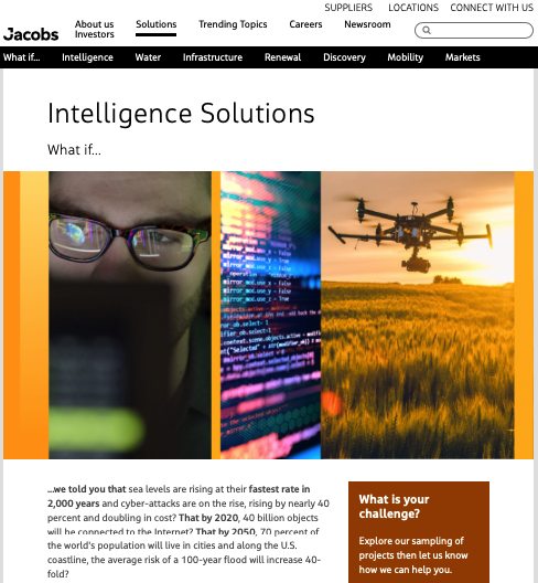
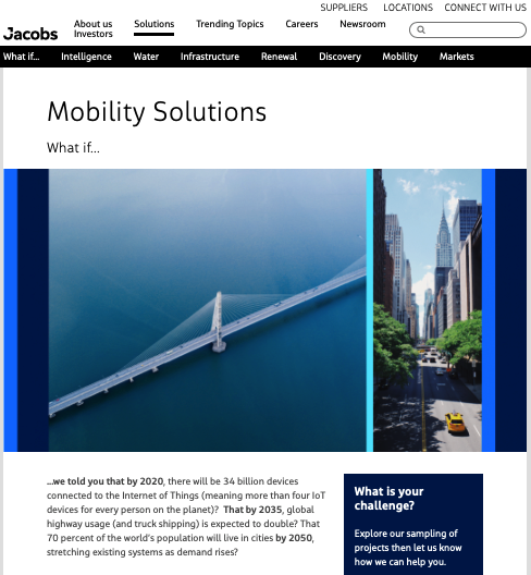
What if... I would tell you to have a discourse with your guests? To engage them in a conversation with this form of narrative? Look below how every section from the main menu communicates with the recipient.
Final thoughts
I hope that the corporate websites presented above will inspire you to find solutions for your organisation's website. Together with my previous text, you were presented with a description of 11 companies in total, and thus – the opportunities offered by Drupal. So, which of these websites caught your attention the most? Do you already know what functionality has the best chance to support your business?