
6 Corporate Websites From The Medical Industry As an Inspiration For Your Website

Are you planning to expand your large organisation's website? Or maybe you want to create a corporate website from scratch and are looking for ideas? Using the examples of medical companies from the S&P500 list, I will present some of the Drupal-based websites that can provide some inspiration for this purpose. Why not model yourself after the best?
S&P500 is a market index initiated in 1957 by Standard & Poor's, which is used to track the valuation of the 500 largest corporations listed on the New York Stock Exchange. It is a key and leading indicator for the economy. It is divided into 11 industries, which include: power engineering, finance, real estate. One of the most numerous is the health care industry, which is further divided into services, equipment, pharmacy and biotechnology. And out of all 62 medical corporations, as many as 16% of companies use Drupal: Pfizer Inc., Baxter International Inc., CVS Health, Danaher Corp., Hologic, Vertex Pharmaceuticals Inc., Perrigo, Laboratory Corp. of America Holding, Regeneron Pharmaceuticals, Varian Medical Systems.
Pfizer
Pfizer put Drupal in the very centre of their digital strategy. Before this happened, however, the Pfizer specialists devoted a lot of time to analyse many solutions in relation to critical cases, which were supposed to be a litmus test in the assessment of particular technologies.
In an interview given in 2018, Mike Lamb, the Global Digital Platforms Vice President, mentions: "We looked at other projects in the Open Source community (…), but we didn’t find anybody who was really living up to our vision."
The challenge consisted of moving many websites (over 60) to one platform, standardising all functionalities, while the creation process was to provide a responsive design of the highest quality while maintaining the consistency of the message about the global brand.
The result of the work was an extensive website that can serve as one of the best examples to show your drupal agency how you imagine your corporate website.
Attention is already drawn to the main menu, divided into five sections: health, science, people, goal, products. Each section is a thematic segment – when hovering over the title, a drop-down list of subpages appears. An interesting solution is the use of graphics here, thanks to which an individual segment does not seem to be overloaded with content, and at the same time – it links to the blog.
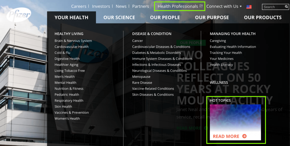
The header was also taken care of. The goal here was to shorten the users' path to the content they are looking for. In addition to redirections to the subpages concerning career, news, relations with investors and partners, there is also a reference to Pfizerpro – the address where industry professionals can order products. So, if – due to the wide range of your business offer – you are wondering how to lead the client and/or contractor to your service in the easiest and most effective way possible, I recommend Pfizer's solution.
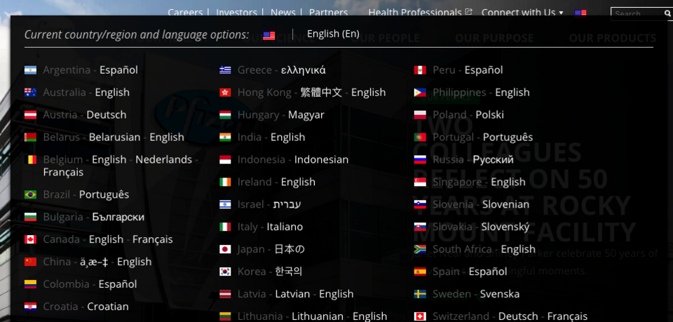
The header also includes Search, Connect with Us and a drop-down list with language versions. I would like to emphasise the latter. This is because on many websites of large organisations the element of language selection is neglected or considered a necessary evil, and thus its design, which – as you can see in the photo below, can please the eye – is ignored. And despite the fact that every version presents the flag, the name of the country and a word in the native language, the whole looks very attractive.
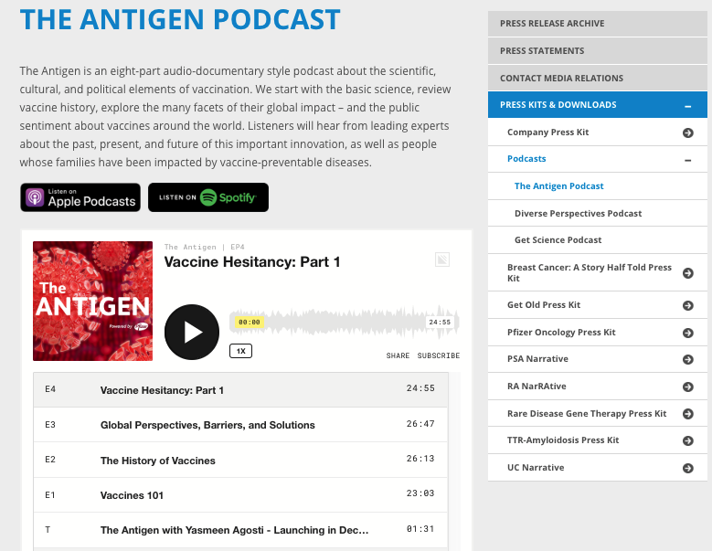
The main page has thematically divided blocks. Particular attention is drawn to the first one, regarding the podcast. It is not often that large companies run their own channel. It is a pity because it provides another medium through which one can communicate with contractors and clients. When integrated with Spotify and Apple Podcasts, it is like a playlist that the user can listen to – anytime, anywhere. So, if you want to share knowledge in an original way on your website or choose a native narrative and become an opinion-forming voice of your industry, this option should at least be considered.
Despite its rich content, pfizer.com does not seem to be overloaded with it. Digital managers cooperating with Drupal developers managed to achieve the effect of lightness, both through the design and the efficient content placement. If one would want to rate this website, it would be an easy 5/5.
Perrigo
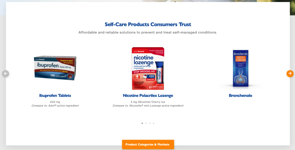
Perrigo is the world's largest manufacturer of over the counter (OTC) care products and a supplier of baby products for the store brand market. The company has an extensive structure of subpages, so it should not be surprising that Drupal 8 MegaMenu was used. It is a tool that enables dynamic menu design through unlimited possibilities for expanding submenus, adding/removing multiple columns and blocks, as well as icons, headers and classes. It is extremely helpful when managing a large amount of content, i.e. arranging content so that the user of your website can find information quickly.
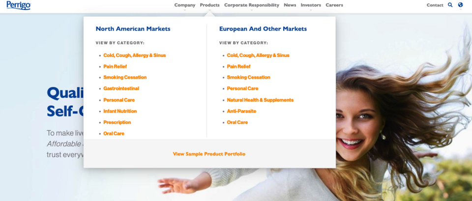
The company's offer includes a wide range of preparations. Therefore, the Perrigo marketers decided to put an emphasis on sales on the main page. For this purpose, they used a slider which presents the products in an attractive way. At the bottom of the slider, there is a redirection to a subpage with categories and markets, and there are sections with specific ailments and medicinal drugs. This is a very good example of how to reconcile the desire for recognition through products and associating the brand with the solution to a specific problem.
The logical transition from one element to another is the hallmark of this drupal-based website. This also applies to other sections. An example is Public Relations, which is in the next navigational step, and which interacts with the above product part. This design choice is worth mentioning regarding the consistency of the message, and if you go a little lower and come across a historical thread, in which you learn about their 130 years of experience in the industry, then in combination with the credo referring to the "responsibility" keyword, you get a thoughtful corporate narrative. The Perrigo website is simply a ready-for-use model for message management.
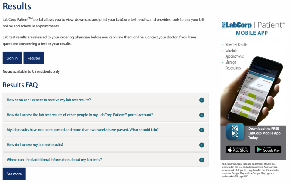
Labcorp
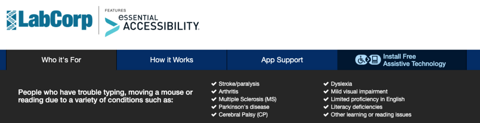
Labcorp Corporation of America is a California-based company that manages the world's largest clinical laboratory – it performs over two and a half million tests a week. The website is primarily used by patients who want specialised tests conducted. Because of this, such a website should be as intuitive as possible. Therefore, noticeable in the header should be the icon addressed to disabled people, clicking on which takes them to the subpage, where they can download and install eSSENTIAL Accessibility – an application that facilitates the use of the website for people with the diseases listed in the photo.
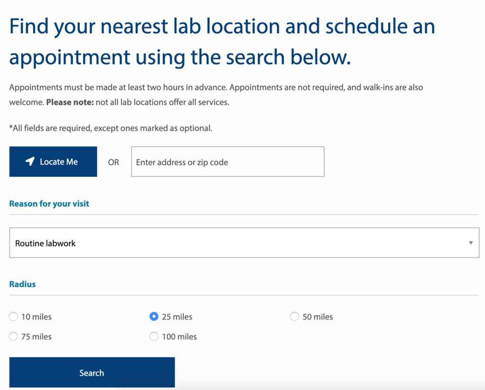
In the main, there is the "Labs & Appointments" section which – after selecting it – helps the patient find the nearest company branch and arrange a visit for performing tests. Interestingly, a satellite positioning function was used here, which speeds up filling of the form and also specifies the information about the user. In addition, there are two variants of search: basic and advanced, in which the patient answers the question about the reason for the visit and can also define the radius for the laboratory they are looking for.
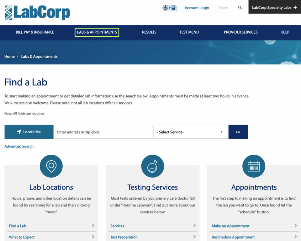
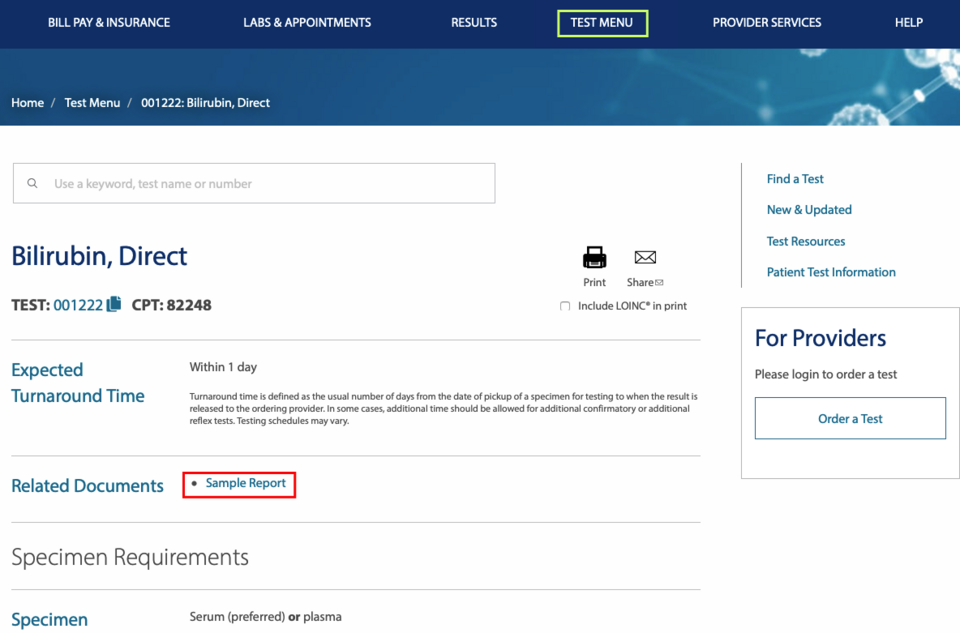
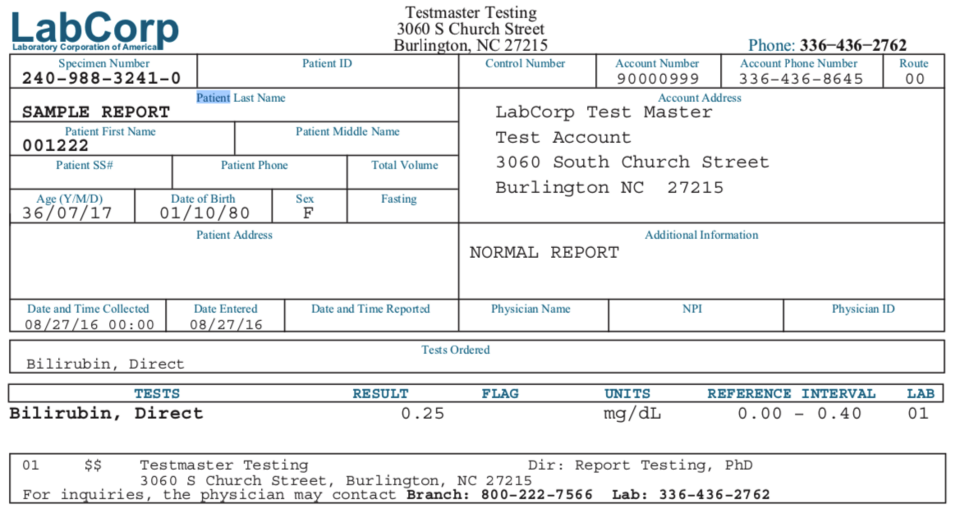
Another element worthy of emphasising is the sample test results for every test. The patient can display the "Sample Report" in order to understand how to read and interpret their results later.
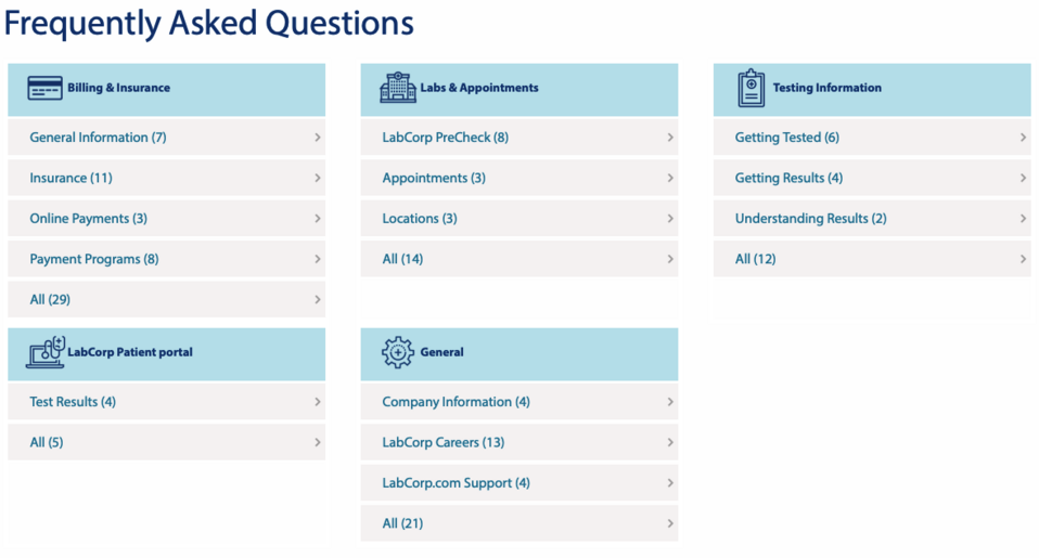
The characteristic feature of this website are shortcuts to the individual content. If there are many links between the products and/or services and the necessary information on your corporate website, labcorp.com shows that you can take on this challenge with great effect. I encourage you to click around their website with this in mind. Let me just mention that even the FAQ section is broken down into themed segments to make it even easier for the patient to find information, as shown in the photo below.
And one more support measure for the patient – LabCorp Mobile App. Describing its function is not necessary at this point, but it should be noted that the information about the application is large and cannot be overlooked when browsing the website.
The company website uses forms, and the range of Drupal modules for creating these is wide. Among the most well-known are: Webform, Entityforms, Contact Storage, eForm, Flexiform, Form Builder, Quick Forms. To sum up: labcorp.com is an example of a website the goals of which have been thoroughly thought out before, and their implementation has been achieved with the best possible effect while keeping in mind the expectations of its users.
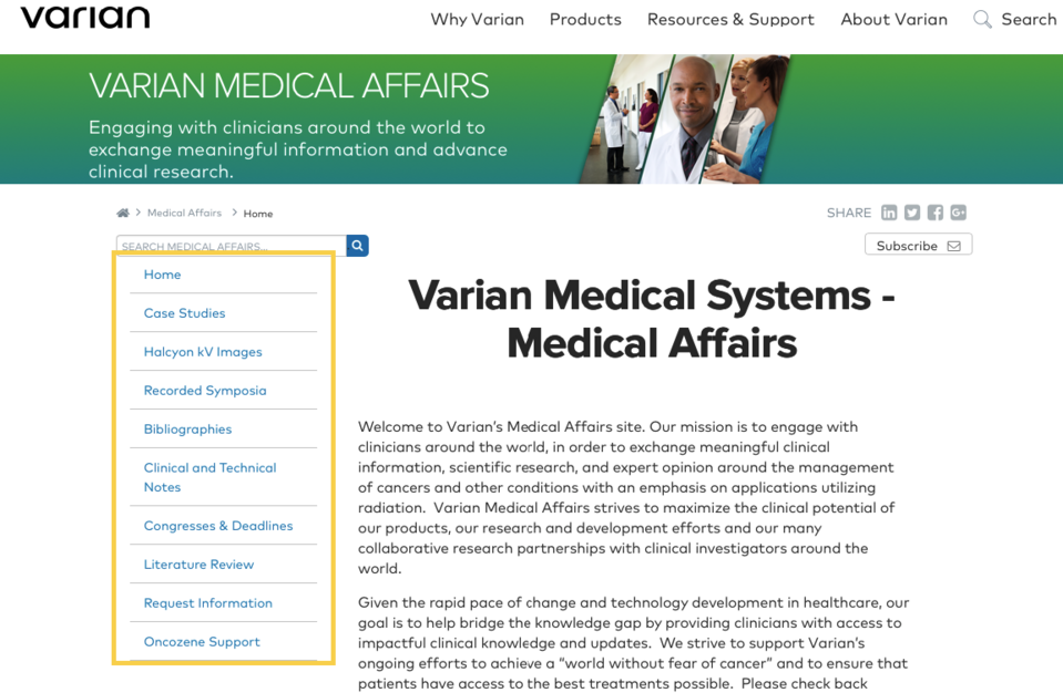
Varian
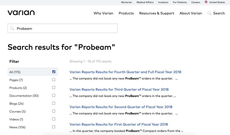
If you are rebuilding or creating your corporate website from scratch and you want good search functionality, the Apache Solr tool used by the Varian company should be mentioned. Apache Solr is an opensource search platform based on the Java library called Lucene. It enables indexing and searching through many websites, and returns recommendations for related content, based on the structure of the query. Thanks to the tool and the previous definition in the administration panel you can change the search to narrow the results for specific ranges, e.g. to titles. Do you run a blog? If so, Apache Solr will certainly help you and make it easier for users to browse its contents.
Varian is a producer of radiological oncology software and a supplier of lamps and digital detectors for X-ray imaging in medical diagnostics, dentistry, veterinary medicine and industrial inspection industry. The company's offer is wide, which did not stop it from choosing the minimalistic approach to the website design.
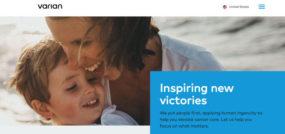
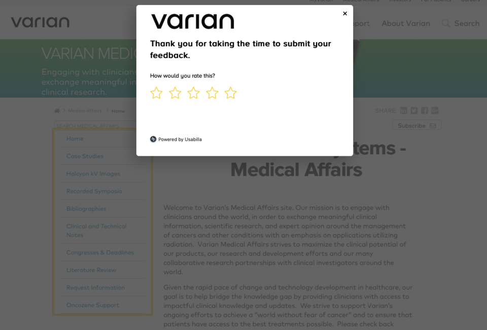
The character of the screen shown above is repeated like a chorus in the subsequent subpages: frugality of messages, care for the space, and the background's brightness. It seems that the aspect of readability was the guiding principle during the creation of the website. The developers decided to use the Views module – a part of the Drupal's core. The Views module enables administrators and site designers to efficiently create, manage and display content lists in the form of a block or page. By default, created can be views displaying the contents of the list (Node view type), versions of the content (Node revisions view type) or users (User view type). Therefore, a view can be limited to the members of specific user roles and can be added, edited or deleted on the administration page of views. This solution is extremely important for the security of a corporate website. For a person creating the view, who is not a developer in the corporation, the method of building blocks is intuitive and does not require high technical competences. Going back to the "chorus" metaphor, there is one more element repeated on the website one more element is repeated – feedback. After clicking the button, a window appears:
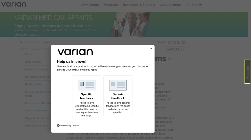
As seen above, the user can choose between a "generic" and "specific" feedback. The first one refers to the assessment of the overall impression of the website while using the second one you can indicate and evaluate its specific element. Have you ever stumbled upon such a solution before?
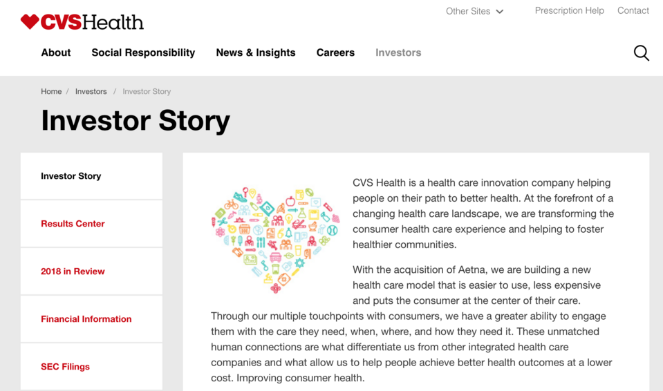
CVS Health
CVS Health, owner of a pharmacy chain and health insurer, in turn, uses the Paragraphs module. For large companies, creating a corporate website based on paragraphs is an extremely important argument in the context of content creation. Thanks to such a solution, all changes can be introduced independently and within the previously defined paragraph. You would probably like to save time on the tasks that can be automated because the resulting benefit is obviously measurable and quantifiable. A paragraph as a template supports the management of repetitive elements on the page. For corporations, it is important to be able to quickly edit and adapt changes to their needs when a new service or product appears. Ready-made templates can also be used to create landing pages.
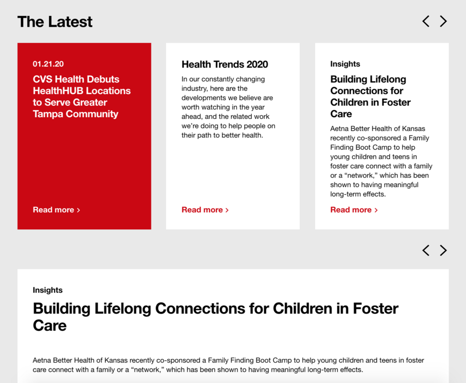
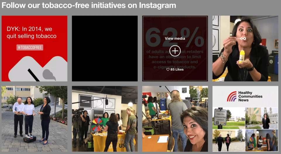
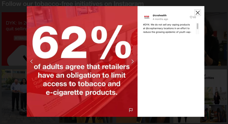
Have I already mentioned social media? This aspect usually consists of simply putting the icons directing to the profiles in social media, however, CVS Health decided to make the message more attractive. The screenshot below shows a preview of Instagram posts. After hovering over a particular block, the "View media" option appears with information about the number of likes. After clicking, a window with the post is displayed.
Baxter
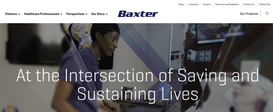
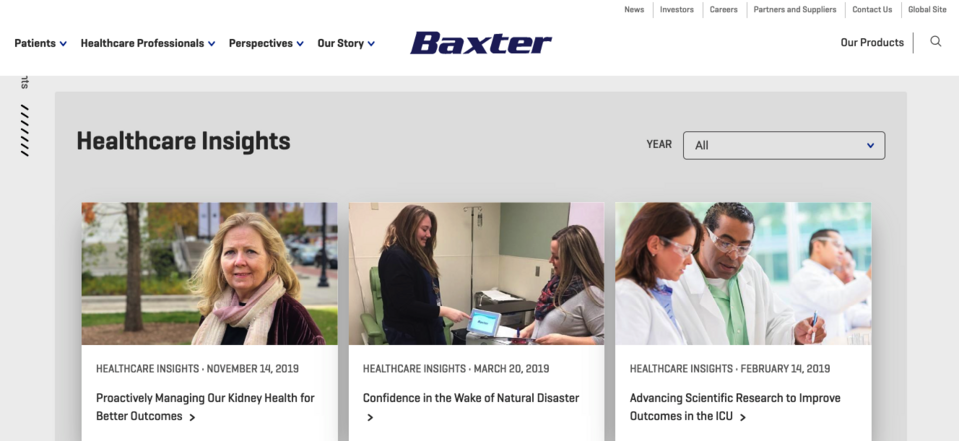
The last noteworthy example of a Drupal-based corporate website from the medical industry is Baxter. After entering the main page, the attention is drawn by the video in the first block, enriched with slogans related to the company's mission. And to counterbalance the large area it occupies, the headline and menu are designed in a minimalistic way, but with maintaining the key elements in the context of communication.
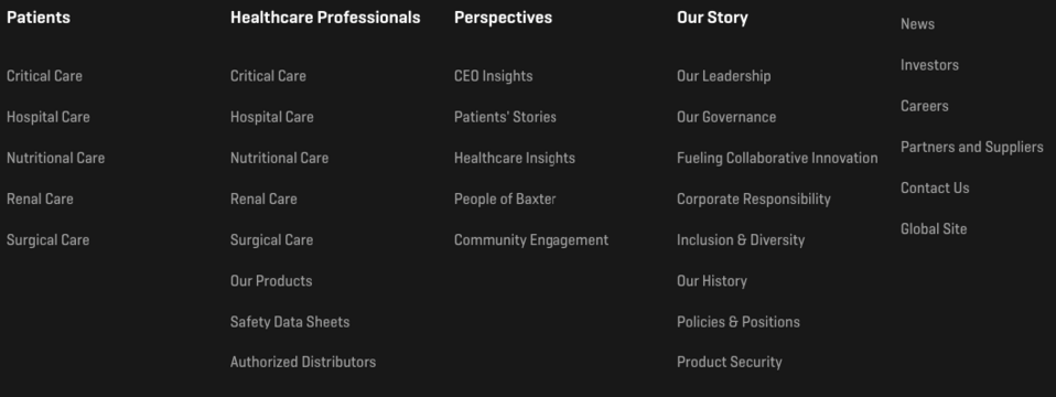
The footer contains more links, and they are an extension of the main menu.
This design choice shows how one can manage information on a large page to achieve the effect of enrichment, but not repetition. The middle part was designed as a place from which the user will be directed to other content. Easily noted here is transparency, a small amount of text and iconography. It is aimed at ensuring the shortest possible path for either a patient or a specialist to the content they are looking for.
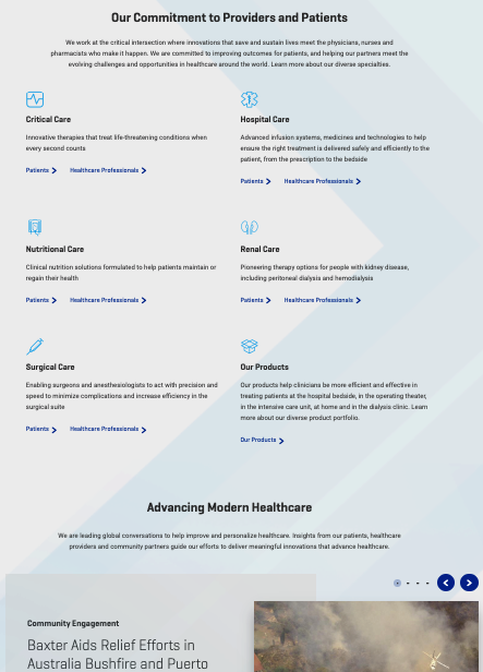
The subpages also have been designed in a way to avoid the impression of content overload. Here the emphasis was put on photos – separated into smaller blocks, they encourage to browse through them, and thus – to stay on the website longer.
Final thoughts
The corporations from the SP500 list presented above are representative examples of using Drupal in an industry where corporate websites must be thought out and built in such a way that removing one element does not threaten to destroy the entire structure. I hope that some of the solutions inspired you to think through. Maybe you would like to change the way language versions are presented? Or maybe it would be a good idea to run a podcast? Is the slider a good option for presenting your products?