7 Drupal Websites of Polish Universities That Inspire - Overview

I recently wrote a blog post about the best university websites on Drupal, which come from different corners of the world. In this article, I focus on web pages from Poland, similarly presenting their functionalities. For this compilation, I’ve selected seven examples of - in my opinion - the most interesting and inspiring websites.
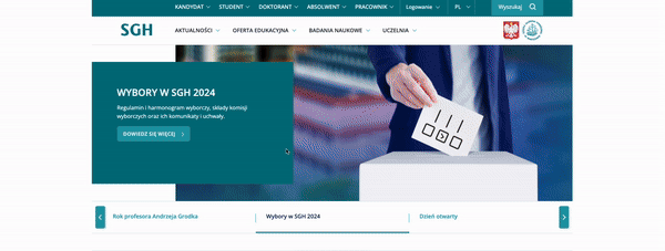
1. Warsaw School of Economics - transparency, newspaper and calendar
The first university I considered is the SGH Warsaw School of Economics. What captured me about this website was its clarity, expressed in the space between paragraphs. The spacing seen on each subpage makes the content extremely readable. We don't get the impression that texts are crowded, and this is undoubtedly very important for university websites that share important information with their audience.
At the same time, such an approach allows for the exposure of practical elements, as exemplified by the slider that "serves" the main banner. This navigation section is divided into three columns, and the arrows located at the edges - used to change the content on the banner - further enhance the impression of space.
The same thing happens lower on the graphic presenting the educational offerings, where tabs provide information about studies and schools. Although there are a few photos in color, this block also remains clear and light.
Another solution that draws my attention is the SGH Magazine, which you can find on a separate subpage. First, the idea of giving the news a newspaper format is worth emphasizing. Secondly - the presentation of the whole thing deserves praise. Here is an original prominence of the newspaper's front page: on the left is a large photo, and on the right are the slides of three articles. You can also go to the printed issues and the archive and read the publication in PDF format.
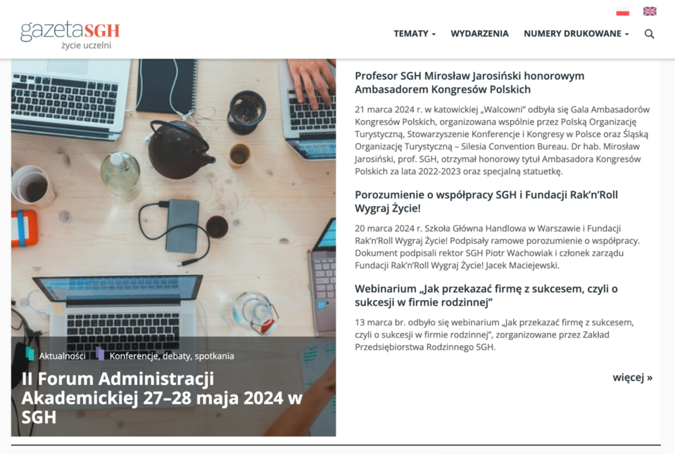
Source: gazeta.sgh.waw.pl
Also worth mentioning is the calendar and the smart filtering option for events. After selecting a category and type, the events appear in real-time, and the mentioned type, as a label, pins to the business card of the event.
The SGH University website is a perfect example of how to help users not get lost in the content and find exactly what they're looking for.
2. Poznan University of Technology - large graphics and calendar
The Poznan University of Technology website on Drupal 10, i.e., on the latest version of the system, also relies on transparency and space, although in a slightly different way. It achieves such an effect with large graphics that stretch the full width of the screen. And I don't just mean the banner on the home page, but also the images visible as you scroll. They’re wide and appear as a background.
My attention was further drawn to the calendar, one of the more original and minimalist I’ve seen. Only the dates and names of the events are placed in the blocks of the slider. When the slider is pressed, the block is highlighted and moves one step forward. Of course, we can enter the event to learn more. If you want to see the entire calendar, just click on the All Events button, and then the current month with a grid of events will be displayed. I'm impressed with this idea.
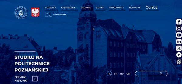
Describing the Poznan University of Technology website, I couldn't leave out the language versions either. Interestingly, the option to change the language appears in an unobvious place, namely at the bottom of the main banner, and not - as usual - at the top, right next to the menu.
And one more functional detail - the search engine. Besides the fact that it's located next to the aforementioned language versions in the hero section if you scroll to the bottom of the page, you'll see it again. In my opinion, this makes sense - if someone doesn't find what they’re looking for, the search option is "at hand" at the bottom of the page.
3. The University of Humanities and Economics in Lodz - a thoughtful search engine
No one needs to be convinced of the importance of intuitive search on a web page, especially a university website. The speed, ease, and efficiency of finding information can be decisive, for example, when choosing a course of study.
A great example is the web page of the University of Humanities and Economics AHE in Lodz. On the home page is a search engine where you can type in the faculty name or just place the cursor to see the complete drop-down list. After selecting a major, you’ll be taken to the landing page, where on the left side, there is all the necessary information (and, in the case of AHE, exceptionally detailed), while on the right side, there is the description of the major and the FAQ section.
Right next to the search engine on the home page, there is also a tiny banner inviting you to check all the majors. In this case, you’ll go to a subpage where they’re not only listed but also enriched with a filtering option. You can choose a system, mode, language of study, and department. For example, if you select an undergraduate program, only the blocks that meet the specified conditions will be displayed next to it.
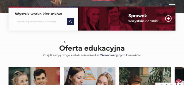
This is an excellent example of "shortening" the user's path in the search. What's more - the relevant label is highlighted in the blocks. And as if that wasn't enough - the Check More CTA button appears only when the cursor is on a particular block.
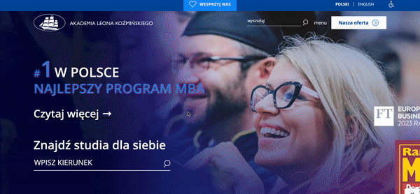
4. Kozminski University - filtering on the home page and accessibility
Kozminski University in Warsaw is also worth mentioning for search and filtering. The difference is that on the home page, in the paragraph just below the banner, there are segments whose contents are displayed when you hover over one of them. As a result, the next options will appear, and after selecting one of them, you can continue your search.
I was particularly interested in the Area segment. For example, if you click on Management and Marketing, you’ll get all the content about studies and courses with a label of the same name. Thanks to the separate blocks, the information is presented very attractively and clearly, including the type of study, admission start date, and language version.
Another interesting feature is the enrollment subpage for a study or course. Before going to the form, you can download a brochure and click Contact, after which the contact information for the appropriate person is displayed, along with their photo.
The website's creators also thought about people with disabilities, who can adapt the look of the web page and the size of the text to their needs.
5. Warsaw University of Technology - high-level accessibility
In the paragraph above, I mentioned accessibility. On its website, the Warsaw University of Technology also strongly emphasizes this aspect to make the service adaptable to the widest possible audience.
And so you can:
- select a language version,
- move the accessibility panel,
- make profile selections, including adjusting for color blindness, visually impaired mode, and ADHD-friendly/focused mode.
In the text settings section, the user can choose:
- readable font,
- fonts for people with dyslexia,
- highlighting headlines and links.
In addition, the following are also available:
- text magnifier,
- content scaling,
- font size,
- line-height,
- letter spacing,
- alignments.
In the appearance settings, besides defining the contrast, users have the option to choose colors for texts, headings, and backgrounds. In addition, in the content settings, they can, among other things:
- mute sound,
- hide images,
- stop the animations,
- invoke highlighting when clicked.
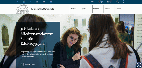
I’m very impressed by the thoughtfulness of the above solutions. I can confidently say that the example of the Warsaw University of Technology website can be an inspiration for other international universities on the topic of accessibility.
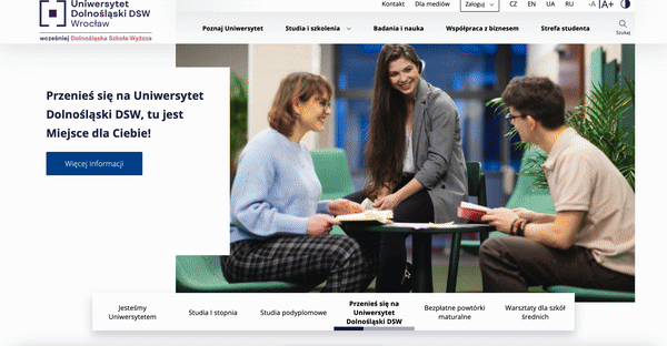
6. University of Lower Silesia DSW - banner and counter
The banner on the home page is a special place. It should contain the most essential information. Sometimes, website editors have a lot of messages to convey, so scrolling with navigation in the form of arrows on the sides is used to present them. However, this can be done differently, as exemplified by the University of Lower Silesia DSW website.
There are small text blocks at the bottom of the banner, and below their captions - a line showing how much time is left until the next slide on the banner is shown. It’s also interesting that you can pause the time until display. Just move the cursor out of the text block. This way, the user decides how fast he wants to read the content.
A similar, and therefore consistent, solution appears with the counter. It’s often used, and in Drupal, it’s the default functionality. However, the creators of the DSW website decided to personalize this option a bit. The numbers are placed in circles, and again, a line "flows" along the edges. When you hover over it with the cursor, the given text stands out by displaying it in a square.
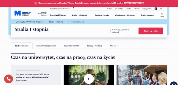
7. WSB Merito Universities - several Drupal websites and design
WSB Merito Universities are formerly the High Schools of Banking. And it’s about this information that there is a beam on the main page where, when we click on it, we can read details about the change. So, the beam is an example of a way to attract the user's attention. When we enter the main page, we can go further to a subpage of a business in a particular city - for example, in Wrocław, Toruń, or Gdańsk. Each of these is built on Drupal, which offers multisite functionality.
An attractive solution is an animation with a presentation of the institution's logo, which additionally shows the transformation of the former WSB into Merito. Usually, the graphic sign, which is located in the upper left corner of the page, remains static. In this case, it’s a dynamic illustration.
Another interesting feature is the contact and pop-up when you press the handset icon. A choice of date and preferred time for a phone call then appears. This undoubtedly increases the chance of successful communication - unlike the scenario where you leave your number and don't know when someone will call back and whether you’ll be able to answer at that time.
On the News subpage, however, the icons, and thus the links to social media, are in an unusual place - horizontally, in the center. However, this is not the case on every subpage, but precisely in the case of news stories, which you can read more about on social media.
Also worth mentioning are the images. When you hover your cursor over them, the graphics enlarge. Such a procedure draws attention to the content and makes it easier to see where you’re on the page.
Merito is an excellent example of how to organize a university website that has multiple outlets and how to divide information while maintaining consistency.
Websites of Polish universities on Drupal - summary
Drupal for higher education is an excellent and proven choice, looking at the reputation of the universities mentioned in the article. This technology offers great functionality, allowing you to build websites that fulfill their purpose as information hubs or platforms for communicating with students and academic staff.
We write about the use of Drupal, as well as other content management systems used by Polish universities, in our report on CMS on university websites.