
Ecommerce Websites Examples and Interesting Tricks in Designing Such Web Pages
More and more businesses are trying their hand at ecommerce. The basis of running such a business is having an online shop. How to design your sales website so that it stands out from your competitors? We present the most interesting examples of ecommerce websites and point out the most important good practices in designing them.
Best practices for ecommerce websites
An interesting design and unusual opportunities won’t help you achieve success if you neglect a few extremely important matters. You’ll ensure satisfaction and a good digital customer experience by:
- Planning intuitive navigation — users of your online shop should be able to navigate the website efficiently, without much hesitation as to where they’ll find the information they’re looking for.
- Providing detailed product information — clear photographs of the product visible from all sides, a precise description, and a table with sizes or other parameters are details that help the customer to make a purchase decision and facilitate the product search. Information that is too brief may discourage them from buying the product.
- Optimizing the website for mobile devices — Online purchases made via smartphones or tablets account for more than 70% of all ecommerce transactions according to Statista, so adapting your online shop to mobile devices is key to staying competitive.
- Implementing multiple payment methods — users buying online like to have a choice. Let them pay for their purchases not only with a quick transfer but also with an e-wallet or cryptocurrencies.
- Allowing customers to give feedback — by adding product reviews to your website, you increase the credibility of your business. There is also a growing chance that customers will be more likely to shop after seeing positive comments from other buyers.
These are just a handful of the many best practices to look out for when designing your own ecommerce website. With the right tools, you can build high-quality custom ecommerce websites that follow these practices.
Best designed ecommerce websites - examples
Ecommerce websites surprise with their diversity and design. It’s worth reading through examples before you start working on your own online shop. Which inspirations you use for your website depends largely on the ecommerce business model you intend to adopt. The idea is to have some kind of business plan for running your company which should identify who your potential customers are, what you want to offer them, and how you will deliver it.
1. Bliss
An interesting feature of the Bliss cosmetics shop website is the change from the typical shopping cart symbol to a shopping bag graphic. Next to the products, instead of the usual button saying add to cart, there is an add to bag button. This doesn’t affect the functionality of the website in any way, but it differentiates the web page from other e-shops, making the shopping experience unique.
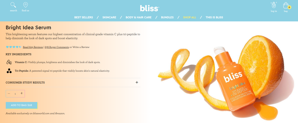
The developers of the website play with the content by putting small comments in brackets in the benefits section of shopping on the Bliss website, showing the human face of the brand.
The function of customer testimonials is achieved by a section containing Instagram photographs of various users who have purchased the brand's products and links to the content of posts in which they discuss or recommend specific cosmetics. This is a great example of using content created by existing customers (so-called user-generated content) to increase brand credibility and convince potential customers to purchase the products of a company.
2. Cowboy
Cowboy is an online shop for electric bikes and accessories with a unique design. By clicking on the website and holding down the mouse button, you can preview slogans advertising the product and photographs showing the urban scenery. The viewing of this content is accompanied by the sounds of the street, turning the browsing experience into a unique one.
The bikes in the collection are presented on the home page by animations and static graphics, accompanied by concise descriptions of the advantages and functionalities of these devices. Once the bike has been selected, the website redirects the customer to a website that allows the personalization of the product. The frame color, additional accessories, and insurance can be selected. This adds a whole new dimension to the purchasing process and makes the user happy to spend a lot of time in the online shop.
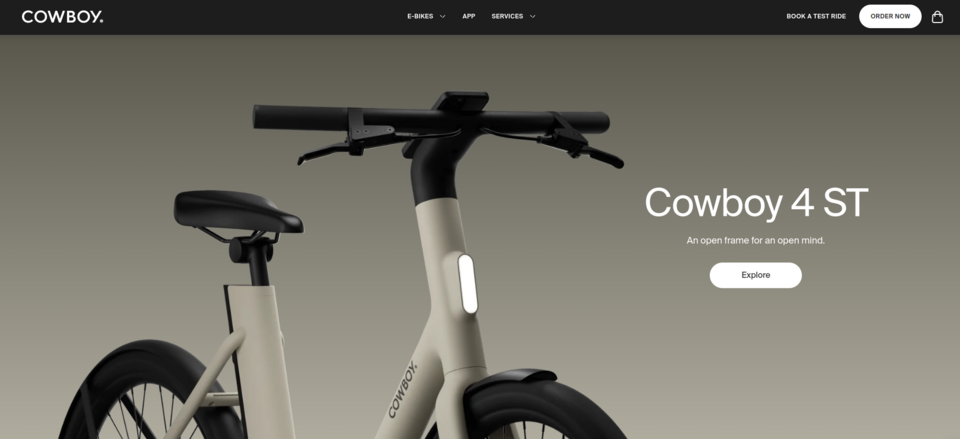
The e-shop has a subpage with customer reviews, categorized by the type of bike to which the comment relates. Reviews are also visible on the subpage of each product. There is also a subpage with press releases about the brand.
3. Burrow
Online furniture shop Burrow has made good use of video, posting a video on its homepage showing how easy it is to assemble the products it sells. Reasons to buy from this ecommerce website - fast and cheap delivery, easy installation, and high-quality materials - are presented with the help of minimalist graphics.
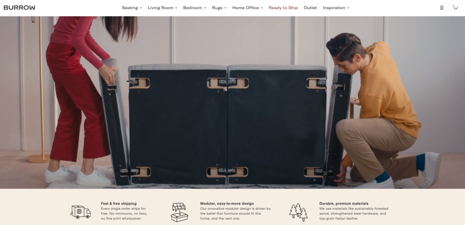
One of the sections contains finished room designs and some of the furnishings shown in the images are marked with buttons. When the cursor hovers over them, the potential customer can see product details. This speeds up the furniture selection process considerably and makes it easier to make a purchase. At the click of a button, the user is redirected to a product website where they can personalize their order by selecting their preferred color, style, materials, and accessories.
A reference from a customer, placed on the website, is juxtaposed with an image of the product to which it relates, making it easier for the user to make a purchasing decision. However, there is also a separate feedback subpage where only comments from verified customers are published, along with the photographs they have taken, increasing the credibility of the brand.
4. Emiozaki
The navigation of the Emiozaki ecommerce website imitates the look of a mobile application. The individual buttons of the main menu look like the application installed on a smartphone. By clicking on a specific icon, the user can browse information and products on the “screen" of a smartphone and interact with the website, having the impression of doing so on a mobile device. This is a very original approach that makes exploring the website more attractive.
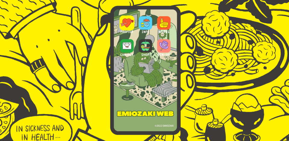
After clicking on a product, the user is redirected to a subpage of the shop where they can make a purchase. The website is decorated with original graphics. It is also animated and engaging, which encourages the user to eagerly engage in browsing and learning about the brand.
5. Old World Kitchen
The advantage of the Old World Kitchen online shop is the beautiful, original photographs and the way the creators have used them not only to decorate the website but also to present the products. Thoughtful arrangements in the photographs complete the design, as do carefully chosen, decorative fonts. High-quality photographs appear in large numbers on most subpages.
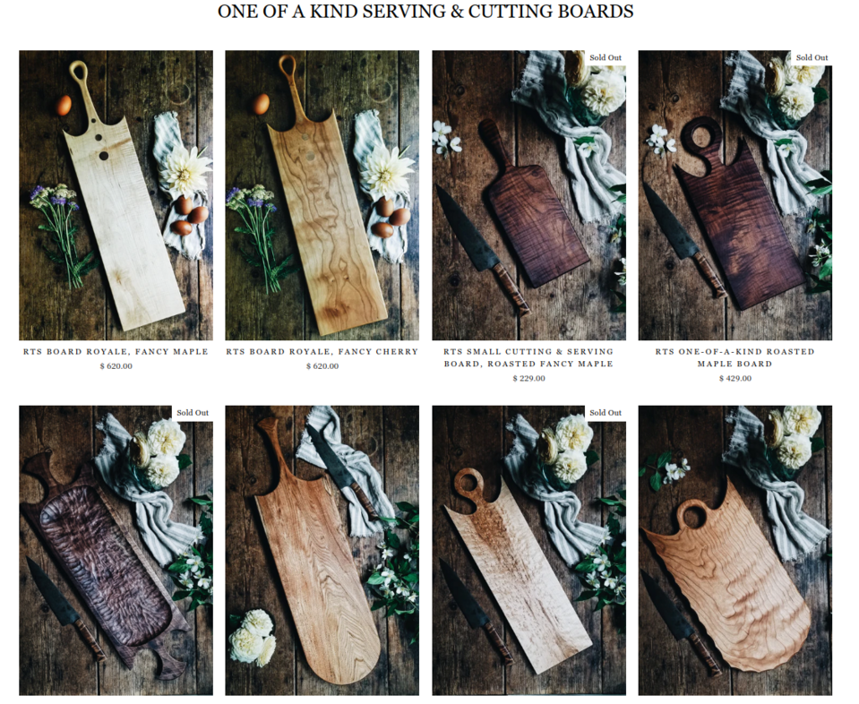
The website applies cross-selling (e.g. when you buy a board, you are offered to buy other boards in the collection or a spatula for greasing), which not only increases sales but also improves the customer experience by making it easier for them to make a purchase. After going to the page of a specific product, under its details, there is not only a section with things that may appeal to a potential customer but also a section with recently viewed products.
6. Deejo
The Deejo online shop offers the opportunity to purchase personalized knives. Product customization is possible by clicking on any CTA located on the home page. After being redirected to an interactive panel, the user can choose the length of the blade, the engraved motif on it, the material of manufacture, etc.
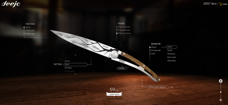
The purchasing process is fun and very much like a real experience, thanks to the fact that the already customized product is presented in 3D. The potential customer can view it from all sides and from any angle. During personalization, the price of the product changes continuously, so the user knows how much each change costs.
On the home page, you can also find press releases. They increase brand credibility and serve as an incentive to make a purchase.
7. Smokehaus
Online shop for smoked and dried meat Smokehaus also strives to make the purchasing process resemble the customer's experience in real life. On the home page, the products are presented on hooks - just like in a butchery or smokehouse. You can browse through them by scrolling to the side with the cursor or clicking on the desired product for detailed information.
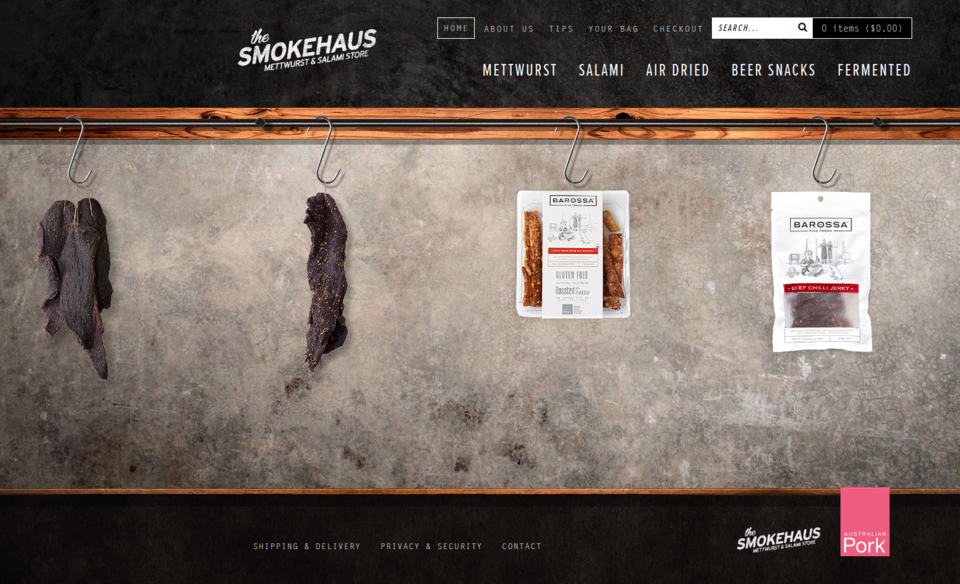
The product subpages also look interesting. In addition to a photograph of the selected product, on the right-hand side, detailed information is presented in a graphic that resembles a label from a traditional shop. The data is organized in individual sections, making it easy to read. An addition from the brand is a suggestion for serving a particular type of meat.
Although there is no blog on this ecommerce website, the company retains the user for longer by giving them a section with tips on storing the products it sells.
8. Home Science Tools
Home Science Tools offers scientific accessories for use at home. The range is quite broad, resulting in the challenge of presenting the products well to the user. However, the company has an interesting way of doing this. There are two categorization systems on this ecommerce website - thematic and by age. Thanks to this procedure, it’s easier for customers to find items tailored to their needs. Thematic categories have also been created for each age category, making it easier to browse through the products. In addition, users have a search option placed at the top of the website.
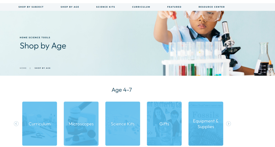
The company knows also how to present additional values and attractions on its website. It clearly shows what its loyalty program is all about, using simple graphics and slogans.
See also: What are the Best Ecommerce Startup Ideas and Companies that Use Them?
Ecommerce websites examples - summary
An ecommerce website doesn’t need to have state-of-the-art functionality to delight the user. Thoughtful design is just as powerful. Carefully selected fonts, original photographs, animations, and interactive elements allow potential customers to be involved in learning about the products and the brand's history. Intuitive navigation is also important. Depending on the development of the website, classic menus, mega menus, or more creative solutions can be used. The website is complemented by reviews from customers, partners or the press, confirming the company's credibility. Unique web pages can be created using the Drupal Commerce platform. We will be pleased to support you in designing your online shop.


