How to Add a Custom Paragraph to Droopler on the Example of an Accordion

The Paragraphs module is a very popular Drupal module for creating reusable components used to build pages. It gives more editing power for non-technical users, while also offering developers the ability to control the elements at the theme level.
By default, Paragraphs is not supplied with adjusting the content in a modal dialog. To enhance and improve the content editor experience, in Droopler we also used and extended the Geysir module.
So now building the pages looks more intuitive:
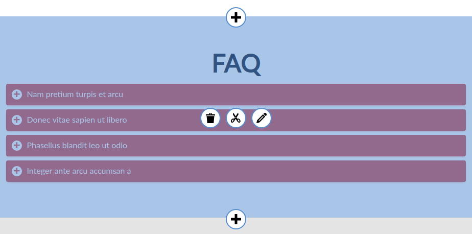
When enriching our Drupal services, in Droopler we tried to create all the necessary components with a wide range of options for design, layout, and grouping of content.
The end-user will get these paragraphs out of the box:
- Banner - A banner with background, icon, text and CTA,
- Form - A Drupal form embedded in a paragraph,
- Group of counters - Group of single counters,
- Gallery - Simple gallery paragraph with Colorbox support and no pagination,
- Carousel - Items scrolled by Slick library,
- Group of text blocks - Group of text blocks or nodes,
- Sidebar image - Background image on one side, text on the other side,
- Reference content - A list of nodes, like latest blog posts,
- Subscribe for file - A form that allows users to sign up for a file,
- Text page - A simple text paragraph,
- Text with image background - A simple text paragraph with background,
- Sidebar embed - Embed on one side, text on the other side,
- Sidebar tiles - Gallery of tiles on one side, text on the other side,
- Side by side - Two columns, text block or node in each one,
- Tiles gallery - Masonry gallery paragraph with Colorbox support.
But still, it is possible to extend our library with your own components. Here we’ll show how easy you can do it.
To achieve our goals we are going to need:
- Installed the Droopler distribution (check our tutorials how to install Droopler on Cyberfolks, Linode server or Platform.sh)
- Check also our customizing color scheme guide.
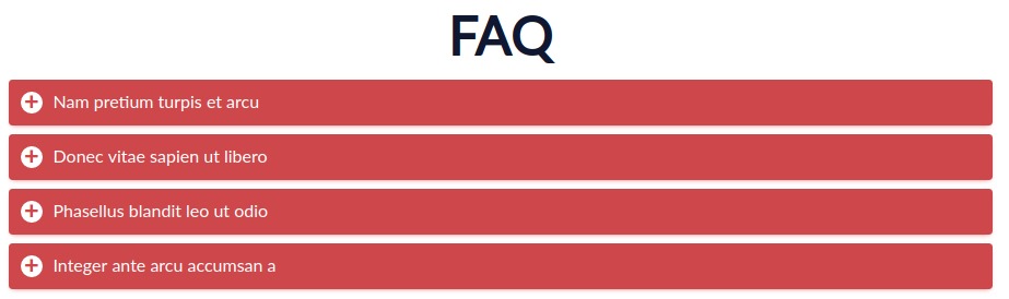
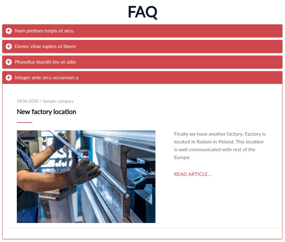
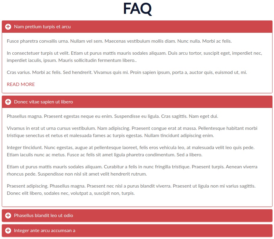
Let’s create something simple and obvious - an accordion. It’s an extremely useful pattern for progressive disclosure - highlighting important details of a section and revealing more details upon a tap or click, if necessary.
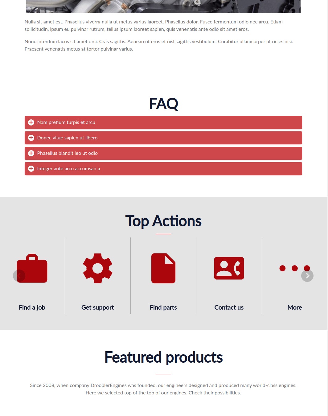
The final Accordion will look like this:
Action
1. First, create the Accordion Paragraph Type, we will need two paragraphs actually: main (as a content wrapper) and items (the content itself).
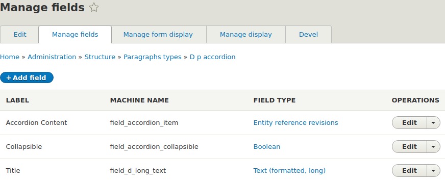
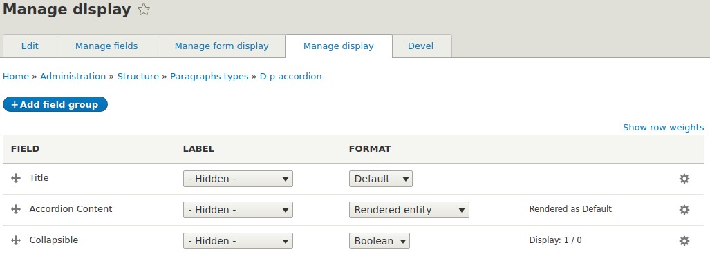
2. The Accordion paragraph type will need three fields: Content, Title and Collapsible (as a settings field).
The Accordion Content field referenced only to the Accordion item paragraph. This means only this one paragraph type will be allowed in the field.
As a Title field, we can reuse the existing one - field_d_long_text.
Field settings:
Form settings:
Display settings:
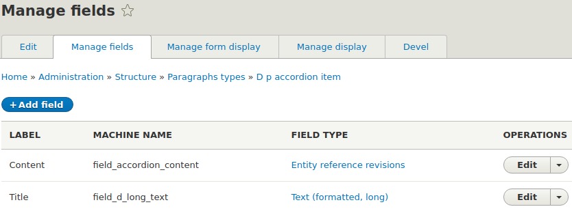
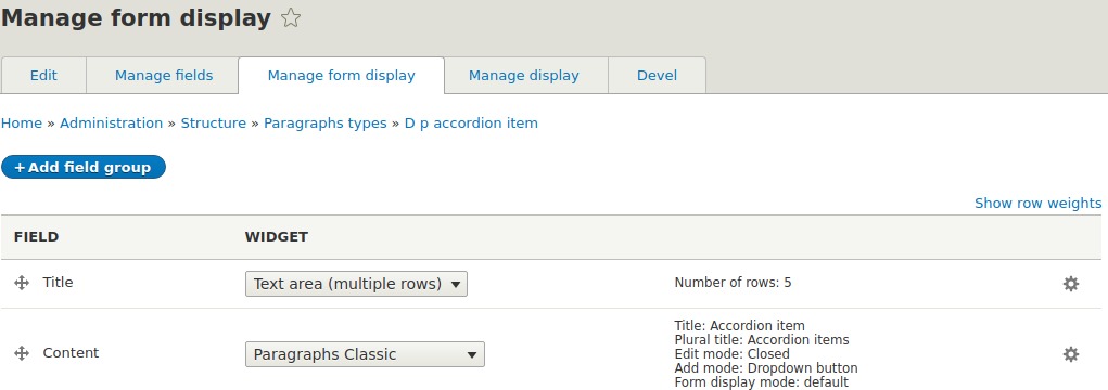
3. The Accordion Item paragraph type will need two fields: Content and Title.
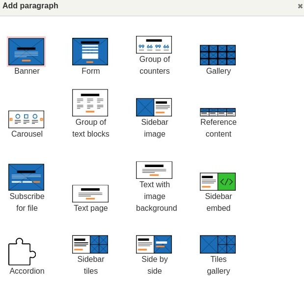
The Accordion Content field could be referenced to any paragraph, just be sure it looks like you want, otherwise you have to adjust some templates and styles to fit them well. For our purposes we will use a reference to Media, Node, Single block text and Text page paragraphs.
As a Title field we can reuse field_d_long_text as well.
Field settings:
Form settings:
Display settings:
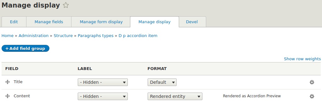
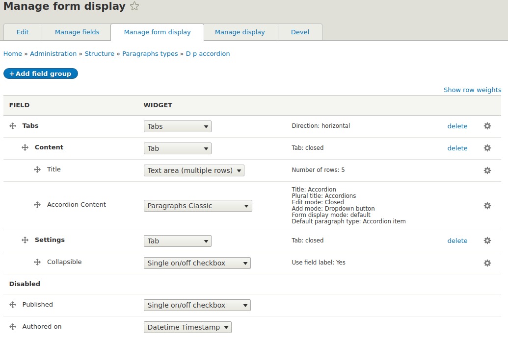
Notice, that we created a specific view mode for the rendered entity - Accordion preview. As you might know, Drupal View Modes allow you to render (display) a Drupal entity in a certain way, based on a particular context.
4. Then we need to add a newly created paragraph Accordion as a reference for Content Page content type.
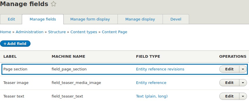
To be sure the Accordion appears in the list:
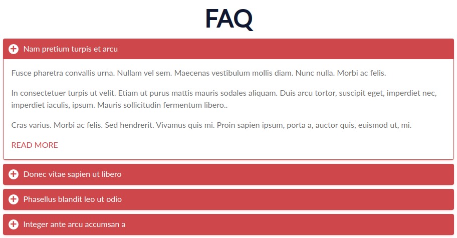
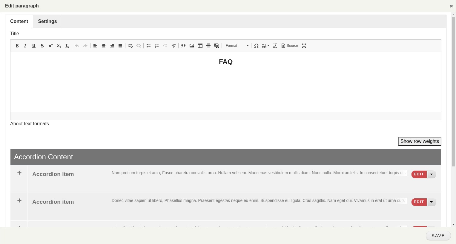
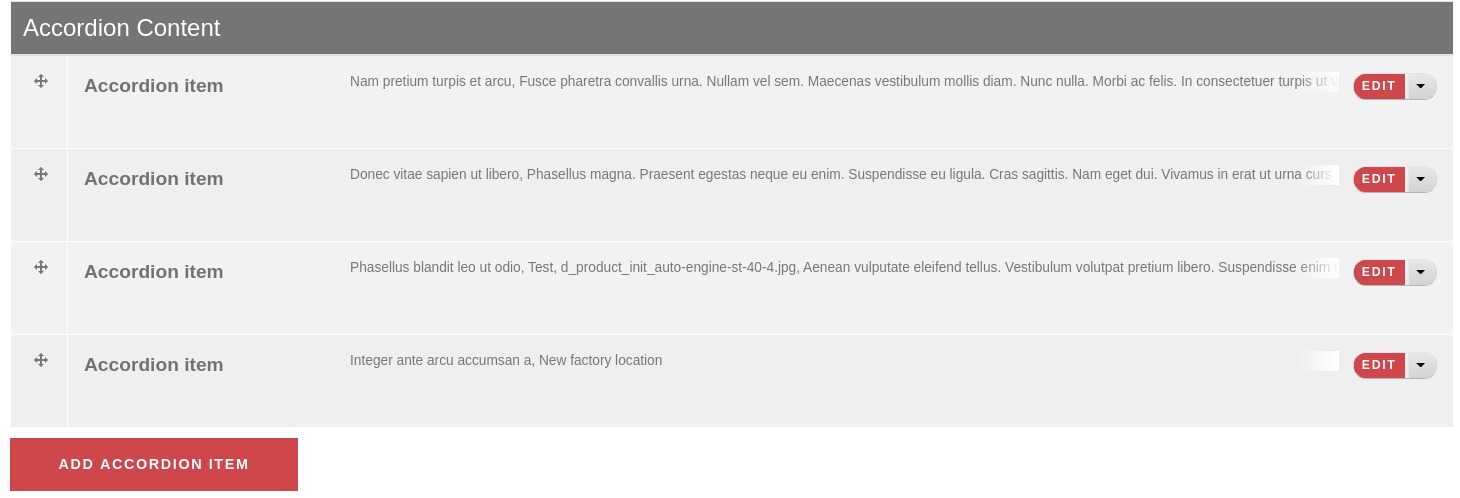
5. After we’ve created the new paragraph, let’s add it to the page, by adding the title and four collapsible items.
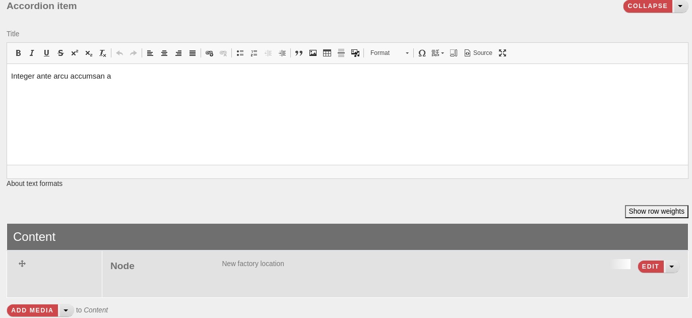
Check the final page view with our Accordion we’ve just added.
The code
Droopler theme uses bootstrap components, which means we can reuse its collapse JavaScript plugin.
The only few things we need to do is:
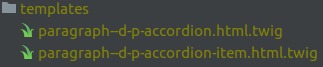
- create two templates,
- write the html markup according to bootstrap documentation,
- add some basic css library to fit our global theme.
Accordion template:
{{ attach_library('droopler_subtheme/accordion') }}

<section class="accordion">
 <div class="accordion__container container">
   <div class="accordion__header">
     {% block title %}
       {{ content.field_d_long_text }}
     {% endblock %}
   </div>
   <div class="accordion__content" id="accordion">
     {% block content %}
       {{ content.field_accordion_item }}
     {% endblock %}
   </div>
 </div>
</section>
Accordion item template:
{% set accordion_id = 'accord-'  ~ random('QWERTY') ~ random(9999) %}
{% set tab_id = accordion_id ~ '-tab' %}

{% set parent_entity = paragraph.getParentEntity() %}
{% set is_collapsible = parent_entity.field_accordion_collapsible ? parent_entity.get('field_accordion_collapsible').value : FALSE %}

{% set tab_attributes, toggler_attributes = create_attribute(), create_attribute() %}

{% set
 tab_attributes = tab_attributes
 .setAttribute('aria-labelledby', accordion_id)
 .setAttribute('id', tab_id) %}

{% set tab_attributes = is_collapsible ? tab_attributes.setAttribute('data-parent', "#accordion") : tab_attributes %}

{% set
 toggler_attributes = toggler_attributes
 .setAttribute('id', accordion_id)
 .setAttribute('data-toggle', 'collapse')
 .setAttribute('data-target', '#' ~ tab_id)
 .setAttribute('aria-controls', tab_id) %}

<section class="accordion__item mb-2">
 <button class="accordion__toggler p-2" {{ toggler_attributes }}>
   {% block title %}
     {{ content.field_d_long_text }}
   {% endblock %}
 </button>
 <div class="accordion__tab collapse" {{ tab_attributes }}>
   <div class="accordion__item-content p-3">
     {% block content %}
       {{ content.field_accordion_content }}
     {% endblock %}
   </div>
 </div>
</section>
Protip
Remember we added one more field to our Accordion paragraph, named Collapsible?
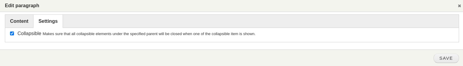
As you might notice our prebuilt paragraphs come with a settings widget, allowing us to adjust the paragraph view just like we want.
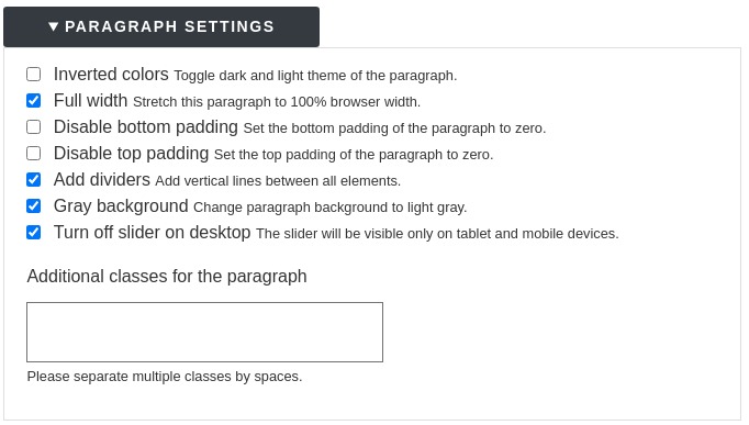
Currently, we don’t allow to alter this widget, but this might happen in future releases. Meanwhile, the easiest way could be adding the field, similar to the Collapsible field we’ve created before.
The only one simple thing that checkbox does - changing the collapsible effect, by providing the data-parent selector. If the parent is provided, then all collapsible elements under the specified parent will be closed when this collapsible item is shown.
Here how it works:
The checkbox is checked:

And unchecked:
Summary
As you can see above, it is very easy to extend the powerful functionality Droopler already brings to the end customers. That’s because of the right tools, used for building websites.
Keep building your own high-quality projects!